...
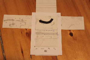
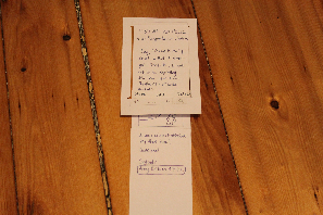
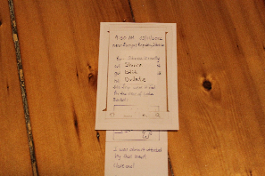
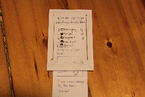
We used index cards to represent the Android phone and long strips of paper for our scrollable screensareas on screen. We also used transparencies and dry erase markers for the editable parts of the UI.
Refer to GR2 for an explanation of what each screen is for. Refer to the end of this document for a summary of design choices from GR2 incorporated into this prototype.
Timeline
Two elements of the UI: a chronological list of journal entries, with the "new entry" button always positioned as the most recent entry, and a map that automatically re-sizes and moves to include all posts currently visible in the entry list. A prominent arrow is loosely fit to the entry points on the map to indicate a rough direction of travel. The arrow is animated as the user scrolls the entry list.
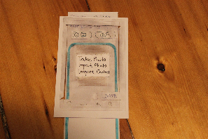
Edit Mode
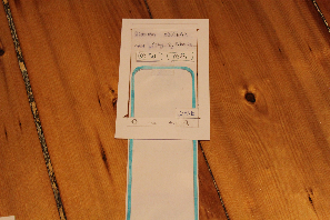
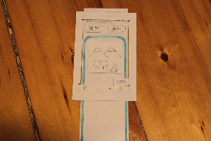
View Mode
Briefing
...