...
Title | Paper Prototype | Web Version | Comments/Description |
|---|---|---|---|
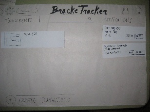
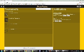
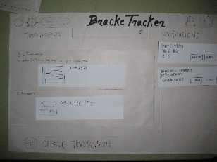
Home | | | No major changes in the home page layout. It was generally pretty clear to the users what the purpose of each section of the page was supposed to be. The biggest/only change was in the header bar: many of the users actually mentioned that they expected the Home icon to be on the top left corner and the settings/logout to be on the top right. That design would be consistent with other sites. |
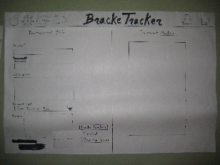
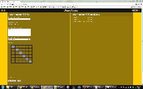
Create Tournament | | | The general layout of the create tournament page was well received by our paper prototype users. It was simple enough and caused few areas of confusion. During the web implementation, we found that there was no particularly good reason to put the form submit buttons on the right side of the form. Putting it directly at the bottom of the form in line with the rest of the inputs seemed to make much more sense. (It seems that we only placed the paper prototype buttons where they were because of poor size estimations of each input/display element on the paper. |
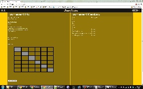
Join Tournament | | |
|
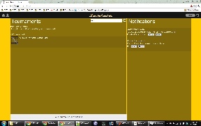
Search for Tournaments | | |
|
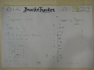
Tournament Page | | |
|
...