...
- The third picture is the settings pop-up that shows up when you hit the gear on the top right.
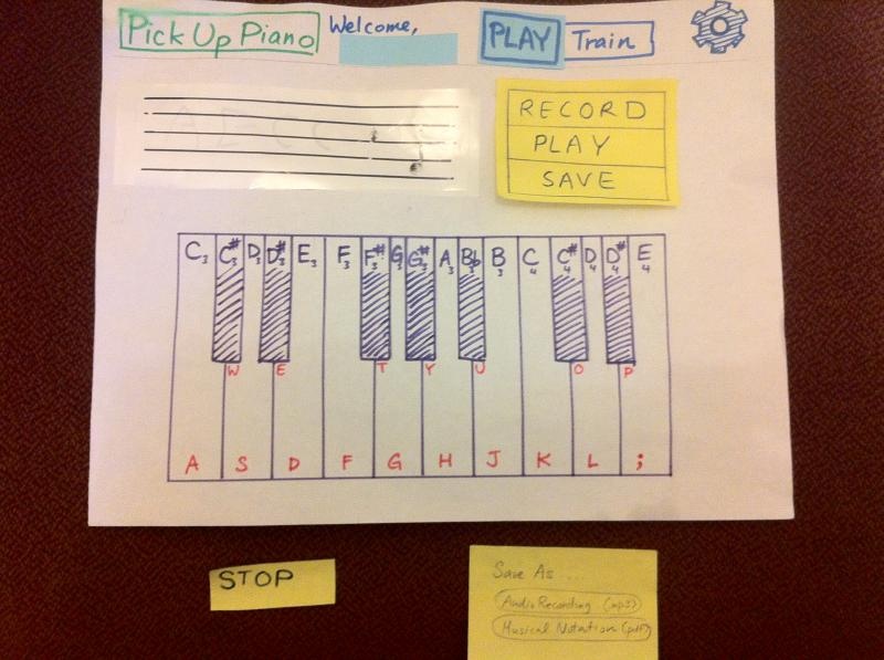
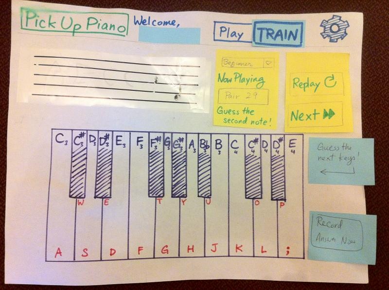
Prototype 1
...

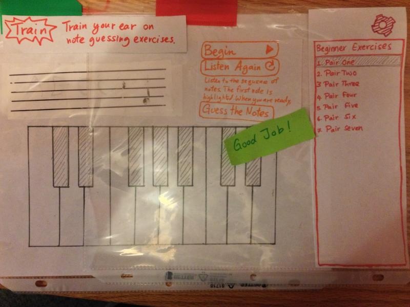
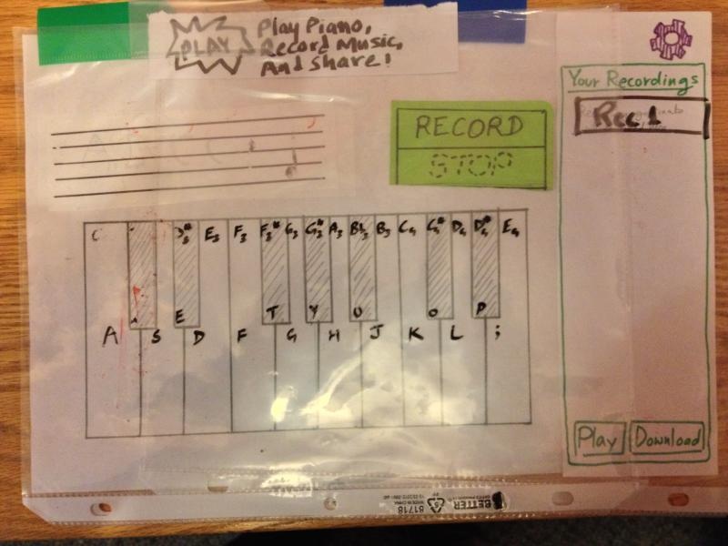
Prototype 2
...

Briefing
The domain of our project is music, in particular, piano.
...
- Ear-training:
- A technique through which one can learn to distinguish different elements of music (e.g. notes, chords) solely by hearing.
- For people who want to transition from "read-and-play" to "listen-and-play"
Scenario Tasks
1. It is Rob's birthday tomorrow. Record yourself playing the song "Happy birthday to you", and save it to your computer. Here are the musical notes you found on the web:
C3 C3 D3 C3 F3 E3
C3 C3 D3 C3 G3 F3
C3 C3 C4 A3 F3 E3 D3
B3 B3 A3 F3 G3 F3
2. You do not understand musical notation. Change the display from musical notation to letter notation.
3. Change your ear training difficulty level to intermediate. Then start and complete an ear training session.
User observations
Below our observations from both Prototype 1 and Prototype 2 are summarized.
Prototype 1:
Task 1 - Playing and recording a song
In the free play mode, there were two problems users came across.
- Learnability: Many users started playing music before hitting the “Record” button. They did not realize that they need to press a button so that the platform starts recording.
- Safety: Starting a new recording would automatically make the first recording unaccessible. Obviously bad.
Task 2 - Changing Settings
- A bunch of users got confused between the “Piano Display” option, notes being displayed on the Piano, and the “Notes Display” option, notes being displayed above it. The former was just to let users know the notes the different piano keys correspond to, and the latter was for letting the users see what they actually played. When asked to change the display setting for the latter, many of them changed the display for the former, since neither name was informative.
- Learnability: Some users didn’t realize that the TRAIN / PLAY button on top were buttons. Normal “button” affordances were not possible on paper.
Task 3 - Ear training Process
What was supposed to happen:
...
- Can’t take care of safely. Especially safety related to misclicks.
- Hard to give affordances on paper. Sometimes users just asked us if this is a button or not.
- Too much time to make changes, and changes happen in a motion instead of a flick. Human eye notices these things were different. A flick catches your attention to the new content that came up. A motion catches your attention in the process by which the new information is coming up. (Users tried to physically remove dialogs.)
- No instantaneous feedback on hovering, etc.
- Can’t really judge efficiency. No expert users. Also, efficiency is better measured than observed via naked eye.
Notes for next design
...
- Eliminate modes entirely.
- We should be able to get around using modes by including all functionality on a single “sandbox” page.
- Strategically place “Hint” icons on places where users have trouble.
- Make affordances clear when a user is exploring the app.