...
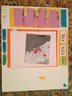
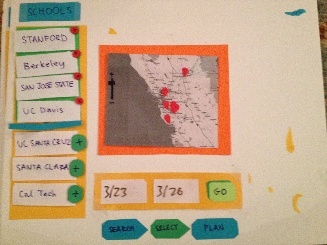
The main change that we made between our two rounds of paper prototypes prototype testing was adjusting the third screen where the user planned their trip. We wanted to make this screen more intuitive and fit the user's expectations more than it had originally because there was a lot of confusion about the layout and the order of selections. However, after doing the second round of testing, we realized that the users were still slightly confused by the layouts of screens 2 and 3 and that these screens were redundant and cluttered so we altered them again on paper to produce a third iteration (seen below). The main changes we made to the selection screen was deciding that the "results" and "selections" panels were repetitive, so we combined them into one panel where the selected schools move to the top of the list. The planning screen was altered to look more like the selection screen so that the user experience is more consistent. There is now a map in the center panel that will show the route and order of the schools that have been selected to be visited and when the user finalizes their basic itinerary by clicking on a button (not yet added to our prototype) the map will be minimized and the user can select specific events for each school (a feature that remained the same from our previous prototyping iterations).
Updated Paper Prototypes for Screens 2 and 3
| Section | ||||||||||
|---|---|---|---|---|---|---|---|---|---|---|
|