Prototype Photos
The photographs below are from the first iteration of our prototype, which includes three screens to step the user through the process of finding schools, selecting schools to visit, and planning a trip.
Search
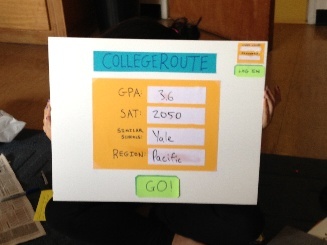
This screen is the welcome screen for our web page, where a user can quickly enter information relevant to their college search and then proceed to begin searching. The GPA, SAT, Similar Schools, and Region fields are all text-boxes that can be filled in by the user; these criteria will be used to narrow down the school search. In the top corner there is an option to log in or register. While users do not need to register in order to use our service, they may register if they wish to save their itineraries and profile information. Upon logging in, users are directed to a homepage (not shown in this prototype) that would display profile information and saved itineraries.
Select
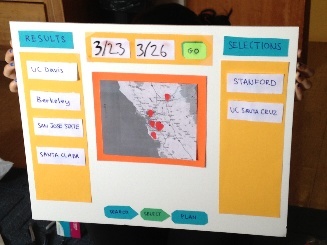
The selection screen is divided into 3 panels and allows the user to begin picking which schools to visit based on the search criteria entered on the previous screen. The center panel is the focal point, presenting the user with an interactive map that they can use to navigate around and see available schools. At the highest level (i.e. if no region is specified) a map of the U.S. would be shown with circular markers indicating the number of search results in the region represented by the marker. As the user zooms in on the map (either by clicking on the map or using the zoom bar), the regions become more fine-grained (e.g., individual states, counties, or cities). At the final zoom level (presented in this photograph) the specific schools within an area will be shown with pins in the map. These schools will then populate the left hand panel labeled "Results," and the user can add the schools to the "Selections" panel (either by clicking on them in results or by clicking on them on the map and adding them that way). After selecting schools, the user can specify the dates of their visit and proceed to the planning screen.
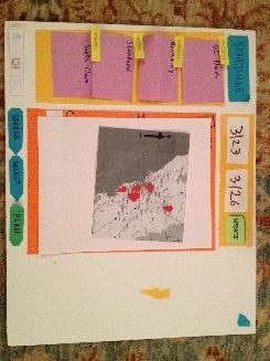
Plan
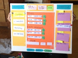
The final screen is used to plans the itinerary. Keeping with the three panel layout, the left panel is populated with the list of schools selected by the user to visit. Upon selection of a school from the left panel, the middle panel will show tour and information session times for that school. By clicking on a (+) button shown next to each event, the user can add the associated event to their itinerary. The schedule panel (right panel) is dynamic; the user can rearrange the order in which they plan to visit schools and modify the time blocks allocated to each school visit. Events added to the itinerary from the main panel will appear on the schedule panel. However, if a user adds an event at School X at a particular time on Day Y and then changes the schedule so that he or she is no longer visiting School X on Day Y, the event will disappear from the schedule.
Briefing
We had the following notes for briefing participants:
Purpose:
- Parents often plan trips for their high school age children to visit colleges, but there are a lot of challenges along the way that we are trying to alleviate.
- Find good fit colleges in a certain geographic area
- Balance multiple campus tours/info session times in one easy place
Tasks:
- A few tasks as if you were a college junior planning visits to schools
Disclaimers:
- We’re not testing you, we’re testing the interface, feel free to ask questions, but also try to explore and see what happens
Conclusion:
- Do you have any questions? If I can’t answer them now because it will interfere with the test I will definitely answer all unanswered questions at the end.
Scenario Tasks
These are the three tasks that users were given when interacting with our interface, the first roughly corresponds to the first and part of the second screen (mainly focused on searching), the second task targets the second screen (selection) and the third the third screen (planning the itinerary).
Task 1
Imagine you are a high school junior with a 3.6 GPA and 2050 SATs. Find schools in Northern California that might be a good fit.
Task 2
Select 4 schools that you would like to visit on spring break (March 23-30th).
Task 3
Plan an itinerary for visiting the 4 schools selected in Task 2.
Observations
Task 1 (Search)
Most of the users were able to go through the first screen very quickly and with no confusion, entering the information and clicking the "Go" button to move on to the next task. However, some users made a couple of comments and there were a few key observations from this stage:
- For efficiency purposes, some users hoped that there would be autocomplete entries in the text fields on the search screen
- There was some confusion and learnability issues with the "Region" text field because users did not know how specific to be or what regions would be accepted in their search (one user suggested the "Region" being a menu of some kind so that users do not have to guess at whta the system wants)
- Some confusion about which fields were optional or whether every field was required.
Task 2 (Select)
This task presented a little bit more of a challenge for users to complete than the first task, and our observations provided some important feedback for points of confusion in the interface
- One main learnability issue was entering the start and end dates of the trip to advance to the next screen. Users often weren't sure where the "Go" button was located, some tried to navigate using the "Plan" button on the bottom before filling in a date (note: we decided to combat the lack of date by having the default be the date of the search as the start date and one week later as the end date).
- Some of the zooming capabilities confused users and they did not understand what the values on the red circles meant, but once they discovered they could zoom by clicking on them and that the value represented the number of schools this feature was really learnable and intuitive.
- Some users did not realize that they could click on specific schools on the map to receive more information, however one user who did find this feature thought that the provided information was not detailed enough.
- A couple of users tried to click and drag schools from the map to the "Selections" panel, and others thought that all three panels weren't necessary because the map could provide the same capabilities as the "Results" panel.
- Originally one user was confused about why the results panel was empty (thought their search returned no results), but once they began zooming that became clear, so filling the results panel is learnable.
Task 3 (Plan)
Planning the actual visits appeared to be the most difficult task for users and the last screen seemed to be the least intuitive and cause the most issues for each user.
- At first some users struggled to figure out which school the events were being shown for, but others noticed that one school was highlighted right at the beginning.
- Many users were confused about what can be dragged and dropped and what had to be clicked and selected. Although playing around with the interface allowed many of them to figure out what could be dragged, it was not learnable at first and often things that they wanted to be able to drag (such as the events in the middle panel) would not drag, or others never discovered they could drag around the times in the "Schedule" panel.
- Some users were unclear about the use of the "Custom" panel and either didn't see it or didn't know how to use it. However, one user did select and add their own custom event to their trip successfully.
- Some users struggled because the layout didn't seem to flow with the decision process, so adjusting the layout will probably be necessary (observation after first iteration).
- Once users had finished planning their trip they would look for a way to either e-mail or print their itinerary or save it somewhere. Although we expect this capability to be possible with users creating accounts for the website, it was not intuitive for this round of prototyping.
- In our second iteration some users had trouble transitioning from the calendar to the tour times.
- Suggesting a default plan makes learnability of the sight challenging because users did not explore as much or realize they had the freedom to change things.
Iterative Prototyping
The main change that we made between our two rounds of paper prototype testing was adjusting the third screen where the user planned their trip. We wanted to make this screen more intuitive and fit the user's expectations more than it had originally because there was a lot of confusion about the layout and the order of selections. However, after doing the second round of testing, we realized that the users were still slightly confused by the layouts of screens 2 and 3 and that these screens were redundant and cluttered so we altered them again on paper to produce a third iteration (seen below). On the selection screen, we combined the "results" and "selections" panels into one panel where the selected schools move to the top of the list while keeping the map in the main panel. When the user moves to the planning stage, he or she can set the high-level itinerary for the trip by blocking out time for visits to each school on a calendar interface. While the user is setting the high-level schedule, he or she can visualize the proposed itinerary on a map in the center panel that will show the route between the selected schools. When the user finalizes his or her basic itinerary by clicking a "Set itinerary" button (not yet added to our prototype), the map will be minimized and the user can select specific events for each school (a feature that remained the same from our previous prototyping iterations). The user can return to editing the high-level itinerary at any time by clicking an "Edit itinerary" button.
Updated Paper Prototypes for Screens 2 and 3
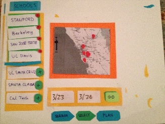
Selection Screen: Redundancies removed, combined selections and results panels
Planning Screen: Now shows the user their itinerary visually, more intuitive and less clutter
1 Comment
Unknown User (jks@mit.edu)