...
| Section |
|---|
| Column |
|---|
| | Wiki Markup |
|---|
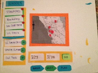
{center} !Select.JPG|thumbnail!{center}
|
|
| Column |
|---|
| The selection screen is divided into 3 panels and allows the user to begin picking which schools to visit based on the search criteria entered on the previous screen. The center panel is the focal point, presenting the user with an interactive map that they can use to navigate around and see available schools. At the highest level (i.e. if no region is specified) a map of the U.S. would be shown with dots over each region that have the number of possible match schools in that region. As the user zooms in on the map (either by clicking on the map or using the zoom bar), more views will be shown and the labels will split and show more and more specific divisions of where schools are located. At the final zoom level (presented in this photograph) the specific schools in an area will be shown with pins in the map. These schools will then populate the left hand panel labeled "Results," and the user can add the schools to the "Selections" panel (either by clicking on them in results or by clicking on them on the map and adding them that way). Then the user can specify the dates of their visit and be taken to the planning screen. |
|
...
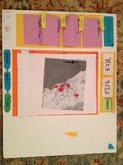
Updated Paper Prototypes for Screens 2 and 3