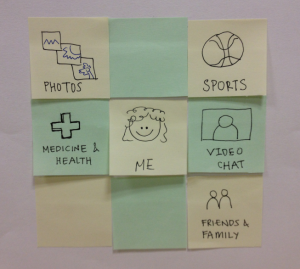
...
Prototype #1 Screenshot | Notes |
|---|---|
| *Navigation Tiles |
| *Answering a question for medicine |
| *Choosing a video chat channel or buddy |
|
|
| *Adding Paul as a friend |
|
|
Prototype
...
Prototype #2 Screenshot | Notes |
|---|---|
| *Navigation Tiles (more contrast) |
| *Answering a question for medicine |
|
|
| *Choosing a video chat buddy |
|
|
| *Adding Paul as a friend |
|
|
Observations
Observations.
Usability problems you discovered from the testing. Describe critical incidents encountered by the users, but don't record users' names. Record these as a series of high-level takeaways, focusing on the usability problems you saw, rather than what each participant did. For instance, you might describe how you had some learnability issues with your prototype, as evidenced by users B and C clicking all of the menus to try to find option X.
Prototype Iteration Analysis
Prototype iteration.
You did two rounds of paper prototyping. Describe how your prototype changed between those two rounds.
Prototype First Iteration User Feedback
...
- was initially confused about whether or not the header grid icon had individually clickable icons or was just one icon
- wondered about the possibility for an expandable reply textbox
- wondered about "BACK" button functionality vs. just using web browser's back button.
- wondered about what happens to responses (under Medicine and Health page) that were started but not finished and if those replies automatically autosave if go to a new page.
- wanted to be able to the edit a question they already answered and wanted to know how to find their previous response.
- wondered if there was a way to show who had answered a particular question - i.e. thought that memory might not be the best and couldn't necessarily remember which questions they can answered.
- thought that the best way to choose to video chat with someone was through the "Friends and Family" section
- thought it was not immediately clear whether or not the interface was a group chat (and everyone was chatting i.e. google chat or just one person talking) & wondered about functionality such as are the individual boxes clickable.
- wanted some way to have more info about people before chatting with them/ had concerns about safety
Prototype First Iteration Observations
Observations.
Usability problems you discovered from the testing. Describe critical incidents encountered by the users, but don't record users' names. Record these as a series of high-level takeaways, focusing on the usability problems you saw, rather than what each participant did. For instance, you might describe how you had some learnability issues with your prototype, as evidenced by users B and C clicking all of the menus to try to find option X.
*
*
Prototype First Iteration Analysis
In summary, feedback from usability tests from the first iteration concluded that the design, although simple, lacked functionality for normal and expert user scenarios, including search, sort and categorization. Hence, we adapted the feedback into our second iteration prototype and added much more functionality and performed another iteration of user testing.
Recitation Feedback:
*
*
*
*
Prototype Second Iteration Photos
Prototype #2 Screenshot | Notes |
|---|---|
| *Navigation Tiles (more contrast) |
| *Answering a question for medicine |
|
|
| *Choosing a video chat buddy |
|
|
| *Adding Paul as a friend |
|
|
Prototype Second Iteration User Feedback
User 1:
*
Prototype Second Iteration Observations
Observations.
Usability problems you discovered from the testing. Describe critical incidents encountered by the users, but don't record users' names. Record these as a series of high-level takeaways, focusing on the usability problems you saw, rather than what each participant did. For instance, you might describe how you had some learnability issues with your prototype, as evidenced by users B and C clicking all of the menus to try to find option X.
*
*
Prototype Second Iteration Analysis
In summary, feedback from usability tests from the second iteration concluded that the design, although more full-fledged, now hampers usability by overloading each screen with too many features. This turned out to be confusing for both of our tested users, so would be safe to say, also complicated for elderlies as well. Hence, for our third iteration, we plan to take a middle ground to sacrifice some functionality and strike a coherent balance.
Prototype Third Iteration Photos
Prototype #3 Screenshot | Notes |
|---|---|
| *Navigation Tiles (more contrast) |
