...
- The main page was way too busy with the colored images => We replaced those images with simple icons that are consistent and commonly used
- Paypal is too different from our web site and leads to local inconsistency => We implemented Stripe for checkout system which is much simpler and has the same styling as our website
- For your reviews, there is not enough distinction between the review and the review title => Made a bigger distinction by implementing a review system that clearly distinguishes the title from the actual content
- The number system is probably not the best visual variable for reviews => We implemented a system that uses stars which are much more common
Walk-through
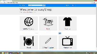
Main page. Consists of big icons for major categories of items in our database. There are not only visuals for the categories but also titles. They somewhat resemble the cards that are used in Google Now which give the affordance of being clickable while also making separation not an issue.
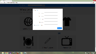
Sign up page.
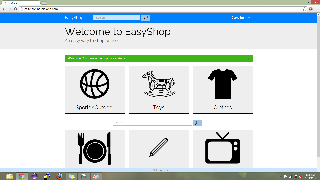
Successful sign up.
...