...
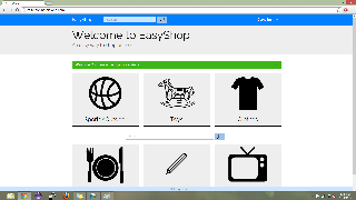
Main page. Consists of big icons for major categories of items in our database. There are not only visuals for the categories but also titles. They somewhat resemble the cards that are used in Google Now which give the affordance of being clickable while also making separation not an issueclearly separating all of the icons.
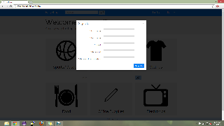
Sign up page. The sign up page is a simple modal that requires the user to enter their first name, last name, email address and password. We decided to make this a modal instead of another page, because it was more simple and also lessens the possibility of mode error.
Successful sign up. In order to inform user that they have signed up successfully, we not only prominently show their name in the upper right hand corner, we also show a message with a green background stating that the sign up was successful. While this might be too much feedback for the average user, for our user population, the elderly, we want to make sure they always know what is going on.
Implementation
We decided to make our website a ruby-on-rails based system. The site is hosted on Heroku and the best browser for it is Chrome. We use a lot of outside libraries for various reasons including Sunspot(search), Stripe(payment), and Rake(database). Our back-end consists of models for items, users,
...