...
Images - DJ Interface | Description |
|---|
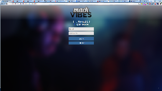
| For the home page, we opted for a simple look. Since login was not part of the previous design process,
we simply mocked it up and implemented it. While testing internally, we found that it would be good to give
the user feedback immediately about the validity of their input. Heuristic Evaluation:- Added a log-in and sign in form page to introduce the app (Consistency and Standards)
|
 There are basically four main sections here. The upper left shows the previous song. During user testing we found that this was not needed on the initial login so we removed it until a song was played. At that point, we There are basically four main sections here. The upper left shows the previous song. During user testing we found that this was not needed on the initial login so we removed it until a song was played. At that point, we
added in both the currently playing song and feedback from how the crowd rated the song.
| Heuristic Evaluation - Removed album title from previous winner (Recognition Over Recall)
- Added DJ feedback graph to show user input (System and Real World)
- Changed "Search" to "Search by song name" (Consistency and Standards)
User Test - Made bars show up on DJ feedback when vote count was 0
|
...
|
 Image Modified Image Modified |
...
When we initially tested this page, we didn't get a lot of useful information. After the user testing, however,
the djs we tested on said that they would like this pane to be able to slide away. If we were to continue further,
we would simply replace the begin voting pane with this and allow the user to cycle between these two views.
Heuristic Evaluation - Increased space between the top section and the voting pane (Flexibility and Minimal Design)
|
...
|
 Image Modified Image Modified
|
...
| Heuristic Evaluation - Grayed out the "Begin Voting" button (Error Prevention)
- Added "BPM" on the table (Skills)
User Test - Added play button on the table
|
...
|
 Image Modified Image Modified
|
...
| Heuristic Evaluation - Made text of the pie chart labels larger and bolder (Visibility, Consistency & Standards)
|
...
|
 Image Modified Image Modified |
During the user test, we got feedback that we should also visualize the voting information here. Currently, we
display data about the songs that were played but not about the user votes that we processed.
Heuristic Evaluation- Added certain genre related information tabs to the graph charts that adapt to the DJ's interests (Skills)
|
...
Images - Listener Interface
| Description |
|---|
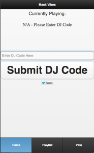
| When a user initially opens the application, they see this default home
page. They are prompted to "submit a dj code." This screen was
created after the entire app was completed. It's simply a less detailed
version of the home screen that we previously developed (explained in
the next image).
Initially, this screen kept the rating buttons, but after the user testing
period, we decided to remove them. Also, to make it easier for users,
we made the DJ code case insensitive.
|
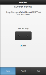
| After submitting a valid "DJ code," information begins to populate the
app. The user can see the name of the song currently playing and "rate"
it either up or down. There is also a "tweet" button that would allow the
listener to tweet about the event. There is also a navigation bar to let
the user move between the other screens.
The main goal for this page was to make it as simple as possible. After
the heuristic evaluations, we decided to change "rate this song" to
"rate this party" in an attempt to give users a better understanding of
what exactly they were rating. After submitting the dj code, we initially
left it on the screen, but after doing the user tests, we decided to
remove it. |
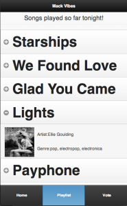
| In this screen, the user sees the list of songs that have been played.
When the user clicks on a song (i.e. after clicking on "Lights"), the
selection expands, showing the album cover, the artist, and the genre.
Initially, we planned on presenting as much information on the song
as possible. However, after the heuristic evaluations, we decided to
remove most of the information (like year produced, record label, etc.). |
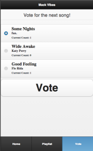
| This is the voting screen. When the DJ selects songs for the listeners
to vote from, they are shown here. Each voting option shows the name
of the song, the artist, and the current number of votes. |
...