...
Images - DJ Interface | Description |
|---|
| Heuristic Evaluation: - Added a log-in and sign in form page to introduce the app (Consistency and Standards)
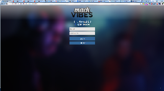
For the home page, we opted for a simple look. Since login was not part of the previous design process,
we simply mocked it up and implemented it. While testing internally, we found that it would be good to give
the user feedback immediately about the validity of their input.
|
 | Heuristic Evaluation - Removed album title from previous winner (Recognition Over Recall)
- Added DJ feedback graph to show user input (System and Real World)
- Changed "Search" to "Search by song name" (Consistency and Standards)
User Test - Made bars show up on DJ feedback when vote count was 0
There are basically four main sections here. The upper left shows the previous song. During user testing we
found that this was not needed on the initial login so we removed it until a song was played. At that point, we
added in both the currently playing song and feedback from how the crowd rated the song.
|
 | Heuristic Evaluation - Increased space between the top section and the voting pane (Flexibility and Minimal Design)
When we initially tested this page, we didn't get a lot of useful information. After the user testing, however,
the djs we tested on said that they would like this pane to be able to slide away. If we were to continue further,
we would simply replace the begin voting pane with this and allow the user to cycle between these two views.
|
 | Heuristic Evaluation - Grayed out the "Begin Voting" button (Error Prevention)
- Added "BPM" on the table (Skills)
User Test - Added play button on the table
This is the same screen as before but now we are looking at the search menu as well. For the search bar, we
got feedback that the user would like to click on the entire row. This was actually an implementation detail as
the autocomplete library would fire it's handler before our custom tags. To get around this, we simple disabled
the default handler.
|
 | Heuristic Evaluation - Made text of the pie chart labels larger and bolder (Visibility, Consistency & Standards)
Everybody pretty much liked our charts. Just changed the text to match the rest of the dj interface.
|
 | Heuristic Evaluation - Added certain genre related information tabs to the graph charts that adapt to the DJ's interests (Skills)
During the user test, we got feedback that we should also visualize the voting information here. Currently, we
display data about the songs that were played but not about the user votes that we processed. We also chose the
bar charts because they mimic sound levels and we liked that metaphor.
|
...
One final thing that we would probably do again is another 2 iterations of the entire design process. As discussed earlier in the semester, the process that we went through should really be a continual one. We should really prototype, evaluate, and user test multiple times. I think if we had gone through the design process 2 more times our user interface would have turned out a lot better. We got a lot of feedback during the final user test that we simply didn't get from the other stages. Building on top of that would result in a much higher quality product.