Scenario
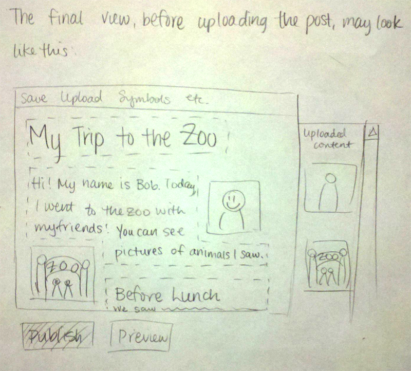
Bob is a blogger. He and his friends go to the zoo to see some animals, and he decides it will be a great opportunity to add to his relatively new blog after he gets home. First they go to see the baboons, and then explore the rest of the zoo. After a great day at the zoo, he goes home to upload some of the videos and pictures he’s taken along with stories about the animals they saw. He logs into his blog, and starts to create a new post. As he’s creating his post, he works to format his text and media layout, embed his images in a way he finds pleasing, and write text conveying what he did that day to his readers.
Storyboard
Design 1
Description
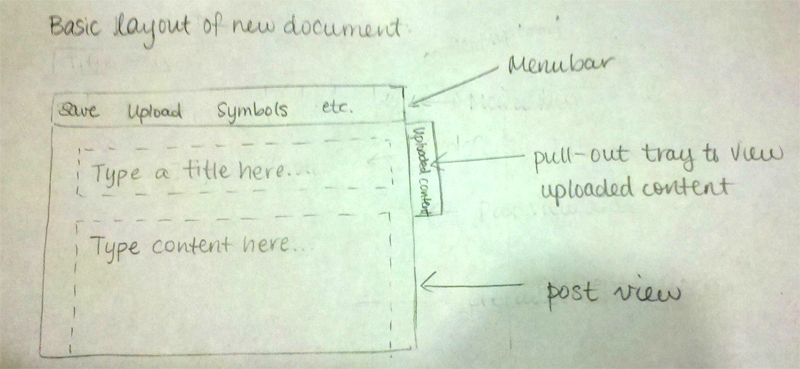
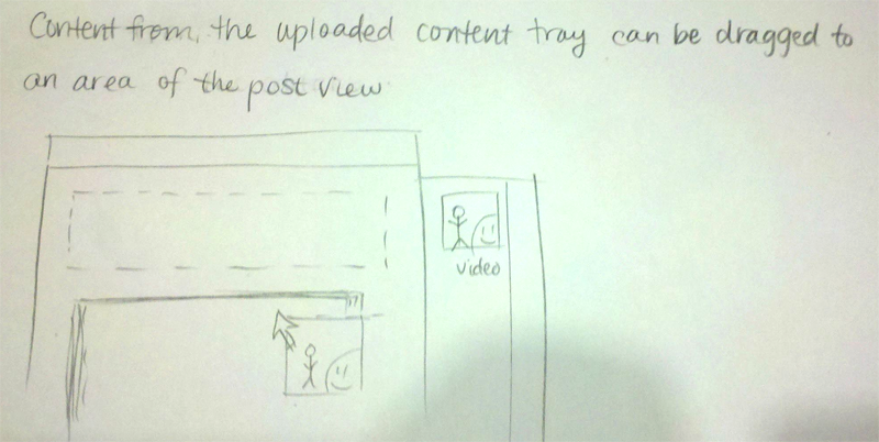
A new document will resemble a blank slide in Powerpoint’s editing interface: on the white document area, there will be an empty box prompting the user to input content. Users can add, delete, move, and resize these boxes as they wish, but all content will be visually contained within these boxes. Users can put different types of elements inside each box: images, photos, Youtube videos, equations, etc. Therefore, if users want to place an element in a position relative to the text, then they would put them in the same box as the text; otherwise, if users want to place an element in a specific position on the page, they would put them in a separate box.
...
This design supports basic document-editing features: formatting, text alignment, undoing. We anticipate that the user will be publishing for the web; as such, the document will be visually displayed without any page breaks, and print-specific features like page numbering will not be supported.
Learnability
Pros
- intuitive interface that lets the user drag boxes of text and photos around the screen
- WYSIWYG: whatever the user sees on the screen is what gets published to the web/printed on paper
- visually is most similar to other web-based text editing platforms (Google Docs, etc.) - affords text-editing
- provides direct manipulation: effects of dragging are rapid (near-instantaneous reshaping of bounding boxes as they are dragged over each other), reversible (undoing is possible), and immediately visible
Cons
- our editor may assume too much about what the user wants to do if they drag things around and magical things happen. Snapping things together without the user expecting them to might disorient users
- there might be a lot of visual complexity if we need to show drag handles and menus near the items in the view
Efficiency
Pros
- Direct manipulation is the fastest way to reposition elements on the page
- Once the user learns what to expect from the interface, this one will be very fast to use because it has the minimum amount of menus and other interface chrome
Cons
- If the user is trying to do something that the direct-manipulation interface doesn’t afford properly, they will waste time trying to fight the features of the program. For example, if he or she is trying to place something on an exact location on the page but the interface is trying to snap the element to a different position, the user will fidget around trying to fight it. The answer might be to have a minimum amount of such automatic features.
Safety
Pros
- Undo features will let users mess around with their layout and content without worrying about losing work
- Auto-save will also guard against computer malfunction or internet connection loss
Cons
- Since this interface gives the user a lot of freedom with positioning and layout, the user might create something that is not pleasing to them, or arrange things in a way that makes sense - the layout will only be as good as the user can make it
Design 2
Description
This design is like a composition of several Tumblr posts. On Tumblr, one can post a text post, video, or image, but only separately. In our design, a document is composed of multiple sections, and each section contains one type of media. There are no options for layout other than rearranging the order of the sections. The main advantages are that this design is the simplest to work with and to create, and that it would be easy for developers to create new kinds of sections and integrate them into the editor (it would be kind of like a template). The disadvantage is that there aren’t many options for users who want complete control over what their documents look like.
Learnability
Pros
- Simple concept that is easy to understand - each box is a separate piece of content
- Easy to combine lots of different kinds of media into one post
- User doesn’t have to use most of the features if he or she doesn’t want to, so it’s as complex as they want to make it
Cons
- Different from the normal paradigm of editing the whole document in one box
- User might assume some features exist, like placing things side by side, and look for them (if they are used to layout editing programs)
Efficiency
Pros
- It’s fast to put in lots of different kinds of media
- Fast to rearrange sections and edit them
- Because there are fewer options, the different sections can be optimized for different media and formats, so the same document could be easily ported to a mobile version, print version, or web version
Cons
- Some things will require using menus, like changing settings for the different content sections
- Writing a long document with lots of sections requires the user to use their mouse upon entering each new section, unless some sort of shortcut to start a new section is implemented
Safety
Pros
- Easy to rearrange items, hide/show sections without deleting them
- Preview mode allows you to look at what your document will look like without committing to publishing it
- Saving each section as you edit it means you can’t lose too much work at once
Cons
- Less familiar interface might cause people to make errors at first and not know how to correct them
Design 3
Description
Basically this design would be similar to a GUI for viewing HTML/CSS code, but allows the styling to be more intuitive for the user. There will be two panes - an editing pane and a view pane, which appear side by side. You work by adding content to content boxes or sections in the editing pane, and the view pane will display what your finished document would look like if you stopped working right then and there. There are content boxes for each section of the document or blog that the user wants to produce, with two dynamic drop down menus denoting what type of content the user wants to produce, and where to put that content. There are two main types of sections: main content sections, and subsections. Main content sections are added by clicking a “new field” button underneath the bottommost section. Subsections are things like lists or quotes, and can be added to main paragraph sections (by pressing a big + button next to the paragraph content, as opposed to clicking the “new field” button for adding normal sections).
The first drop down menu will be populated depending on whether our content is a main section, or a subsection. If our content is a main section, the types of content will be Title, Paragraph, Section Header, Picture, and Video; if it’s a subsection, the type options will be list or quote. The location menu will be populated such that you can choose the order your content appears. If you decide to move a section where an old section already exists, the lower sections will update and all move down by one. Also, the location drop-down will update such that for existing sections, there will be additional locations added such that you can place new sections to the left or right of existing ones. If you select one of these, the two content sections will appear side-by-side.
Learnability
Pros
- Simpler than HTML - makes it possible to specify more complicated control sequences like you would with HTML by using a GUI instead.
- Easy to specify what kind of section each content will be.
- Easy to change the order of things once you’ve done it, but a little tedious.
- Easy to deal with media because it’s treated similarly to everything else.
Cons
- Parts of the interface may not make enough sense. It might be confusing how things are reordered or how to add subsections.
- Users may want to do things differently than we allow them - like interleave pictures in a way we don’t let them given our limited positioning options.
Efficiency
Pros
- Fast to add new sections if you have a plan laid out.
- Fast at inputting pictures and placing them simply.
Cons
- Has multiple drop down menus, which have a little bit of a steering task to them, and steering tasks are generally not that efficient.
- Takes too long to reorganize the entire document if you have to change multiple sections - not as quick or easy as drag-and-drop.
Safety
Pros
- Has an undo feature to bring back a section if you delete it by accident.
- Checks to make sure a user wants to delete a section before actually deleting it.
- The sections are designed not to be too large so changing a given section and messing up will not ruin the whole document.
Cons
- Not completely easy to know what’s changing when you edit things, since the edit and view panes are distinct.


