Paper
...
Prototype
[Notes 1] and [Note 2]
Phase 1
...
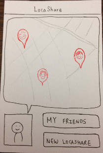
Following are the screenshots of the screens of LocaShare (phase 1):
Home | Home (with notification) | Friends | Viewing Friend | Viewing what the friend |
|---|---|---|---|---|
| | | | |


Editing preferences | Adding friends | Deals | Selecting a category in deals | Viewing offer |
|---|---|---|---|---|
| | | | |


...
Briefing:
- View Bob’s information (current location and historical location)
- View what information Bob can see about you, edit it.
- Suppose you deleted Bob from your friends. Add him again as a new friend in the system.
- View offers and select one.
Responses:
User 1:
Home: Able to navigate to friend's page and deal's page. Asked about how to add a friend since clicking on “My Friends” does not make sense ("Bob is not my friend at this point")
Friends page/Add Friends: Was wondering if the location mentioned was the last one updated. Didn't see an intuitive way of how to add Bob. Asked if the user could add Bob by clicking on "Friends" beside "LocaShare".
Viewing Friend page: Tried clicking on the photos to view Bob's info and info that Bob could see about Joe. When said that nothing would happen, the user tried clicking on the buttons. And was able to view appropriate information. The information displayed on the screen made perfect sense to the user. Did not understand what "Bob's LocaShare" and "My LocaShare" meant (they didn't look like clickable buttons either). And the fact that the red triangle in "Bob's LocaShare" pointed towards Joe further confused the user.
View information that Bob could see about Joe/Edit preferences: Tried clicking on Joe's photo on the home screen, which did not work. Did not understand that the textbox was a map (we hadn't put the marker on the map at that point). The user thought about writing the location names in that "textarea". Understood the rest of the controls. Also understood what the charts were conveying. Wondered whether these edits were being made only to Bob or to all friends.
Deals: Tried clicking on the box to the left of "Star Market" as it looks more like a button than an icon (we hadn't drawn the "star" in it at that point). Was able to understand the concept of categories and was able to navigate to the appropriate offer and select it. Asked whether the categories were pre-defined. Wondered if it was possible to create user-specific categories. Also, how to select multiple offers at once.
User 2:
Home: Able to navigate to friend's page and deal's page. Was not able to navigate from the home screen for the "Add Bob" task since the user was expecting an “Add friend”/”+” on the homepage. Wouldn’t expect to click on “My Friends” to add Bob as a new friend.
Friends page/Add Friends: Was able to view Bob (in friends currently near him and was also able to use the vertical alphabetical listing to spot Bob). However, while adding Bob as a friend asked why there was no feedback given about success/failure of the action.
Viewing Friend page: Asked about the difference between "Bob’s LocaShare" and "My LocaShare". Said that the user shouldn't be called "Joe" ("me" sounds more natural). Was able to understand current location and aggregate information intuitively.
View information that Bob could see about Joe/Edit preferences: Asked whether the user was adding more restrictions or removing restrictions from what Bob can see (when editing information). Asked what would happen if there was a contradiction (If the time I enter now contradicts information already present, when would Bob be able to see my location?). Mentioned that deleting (by clicking "Show"/"Hide") was possible for the aggregate information, but could do that for other details ("When/Where/What"). Initially asked what the radius would be when the user clicks on the map. Then spotted the "What" and asked if the user selects "State" level, why would the user need to select multiple locations on the map (e.g., "Stata Center", "Walker Memorial") since they're all in the same state?
Deals: Understood the concept of the notification, but said that the user was not interested in utilizing any offers right now and could click "My Deals" at a later point in time. Tried both approaches (using "My Deals" and clicking on the notification). Saw the categories and was able to easily navigate to the offers from Star Market. Tried clicking on the "Star" symbol to see the offers but was told it wouldn't work. Then asked whether the little arrow below "0.4 mi" would provide a map/directions to Star Market (since it was directly below the distance). When given an explanation that it would display the offer, the user went ahead and was able to view and select an offer.
User 3:
Home: Able to navigate to view friends and deals. However, when asked to view the information that Bob would see about Joe, tried clicking on Joe's photo and name.
Friends page/Add Friends: Saw an inconsistency in adding friends. Said that "searching" should be the same as in contacts on a cell phone (search for people in your contact list). On a cell phone (contact list), when you want to add users, you don’t search for them. Understood the vertical alphabetical listing as a scroll bar (not as a clickable mechanism). Asked if the user could add Bob by clicking on one of the "empty boxes" under "Currently Near You").
Viewing Friend page: Asked why Joe was showing up on the screen when viewing Bob's information. Was able to understand all the data presented on the screen.
...
| Panel |
|---|
Thank you for participating in this user study. LocaShare is an application that allows you to share your location data in ways that are different from existing services like Foursquare and Latitude. It gives you an ability to set preferences on what type of location information friends and companies can view about you. Also, you can have a look at your information that those entities (companies/friends) can see about you. |
Tasks:
Task 1: View Bob’s information (current location and historical location)
Task 2: View the information that Bob can see about you and edit the time period when he can view you.
Task 3: Add John as a new friend of yours.
Task 4: View offers and select the 5% discount that Star Market is offering.
Observations:
User | View Bob's information | View what information Bob can see about you | Add John as a new friend | View offers and select the 5% | Suggestions |
|---|---|---|---|---|---|
#1 | N/A | ‧ Learnability: | ‧ Learnability: | ‧ Learnability: | User wondered if |
#2 | N/A | ‧ Learnability | ‧ Learnability | ‧ Learnability |
|
#3 | ‧ Learnability | ‧ Learnability |
Deals: Was able to navigate to the deals page and understood the concept of categories. Said that the little number would indicate that she has those many # deals available. When asked to read the offer and decide whether to select it, the user was able to take appropriate action. The user also mentioned that "Select" sounded rather ambiguous. Was the user adding Star Market as a “friend”? How much/what information can they see?
Lessons Learned:
- Adding users is currently not intuitive. All three users asked why they had to go to "My Friends" and "search" for Bob when Bob wasn't a friend.
- Home screen is not conveying sufficient information for the tasks described. All three users tried clicking on Joe's photo on the home screen to view information that Joe's friend can see about him.
- Navigation controls need some work. All users thought that "Friend" and "Deals" beside "LocaShare" (at the top of the screen) was clickable. None of them realized that "LocaShare" would lead them back to the home screen.
- Viewing friend page could use some work. As User 1 pointed out, the buttons do not convey necessary/sufficient information to take an action.
- Editing preferences page could use some work. The "What" and "Where" seem to be contradictory as User 2 mentioned. Also, would the preferences erase the previous setting and create a brand new one? Or would Joe be able to edit the previous one and create a modified setting?
- User 3 asked if the "deals functionality" could be turned into a social experience ("I would like to share my deals with Bob").
Briefing:
LocalShare is an application that allows you to share your location data in ways that are different from existing services like Foursquare and Latitude.
- place and time-based sharing: you can elect to share your location only when you arrive in certain places, or only during certain times of day or times of the week.
- granular sharing: You can also choose to share more granular data -- such as what city you are in, but not where precisely.
- sharing for deals: Besides just social sharing, you can also share with companies in exchange for incentives that they offer. Deals can be offered based on your current location, and the app
- data browsing / transparency: An important part of the interface is the part that lets you see both data that is shared with you and see the data that you are sharing with others.
- localshare types: in order to avoid having to manually select every detail every time, LocalShare allows you to choose from templates. * a Basic share shares your location all the time
- a Neighborhood share shares your location only when you are in a certain neighborhood.
- an Out & About share accepts a list of locations and will share whenever you are in any of them.
Task Scenarios:
Task 1:
Create a LocalShare that shares your location all the time with your friend Bob.
Task 2:
You live in Cambridge, but Bob lives in Jamaica Plain. Create a share that allows Bob to see whenever you are in his neighborhood, but only during evening hours.
Task 3:
Your mother Alice knows you're going on a ski trip, and wants to know that you've arrived safely there and safely home. Create a LocalShare that allows her to see what city you're in.
Task 4:
You like to eat in several places. Bob likes to come eat with you sometimes, and you would like to share what places you eat and how often you go to them. Choose two restaurants, and share with Bob information about when you go to those restaurants.
Task 5:
‧ Learnability | ‧ Learnability | 1. User asked “am I |
Findings:
- Paper-prototyping still has its constraints. It is very hard to create a button by using papers, even if we tried to use paper and transparency together and colored it with red, it is still not obvious for users, since the texture is similar to paper.
- Another limitation is that it is hard to tell whether a picture is clickable or not. In a computer, when users hover a clickable item, the mouse icon would change, but it is hard to create this effect in paper-prototyping.
- The other limitation is due to time constraint. One user would only spend 15 mins finishing all the tasks; therefore, they would not think very clearly about the UI design or the functionality of the application, but just follow their instinct. Therefore, new designs would hard to be noticed or appreciated since they are externally different from existing applications. We solve this problem by finding users outside of the class to test our second design, and had an one-hour interview with each of the user.
- Our design is challenging in the sense that we want to make the option "how others view me" obvious and salient; however, this change might cause external inconsistency with other existing apps, since currently, they are not making this functionality easily accessible to users. (For example, in facebook, you need to click on a tiny widget icon in your profile page and click "View as". But the icon in nearly invisible and the word "View as" carries bad information scent.)
Re-design:
After receiving the feedback in the first iteration, we made changes to our design.
Functionality changes
- Remove "Deals". Fully concentrate on how to share/view location information. This decision was also made because of our consultation with Katrina who gave us this suggestion to help us narrow the focus of the project.
- Removing the task of adding friend(s) and making it into a task of creating LocaShares with friend(s). This way, we assume that users can add a friend as their contact only when they create and share their location with that friend using the app.
Design changes
| Home screen | Friends | Viewing what the friend | Editing preferences |
|---|---|---|---|---|
Problems in |
|
|
|
|
Solutions for |
|
|
|
|
...
Phase 2
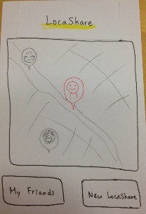
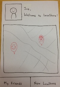
Following are the screenshots of the screens of LocaShare (phase 2):
| Panel | ||||||
|---|---|---|---|---|---|---|
Multiple home screen designs: We created three iterations of home screens to incorporate the feedback of the phase 1 users, and also try to generate more feedback, since users tend to criticize more when multiple designs are presented. All three display a large visual of a map that show nearby friends. The map gives an affordance of moving so that users can view friends that are not currently in their locality as well.
|
Home | Friends Page | View Bob's information | View yourself as... | View yourself as Bob sees you |
|---|---|---|---|---|
| | | | |


Permissions (1) | Permissions (2) | Permissions (3) | Permissions (confirmation) |
|---|---|---|---|
| | | |


Briefing:
| Panel |
|---|
Thank you for participating in this user study. LocaShare is an application that allows you to share your location data in ways that are different from existing services like Foursquare and Latitude.
|
Tasks:
Task 1: View Bob's current location and identify the restaurant he visited most frequently last week.
Task 2: Create a new locashare with Bob that allows Bob to see whenever you are in his neighborhood (Boston), but only during evening hours (7pm-9pm).
Task 3: View and edit your information that Bob can view to hide your statistics information.
Observations:
User | View Bob's information | Create a new LocaShare with Bob | View yourself as Bob | Suggestions |
|---|---|---|---|---|
#1 | ‧ Learnability/Efficiency: | ‧ Learnability | ‧ Learnability | 1. Option to "Duplicate" the |
#2 | ‧ Learnability | ‧ Learnability | ‧ Learnability | 1. User would be more interested in an |
#3 | ‧ Learnability | ‧ Learnability | ‧ Learnability | 1. If Joe wants to notify Bob that he |
Findings:
1. Users might have really different mental models when using applications. In the task of finding information about Joe that Bob could see, phase 1 users would click on Joe's photo to see the information that Bob could view about Joe. However, phase 2 users clicked on Bob to view the same information. We identified that different users model the direction of the flow of this information differently. We should try to include both of the designs to accommodate our app to different users. For example, providing multiple ways to view how others see about your location information.
2. We got lots of precious feedback from users in terms of the functions that they would like to see and the problems in UI design, we are trying to re-design our application to include all the good design ideas and will keep doing paper-prototyping to produce the final design. You are at a shopping center and you view the deals that are available to you. Select one that looks attractive and opt-in. (REI 5 % off) Make sure you understand what you are sharing.