Requirements (Delete before submitting):
Update your group's wiki page so that it contains a section GR3 Paper Prototyping, containing the following subsections:
- *Prototype photos.*Digital photos of the pieces of your prototype. Show the prototype in interesting states; don't just show a blank window. Although you will iterate your paper prototype during this assignment, the photos only need to show one iteration.
- *Briefing.*The briefing you gave to users.
- *Scenario Tasks.The tasks you gave to users, as you wrote them on the cards. *<-- SO I ONLY INCLUDED WHAT THE CARDS SAID
- Observations.*Usability problems you discovered from the testing. Describe critical incidents encountered by the users, but *don't record users' names. Record these as a series of high-level takeaways, focusing on the usability problems you saw, rather than what each participant did. For instance, you might describe how you had some learnability issues with your prototype, as evidenced by users B and C clicking all of the menus to try to find option X.
- *Prototype iteration.*You did two rounds of paper prototyping. Describe how your prototype changed between those two rounds.
Briefing
Thanks so much for helping us test our website.
...
- Begin entering votes. Go through one full ballot at a time.
- Correct the presidential race on the previous ballot to “Stein and Honkala".
- Continue entering votes.
- Correct the entry for the previous race to “Obama and Biden”.
- Restart audit.
Observations
Round 1
User 1:
- Asked if they were buttons
- No problem finding buttons
- Assumes race means same ballot -> strange because different levels of seriousness (could accidentally hit wrong help button)
- Knew restart previous ballot because it was in previous ballot summary
- Interesting - why fix mistake over back?
- Safety for restart all auditing? "Are you sure" button?
- Perhaps keep party lines for top/bottom over frequency
User 2:
- Wants candidates in a list to easily select
- "I don't actually say who the write-in was?"
- Hesitation restarting all audits
- Likes that the buttons are big and far apart
- Confused about what "previous" means
- Wants to be able to click left side of the screen to correct
User 3:
Wiki Markup \[\]- "Don't you have to write who the write-in was?"
- Lots of time reading the menu
- Lots of hesitation before selecting an option (bu didn't click 'Help')
- Chose "restart previous ballot" instead of "restart previous race" -> was confused about wording
- "Fix previous race" instead of "restart previous ballot"
- Then got "fix this ballot"
- Really likes the giant screen, easy to use and less chance for mistakes
- Why previous ballot summary? Could get confusing
- Confused between "race" and "ballot" in the menu
- What do you do with more candidates?
- Tradeoff between big screen and changing screens frequently, but good call
- How does this look on the screen?
User 4:
...
For Round 1, we tested our main candidate button interface as well as different error detection. None of the users had difficulty with using the main button entering interface. Entering ballots seemed pretty intuitive and no major critical accidents were recorded with ballots that had names on them. Almost all users were confused by the write-in option. All selected the button correctly but then were confused that they did not have to enter the write-in name.
All of the users were confused with using the error menu. While most easily found the Fix Mistake menu, one tried to click on the candidate names in the sidebar to change them. Almost all of the users spent a very long time reading the menu, and not a single one pressed the help button for further instructions. Multiple users were also very confused by the difference between race and ballot and one user even chose the wrong option and ended up performing the incorrect task. The second user was also confused with what "previous ballot" referred to in the help menu. The first user was also very surprised that there was no confirmation popup when "Restart Audit" was clicked.
...
Round 2
In Round 2, we focused our testing on the "Fix Mistake" menu, so our critical incidents were centered on that part of the prototype.
...
Most users found the main screen easy and intuitive to use, but had lots of trouble understanding the "Fix Mistake" menu. As a result, we focused on changing that menu in our second iteration. The terminology of auditing is confusing, but our testers never chose the "Help" menu. As a result, we now just display the instructions on the right hand-panel to make sure all information is shown from the start. In addition, instead of lots of buttons requiring understanding of auditing terms, the edit button now shows up beside each ballot, and each race/candidate name becomes a clickable button. Now users can just click on what they need to edit without knowing the name for it. The bottom buttons of the left panel include "cancel" and "restart whole audit" to make these two items distinct. We also added a confirmation page so any choice informs the user what proceeding will do the audit, and gives them a chance to cancel. This improves the system safety.
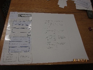
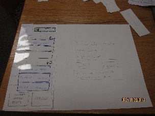
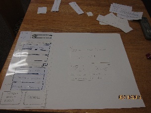
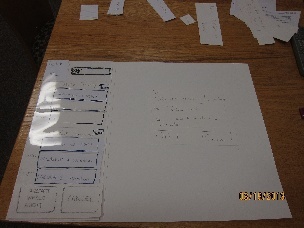
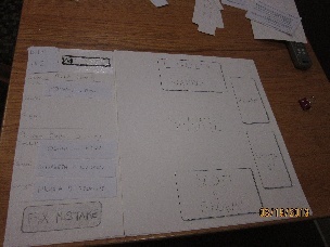
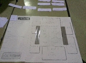
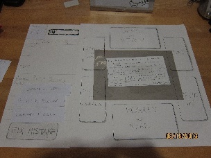
Paper Prototype Photos
Images (Round 1) | Caption |
|---|---|
| This is the first screen the user was shown - we skipped the log in screens, etc. |
| This is the menu that popped up when users selected "Fix Mistake" |
| If users chose "Help" on the "Fix Mistake" menu, they would see these instructions. This state was never encountered in user testing. |
Images (Round 2) | |
|---|---|
| The main screen didn't change since we got such good user feedback on it. |
| This is what the users see now when the select "Fix Mistake" |
| If the user chooses a specific candidate name or race, they get a confirmation screen. The screen confirms the element they selected, and also warns that all information from that point will be reentered (by system design). |
| There is a similar confirmation page for restarting a ballot. |
| This is the confirmation for restarting the full audit. Now users are informed that all information will be reentered. |