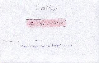
| Table of Contents |
|---|
We came up with 3 designs for our interface: the first runs you through a wizard (the "wizard" interface), the second displays all the relevant information immediately (the "kitchen sink" interface), and the third allows you to progressively filter a list of selected concerts (the "static sidebars" interface).
...
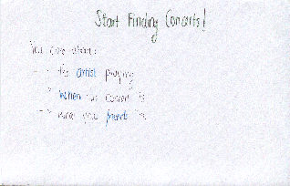
- find an artist to get inspired by
- find a friend to go with
- research the venuefind a concert that matches contraints
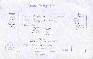
Sparklepony is a vivacious young musician in the greater Boston Area. Lately, she’s felt like her work needs more depth and variety. She’s looking for something new and fresh to go to for inspiration, but doesn’t really know where to start. Another issue is that Sparklepony is well aware that it’s important to go to concerts with a friend to have a lively discussion about the musical merits of the artist with while the experience is still fresh. She also likes having friends present in order to give her sanity checks and get another trusted person’s perspective on whether a given musical direction is a good way to go. Attending a few concerts seems to be the obvious place to start.
...
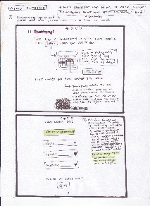
- uses a “wizard” like set of pages to actively limit how much information the user is looking at at one time and lets them focus their priorities in terms of what they are searching for, while offering the chance to change them.
- Many different visualization pages depending on the set of constraints that the user has chosen in order to make the information as easily available
- popup “previews” of artists
- visualizations filter both by what people listen to and what people have actively liked
Storyboard
Photo | Description |
|---|---|
| In the above scenes, Sparklepony is led through a wizard that focuses her search based on timing and the artist she is seeking similar musical influences from. |
| Sparklepony continues through the next two frames to filter her concert choices by budget and distance, and then peruses friends who might be interested in attending concerts with her. |
| In this final frame, Sparkle pony is given an information summary for her search, as well as the ability to invite more friends, and start a new search. |
Errata: The dot depicting how far she is along the process is supposed to be present in all frames, as are arrows to go back and forth, and a button to logout at any point in the top righthand corner.
Analysis
Learnability
- The use of a wizard makes selecting options simple
- Sentence by sentence navigation with options clearly underlined so that it is obvious they are linked, as well as words made into buttons make it clear based on past conventions that user can click on words. However, this assumes past knowledge.
- The use of popup directions help the user along.
- The design has some hidden features that the user may not pick up on immediately, such as an autocomplete bar that also has a button for inspiration on the side of top 5 hits based on their preferences.
Kitchen Sink
Efficiency
- The use of a wizard can slow the user down, because it limits how many preferences they can indicate at any given point. If they change their mind, they also have to navigate back through the sequence, so this design sacrifices efficiency in favor of clearly limiting the amount of information that the user has to parse at any given screen.
- Features like autocompletion and intelligent suggestion of similar artists and highlighting of bands that are currently touring help increase efficiency in frame.
Safety
- As mentioned before, the wizard interface sets the user up so that if they want to change a preference, they may need to navigate backwards in order to change their preference during the search, which may be frustrating, so there is less safety in this regard.
Kitchen Sink
Salient Features
...
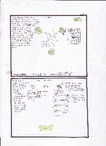
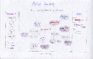
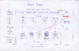
- single overarching visualization for bands
- user lands immediately on the band visualization
- artist page has visualizations about future prices and interested friends*
- friends page has visualizations about similarity*
- allows you to curate friends (subtask)*
Storyboard


Learnability
LEARNABILITY:
- all the information neccessary is presented in the home page. All you do is find the visualization that you want (eg if you’re finding a concert click concert visualization, if you’re looking for a new artist, click artist visualization). The only thing that is neccessary to “learn” is that these visualizations exist, but seeing as this is the point of the website, it is safe to assume that the user realizes concertBOS has visualizations. It is also easy for the user to learn which visualizations exist, because they all appear in the same drop down menu
Efficiency:
- ConcertBOS is very fast because almost all of the information is presented in the home page. The only thing that is necessary to do is click on the right visualization (so that you can find what you are looking for), then click on the band/concert/friend that you are interested in to go to their page. All the information about this band/concert/friend is listed on their page, so there should only be two pages that any user needs to visit (the home page, and the band/concert/friend which they are interested in).
- SAFETY
Safety:
- The only thing that could be unsafe is if your preferences were changed somehow. But at every step of the way you can edit your prefrences. Also, by default your prefences come from last.fm, if everything is uploaded from last.fm automatically there is no way for the user to mess anything up
Static Sidebar
Salient Features:
- One question page before you get visualized results
- Three main pages with visualizations: band cloud, calendar, friends multi-map
- All main pages have the same 2 sidebars: interested concerts, and filters (price and date)
- subpages have “details” instead of “filters”
Storyboard
Sketch | Description |
|---|---|
| Sparklepony starts by logging in with her Last.fm account. |
| She lands on a page that asks her what she's most interested in in a concert. She selects the "artist" option. |
| She's taken to a page that displays a graph of the artists she listens to on last.fm. Artists on tour have the date of their Boston concert displayed. Sliders on the right allow her to display information about the certain criteria (price, date, age restrictions) by coloring nodes on the graph. She drags several concerts she finds interesting to the sidebar. |
| She’s taken to a page that displays the concerts she’s displayed interest in. These concerts are displayed on a multimap matched with friends who might be interested. Selecting a friend highlights all of the concerts that they’re interested in, and selecting a concert highlights interested friends. |
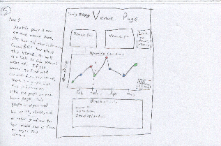
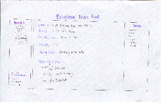
| At the concert page, she’s most interested in the venue. She follows that link to learn more. |
| The venue information is displayed. The Brighton Music Hall is a medium-sized venue, with standing room only. Perfect! She’s decided, and can now email her friend and purchase tickets. |
Errata
The coloring for date filtering isn't quite right. I'm bad at tinting properly.
Analyis
Learnability:
- Dragging has no affordances, so it’s initially difficult to discover that you can drag concerts to the left sidebar. There’s helpful text at the top of the screen that should ease this discovery.
- It may be initially unclear that you can progressively filter concerts through the “explore these further” option at the bottom of the sidebar
Efficiency
- easy progressive filtering allows you to maintain a single consistent list of interesting concerts
- prevents the user from flipping back and forth between interfaces to remember what they thought was interesting before
- possible to get from any one screen to another in at most 2 clicks (longest would be from an interface to a specific artist/venue page: visualization → concert → venue)
Safety
Any action is undoable. - dragging a concert onto the “interesting” list can be undone by dragging it back off
- dragging a concert off the “interesting” list is confirmed by a notice at the top of the list: “Removed <uninteresting concert> Undo”
- navigation errors can be undone with the back button (or by using on-screen navigation links)
SUMMARY:
We have outlined the salient features of our three designs in more detail above, but in summary, the big picture design points are as follows:
We decided given our task analysis that all designs SHOULD (and do) have:
- a way to curate a list of interesting concerts
this list is available to your friends - a way to find and curate a list of friends (slightly different for all of us)
- filtering by pricing, date, age (over 18, over 21)
- venue information
- artist information
All of our designs also have:
- band filtering network tool
- previews of something on clicking a node in the graph
- artist, venue and friend pages (but they all display very different things)
Major design directions in which they differ, (with many smaller details that are discussed above resulting from this design decision):
Each design offers the user a different level of data when they enter the application.
- Wizard: heavily structures the users path through a decision, limiting how much information is present in each screen
- Kitchen Sink: Presents all the information necessary on the home page. Can change visualizations in order to filter results, but this is all done on the home screen. Only once all of the filtering and concert finding is done does the user go to the page of the specific band/concert he is interested in
- Static Sidebar: Select from 3 main visualization with sidebars that don’t change. Allows for easy progressive filtering.