Design
Describe the final design of your interface. Illustrate with screenshots. Point out important design decisions and discuss the design alternatives that you considered. Particularly, discuss design decisions that were motivated by the three evaluations you did (paper prototyping, heuristic evaluation, and user testing).
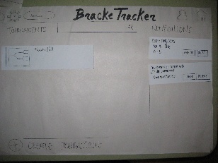
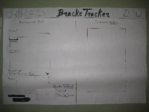
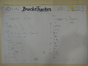
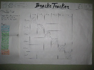
The best way to look at the iterative design process our product underwent is to compare it to the last draft of the paper prototypes we created.
Title | Paper Prototype | Web Version | Comments/Description |
|---|---|---|---|
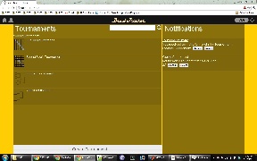
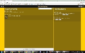
Home | | | No major changes in the home page layout. It was generally pretty clear to the users what the purpose of each section of the page was supposed to be. The biggest/only change was in the header bar: many of the users actually mentioned that they expected the Home icon to be on the top left corner and the settings/logout to be on the top right. That design would be consistent with other sites. |
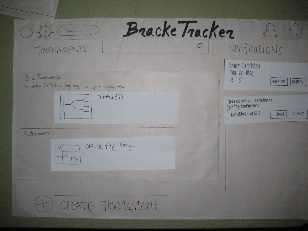
Create Tournament | | | The general layout of the create tournament page was well received by our paper prototype users. It was simple enough and caused few areas of confusion. During the web implementation, we found that there was no particularly good reason to put the form submit buttons on the right side of the form. Putting it directly at the bottom of the form in line with the rest of the inputs seemed to make much more sense. (It seems that we only placed the paper prototype buttons where they were because of poor size estimations of each input/display element on the paper. |
Join Tournament | | | No changes here. Since there are only two actions to take from this page ("Join", or leave the page) there was no confusion by the users in the prototype. |
Search for Tournaments | | | Took the feed back from users and made sure to put search results (specifically the error message "No Match for "...." found in your tournaments") on a separate line to make it more visible. After actually implementing the search on the functioning web page, it is very clear when the search results change on the page. When elements automatically disappear and reappear on the page, that change in appearance is more than enough to notify the user of search results. |
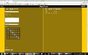
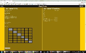
Tournament Page | | | The tournament page also did not change much in terms of overall layout. All the page elements in the from the paper prototype were kept in the web implementation. The major changes were: |
Implementation
As a web application, our project was implemented with HTML, CSS, Javascript and JQuery (and JQuery UI) on the front end. For the back end, we used the Python framework, Flask. While all the pages are written with HTML and formatted with CSS, most of it is generated on the server side with Flask and Jinja2 templating. Through the use of Flask and Jinja templating, we were easily able to make each page within our site inherit a set of properties, notably the header bar that included the BrackeTracker logo and icons. Similarly, all the tournament (active, create, and join) pages were generated on the server side with the relevant tournament information. Any of the changes on the page that were made after being loaded were dynamically updated with Javascript and Jquery, while simultaneously sending the updated information to the server in order to persist the data. For instance, booting a player would use Javascript to bump the user down on the member-list sidebar then make an AJAX call to the server telling the server of that change. We persisted the data on the server, with the Python Shelve module instead of implementing a full database. For the small scale of the project, Python Shelve worked better than a database would have. With only a single user, the amount of stored data would be minimal. Python Shelve allowed us to store Python objects in a mock database. These Python objects stored the states of each Tournaments (information such as name, description, members, etc) and the Notifications on the home page.
...
Another design choice was that we did not implement user accounts. While this does limit the amount of social interaction user would have on this site, it does not prevent the user's experience for the main tasks. While many of the possible tasks in the site are social, these are not the primary focus of the site's interface. Our implementation has a single user, and supplies enough scenarios to give that single user the experience of the three defined user types (i.e., tournament administrator, player, and administrator+player).
Describe the internals of your implementation, but keep the discussion on a high level. Discuss important design decisions you made in the implementation. Also discuss how implementation problems may have affected the usability of your interface.
Evaluation
Evaluation
User testing was done with volunteers from the general MIT student population, who had either run a tournament before or participated in tournaments before. Users were given a short briefing and scenario tasks to perform as described below. There was no demo included and users had no prior exposure to the website and Bracketracker as a wholeDescribe how you conducted your user test. Describe how you found your users and how representative they are of your target user population (but don't identify your users by name). Describe how the users were briefed and what tasks they performed; if you did a demo for them as part of your briefing, justify that decision. List the usability problems you found, and discuss how you might solve them.
User Testing Description:
...
User | Usability Problems/Points of Confusion | Possible Design Changes |
|---|---|---|
User 1 |
|
|
User 2 |
|
|
User 3 |
|
|
User 4 |
|
|
- Create a Tournament
- Problem locating "Create Tournament" button at the bottom of the page. Thought it should/would be at the top of the page next to the Tournaments label. (Monitor was fairly large resulting in little content at the bottom of the page, so eyes were not drawn to tournament button).
- When inviting members, user expected that pressing "Enter" on the keyboard would result in adding another member. However, the names had to be comma delimited
- Search for/Join a Tournament
- No problems
- Update a Tournament
- Thought that check boxes on the side panel had to be marked to update the players' score, resulting in slight confusion when there was no visible change. Quickly recovered as soon as
Reflection
Discuss what you learned over the course of the iterative design process. If you did it again, what would you do differently? Focus in this part not on the specific design decisions of your project (which you already discussed in the Design section), but instead on the meta-level decisions about your design process: your risk assessments, your decisions about what features to prototype and which prototype techniques to use, and how you evaluated the results of your observations.
slkdjf
Reflection
We’ve discovered over the course of the semester that a well-designed, user friendly interface truly does need the iterative design process. Through the course of the semester we witnessed the power of repeated user testing and re-evaluating the design and implementation of our user interface. Using steps such as paper prototyping proved invaluable in assessing our design and gave us insight into the importance of doing user testing early in the design process and saved us from having to potentially have re-coded large portions of our project. Furthermore, although paper prototyping saved us a lot of time, translating the design and vision into an actual product was by far the hardest part of the design process. We found that even going from the computer prototype to the finished product required lots of design and implementation decisions, such as how to most effectively create the backend of our website. Given more time, we would have liked to use the user testing to make changes to our website and do another round of user testing to create a better user experience.asldkjf