...
Title | Paper Prototype | Web Version | Comments/Description |
|---|---|---|---|
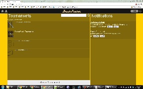
Home | | | No major changes in the home page layout. It was generally pretty clear to the users what the purpose of each section of the page was supposed to be. The biggest/only change was in the header bar: many of the users actually mentioned that they expected the Home icon to be on the top left corner and the settings/logout to be on the top right. That design would be consistent with other sites. |
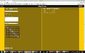
Create Tournament | | | The general layout of the create tournament page was well received by our paper prototype users. It was simple enough and caused few areas of confusion. During the web implementation, we found that there was no particularly good reason to put the form submit buttons on the right side of the form. Putting it directly at the bottom of the form in line with the rest of the inputs seemed to make much more sense. (It seems that we only placed the paper prototype buttons where they were because of poor size estimations of each input/display element on the paper. |
Join Tournament | | | No changes here. Since there are only two actions to take from this page ("Join", or leave the page) there was no confusion by the users in the prototype. |
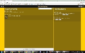
Search for Tournaments | | | Took the feed back from users and made sure to put search results (specifically the error message "No Match for "...." found in your tournaments") on a separate line to make it more visible. After actually implementing the search on the functioning web page, it is very clear when the search results change on the page. When elements automatically disappear and reappear on the page, that change in appearance is more than enough to notify the user of search results. |
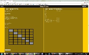
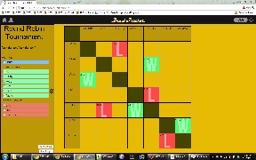
Tournament Page | | | The tournament page also did not change much in terms of overall layout. All the page elements in the from the paper prototype were kept in the web implementation. The major changes were: |
|
.
Implementation
As a web application, our project was implemented with HTML, CSS, Javascript and JQuery (and JQuery UI) on the front end. For the back end, we used the Python framework, Flask. While all the pages are written with HTML and formatted with CSS, most of it is generated on the server side with Flask and Jinja2 templating. Through the use of Flask and Jinja templating, we were easily able to make each page within our site inherit a set of properties, notably the header bar that included the BrackeTracker logo and icons. Similarly, all the tournament (active, create, and join) pages were generated on the server side with the relevant tournament information. Any of the changes on the page that were made after being loaded were dynamically updated with Javascript and Jquery, while simultaneously sending the updated information to the server in order to persist the data. For instance, booting a player would use Javascript to bump the user down on the member-list sidebar then make an AJAX call to the server telling the server of that change. We persisted the data on the server, with the Python Shelve module instead of implementing a full database. For the small scale of the project, Python Shelve worked better than a database would have. With only a single user, the amount of stored data would be minimal. Python Shelve allowed us to store Python objects in a mock database. These Python objects stored the states of each Tournaments (information such as name, description, members, etc) and the Notifications on the home page.
...
User testing was done with volunteers from the general MIT student population, who had either run a tournament before or participated in tournaments before. Users were given a short briefing and scenario tasks to perform as described below. There was no demo included and users had no prior exposure to the website and Bracketracker as a whole.
...
