GR3 - Paper PrototypingYou must do at least two rounds of testing, with a revision of your paper prototype in between. Each round must involve at least 3 users. Note that if you don't have time to run 3 users during the in-class testing sessions, you will have find users outside of class as well. After the first round, revise your paper prototype to address the critical usability problems and explore possible design alternatives, then run 3 more users. Preparing for TestingBefore testing your prototype, you should: - Build your prototype.*Draw the static background, menus, dialog boxes, and other windows. Decide how to implement the dynamic parts of your interface. *Hand-sketching is encouraged. You don't have to prepare every possible screen in advance; it may be much easier to write responses on the fly.
- *Prepare a briefing for test users.*This should be at most a page of information about the purpose of your application and any background information about the domain that may be needed by your test users (who may be classmates) to understand it. These are your notes for the briefing, so make them short, simple and clear, not dense wordy paragraphs. This is not a manual or quick-reference card. It should not describe how to use the interface.
- *Write your scenario tasks on separate index cards.*Your scenario should have involved at least three tasks. You should write these tasks down to give to your users. Just write the concrete goal(s) of the task (e.g. "buy milk, tomatoes, and bread"). Don't write the specific steps to follow, since that's for your users to figure out. The tasks should be brief, roughly 5 minutes to run.
- *Choose roles for your team members.*One person must play the computer. The other team members will be observers. It's not necessary to have a facilitator for these pilot tests. It may be useful for you to swap roles after every user on during the testing sessions, so that each of you gets a chance to try each role, but decide how you'll do it in advance.
- *Practice running your paper prototype.*Every team member should practice playing the computer, learning the steps involved in making the prototype functional, such as rearranging pieces and writing responses. It isn't important to be fast, just competent and confident. A few trials are enough. Make sure your prototype can handle the tasks involved in your scenario.
Running the TestsWhen you run your prototype on a user, you should do the following things: - *Brief the user.*Use the briefing you wrote up to describe orally the purpose of the application and background information about the domain. Don't waste too much time on this: 1 minute should be enough.
- *Present one task.*Hand the index card to the user and let them read it. Make sure they understand the task.
- *Watch the user do the task.*Take notes from your observations, keeping an eye out for critical incidents.
- *Repeat with the other tasks.*Run as many tasks on the user as you have time for.
Serving as a User for Your ClassmatesDuring the testing sessions, when you are serving as a user, you should: - *Relax and enjoy yourself.*You're not being tested -- the interface is. Part of the point of this experience is to feel what it's like to be users in a user test, so that you can empathize with them.
- *Be cooperative.*Don't be intentionally dense, e.g. looking for Exit everywhere but the File menu. Interact with the interface as you would if you were really using it.
- *Think aloud.*Help the observers understand what you're thinking by verbalizing your thought process. "Let's see, I want to enter this bottle of milk, so where's the scanner... oh, here it is. I'll scan the bottle like this, oops that didn't work, let me find the bar code..." You get the idea.
Prototype PhotosDigital photos of the pieces of your prototype. Show the prototype in interesting states; don't just show a blank window. Although you will iterate your paper prototype during this assignment, the photos only need to show one iteration. BriefingThe briefing you gave to users. Scenario TasksThe tasks you gave to users, as you wrote them on the cards. ObservationsUsability problems you discovered from the testing. Describe critical incidents encountered by the users, but don't record users' names. Record these as a series of high-level takeaways, focusing on the usability problems you saw, rather than what each participant did. For instance, you might describe how you had some learnability issues with your prototype, as evidenced by users B and C clicking all of the menus to try to find option X. Prototype IterationPrototype Photos 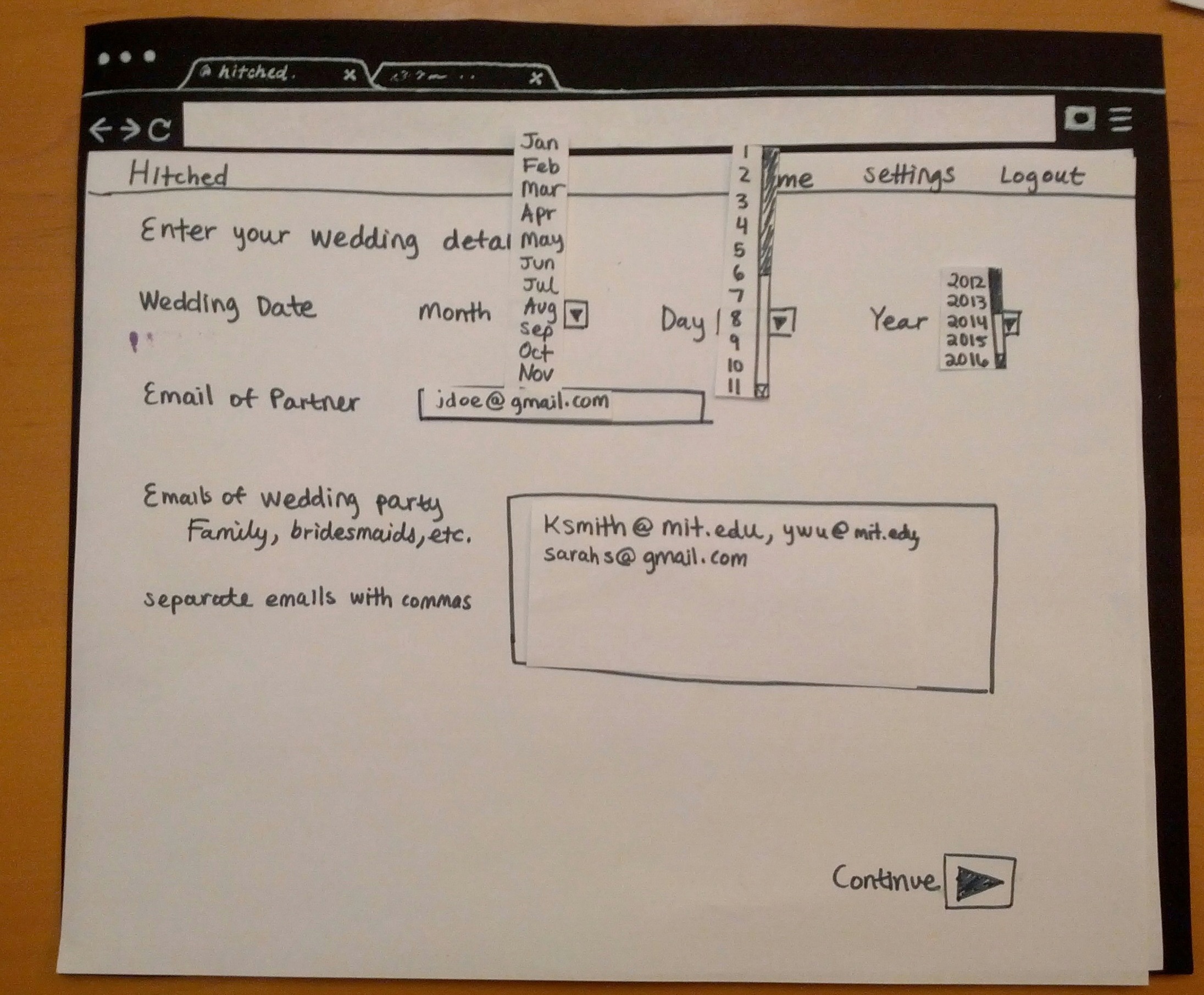 Image Added Image Added
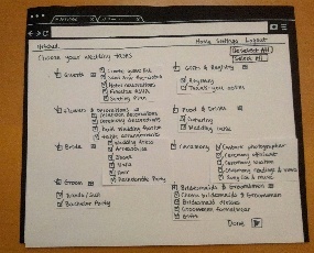 Image Added Image Added
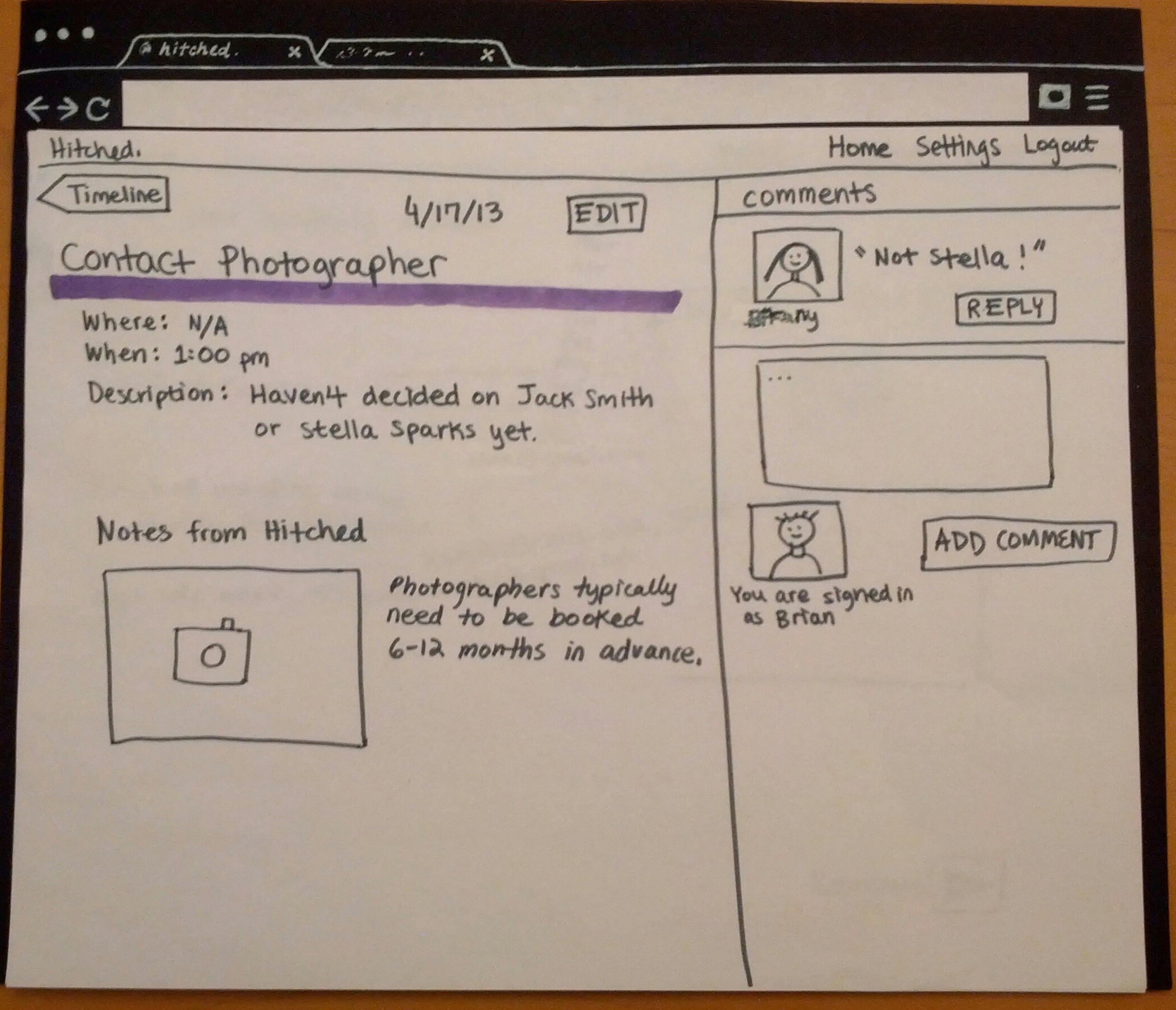 Image Added Image Added
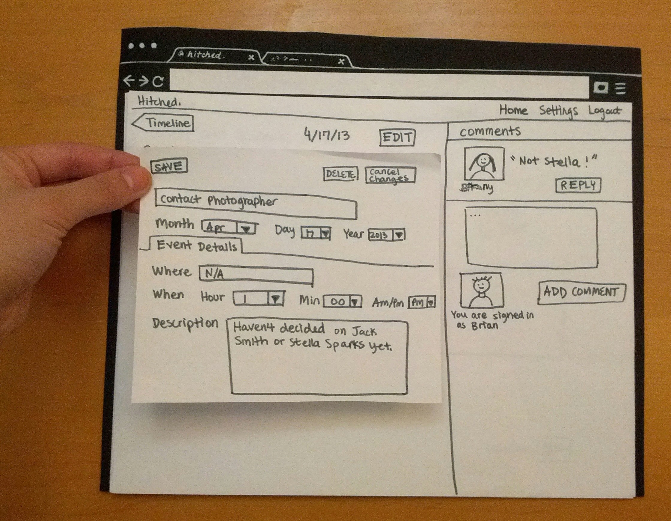 Image Added Image Added
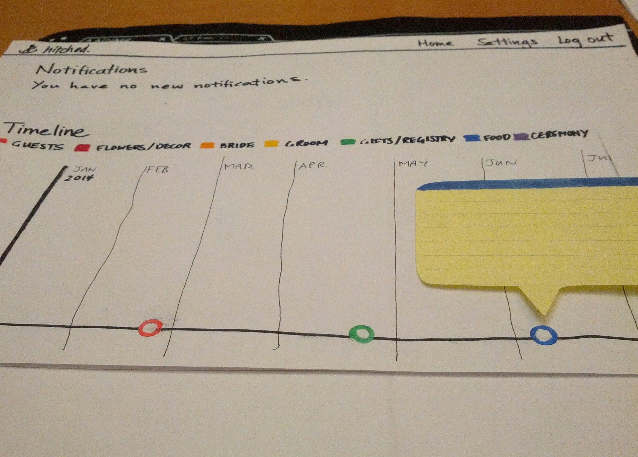 Image Added Image Added
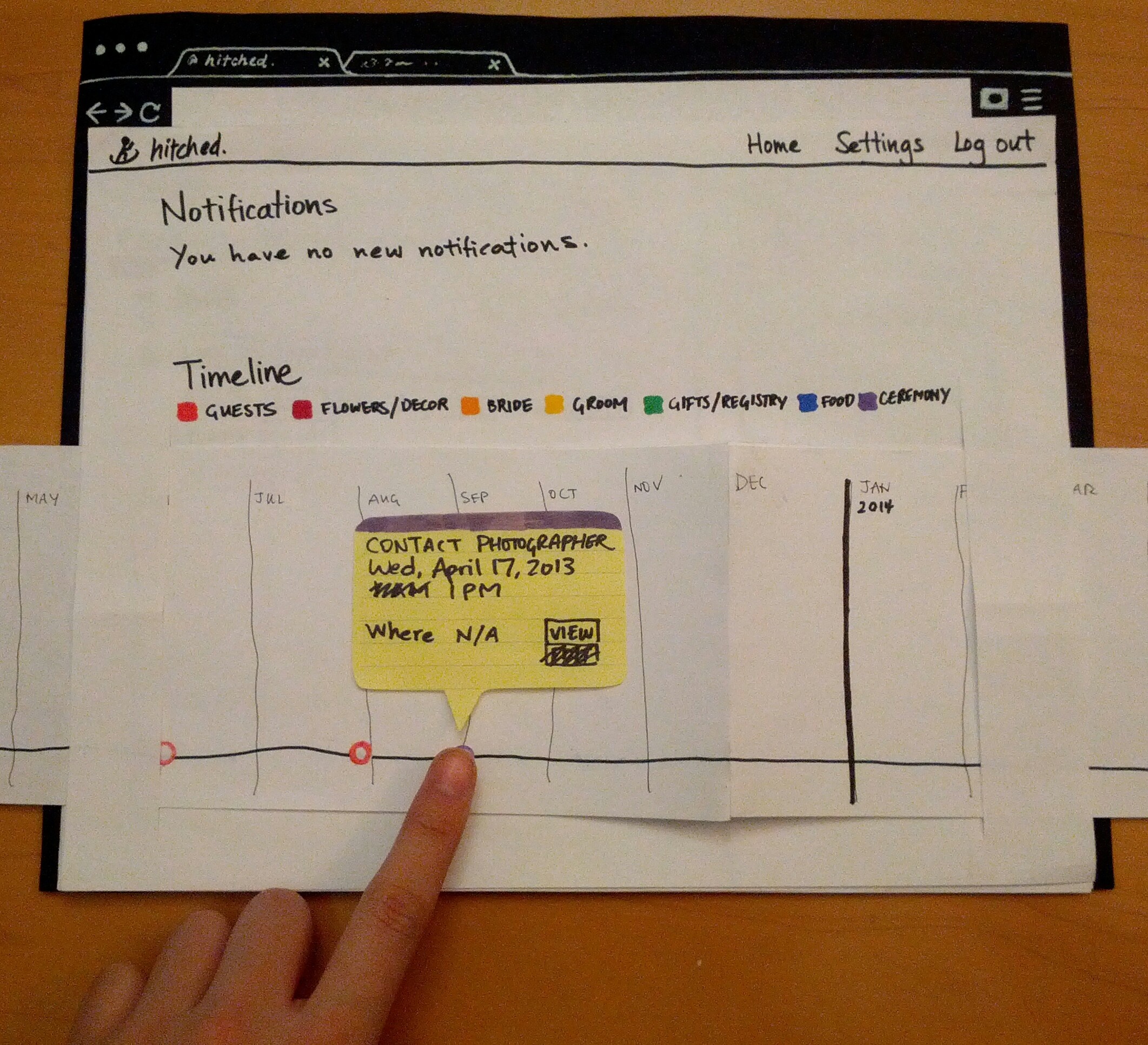 Image Added Image Added
BriefingMany brides-to-be plan their own weddings without the help of a professional wedding planner for financial reasons. The aim of our app is to provide comprehensive guidance on the scheduling of tasks and events related to the wedding. Additionally, the app allows involved parties, such as family members, to provide their opinions during the wedding planning process. First, you’ll be a bride-to-be who opens an account and edits an event in the timeline.
For the second portion, you’ll be a family member who’s going to comment on a task.
Lastly, you’ll be the groom who makes changes to a task. Scenario TasksTask #1(Bride) Create your wedding timeline. Use the following information:
Wedding date – 8/8/2014
Partner email – jdoe@gmail.com
Wedding party emails – ksmith@mit.edu, ywu@mit.edu, sarahs@gmail.com Include the following tasks:
– All Gifts & Registry tasks
– All Guests tasks
– Contact photographer
– Wedding cake Task #2(Bride) Edit Contact Photographer details. Change the time of the Contact Photographer task from 1:00 pm to 3:00 pm. Task #3(Family member) Add a comment. Add a comment to the Contact Photographer task that says "Jack is more expensive." Task #4(Groom) Edit Contact Photographer details. Change the date of the Contact Photographer task from April 17, 2013 to September 1, 2013 from the timeline page. ObservationsTask #1For the purposes of this prototype, we used theknot.com's category breakdown for wedding tasks. Users A and B both faced learnability issues in trying to locate specific tasks, as they weren't aware which category those tasks fell under. All three users seemed overwhelmed by the large amount of information presented; User C noted that the inclusion of pre-set categories made the task less "daunting" but wanted the ability to search (with autocomplete) for known tasks. Additionally, this page initially lacked efficiency as there was no aggregation: it took User A a long time to complete the task due to his inability to collapse/expand or select/deselect items in bulk. (We added buttons for those features after the first test). Task #2All three users faced learnability problems on the timeline page---it was difficult to find a particular task as there was no option to search through them, and filtering was rendered useless if the users forgot which category a task fell under (as Users A and B did). User A suggested having the category breakdown be visible, while User C suggested having task names be visible when filtering a specific category. In terms of efficiency, Users A and C wanted to be able to edit basic event details like time directly from the timeline without having to go into a separate page. On the edit page, both Users A and C were surprised by the inability to edit details by directly clicking on the fields. User A felt that having an intermediate "view" page was kind of useless, as the tooltip on the timeline already served the same function. Task #3Although the commenting and reply area dominated the right third of the screen, most users overlooked it completely and had to search around before realizing that the comment system was separate from actually editing an event. Users used to gCal or iCal confused adding a comment (where the goal of adding a comment is to generate discussion, like in a forum thread) with adding a short note to the event. Task #4In terms of learnability, here were no clear affordances for being able to drag the circles along the timeline, though User C did so successfully because it was externally consistent with services like Google Calendar. User A suggested having a hand cursor upon mouseover to indicate draggability, and all three users liked our idea of having a YouTube video scrubbing-style indicator to indicate date. Prototype IterationBetween the two iterations, we added a wedding packages page and made changes to the checklist and timeline pages. Wedding Packages We added a page that allows users to either customize their own package (taking them to the checklist in the first prototype) or choose among three types of wedding packages: Princess, Queen, and Goddess. The Princess package has only the most basic wedding tasks (i.e., invites and guest list, wedding location, etc). The Queen package includes a larger subset of tasks (i.e, bachelor / bachelorette parties, hotel reservations for guests, flowers, etc). The Goddess package has the entire range of wedding tasks (i.e, gifts for bridesmaids / groomsmen, salon services for bride, etc). We added this screen because users commented that brides-to-be may not know up front exactly what tasks they want in their wedding. As a result, this page presents the option to select a pre-set package or create a customized package. Checklist Page On the checklist page, which allows users to select the tasks they want to include in their weddings, we added a search function. We also added a select-all button, as well as a deselect-all button. These changes enable users to more efficiently locate specific tasks that they want to select or deselect. Timeline We made a few key changes to our timeline. First, we added a sidebar, which displays the tasks categories. By clicking on a task category, users can filter the tasks they see in the timeline. Only tasks under the clicked category will be displayed, with all other tasks greyed out. Next, we made the sidebar expandable, so that users can see a list of tasks under each category. By clicking on a specific task, the timeline will scroll to that task and display a pop-up window with the date, time, and location of the task. The user can then click the “view” button on this pop-up window to edit the task or see further details. Finally, we added a search function that allows users to search for a specific task on the timeline. We made these changes because during our initial prototype testing, users struggled to locate the "Contact Photographer" task on the timeline (as explained in the Task #2 section above). The sidebar, as well as the search function, will make it easier for users to locate specific tasks on the timeline. Prototype Iteration Testing ResultsWe asked three users to test our prototype after we iterated our design. Selecting Events As part of the registration step, users select what events they would like to include in their wedding. In the previous round of testing, users wanted select-all and deselect-all buttons. Thus, in this design iteration, we made all events selected as a default and included both select-all and deselect-all buttons. User A said she would rather have all the events deselected as a default. Comments User A pressed the "Add Comment" button before typing in her comment, leading to a blank comment submission. The user suggested changing the "Add Comment" button to a "Submit Comment" button, in order to clarify that users should type their comment in the text box BEFORE clicking the button. Timeline Categories Users A and C liked how each task in the timeline was part of a pre-determined category (i.e, food & drink, invitations, etc). However, User B wanted the option to move tasks from their pre-determined categories. In order to maximize user freedom and control, we want to give users the option to add custom categories and move tasks around to different categories in the next design iteration. Timeline Dragging Users B and C mentioned that they did not know that they could drag events on the timeline in order to change the dates. From the first iteration, we decided to add a hand icon cursor whenever a user hovers over an event to indicate dragability. However, users thought that it would be more clear if there were a line of text that explicitly stated the dragging affordance. Timeline View Users A and B commented that they would like to be able to zoom in/out of the timeline. As a result, we will add 1-month, 3-month, and 6-month view options to the timeline. User Model User A asked if our application cost money (i.e, if it is a cheaper version of wedding planning). In the next iteration, we will emphasize on the homepage that Hitched is a free application (which will hopefully make users more willing to try it)You did two rounds of paper prototyping. Describe how your prototype changed between those two rounds.
| 