Paper PrototypePrototype
Phase 1
Following are the screenshots of the screens of LocaShare (phase 1):
...
| Panel |
|---|
Thank you for participating in this user study. LocaShare is an application that allows you to share your location data in ways that are different from existing services like Foursquare and Latitude. It gives you an ability to set preferences on what type of location information friends and companies can view about you. Also, you can have a look at your information that those entities (companies/friends) can see about you. |
Tasks:
We are now going to
Task 1: View Bob’s information (current location and historical location)
...
Task 2: View the information that Bob can see about you
...
and edit the time period when he can view you.
Task 3: Add John as a new friend of yours.
...
Task 4: View offers and select
...
the 5% discount that Star Market is offering.
Observations:
| Wiki Markup |
|---|
\[[Paper-prototyping notes\]|https://wikis.mit.edu/confluence/display/6DOT813sp12/LocaShare-PaperPrototypingNote] |
User | User | View Bob's information | View what information Bob can see about you
and edit the time period when he can view you. | Add John as a new friend | View offers and select one and select the 5%
discount that Star Market is offering. | Suggestions |
|---|
#1 | N/A | ‧ Learnability:
1. Different mental model: She attempted
to click on her own profile picture to view
how Bob could see about him rather than
clicking on Bob’s page and choose
“My LocaShare”. The user expressed
that since it is how others view my information,
it should be shown in my page instead of others
page.
2. Affordance mismatch: A profile picture has
the affordance to be clickable; however,
our design does not support this function.
3. Misleading arrows/bad affordance: She
was confused by “< My LocaShare” button
and “> Bob’s LocaShare” button. The
direction of the arrows is hard to understand,
the text on the button does not help user to
make the decision as well. Also, the texture
of the button does not make the user feel like
it is a clickable button.
4. Unclear affordance: An empty map in the
editing page makes user think it is a text
box and want to type something in it.
‧ Visibility:
1. User was unable to know the edits were
only applied to a specific friend. | ‧ Learnability:
1. Different conceptual model:
User was unable to find the
search bar for adding a
friend since clicking on
“My Friends” does not
make sense ("John is not my
friend at this point"). | ‧ Learnability:
1. Affordance: User tried clicking
on the box to the left of "Star
Market" as it looks more like
a button than an icon.
| User wondered if
it was possible to
create
user-specific
categories.
Also, how to
select multiple
offers at once. |
#2 | N/A | ‧ Learnability
1. Different mental model: It is more
natural to name the user as “Me”
instead of “Joe”.
2. Inconsistency/different mental
model: We noticed that user habitually
assumed that the picture on the
upper left corner should be me rather
than my friend. Putting user’s profile
picture on the upper right corner is
externally inconsistent with other
social apps.
3. Lack of feedback: The map does not
provide enough feedback about the
coverage of a location. A circle
(with different radius) below the bubble
would help solve this problem. Also,
user was puzzled about what would
happen to the coverage of a location
after choosing “city” or “state”, would
the radius of a location change as well?
‧ Efficiency
1. Aggregation: User suggested
4. Unclear wording: What does "MTWTFSS"
mean?
‧ Efficiency
1. Aggregation: User suggested that the
application should be able to support a
function to hide/show all the charts,
instead of clicking on each chart one
by one in order to hide/show it. | ‧ Learnability
1. Different mental model: User
was unable navigate from the
home screen for the “Add John”
task since the user is expecting
an “Add friend +” button on the
home screen. User did not
expect to click on “My friends”
to add a new friend.
2. Lack of feedback:
User was expecting some
feedback would be provided
after adding John, things like
a successful or failure alert.
| ‧ Learnability
1. Different mental model: User
expected that upon clicking on
the little arrow below “0.4 mi”,
the map/direction to Star
Market would be provided
(since it was directly below
the distance).
2. Affordance: User tried to
click on the "Star" symbol to
see the offers but it was an
icon instead of a button.
‧ Visibility
1. User asked if the user was
not interested in utilizing any
offers right now, is it possible
to provide a way to hide it and
click on "My Deals" to view it
at a later point in time.
| |
#3 N/A | ‧ Learnability
1. Different mental model:
The two charts seem to
convey similar information.
| ‧ Learnability
1. Different mental model: User attempted
to click on his own profile picture to view
how Bob could see about him rather
than clicking on Bob’s page and choose
“My LocaShare”. (Similar thing
happened to user 1.)
2. Inconsistency: User asked why my profile
picture shows up when viewing Bob’s
information. It is externally inconsistent with
other social apps because they would not
show your pictures when viewing others page.
3. Inconsistency: User might expect to have a
profile page which can be accessible by clicking
on his/her own profile picture just like other
social apps.
‧ Efficiency
1. Aggregation: User asked “If I want to hide
my daily/weekly and
4.Inconsistency: The charts seem to be a
different kind of setting from "when" and "what."
It would be better to use another screen for
setting the charts.
5. No immediate feedback: User asked after I
set these settings, what would happen?
‧ Efficiency
1. Aggregation: User asked “If I want to hide
my daily/weekly and monthly stats, do I have
to click "Hide" 3 times?”
‧ Visibiltiy
1. The search bar under the map is not salient.
2. The "neighborhood/city/state" did not
convey the look of radio buttons to the user.
| ‧ Learnability
1. Inconsistency: User found
the way to add a new friend is
externally inconsistent with the
way to add a new contact on
a mobile phone. On a mobile
phone (contact list), when you
want to add users, you “add”
them instead of “searching”
for them.
2. Unclear affordance: User
attempted to add a friend by
clicking on the “empty box” in
“friends near you”, since it is
intuitive to fill in an empty box
by adding something in it.
| ‧ Learnability
1. Jargon: The user mentioned
that “Select” sounded rather
ambiguous.
| 1. User asked “am I
adding Star
Market as one
of my friends?”
2. User 3 asked if the
"deals functionality"
could be turned into
a social experience
("I would like to
share my deals with Bob"). |
...
- Paper-prototyping still has its constraints. It is very hard to create a button by using papers, even if we tried to use paper and transparency together and colored it with red, it is still not obvious for users, since the texture is similar to paper.
- Another limitation is that it is hard to tell whether a picture is clickable or not. In a computer, when users hover a clickable item, the mouse icon would change, but it is hard to create this effect in paper-prototyping.
- The other limitation is due to time constraint. One user would only spend 15 mins finishing all the tasks; therefore, they would not think very clearly about the UI design or the functionality of the application, but just follow their instinct. Therefore, new designs would hard to be noticed or appreciated since they are externally different from existing applications. We solve this problem by finding users outside of the class to test our second design, and had an one-hour interview with each of the user.
- Our design is challenging in the sense that we want to make the option "how others view me" obvious and salient; however, this change might cause external inconsistency with other existing apps, since currently, they are not making this functionality easily accessible to users. (For example, in facebook, you need to click on a tiny widget icon in your profile page and click "View as". But the icon in nearly invisible and the word "View as" carries bad information scent.)
- Editing preferences page could use some work. The "What" and "Where" seem to be contradictory as User 2 mentioned. Also, would the preferences erase the previous setting and create a brand new one? Or would Joe be able to edit the previous one and create a modified setting?
Re-design:
Re-design:
After receiving the After receiving the feedback in the first iteration, we made changes to our design.
Functionality changes
...
- Remove "Deals". Fully concentrate on how to share/view location information. This decision was also made because of our consultation with Katrina who gave us this suggestion to help us narrow the focus of the project.
...
- Removing the task of adding friend(s) and making it into a task of creating LocaShares with friend(s). This way, we assume that users can add a friend as their contact only when they create and share their location with that friend using the app.
Design changes
| Home screen | Find Friends | Viewing what the friend
can see about me
| Editing preferences
|
|---|
Problems in
design 1 | - Home screen is not
conveying sufficient
information for the
tasks described. - All three users tried
clicking on Joe's photo
on the home screen
to view information
that Joe's friend can
see about him. - One user said that "I would
turn off the app since it
does not convey useful
information when I turn it on."
| - All users thought that
"Friend" and "Deals"
beside "LocaShare"
(at the top of the
screen) was clickable.
| - The "My LocaShare"
and "Bob's LocaShare"
are confusing. First,
users cannot recognize
it's a button. Second, the
meaning of the arrow
direction is rather
confusing. - Users have the mental
model to click on his on
picture to view how
friends view me instead of
clicking on my friend and
exchange the position.
- User habitually assumes
that the picture on the
upper left corner should
be me rather than my friend.
| - Users tend to be overwhelmed
by so many settings in one page. - The two chart (pie chart and the bar graph)
on this screen seemed to convey the same
information. - Users are unable to know what changes they have
made.
|
Solutions for
design 2 | - Make home screen more
interactive, carry more
affordance and relevant
information. - Make Joe's photo
clickable. - Make it more intriguing to
users.
| - Remove the
confusing
"Friend" on the
navigation bar
| Solutions for
design 2 | - Make home screen more
interactive, carry more
affordance and
information. - Make Joe's photo
clickable.
| - Remove the
confusing
"Friend" on the
navigation bar, since
it does carry any
functionality but brings
confusion to users. - For simplicity and
internal consistency in
a single page, we
move "friends near you"
to the home screen
and only keep the lower
part.
| - Move this Move this functionality to
the profile picture in the
home screen. It brings user
to a personal profile like
page with a list of friends to
choose from.
|
Phase 2
Following are the screenshots of the screens of LocaShare (phase 2):
Home | Friends Page | View Bob's information | View yourself as... | View yourself as Bob sees you |
|---|
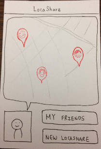 Image Removed Image Removed |  Image Removed Image Removed |  Image Removed Image Removed |  Image Removed Image Removed |  Image Removed Image Removed |
Permissions (1) | Permissions (2) | Permissions (3) | Permissions (confirmation) |
|---|
 Image Removed Image Removed |  Image Removed Image Removed |  Image Removed Image Removed |  Image Removed Image Removed |
Briefing:
LocaShare is an application that allows you to share your location data in ways that are different from existing services like Foursquare and Latitude.
- place and time-based sharing: you can elect to share your location only when you arrive in certain places, or only during certain times of day or times of the week.
- granular sharing: You can also choose to share more granular data -- such as what city you are in, but not where precisely.
- data browsing / transparency: An important part of the interface is the part that lets you see both data that is shared with you and see the data that you are sharing with others.
Tasks:
Task 1: View Bob's current location and identify the restaurant he visited most frequently last week.
Task 2: Create a new locashare with Bob that allows Bob to see whenever you are in his neighborhood (Boston), but only during evening hours (7pm-9pm).
Task 3: View and edit your information that Bob can view to hide your statistics information.
Observations:
- Try to avoid putting two
profile pictures in the same
page at the same time.
| - Use a tab menu and have a page
for each setting. It also allows user
to skip some settings. - Since both the graphs in the preferences screen
seemed to convey the same idea, we decided to
use only one to make the task
more efficient for the user. - We provide a summary page to let user know
the changes they have made.
|
...
Phase 2
Following are the screenshots of the screens of LocaShare (phase 2):
| Panel |
|---|
Multiple home screen designs: We created three iterations of home screens to incorporate the feedback of the phase 1 users, and also try to generate more feedback, since users tend to criticize more when multiple designs are presented. All three display a large visual of a map that show nearby friends. The map gives an affordance of moving so that users can view friends that are not currently in their locality as well. Design 1 | Design 2 | Design 3 |
|---|
Image Added
This design shows the
map with the locations
of Joe's friends.
| 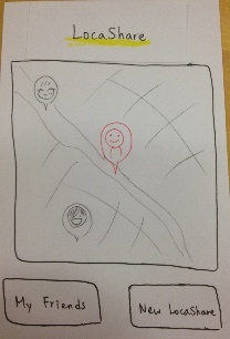 Image Added Image Added
This design put Joe
inside of the map to
help Joe eyeball the
relative distance
between himself and
his friends. | 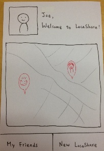 Image Added Image Added
This design has 2 tabs
with a welcome
sentence next to Joe's
profile page.
|
|
Home | Friends Page | View Bob's information | View yourself as... | View yourself as Bob sees you |
|---|
Image Added | Image Added | Image Added | Image Added | Image Added |
Permissions (1) | Permissions (2) | Permissions (3) | Permissions (confirmation) |
|---|
Image Added | Image Added | Image Added | Image Added |
Briefing:
| Panel |
|---|
Thank you for participating in this user study. LocaShare is an application that allows you to share your location data in ways that are different from existing services like Foursquare and Latitude. - place and time-based sharing: you can elect to share your location only when you arrive in certain places, or only during certain times of day or times of the week.
- granular sharing: You can also choose to share more granular data -- such as what city you are in, but not where precisely.
- data browsing / transparency: An important part of the interface is the part that lets you see both data that is shared with you and see the data that you are sharing with others.
|
Tasks:
Task 1: View Bob's current location and identify the restaurant he visited most frequently last week.
Task 2: Create a new locashare with Bob that allows Bob to see whenever you are in his neighborhood (Boston), but only during evening hours (7pm-9pm).
Task 3: View and edit your information that Bob can view to hide your statistics information.
Observations:
User | View Bob's information | Create a new LocaShare with Bob | View yourself as Bob | Suggestions |
|---|
#1 | ‧ Learnability/Efficiency:
1. Multiple accessibility: Liked
that we provide two ways to
access to friends. One is
by clicking on friend’s
picture on the map in the
home screen and the
other way is by clicking
on “My friends.”
| ‧ Learnability
1. Not speaking user's language:
"What" is ambiguous. She
suggested that we should use
"History" or "Statistics" instead.
‧ Efficiency
1. Add multiple people to a
LocaShare: We should support
adding multiple people to a Loca-
Share. User suggested that this
could be achieved by
i. Choosing multiple people
while creating a LocaShare.
ii. Have a "who" tab in the
setting menu to add people
and view people who has
already been added in the
LocaShare.
2. LocaShare naming: The app
should allow users to name the
new LocaShare, since it makes
LocaShares easy to remember.
User also suggested that we
could provide a default name
of a LocaShare, but it should
be fragile. | ‧ Learnability
1. Different conceptual model:
I should be able to know all the
LocaShares that I have with Bob,
rather than just showing the
aggregated location sharing
information.
2. |
User | View Bob's information | Create a new LocaShare with Bob | View yourself as Bob | Suggestions |
|---|
#1 | ‧ Learnability/Efficiency:
1. Multiple accessibility: Liked
that we provide two ways to
access to friends. One is
by clicking on friend’s
picture on the map in the
home screen and the
other way is by clicking
on “My friends.”
| ‧ Learnability
1. Not speaking user's
language:
"What" is ambiguous. She
suggested that we should use
"History" or "Statistics" instead.
‧ Efficiency
1. Add multiple people to a
LocaShare: We should support
adding multiple people to a Loca-
Share. User suggested that this
could be achieved by
i. Choosing multiple people
while creating a LocaShare.
ii. Have a "who" tab in the
setting menu to add people
and view people who has
already been added in the
LocaShare.
2. LocaShare naming: The app
should allow users to name the
new LocaShare, since it makes
LocaShares easy to remember.
User also suggested that we
could provide a default name
of a LocaShare, but it should
be fragile. ‧ Learnability
1. Different conceptual model:
I should be able to know all the
LocaShares that I have with Bob,
rather than just showing the
aggregated location sharing
information.
2. Not speaking user's
language:
The sentence "View me as Bob"
is confusing.
3. Different conceptual model:
User tried to click on Bob's
profile page and find a way to
view how Bob sees me. (This
behavior is just the opposite
from what we faced in first
iteration).
‧ Efficiency
1. Too many button clicks:
User felt annoying when she
was informed that there is
still one more button click
to finish creating a
new LocaShare. She
suggested that the app
should just show the inform
without asking user to click
on "ok".
1. Option to "Duplicate" the
locashares to create them
for other people.
2.Should provide a list of LocaShares. #2 | ‧ Learnability
1. Unclear affordance: User
suggested to have an icon below
the photo to show an affordance
of clicking
‧ Visibility
1. User expressed that she
would like to know her location
on the map in the home screen. ‧ Learnability
1. Not speaking user's
language: Instead of using "What" to
mean statistic charts, we should use
"History" or "Statistics". Also, instead of
using "Where" and "When", use "Location"
and "Time" would be more clear.
2. Inconsistent time display:
It is bad to use both military time and
normal time.
‧ Efficiency
1. Duplicate charts: User suggested to
have only one chart with a bar to control
the frequency instead of having daily,
weekly, and monthly three separate
charts. (Or, it should use different charts
in different context. Restaurants -- how
many times, Location Tracking --
amount of time)
2. Add multiple people to a
LocaShare: We should support
adding multiple people to a Loca-
Share.
3. Global function: User should be able to
set a global preference which overrides all
the LocaShares. (For example: During this
time, I don't want to be seen by anybody.) ‧ Learnability
1. Different conceptual model:
User tried to click on Bob's
profile page and find a way to
view how Bob sees me. She says
that since the information is "seen
by Bob," it should not be in my
profile page.
2. Number of times in the chart
*is confusing: *Say they're at a
restaurant and they get a phone
call. So they exit the restaurant,
complete their phone call and
come back. Does that constitute
two visits? Displaying the
amount of time on the chart
may be more useful. 1. User would be more interested in an
app which shares her exact location all
the time, but she is allowed to specify
the when to share.
2. User suggested that it may be more
intuitive to give the user an option of
specifying how long they would like
information to be stored (in number
of days)
3. What if there are multiple restaurants
in a building. How would LocaShare
identify the location as? | #3 |
The sentence "View me as Bob"
is confusing.
3. Different conceptual model:
User tried to click on Bob's
profile page and find a way to
view how Bob sees me. (This
behavior is just the opposite
from what we faced in first
iteration).
‧ Efficiency
1. Too many button clicks:
User felt annoying when she
was informed that there is
still one more button click
to finish creating a
new LocaShare. She
suggested that the app
should just show the inform
without asking user to click
on "ok".
| 1. Option to "Duplicate" the
locashares to create them
for other people.
2.Should provide a list of LocaShares. |
#2 | ‧ Learnability
1. Unclear affordance: User
suggested to have an icon below
the photo to show an affordance
of clicking
‧ Visibility
1. User expressed that she
would like to know her location
on the map in the home screen. | ‧ Learnability
1. Not speaking user's
language: Instead of using "What" to
mean statistic charts, we should use
"History" or "Statistics". Also, instead of
using "Where" and "When", use "Location"
and "Time" would be more clear.
2. Inconsistent time display:
It is bad to use both military time and
normal time.
3. Different mental model: Show
different times for different locations?
Right now all the times in the "When"
tab map to all the locations in the
"Where" tab.
‧ Efficiency
1. Duplicate charts: User suggested to
have only one chart with a bar to control
the frequency instead of having daily,
weekly, and monthly three separate
charts. (Or, it should use different charts
in different context. Restaurants -- how
many times, Location Tracking --
amount of time)
2. Global function: User should be able to
set a global preference which overrides all
the LocaShares. (For example: During this
time, I don't want to be seen by anybody.) | ‧ Learnability
1. Different conceptual model:
User tried to click on Bob's
profile page and find a way to
view how Bob sees me. She says
that since the information is "seen
by Bob," it should not be in my
profile page.
2. Number of times in the chart
is confusing: Say they're at a
restaurant and they get a phone
call. So they exit the restaurant,
complete their phone call and
come back. Does that constitute
two visits? Displaying the
amount of time on the chart
may be more useful. | 1. User would be more interested in an
app which shares her exact location all
the time, but she is allowed to specify
the when to share.
2. User suggested that it may be more
intuitive to give the user an option of
specifying how long they would like
information to be stored (in number
of days)
3. What if there are multiple restaurants
in a building. How would LocaShare
identify the location as?
4. Can you send a text message to
that friend as well? |
#3 | ‧ Learnability
1. Affordance mismatch:
The bubble-like shape that looks
like Joe is "saying" something.
| ‧ Learnability
1. Inconsistent time display:
It is bad to use both military time and
normal time.
2. | ‧ Learnability
1. Affordance mismatch:
The bubble-like shape that looks
like Joe is "saying" something.
| ‧ Learnability
1. Inconsistent time display:
It is bad to use both military time and
normal time.
2. Not speaking user's
language: Instead of using "What" to
mean statistic charts, we should use
"History" or "Statistics".
3. Different mental model: May I add the
date to "when"? That is, may users are
allowed to set an expiration date for a
LocaShare?
‧ Efficiency
1. Recognition v.s recall: User suggested
that we should provide the locations we
have already decided to share, they are
uneditable, but would serve the way to
remind user where they have already
shared.
2. Recommended location settings:
User said that it would be helpful to show
past statistics of locations I usually share
with others (simplify the need to create
new locations on the map)
3. Grouping for friends: User suggested
that we should allow
‧ Visibility
1. User did not notice that there is a
"minus" button there allowing her to
delete time.
‧ Learnability
1. Not speaking user's
language:
The sentence "View me as Bob"
is confusing
2. Different conceptual model:
User tried to click on Bob's
profile page and find a way to
view how Bob sees me.
3. Confusing icons:
User asked why there are two
pictures when I try to view me as
Bob?
*4. Affordance: *Instead of using
charts, user suggested that we
can use a map with multiple locations
indicating the places a person has
been to. And use the size of the
bubble to show how many times
a person has been to the location. | |
Findings:
1. Users might have really different mental models when using an applications. We would try to include both of the designs to accommodate our app to different users. For example, providing multiple ways to view how others see about your location information.
User 1:
Task 1:
- There are multiple ways to get to Bob (click on map or click on "My Friends").
Task 2:
- Too many button clicks (there is one even for confirmation that a new locashare has been created!) efficiency
- Just inform the notification, instead of asking them to click. -- efficiency issue
- Daily stats - when/what? -- not speaking user's language
- "What" sounds ambiguous -- use "History" instead
- Would like to know what locashares Joe has with Bob.
- View Bob's locashare accessible by me.
- Can have multiple locashares (naming will be helpful, but should not be mandatory).
- Name locashares as the placesnames (Cosi, Stata, Cambridge etc)
- Click on multiple friends for one location is intuitive.. but would like a "who" tab... should be already set with the list of friends that have been assigned to that locashare.
Task 3:
- The title "View me as Bob" is ambiguous
- To view my locashare, there are multiple paths -- my friends, my photo
- Edit relationship with Bob either way -- clicking on Bob or on yourself (photo)
- Saved locashares -- lists/tabs of locashares - visibility issue
- Bob (my relationship with Bob) .. same options should be given (list of locashares with Bob)
Suggestions:
- Option to "Duplicate" the locashares to create them for other people.
User 2:
Task 1:
- favorite restaurant doesn't make sense since there is no rating feedback given. Also, if Bob already went to PepperSky multiple times this week, he may not want to go there again.
- no preference info given.
- #times visited != fav. place
Task 2:
- "Whenever in Boston" in the task is ambiguous. If a friend in UCLA is coming to visit, their purpose of being in Boston may be different from someone in Cambridge. Requesting to share whenever you're in SP between 7 and 9pm makes more sense.
- there should be only 1 chart and user should be able to select the frequency of update
- difference between timeframe and the frequency of update
- if you want to share, but only see at specific times.
- time is not displayed consistently. Military time vs normal time.
- number of times in the chart is ambiguous. Say they're at a restaurant and they get a phone call. So they exit the restaurant, complete their phone call and come back. Does that constitute two visits? Displaying the amount of time on the chart may be more useful.
- may be more intuitive to give the user an option of specifying how long they would like information to be stored (in number of days).
- sharing exact location (everywhere) with family members seems more intuitive. something along the lines of "During this time Bob can see me wherever I am"
- can have similar settings like facebook. selecting multiple friends .. lack of external consistency
- history for the whole group, multiple -- singel entries or is there 1 single one for group formation.
- "My Friend" vs "New Friend". How do I add a new friend? learnability issue
- Show different times for different locations? Right now all the times in the "When" tab map to all the locations in the "Where" tab.
- Easier to "Choose time", and notify when that person can see where I am.
- Tell where you are right now vs track your locations.
- May be interested in viewing historical information out of personal curiosity.
Task 3:
- History of share -- hide weekly? if they hide daily, they can infer this information when they view the weekly chart.
- affordance is not there to view your info. seen by Bob (did not click on own photo).
show history (in "View me as Bob"):
Now ------|||---------- 7days ago (this will be filled in based on the permissions that Joe sets)
- would "poke around" to view the information Bob can see about Joe. However, better labels would be "Location", "Time", "History" (can be repetitive). speak the user's language
- show amount of time, not number of times. depends on the context though. Restaurants -- many times, Location Tracking -- amount of time
- have an icon (like in MSN) below the photo to show an affordance of clicking. Right now, clicking on the photo is not easy to learn.
- What if there are 5 restaurants in one building? How would LocaShare identify that building as?
- Need to have a mechanism to self-identify the location (like Facebook Check-In) for labeling the locations. If only GPS location is more important, maybe not need. If users don't identify themselves, coming up with labels will be very difficult.
Suggestions:
- Have a "global function". During this time, I don't want to be seen by anybody. This will override all other locashares.
- Time I want to be seen is like Facebook chat with location.
- Can you send a text message to that friend as well?
- Issue of privacy -- not at home/office can help someone break into my home and steal my stuff. I wouldn't use this app for social networking, but will use it for my family members for real-time location sharing.
User 3:
Task 1:
- The home page has a bubble-like shape that looks like Joe is "saying" something. However, the internal model is that the nearby friends are the ones that are doing the "saying" (mentioning their location as being close to Joe).
- Sharing preference seems to be for future plans (sharing in the future). Mode is visible at that time.
- Inconsistency in time display (military vs normal)
Task 2:
- Date -- is it this Sunday or the next? No option for setting dates.
- Did I already share Cosi and Stata with Bob? What do these markers mean?
- Call "What" as "Past Statistics". Quite ambiguous. not speaking the user's language
- Past History. Current location. Mention the time.
- Didn't notice the option to delete time (the circle with "minus" symbol).
- How do I add date to "When"?
- How to share with multiple friends at the same time?
- Location option. Will be helpful to show past statistics of locations I usually share with others (simplify the need to create new locations on the map).
- New LocaShare --- map in "What" tab should be blank.
- Specific group of people will be more helpful in the friends page. Divide by "Family" and "Friends". That way you can easily select all friends you want to be associated with that locashare.
- Associate "When" inside the markers on the map in "Where". When you click on a marker, a new window pops up and you can add it. Then you can add time and other details in that window. Should also be able to delete the markers (delete locashares).
- Existing locashare should not be editable. but should be shown when creating a new locashare so that you don't unnecessarily create a new one.
...
Instead of using "What" to
mean statistic charts, we should use
"History" or "Statistics".
3. Different mental model: May I add the
date to "when"? That is, may users are
allowed to set an expiration date for a
LocaShare?
4. Different mental model: The location
and the time to share the location should
have one-to-one mapping. User suggested
to associate "When" inside the markers on
the map in "Where". When you click on a
marker, a new window pops up and you
can add it. Then you can add time and
other details in that window. Should also
be able to delete the markers
‧ Efficiency
1. Recognition v.s recall: User suggested
that we should provide the locations we
have already decided to share, they are
uneditable, but would serve the way to
remind user where they have already
shared.
2. Recommended location settings:
User said that it would be helpful to show
past statistics of locations I usually share
with others (simplify the need to create
new locations on the map)
3. Grouping for friends: User suggested
that we should allow users to create a group
of friends.
‧ Visibility
1. User did not notice that there is a
"minus" button there allowing her to
delete time.
| ‧ Learnability
1. Not speaking user's
language:
The sentence "View me as Bob"
is confusing
2. Different conceptual model:
User tried to click on Bob's
profile page and find a way to
view how Bob sees me.
3. Confusing icons:
User asked why there are two
pictures when I try to view me as
Bob?
4. Affordance: Instead of using
charts, user suggested that we
can use a map with multiple locations
indicating the places a person has
been to. And use the size of the
bubble to show how many times
a person has been to the location. | 1. If Joe wants to notify Bob that he
will be in Boston on Friday night, Bob
has to to go view Joe's profile to view |
...
whether Joe is in Boston. It may
|
...
already be too late. Having some kind
|
...
of alert (using color or notification) will
|
...
be helpful whenever a new
|
...
Task 3:
- What does "View me as Bob" mean? Ambiguous not speaking the user's language
- 2 faces on ("View me as Bob") page. What are they for?
- Statistics is very ambiguous. Will be more useful to have a map that shows the route that Bob took in the past. Time is more important than frequency for the user. Can vary the size/shape of the markers on the map to indicate frequency (don't make the map messy)
Findings:
1. Users might have really different mental models when using applications. In the task of finding information about Joe that Bob could see, phase 1 users would click on Joe's photo to see the information that Bob could view about Joe. However, phase 2 users clicked on Bob to view the same information. We identified that different users model the direction of the flow of this information differently. We should try to include both of the designs to accommodate our app to different users. For example, providing multiple ways to view how others see about your location information.
2. We got lots of precious feedback from users in terms of the functions that they would like to see and the problems in UI design, we are trying to re-design our application to include all the good design ideas and will keep doing paper-prototyping to produce the final design. - exact location all day versus decide a location in advance.