...
| Panel |
|---|
Our mobile application can currently be accessed at MenuMe2. Evaluation and develop development took place on an Iphone with a landscape orientation. |
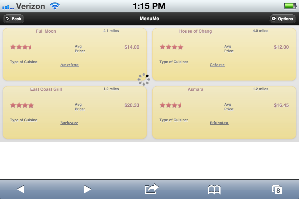
Our initial screen uses an initial loading screen to provide users with a subtle tutorial in how to use the application. The animations behind the loading screen shows show the ways in which the user will be bale to navigate through the application, specifically through swipe actions. This screen also provides the application enough time to perform the necessary queries and geolocation calculations to take place.
Design Features and Decision:
- User cannot modify any of the content of this aspect of the screen. This feature forces the user to view a subtle tutorial on how to use the application. The motivation is to help the users understand how the animations will take place on the application, providing the user with understandable goal to reach in learnability.
- Loading Bar Animation. Allows the user to watch the tutorial with the belief that computations are taking place that cannot be skipped. This decision is aimed at reducing the user resentment to watch a learnability feature by making them believe something else necessary to the application is taking place.
| 
|
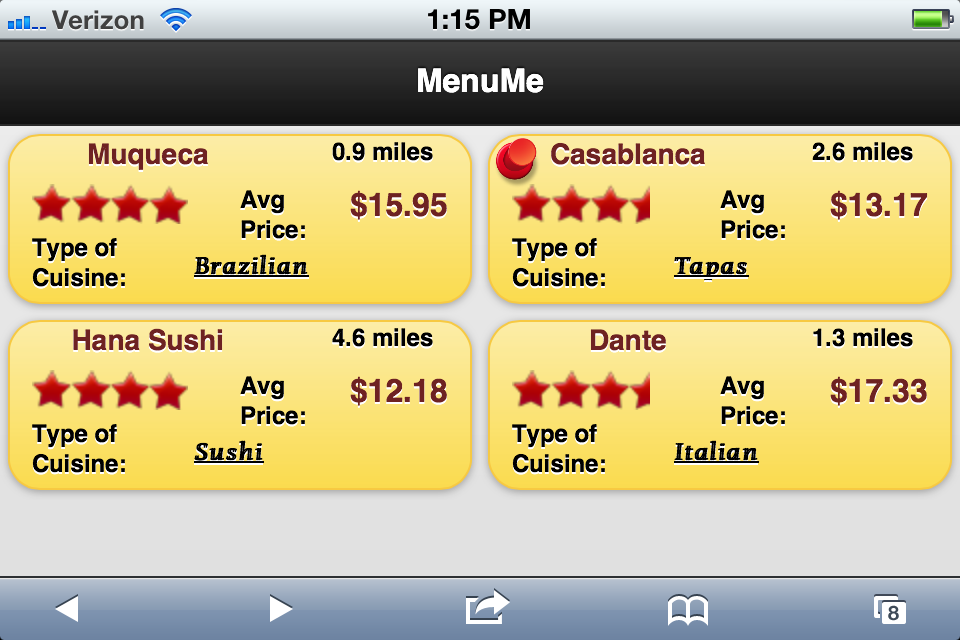
After the loading screen, the user is presented with four restaurants in the immediate area of their location. The
screen The screen represent each restaurant on its own tile, and provides basic information for each restaurant such as rating,
distance, price, and type.
Design Features and Decisions: - *Tiles Restaurants are no longer visibly stacked on top of each other. * This decision removes the physical representation that there are additional restaurants to choose from, which reduces the learnability of the application. This concern prompted the need for a learning screen. Displaying the four choices creates a more simplistic feel to the application, and increases the amount of information we can provide on a limited canvas size.
- Clicking on the restaurant places a pin on it. Once the user finds a restaurant that they would like to learn more about, a pin a placed on it, and once two are selected, the application will move on to the next step. The pin is user as a physical analogy of pinning a something to a board - the mental association of keeping it in mind.
- Placing a pin freezes the card in place. This design adds to the safety of the application. A user will not be able to 'swipe' off a pinned restaurant without removing the pin first. It increases number of steps required to remove a pinned choice, but for the general case, a pin is suppose to signify choice the user wishes to learn more about.
- Remove and Create animations. When an user swipes in a restaurant tile off the screen, the animation will show that particular tile sliding off in the same direction. The feature provides immediate feedback for the user that is consistent with swiping. Once one restaurant is swiped off, another one will appear from a different location. This option, as opposed to it coming back from the same direction, suggests that the tile is a new one instead of the same one. In some test cases, users had difficulties recognizing that a new choice had showed up, and the animation decision was aimed at this issue.
| 
|
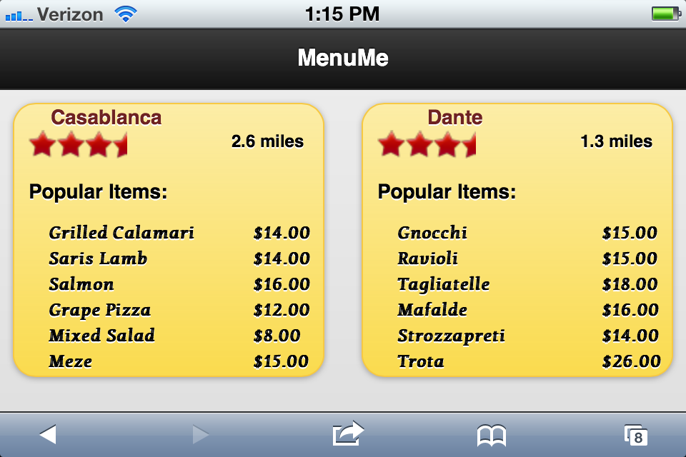
On this page, the user will be analyzing between the two pinned choices, and more menu information is provided for this comparison. The user can now pick one of the choices to receive even more in depth information.
Design Features and Decision:
- Display of additional meal choices. Once a user has decided upon two choices, the most important information that could be added to help make a decision between two restaurants is menu options. This pages provides as many possible option on the limited space.
- No swiping animations. At this point in the searching process, the user does not need to continue to search for other options. If they would like to do that, returning to the previous page will return the user to the state before two pins. The decision is based on the process of restaurant search provided in our limited user testing. With a larger study, this feature may be altered in later implementations.
| 
|
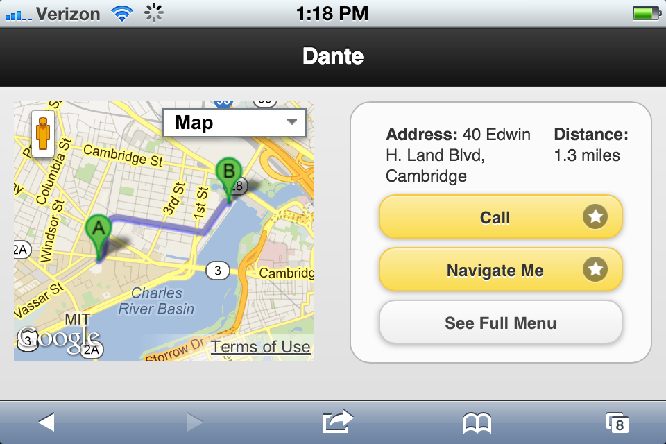
The last page displays details for the restaurants that will help the user finalize his or her decisions to go to restaurant of their choice. The page displays a general map to represent the location of the restaurant as well as links to external sites for more information. The user can use this page to make calls, receive detailed information, and look at the full menu.
Design Features and Decision
- Display of Map only. At this stage, the map provides the user with added assurance that the choice they have made is correct relative direction form where they are. The goal to help them make the decision on a restaurant, and the map aids in that task. If the user needs detailed directions, the navigate me options will utilize other, more power applications to provide detailed directions.
- Call, Navigate Me, and Full Menu Options. Our application helps the user decide on the a restaurant to attend. These external links allow users to have a more in depth analysis of their choice, and utilizing other features of their device to accomplish this.
| 
|
Implementation
MenuMe was implemented for Mobile Web utilizing HTML, CSS, JavaScript, and jQuery. No formal framework was used. The key feature of the application was the user's ability to swipe away restaurants in which they were not interested, and retain restaurants that were appealing to them. The goal was simplicity, and this design choice achieved this.
As seen in the first computer prototype, users could initially drag the restaurant tiles around. If the tiles moved more than a certain number of pixels from the starting point, the information on the tile was changed to contain a new restaurant's data. A user could then click the tile to highlight it and keep it on the page. While the implementation worked, learnability was not great since the actual process of choosing two restaurants was not immediately apparent. Also, the process of dragging a tile was not synonymous with removing it.
To fix these usability issues, we removed dragging and bound 'swipe' event handlers to every tile. Swiping a tile removes it, and an animation shows a new one taking its place. This animation is much more intuitive, and users responded by actually knowing what to do without a demo. Another new implementation choice involved showing a loading screen when the app starts. This loading screen showed an animation in the background of tiles being swiped away and new ones arriving. This animation greatly increased the learnability, and the feedback was much better.
The other implementation features of Google Maps navigation and phone calls was straightforward. The main implementation problem involved the swiping of tiles and generally how users picked two restaurants to compare. We concluded that our application successfully conveyed the correct message to users through the implementation, and the application met our satisfaction.
Evaluation
For our user test, it was important that we did not give a demo before the test. The greatest learnability problem in our application is figuring out that tiles can be swiped and pinned. If we showed a demo, this behavior would be immediately apparent, and the test would not be indicative of an actual user scenario.
...