...
| These photos are of the second version of our prototype. | ||
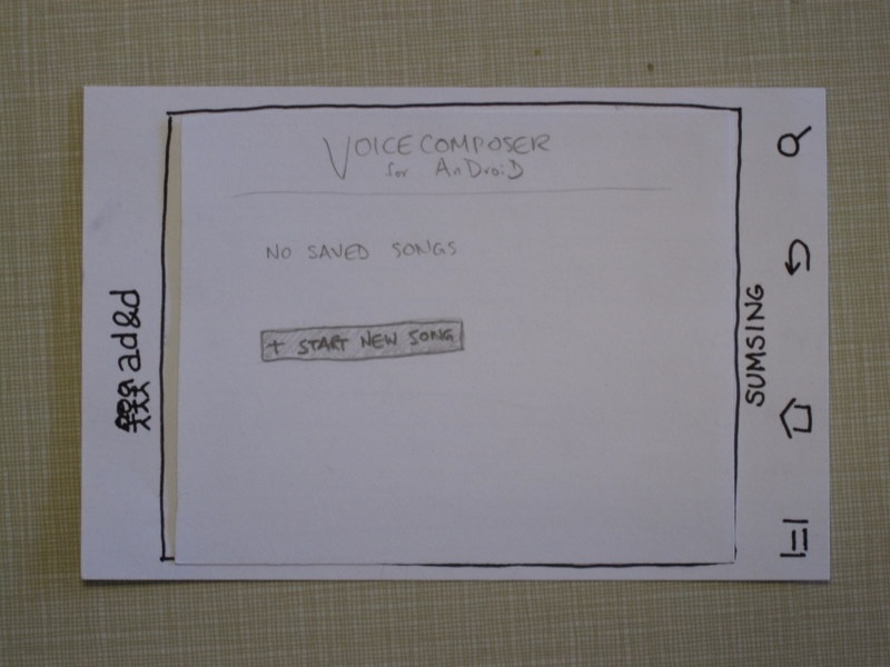
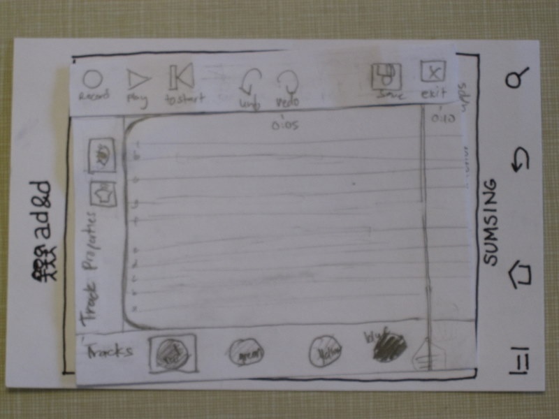
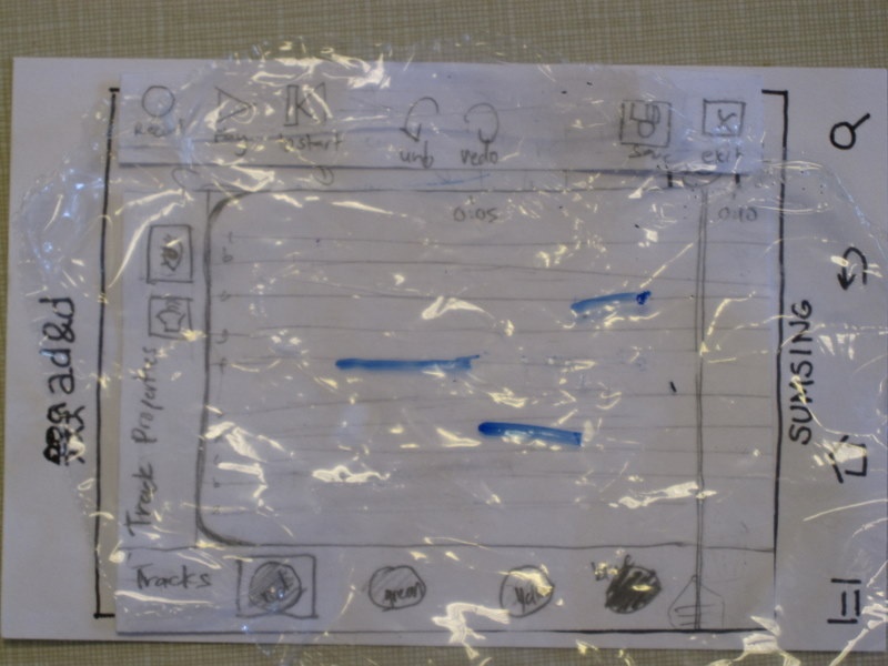
| Click "+Start new song." The menu bar at the top reads, from left to right, "Record, Play, To start | Undo, Redo | Save, Exit." | ||
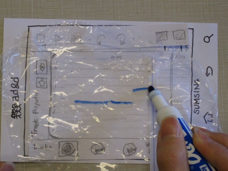
| The first task is to record a melody. When record is hit, the red line (here represented by a blue line) progresses across the track. The user hums or sings into the phone and a line of the appropriate color is drawn. Here the line is supposed to be red, since the red track is selected. | ||
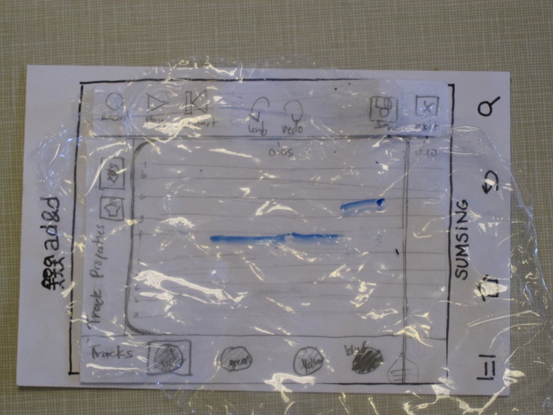
| After the user finishes singing (two notes here), he presses stop. The menu returns to the original menu, and now we have some notes on the track. | ||
| some text | ||
| some text | ||
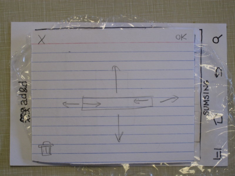
Say the user taps on one of these notes to edit it. The note plays, the interface zooms into the note (the note stays the same color, and if there were other notes nearby, they would also be visible in this view) and a transparent overlay pops up with these options. You can manipulate the note by dragging it or extending and shortening it (dragging a note causes it to play all the notes it's dragged to.) We actually tried two alternatives for this note-editing view; this zoomed-in interface, and a not zoomed-in interface where you edit the note straight on the track. The zoom, we hoped, would require less accuracy of users to get the exact note lengths they want, but it was difficult to tell which was more effective in the paper prototype, because our "playback" wasn't very accurate anyway. | |||
| Say the user drags the note down, then exits the mode. The note now appears lower on the track. If the note were dragged below the track, the lines on the track would become more dense to accommodate the lower note. | ||
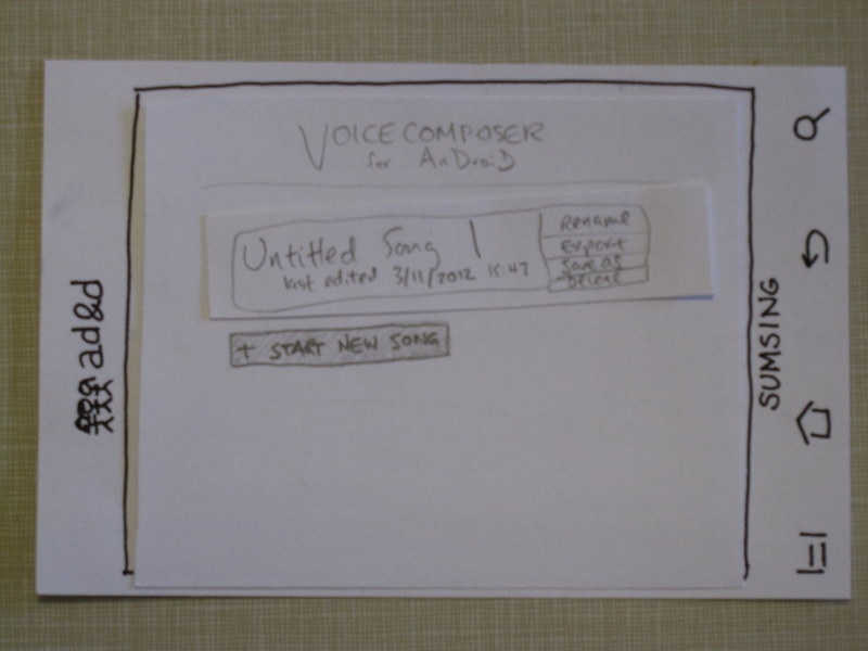
| The user presses save, then exit. The song is now visible on the main screen, with its title, time of last edit, and options to rename, export, save as, and delete. | | some text. |
Briefing
Our project is called VoiceComposer, and it's intended to let users quickly record a melody they're thinking of onto their smartphone.
...