Presentation Links:
Design
Images - DJ Interface |
Description |
|---|---|
|
Heuristic Evaluation:
|
|
Heuristic Evaluation
|
|
Heuristic Evaluation
|
|
Heuristic Evaluation
|
|
Heuristic Evaluation
|
|
Heuristic Evaluation
|
Images - Listener Interface |
Description |
|---|---|
|
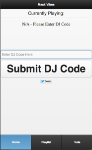
When a user initially opens the application, they see this default home |
|
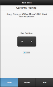
After submitting a valid "DJ code," information begins to populate the |
|
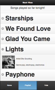
In this screen, the user sees the list of songs that have been played. |
|
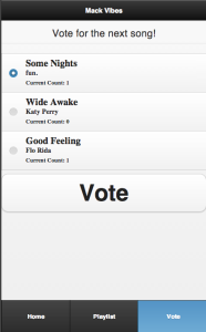
This is the voting screen. When the DJ selects songs for the listeners |
Implementation
For mackVibes, we used HTML/CSS/Jquery to design and implement the front end. Initially we chose to use twitter bootstrap to design the application, but this implementation decision caused problems. Instead, we found that using the jquery mobile library provided for an easier designing process, as well as a consistency for mobile web applications that we could not achieve using twitter bootstrap.
On the mobile application side we used echonest, an api used to gather and display information about a song, artist, or track, and utilized this to present important information about songs played by the DJ.
For the backend we utilized node.js as well as bcrypt.js files for password encryption
For the desktop app, we used twitter bootstrap typeahead files for the song autocomplete and the echonest api for song data and information. We used the g.raphael.js library for all of the graphs displayed in our user interface. We also used the jquery validator plugin for registration and login validation. Finally, we used socket.io for all of the realtime aspects of our app and all dynamic updating of elements.
Evaluation
Users:
Because we had 2 interfaces for our project, we had to pull two different types of users.
- User Type 1 - DJ: A College DJ that often Dj's at parties whether for pay or free.
- User Type 2 - Party-goer: A College student that frequents parties
Of these user types we had 3 Dj's
- DJ 1: A Senior at MIT, with 4 years of experience Dj'ing fraternity parties.
- DJ 2: A Junior at MIT, with only about 1 1/2 years of experience DJ'ing fraternity parties
- DJ 3: A Freshman at MIT, who has only DJ'ed at about 2 parties thus far in his career
We also had three random party goers (their background is less important since the focus group for MackVibes is the Dj community).
Briefing:
DJ
You've just finished setting up your equipment to DJ for the party tonight, however, you don't quite know what kind of music the crowd is going to like THis is a new audience, and you don't want to perfom badly. You have decided to Use MackVibes, which is a software that allows you to interact with your audience, by giving them options for songs to vote on by the click of a button, or simply provide them with the name of songs currently playing.
Audience
You've just shown up at this awesome party and heard of this cool application that allows you to rate the song currently playing, check information about songs that have already played during the night, or vote between a set of songs to see what they want to hear coming up.
Tasks:
DJ
- Theoretically download our plugin and organize his music into a playlist for the party
- Select 3-5 songs for the audience to vote on, and begin the voting process
- End the voting process and analyze results, both
- Genre popularity, and
- The overall mood of the party
- Analyze feedback from the audience about the overall performance
Audience
- Vote for song to listen to in the next few minutes
- look at previously played songs from the audience and interact with that list
- Upvote and/or downvote DJ performance
Usability Issues
User |
Issue |
Severity |
Possible Solutions |
|---|---|---|---|
DJ #1 |
Samples for the music in the queue and when searching would be useful |
Minor |
We will have difficulty making sure that this does not interfere with other songs being played by the DJ on other devices, but if desired we could utilize any other aspects of the EchoNest API to play small samples when prompted. |
|
Drag and Drop to add songs to the queue |
Cosmetic |
Add jQuery functionality on the page should it be used on a laptop |
|
Confirmation before playing a new song (Error Prevention) |
Major |
Add a small pop-up window over the queued item that confirms the play |
|
Search is very useful |
Good |
N/A |
DJ #2 |
DJ Feedback on the homepage does not display correctly |
Major |
Make the DJ Feedback more minimal, remove other inhibiting features like pop-ups |
|
Queuing genres rather than songs could be useful |
Minor |
Have the genres as options to be queued and voted upon on the home screen |
|
Set up Queue like Reddit, with upvoting/downvoting |
Minor |
To avoid popular songs becoming too overplayed, songs once played can be take off the queue. |
|
Search lets user click an entire row |
Good |
N/A |
DJ #3 |
Voting runs in the background for DJ |
Minor |
Maintain the voting tally while on other pages. |
|
Sortable song lists |
Minor |
Using a jQuery / Javascript tool, implement columns for the data, and sort the info in those columns |
|
No graph about song votes shows up |
Major |
If added, the votes for songs would show up as an option on the Vibes page of the DJ interface. |
|
Make sure the bottom menu stays fixed |
Major |
Code fix in CSS, adding a fixed position attribute to the bottom menu |
|
Change 'Previous Winner' to 'Now Playing' |
Cosmetic |
Code fix in HTML. |
|
DJ feedback last hour shows no information |
Minor |
After songs have been played, more information shows up. Until then, perhaps show text that says no data has been gathered |
|
Auto-Login after registering |
Major |
Change destination page after registration to the DJ interface page |
Client #1 |
Case Sensitive DJ code |
Cosmetic |
Changed backend to ignore case. |
|
Submit DJ code button should disappear after submission |
Major |
Once the party client has submitted DJ code, remove the button until party ends or party client wants to leave. |
|
Rate the party at the end, between 1-10 |
Minor |
Add some feedback on the DJ interface that shows the party's votes from one to ten, add a voting feature on the client interface |
|
Notification when voting starts |
Major |
Push Notification, color change, or device vibration are all viable options for alerting the party client that voting has started |
|
Voting has a timeout so that the DJ doesn't have to go back and forth |
Major |
After a set amount of time, the voting poll closes without input from the DJ (although he can end voting as he pleases using our current UI). |
|
Rate the Party feature is great |
Good |
N/A |
Client #2 |
Tablet interface is weird - Text is too big, page is not scaled to phone |
Major |
Make sure text responds to change in viewport's size. |
|
TEST ON THE PHONE |
Major |
Some features and UI elements (pictures, text, menus) need to adjust based on the width of the screen. Change the CSS properties that control those aspects and have them show up the same way regardless of screen size. |
|
Send comments to DJ |
Minor |
Add a push notification-ready message tool on the client interface, perhaps on the home screen after the 'Submit DJ Code' button disappears. |
Client #3 |
Vote on party and song. |
Good |
N/A |
|
Change the voting style to that of 'Rate the Party', good for users used to one-click functionality |
Cosmetic |
This defeats the purpose of voting, and changes things way too much. We probably wouldn't try to change the UI to this. |
|
Add an Undo button after voting |
Minor |
Once voting happens, an undo button removes one from the DJ's vote tally and the party client has until the poll ends to change his vote. |
Reflection
When starting out with this project, our main goal was to keep things simple and unobtrusive, while still providing the user with useful features and information. We had to keep in mind that the DJ would be constantly using other software and thinking about what music to play and that the listeners would probably only use the app while being at the event. Therefore, in terms of assessing risk, we wanted to make sure that the DJ app would be as efficient as possible for the DJ and that the listener/client app would be as high in learnability as possible for the listeners.
Paper Prototyping
We started off with a paper prototype. In the first iteration, we attempted to include as many details and features as possible. Our plan was to test the functionality of the features that we wanted, but excluded things like a signup/login process. After the first round of usability tests, we quickly noticed that things were too cluttered and inconsistent. This caused a lot of confusion for out testers. Given our goal, we decided to make things simpler by reducing information we provided and providing navigation bars.
Computer Prototyping
Our second round of prototyping consisted of computer prototyping. For this round, we tried to optimize the efficiency of all features for the DJ app and focused on the simplicity and consistency of the listener/client app for the listeners (while keeping the features we didn’t remove during our paper prototyping rounds). Feedback from heuristic evaluations left us in a good position for implementing the backend of the project. For the listener app, we had to focus on making things more visible for the user, given the scenery that they would be using the app in.
Complete Implementation
For our last round of testing, we had out backend implemented. In this round, we finally included a login/register page for the DJ and a way of connecting the DJ app with the listener app. However, by this round, the design was pretty much finalized and we simply had to focus on fixing bugs that were causing UI problems.
If we could do it again...
If we could do this whole project again, we would probably focus on trying to test the product in more realistic settings. Using the DJ app for an extended amount of time and using the listener/client app during an actual event is extremely different than sitting down for a few minutes. Therefore, if we could have performed such tests earlier on in the process, results and observations could have been much more useful. We would have also spent more time in figuring out how to implement more useful visual hints. It would have been interesting to look at different forms of implementing the synchronization between the DJ app and the client app (for example, one alternative would have been using a bar code and having listeners scan the code on their phone).
One final thing that we would probably do again is another 2 iterations of the entire design process. As discussed earlier in the semester, the process that we went through should really be a continual one. We should really prototype, evaluate, and user test multiple times. I think if we had gone through the design process 2 more times our user interface would have turned out a lot better.
