You are viewing an old version of this page. View the current version.

Compare with Current View Page History

« Previous Version 13 Next »

Paper Prototype Design

Photos

Reading

Tagging

Filtering


Briefing

Tasks

Index Card

Description


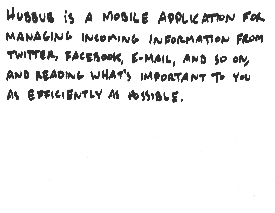
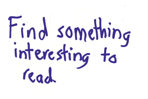
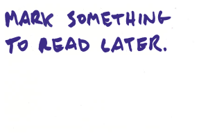
This was our first task. There are two index cards because we updated the task part-way through our paper prototyping. This task is meant to prompt the user to explore our reading interface so we can see how easy/intuitive it is to read information.


This was (sometimes) our second task. This is a form of organizing/saving information (our third high-level task in GR1) that we wanted to test. We learned later on in our paper prototype testing that the behavior of this feature confused some users. It is not consistent with how users prepare items for reading later in emails/twitter/etc, and it was unclear what was supposed to happen when the users hit the "read later" button (does the item go away? etc.).


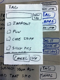
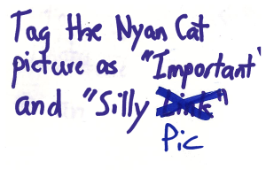
This was our second/third task. It is also a form of organizing/saving information like the previous task. Our paper prototyping users told us that the tag menu/general functionality was more straightforward than the "read later" functionality.


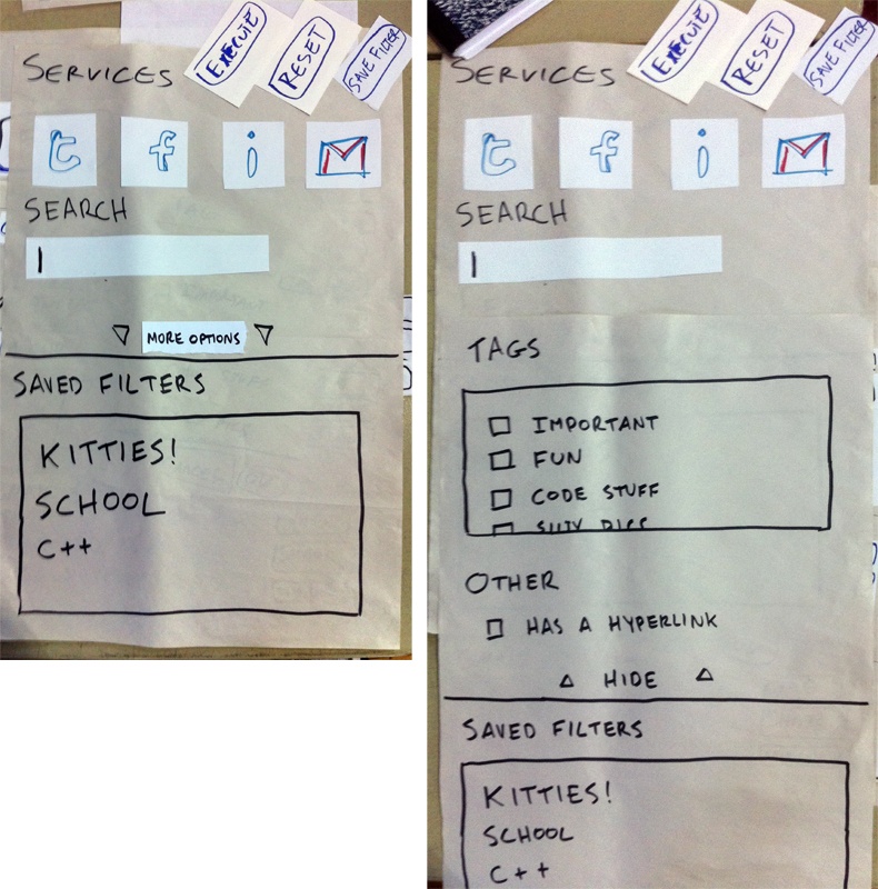
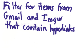
This was our last task, testing our implementation of the filter task (second high-level task from GR1). It was our most complex task, and was changed the most in our iterations for our paper prototype.

Analysis

Observations

User

Tom's Notes

Rahul's Notes

Leilani's Notes

User 1

computer


--user wants email marked unread when hit “read later”
--user wanted to scroll early in the test
--“silly link” != “silly pics”, need to fix task index card (but scrolled in the task list to find it, is this --intuitive?)
--need to show somehow that items are tagged
--filter - toggle or include
--user tried looking for “href” in search bar
--user wants to see results before saving filter
--user wants to rename filter to “links” (how would a user do this?)
--we forgot to print out sharing material for paper prototype
--we forgot the add “shrink” button option for when users are reading stuff
--user thought reset button resets filter options only (resets the form, not the filter)
--user wants views and easy access to the original state of the feed
--user wants an “x” button to kill the filter (to get to original state)
--user wants a preview button
--user thought saved filters section = advanced section in filter menu (paper prototype issue only?)

User 2


computer?

--User was unsure what “read something interesting” meant (didn’t try to expand any of the information in the list, just tried to read them as is)
--filter
    --toggle/selection not clear for sources
    --hard for user to specify links in filter. took a long time to find link checkbox (too hard?)
    --user felt getting back to the information was not clear (hit read tab vs back button)
    --navigation
        --filter menu needs execute button
    --user wants ability to make “views”
    --user wants to split “views” by source (only see email, only see something else, etc)
    --user wants to have a small filter menu directly on the read page (like firefox search bar?)

User 3


computer

User 4


computer

--clicked on gmail “icon” directly, rather than the email content
--user felt “saved!” feedback was confusing when marking the item
    --user said gmail already saves it, so why is it being “saved” here? what does this mean?
--read later button should change if item is visited already
--user felt tagging functionality was straight-forward
--user felt our interface was really busy
    --user would rather click on the item to access the (read later, save, tag) buttons then have them always there
--user felt “read later” functionality was unclear, where does it go after marking it “read later”?
--user wants read items to go away after reading them
--being able to drag things off of the screen to delete them sounded like a nice feature to the user (Rahul showed user an example of this, similar to dragging things off the dock in Mac taskbar)

User 5

computer


--I only have half the notes for this test because I was working on RS2 testing for a bit
--user used execute button on the filter menu!
--user hit the item itself rather than the “shrink” button to shrink the information
--user picked things he liked for read later (opposed to things he wasn’t finished with, paper prototype issue only?)
--new tag button’s functionality not immediately clear to user
--user wants multiple sharing options, not just one for the source being read

User 6

computer


--user’s first comment was that our interface is very busy
--user hasn’t really used twitter (user wasn’t sure if he needed experience to use this interface)
--tapped on text of top email (and tapped it to shrink again)
--tag task went quickly
--user liked Tom’s silly sound-effects
--user identified and hit filter button quickly
--user tried to save filter (we didn’t implement saving of this filter! just the button)
--user felt the interface was relatively straight-forward and simple to use

Iteration

We performed half of our paper prototype tests before making any considerable changes to the interface. We made the following changes:

  • Eliminated the “tabs” format
  • Modified the first index card to “find something interesting to read”, rather than “read something interesting”
  • Changed access to the filter menu as a button at the top of the screen
  • Added an execute button to the filter menu that automatically brings the user back to the original reading interface (with filtered content)
  • Changed the description of the button that reveals more options in the filter from “advanced options” to “more options”
  • added “shrink” buttons to expanded content
  • Specified to users that the buttons for sources in the filter menu “toggle”

We noticed these changes had the following general effects on our subsequent users:

  • Users more quickly and confidently navigated through our filtering task
  • Users were somewhat less confused about how to access the hidden filter options in the filter menu
  • Users interacted more with the reading interface (the first task was clearer)
  • No labels