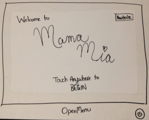
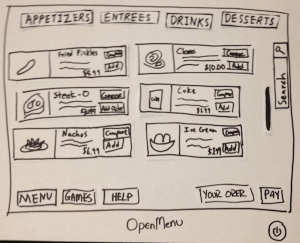
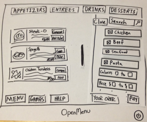
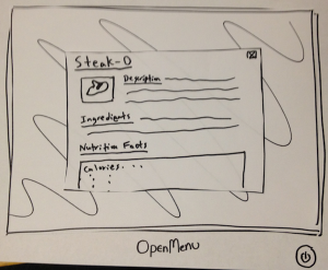
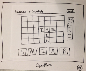
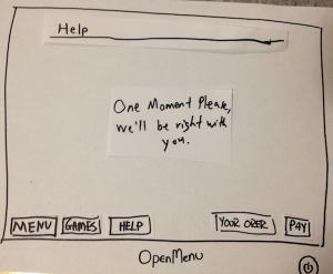
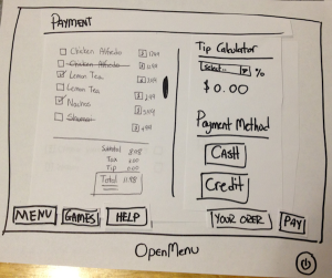
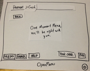
Prototype Photos
|
|
|
|
|
|
|
|
|
|
|
|
|
|
|
|
Briefing
This is the briefing statement we gave to our testers:
Hello and thank you for help us with our project, OpenMenu! This is _____, ________, and __________.
Picture this:
You are going out to a restaurant on a Friday night with a couple friends. When you are seated, you notice that instead of menus, your waiter has grabbed tablets instead. Your waiter informs you that the restaurant is trying out a new electronic ordering system. The purpose of this new ordering system is to make ordering and waiting at restaurants faster and more efficient and to entertain customers while waiting for their orders to arrive.
To help us test the system, we're going to ask you to do some scenario tasks.
Scenario Tasks
# |
Title of the Task and Statement to User |
Steps of the Task (For our personal use) |
|---|---|---|
1 |
Viewing and Ordering FoodsYou and your friends were just seated by a lovely waitress at Mama Mia's. |
1. Scroll through the menu |
2 |
Play Some Games You and your friends just ordered some delicious food from Mama Mia's. In the mean |
1. Navigate the game screen |
3 |
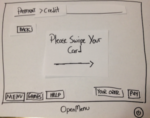
Pay the BillYou and your friends just finished your delicious meals and everything was wonderful.Only thing left to do is to pay the bill. So:- You pay the bill |
1. View the bill |
4 |
Filter and Comparing Foods You and your friends are very impressed by the number of items on the menu, butsome want beef while others want seafood. So:- You filter the items that appears to suit your preferences. |
1. Filter the menu based on certain specifications |
5 |
Ask for HelpYou and your friends have just spilled a drink accidentally and really need help from the waiter/waitress. So:- You get help |
1. Click on the help button |
6 |
Do the Tutorial (Iteration #2 task only)
You are slightly unsure of how the new device and system works and decide |
1. When the system starts, click on |
Observations
Prototyping Iteration #1 Notes
User |
Description |
Lessons Learned |
|---|---|---|
1 |
Task Presented: Play Some Games |
|
2 |
|
|
3 |
|
|
Prototyping Iteration #2
User |
Description |
Lessons Learned |
|---|---|---|
1 |
|
|
2 |
|
|
3 |
|
|
Prototype Iteration
After the first prototype iteration, we noticed a lot of key flaws that caused our prototype design to change.
Switching from a Tab System to a Button Navigations System
One of the most common responses we got was that they did not like our tab system. Some users though that it reminded them too much of web browsers or settings tabs on computers, so they don't "feel" like they were using a virtual menu. This issue was not noticed when we switched to using buttons as navigations system.
Displaying More Information when Browsing
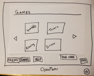
Users would like to know when their food was coming and when they are playing games they want the information to be displayed somewhere. We decided to make the system more efficient by displayed a mini info window in the games in the up right that displays important data like time and estimated food arrival time.
Adding a Tutorial Button on the Main Screen
One of the users suggested that we added quick tutorials to make the learning curve of the device better. We omitted it in the initial prototype under the assumption that it was unnecessary, but we decided to add it to the second prototype. We did get advise they we should avoid video tutorials and use interactive tutorials. We added the extra task of viewing the tutorial and got good feedback on it. It said it helped them learn of features they did not know available.
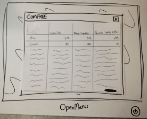
The Compare Feature is Hard to Use
We are having a difficult time teaching users hows to use the compare feature, since they have to make a list of items they want to compare. At first, we sued check boxes but users were unclear whether the check boxes meant added to their order or to the compare feature. During the second round of prototyping we chained it to a "Add to Compare" button would received better feedback, but it was still taking users a long time to use it. We need to make it more intuitive to use for better learnability, easier to add items to the list for better efficiently, and make it more noticeable when users have added it to the list for better efficiently.