GR3
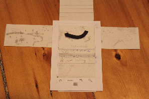
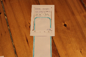
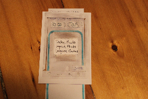
Prototype Photos
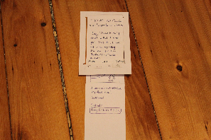
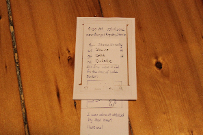
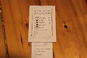
We used index cards to represent the Android phone and long strips of paper for our scrollable screens. We also used transparencies for the editable parts of the UI.
Timeline
Edit Mode
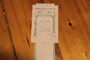
View Mode
Briefing
This paper prototype represents a design for our mobile application, The Travel Book. The Travel Book can be used to maintain a timeline, or a timed journal, of all your traveling experiences. Every journal entry can contain textual descriptions, photos, or contact information.
A few things a user should know before testing:
- This is designed for an Android phone-- Holding down on a screen is similar to right-clicking on a computer. Also, the four buttons below the screen are a part of our interface.
- Please let us know whenever you want to tap/scroll a screen-- we'll show you what happens (or what doesn't happen).
- For all text inputs, assume that a virtual keyboard will pop up. In the actual testing, however, you will be using a pen.
- For all inputs, the cursor is, by default, located at the end of the box's current contents.
Scenario Tasks
Task 1 - View a previous entry on your timeline.
Task 2 - You are traveling in Siberia. You see a beautiful view of some snow-capped mountains. Create a new entry that includes 1) a small textual description, and 2) a photo (that you will be taking).
Task 3 - You realize that your photo is blurry. Edit the post to replace the photo with a new one.
Task 4 - Share your entry online.
Observations
Version 1
Timeline:
- Users tried to accomplish some tasks (mostly sharing a post) using the "Menu" button at the bottom of the phone; however, these tasks are specific to a single post and cannot be accessed through the menu of the Timeline screen. No one tried to accomplish post-specific tasks by pressing and holding on a post, which we expected people to do, as this is a standard Android right-click analog. Perhaps this is due to the paper nature of our prototype.
- Users generally ignored the top part of the screen - likely because we chose to set our fake posts in Siberia (to reduce the necessary complexity of the map and pictures we create) and the users could not really connect the post locations to the map. We expect this not to be a problem with real users, as they will be creating posts at locations which they are familiar with.
Edit Mode:
- Users were confused as to how to add items that were not text (in particular, photos). Because there were no visual cues for adding photos and contacts, it is possible that users would not know about those features at all. Since we included "add a photo" in our tasks, users generally did so with the "Menu" button at the bottom. However, no users tried to do so by pressing and holding in the text box.
- Users were also confused as to how to delete non-text items (in particular, photos). The most common way people tried to delete photos was just by tapping on the photo, but that does nothing. What we intended was for people to delete the photo by moving the cursor to right after the photo and pressing backspace. We did not implement an Android keyboard into our prototype (they just wrote text with a pen on the transparencies), which likely affected people's actions. Users also tried to delete photos by pressing and holding on photos, which also did nothing in Version 1.
- Some users tried to move photos around by clicking and dragging on them. We did not think to implement this in our design, but we will add it to our list of features as it is a convenient way to edit posts.
- Users did not attempt to change the time or location of posts. This is likely because we did not include that in any of our tasks.
View Mode:
- Users took a bit of time to figure out how to do things (share, edit, or delete) to a particular post while in View Mode. They all ended up using the "Menu" button at the bottom, but they also could have pressed and held the screen. Although we thought pressing and holding was intuitive for most Android users, it is possible that this is not the case. However, all options that are accessible through pressing and holding are also accessible through other means (like the "Menu" button), and it is possible that the paper nature of the prototype is affecting people's Android usage intuitions.
Version 2
Timeline:
- Users were confused by the arrow on the map, likely because the posts were located in an unfamiliar place. One user suggested that we change the arrow from a solid line to a dotted line to look more like a path on a map.
Edit Mode:
- Users added photos using the new "(+ camera)" button, which was much faster than trying to figure out how to add a picture. The small buttons for adding items seemed to improve both learnability and efficiency significantly.
- Users were still confused about how to delete photos. Some just had no idea what to do, most just tried tapping on the photo. We decided that since everyone just tried tapping once on the photo, we would move the cursor to right after the photo when they tap it so all they have to do to remove it is press backspace. In addition, we added the ability to delete photos by pressing and holding on them, which helped a little but not as much as we would have liked. One user suggested adding the ability to delete photos by double tapping on them.
View Mode:
- Users were a little confused by the disappearance of the share/edit/delete buttons after a few seconds. However, when they needed to perform those functions it was more intuitive to use those buttons than the "Menu" button or pressing and holding the screen. Also the disappearance on screen will be less obvious and distracting when it does not involve someone physically moving the buttons away from the user.
- One user recommended that we toggle the share/edit/delete buttons by tapping on the screen. After they disappear, the user can tap once on the screen to get them back, and again to make them disappear. This seemed more useful than having them appear when the user scrolls, since the user may want to view the entire post cleanly while they are scrolling.
Prototype Iteration
Our first prototype was the Timeline screen of the second design mixed with the View/Edit screen of the first design. We made a few big changes to improve the visibility of some features and to improve the learnability of our UI.
Edit Mode:
- We added buttons above the text box for adding photos and contacts, with little icons to represent each. This visual cue not only informed users of the ability to add items other than text, it also made it much simpler for them to do so.
- We made it easier to delete photos by allowing the user to press and hold on a photo to have the option of deleting it.
View Mode:
- We added a set of buttons at the bottom of the screen (share/edit/delete) to allow users to interact with the post they are looking at. So as not to clutter the view screen, we decided to make these buttons disappear after a few seconds. They would reappear for a few seconds when the user scrolls then disappear again. We decided to make them temporary because if the user wanted to perform any of those tasks, they likely came to the view screen with that task in mind, so would press the button for that task right when they enter the view screen.
After testing with the second prototype, we decided to make a few more changes to our UI: