ElderConnect
Connecting family members via the web.
<STYLE mce_bogus="1"><!--
.pagetree2 a
--></STYLE>
GR5&6 - Implementation & User Testing
Design
Our final design focused around simplicity and learnability, to help our less experienced user population use our website. One of our first major decisions was to use metaphorical consistency to enhance learnability. The address book and phone interfaces are intended to mimick everyday objects that would most likely be already familiar to our target group. We also decided early on to avoid necessary use of the keyboard for most of the functionality. We felt that these design aspects address both inexperience with modern computer interfaces as well as motor difficulties, qualities that may be particularly pertinent to the elderly.
First screenshot: Add Contact phone
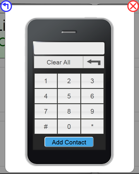
While we were confident the phone metaphor was applicable for calling contacts, we were unsure about using the same phone interface to add a new contact. Based on our paper prototyping feedback, we decided to remove the dialing and ringing sound effects we used on the regular calling interface. We also added an “Add Contact” button for adding the contact, instead of just automatically adding them once enough numbers were entered. Finally, from our heuristic evaluation feedback, we decided to make the “Add Contact” button blue instead of green, to differentiate clearly between adding a contact and calling a contact.
One design alternative we considered was making a “normal” add contact interface, similar to those used in other messaging clients. In this case, the user would enter multiple fields of information to add a new contact. However, we decided against this type of add contact interface to limit the amount of typing the user must do and remain consistent with the phone metaphor. We also felt that this non-conventional approach was acceptable, given that our user population does not have much experience with popular messaging clients.
Based on our heuristic evaluation feedback, we also decided to implement one-click calling instead of requiring the user to click “Call” on the phone interface. This extra click seemed unnecessary, so we removed it to increase efficiency.
Second screenshot: Homepage, focus on Add Contact button
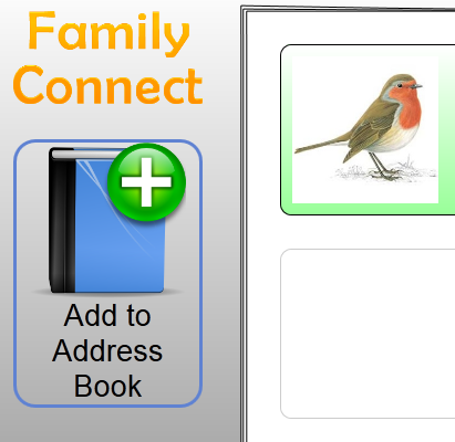
Part of our initial address book design was to use the next blank contact location as an “Add Contact” button, which would take the user to the Add Contact phone interface. While this avoided the trouble of placing an additional button on the interface, our paper prototype testers found this feature to be confusing, particularly because the button was always in a different location, depending on how many contacts were already in the address book.
Third Screenshot: Action Options and Message Options overlays
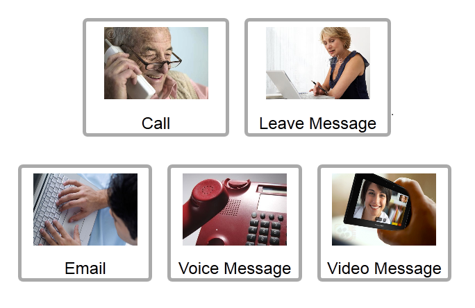
One last controversial aspect of our design was the use of action photos (photos of real people doing something) in a couple of our overlays. One of our heuristic evaluators suggested that we remove the photos and stick with traditional icons, which would make the function of the buttons clearer. We disagreed with this suggestion mainly because our user population, lacking in experience with modern software interfaces, may find the icons to be less clear than a real photo. Furthermore, we felt the action each photo represented was clear when coupled with a caption written underneath it.
Implementation
From a macroscopic point of view, the implementation is structured as three components: the PHP server (with MySQL), the Flash Media Server, and the client HTML/Javascript. The components interact with each other as follows:
- The client HTML is given as is by Apache HTTP Server.
- The client makes most requests with AJAX to the PHP script on the server side. These requests are in the JSON format, and responses are also in JSON. This allows us to easily pass objects back and forth.
- The client connects to the Flash Media Server. Our implementation uses the Flazr open source implementation of Flash Media Server. Alternatively, the Flash Media Server Development version could have been used, but it was too complicated to set up. We used Flazr for video chat, audio chat, video messaging, and audio messaging.
Many tradeoffs had to be made for implementation, primarily due to time constraints. Some of the tradeoffs we made were as follows:
- We decided to support only Firefox. Only Firefox supports CSS gradients and SVG grayscale filters (to gray out icons).
- We made extensive use of overlays. Instead of doing overlays by loading iframes, we decided to pre-load all the overlays using AJAX, and then construct HTML elements and execute Javascript to show the overlays whenever they are invoked. The advantages of this approach were that we did not have to wait for the iframe to finish loading, and that we could measure the size of the overlays beforehand. However, this in fact led to complications:
- No Javascript isolation. Unlike the case of using iframes, we no longer had any kind of isolation for the overlay’s Javascript. Therefore we used “new Function(...)” to compile the loaded Javascript so that it could be run under an isolated environment. As a result, a special selector was necessary to select only elements within the overlay. Also, it was impossible to debug (setting breakpoints, etc.) overlay scripts, because they were not being run as is, but compiled first.
- Naming conflicts. We had issues with the naming of elements with the same ID across different overlays. This wasn’t an issue with the Javascript technique we’re using, but it was an issue for CSS. Since CSS is global, all elements need to have different IDs if they want to have different styles. To be safe, we decided to prefix each element with the name of the overlay, which complicated our code.
- To support online status notification, message notification, and call notification, it would be ideal to have a Javascript based socket library. However, that isn’t very easy to do with PHP, so instead, we make the client poll updates from the server every few seconds, and let the server be stateless except the database. The advantage is that the implementation is somewhat much simpler (due to being stateless on the PHP side), and the disadvantage is that either we update too infrequently, or we flood the server with requests.
- The implementation has a major function called updateContacts. This function redraws the contact book (with pure strokes using canvas), and then re-constructs the HTML elements for the contacts. This function is called whenever the window resizes or whenever the list of contacts change. The advantage is that it’s much easier to implement than trying to add/remove things. The disadvantage is that it consumes lots of CPU power and potentially lots of RAM too.
- We decided not to make a UI for the child-user. Instead, the child side is only a plain registration form and a page for sending messages, reading messages, and seeing incoming calls. The implementation also does not support calling from the child side to the grandparent side because it would take too long to implement this feature, as we didn’t even have a prototype for such functionality.
- Some fine details are simplified to ease implementation. For example, when the grandparent calls the child, the child is supposed to accept the call. Instead, we don’t give the child such an option, and we simulate a few seconds of dialing time on the grandparent side. Also, for a real system, when the grandparent adds the child as a contact, the client should not show the picture and name of the contact directly (for security reasons, as the grandparent side does not require registration). It should wait for some form of confirmation from the child, perhaps through a temporary voice call. Our implementation skips this process as it is too complicated to implement, and is not fundamental to the overall usability goals of the project.
- The registration system skips the grandparent side. Instead, we assume there is only one grandparent using the system. This is sufficient for user testing. However, in a real system, there needs to be an implicit registration mechanism, and the server needs to keep some persistent data in the database; the client should keep only the implicitly assigned user ID in its cookie. Our implementation does not do this, but instead keeps a list of contacts in the grandparent’s client’s cookie.
Evaluation
User testing was conducted at The Boston Home in Dorchester, Massachusetts, a special care residence for adults (many of whom are elderly) with advanced Multiple Sclerosis and other neurological diseases. We connected with The Boston Home through a CSAIL graduate student who does research on assistive technology and who previously conducted user testing at this site.
The five users were within the age range of late 40s - 60s. Three were female and two were male. All had Multiple Sclerosis to various degrees; users were thus provided with trackballs to interact with our interface due to fine motor disabilities. Four of the five users were somewhat familiar with computers (mostly email) and one was unfamiliar with computers. Although these users were perhaps more computer literate than our target population, they were substantially less fluent computer users than typical MIT students, and all had visual and physical limitations that are more characteristic of the elderly population.
We briefed the users by explaining that the purpose of the site is to help people more easily connect with their family members. We also explained that we are interested in how users naturally interact with the interface, and reassured them that there is no right or wrong way to use the site.
All users sat in wheelchairs and interacted with the laptop on a pull-over wheeled tabletop. Four users used the trackball and one user chose to use the trackpad on the laptop instead. Half of the trackball users used their left hand to interact with the computer probably due to motor issues in their right hand; this was simple to accommodate since trackballs are agnostic to handedness and can be placed on either side of the laptop.
The tasks we asked the users to perform were the same as the tasks in our paper prototype user testing session:
- Your daughter/granddaughter Lily calls you and asks you to add her on FamilyConnect at the phone number 721-4146. Add her as a contact.
- Send Lily a message.
- Call Lily.
Usability problems observed
Users tended to use the keyboard to interact with the phone interface. (Major)
Contrary to our assumptions that users would interact more naturally with a mouse rather than a keyboard, most users preferred the keyboard over the mouse. This is likely at least due in part to their existing familiarity with email, yet even the novice user first reached for the keyboard rather than the mouse. Perhaps the users are accustomed to seeing other computer users interact primarily with keyboards, and thus assumed that the system was designed to meet this common case. Moreover, we noticed that it might actually be easier for those with fine motor disabilities to press keys on the keyboard rather than move the trackball and click buttons on the screen. This is consistent with what we learned in lecture about the physical effort required to execute aiming and steering tasks.
Potential solutions:
- Allow each action to be executable both on the keyboard and on a mouse. This is already true to some extent, but could be more extensive. For example, allow keyboard arrow keys to toggle between selections and the “enter” key to select an option.
- To accommodate users with motor difficulties, minimize the depth of action selection sequences to decrease amount of clicking required. This may result in a greater number of options on one screen rather than a funnel sequence, and would thus require further user testing to ensure that the large number of options would not be too confusing or overwhelming.
Even though users were told to add Lily as a contact using her phone number, one or two users still attempted to add Lily by typing her name into the phone. (Major)
This may have happened either because users had such a strong mapping between phone numbers and phone calls that they would not think to use the phone number for any other action.
Potential solutions.
- Conform to expectations and enable the name functionality in addition to the existing functionality. Allow typing of names into the phone’s existing textfield, and have the corresponding phone numbers of those who have requested the grandparent as a contact auto-populate depending on the name entered.
- Alternatively, give users a visual hint when they attempt to enter a non-number. For example, the numbers on the phone could blink or light up to hint that they should use those instead.
Users attempted to send voice/video messages before clicking the “stop recording” button. When this did not work, some gave up and closed the overlay. (Major)
It is possible that users are unfamiliar with the toggle functionality of record/playback.
Potential solutions:
- Separate “record” and “stop recording” buttons to increase the visibility of the “stop recording” functionality.
- (More complex and riskier) Use voice detection to determine when user has stopped recording. Then ask user to confirm whether they have indeed finished.
One user was unable to track the cursor on the screen due to minor visual impairment. (Major)
This user was also the least familiar with using computers in general, so is perhaps most characteristic of our target elderly population. Some of her remarks included: “Where is the arrow? I can’t see the arrow.” and “So do I need to put the arrow on top of Lily’s name?” Although most of the buttons on our interface were sufficiently large, one crucial thing we overlooked in our implementation was the size of the cursor. A solution would be to substantially enlarge the cursor or make it a more contrastive color so that it is easier to track.
“Add to Address Book” button was not immediately obvious. (Minor)
Most users spent some time perusing the (mostly blank) website before discovering that the Add button they were looking for was right in front of them. This may have been due to insufficiently large text under the icon, or simply that the icon did not immediately convey its meaning.
A potential solution would be to enlarge the text or place the icon more centrally on the page. A deeper solution might be to replace the icon with simply a large button with the word “Add family member” with a plus on it, so that the text immediately draws the eyes.
When the contact phone number entered was incorrect, users did not understand the error message. (Minor)
Potential solution:
Integrate error message into phone interface so that it looks less like an alert. Also, error message should state specifically that the user has entered the wrong phone number, so that the user receives more fine-grained feedback.
When calling Lily, some users were surprised that the phone dialed for them. (Minor)
It occurred to us that although our one-click dialing was intended to increase efficiency, the primary concern for users in this demographic is not efficiency, but rather learnability and safety. Users did not seem perturbed when they needed to dial each digit of a phone number or type slowly to construct an email message. They were more at a loss when the system reacted in a way that was not expected and that left them in an undetermined state. Thus, it may be beneficial to sacrifice some efficiency for greater learnability and safety.
What users found intuitive
All users interacted seamlessly with the Add Contact / Call / End buttons on the phone, as well as the Send button on the email interface. Many noted at this step that the interface is “simple and easy to use.”
Four out of five users correctly clicked on the contact itself to initiate a call or send message action. The fifth user, who was not familiar with computers, had no idea where to start partly because she could not see where the cursor was or what to do with the cursor.
Although users tried first to interact with the phone using their keyboard, they immediately understood that they could click on the phone’s number buttons once the buttons highlighted on mouse hover.
All users understood that the video icon which appeared during a call corresponded to videochatting.
All users understood that a call was being initiated once they heard the dialtone and dialing sounds.
Users appeared the most happy at the following points:
- When they saw the “Sending message...” notification turn into “Message Sent”
- When they saw Lily’s face appear in the address book after the contact was successfully added
- When they had a pretend phone conversation with Lily (the facilitator pretended to be Lily)
Reflection
Overall, we learned that prototyping and “failing early” is very beneficial to the design process. We felt much more committed to the design after having created the computer prototype, largely due to the substantial effort that went into its creation. Paper prototyping allowed us to quickly test three different ideas and change components more substantially.
We also learned that paper prototyping can oversimplify or gloss over important implementation issues, many of which we only discovered later on in the process. For example, the overlays were very easy to implement using paper cut-outs – and were perhaps even overly convenient to re-use for different overlay content during user testing, yet they became a major point of technical complexity in the computer implementation. Multimedia implementation was also easy to fake in the paper prototype but took a substantial amount of time to implement in GR5. Other details, such as the specific design of the message inbox (i.e. whether messages should be transient or permanent) were left out in the paper prototype due to the simplicity of user tasks, but had to be considered in the final implementation.
If we were to do this project again, we would perform more paper prototyping on the message inbox interface, and even try more variety of tasks, before implementing the computer prototype so that we would discover more “routes” through the system that might lead to pitfalls. We would also make more conscious decisions about which features to prioritize in the final implementation (i.e. multimedia vs. multi-page address book, message checking etc.) to ensure that we devoted the most time to components that were most crucial to the goal of the website.
Lastly, through the user testing we conducted at the Boston Home, we experienced first-hand how confounded some of our assumptions were about the target group (i.e. preferring keyboard vs. mouse) and how fundamental issues specific to our target group (i.e. visual acuity) can be easily overlooked due to our own daily routines and experiences (i.e. taking cursor tracking for granted). Ironically, some of our assumptions were wrong precisely because we had not realized that the users themselves bring to the table existing assumptions about “how computers work” due to having observed others using computers in a particular way. Not only may mouse clicks be actually less efficient than key hits for someone with motor impairments, but it is also possible that even an interface entirely devoid of necessary keyboard interactions would be used primarily via the keyboard if the user’s mental model associates computer usage with heavy keyboard interactions. Hence, when designing with a specific user group in mind, we find it is important to acknowledge that even completely novice computer users are in no way a “blank slate,” and that a user’s own observations and preconceptions are as influential to their computer interaction as any perceived lack of direct computer experience.
2 Comments
Edward Oscar Benson
"Overall Wiki presentation
: Good overall, but would be nice to include more details about the design choice (instead of just ""this is a form"") and the changes (e.g., what did the MapMe button do? was the functionality removed, or just a method of getting to that functionality. If users weren't clicking on it, was it because they didn't want that feature or because they weren't sure what it was?)
Design description: Good walkthrough and commentary on design decisions. I think you're the only group that wrote about how you went against your heuristic evaluator's suggestions :) But you make a fair argument and it's thought provoking.
Implementation: Very thorough; nice writeup on this. I'm still amazed you were able to get video/voice to work!
Evaluation: Fantastic evaluation. This was a great read. It's interesting that we think of ""click on a big picture"" as simple, but they all went straight for the number keys to punch in a phone number. ** And with regard to typing in names to add a contact: perhaps the elderly generation is more tech savvy than you initially assumed. However even if there are tech savvy grandparents, there is probably a huge variance in this population so aiming for an interface free of computer metaphors is still valuable/interesting for a big population. ** Another possible fix for sending video chats before ""stop recording"" is clicked: simply allow the ""send"" button to additionally halt recording if need be, before sending.
Reflection: very thoughtful.
Overall: Fantastic job! I wish I could give you more than 100 points.
"
Unknown User (cjcai@mit.edu)
Thanks for your thoughts Ted! I think your top 3 lines were intended for another group because we don't have a MapMe button...?