Scenario
Mother (passive user) wants to find pictures from her son's 6th birthday so the grandparents can view it. She is not sure where these picture are stored- if it is on a site, a camera, or anywhere. So she searches on the site for them. Once she gains access to it on the site, she distributes the picture (as well as maybe any other relevant ones) to the grandparents.
Goal: share a picture from son's 6th birthday
Individual Designs
Ken
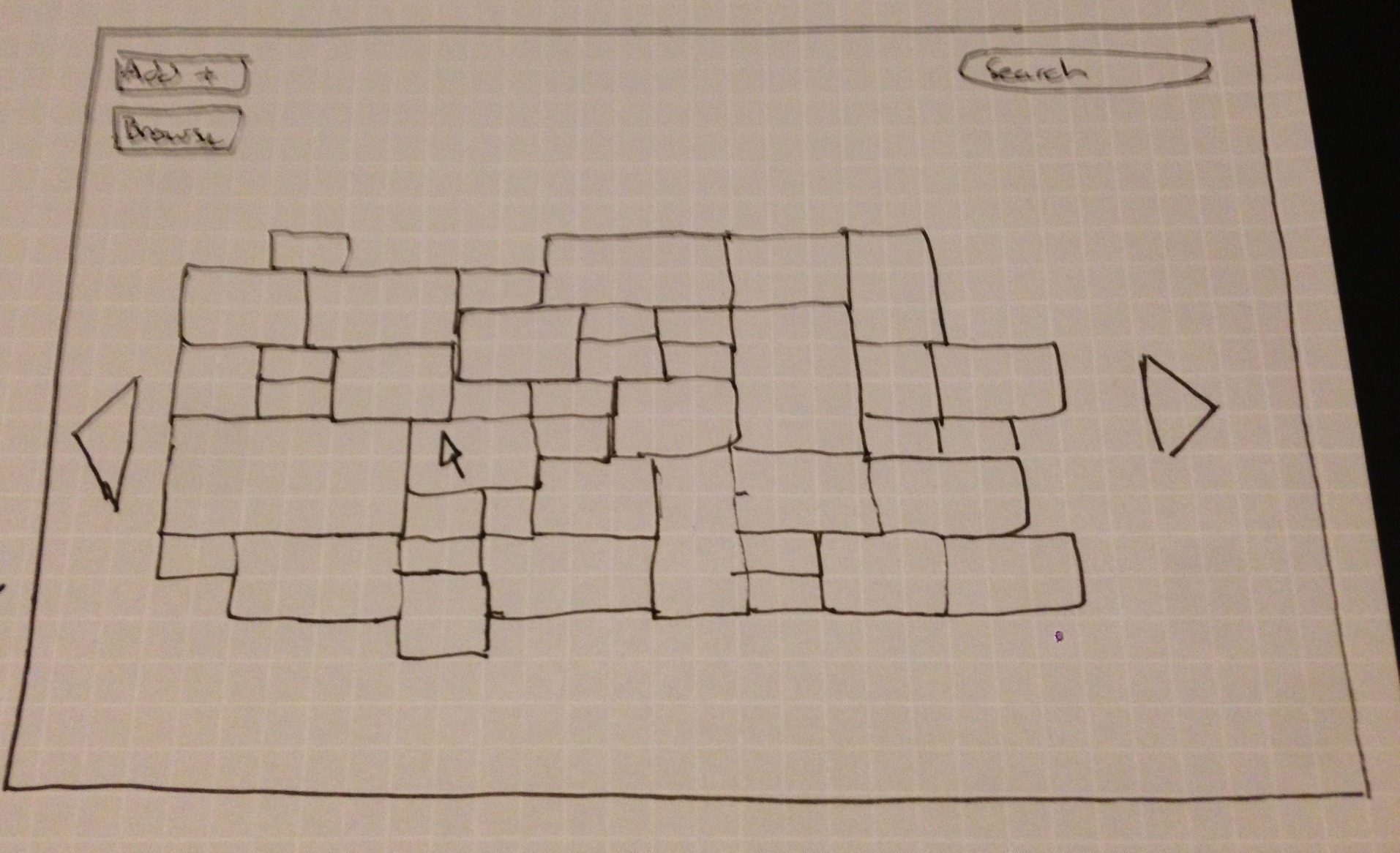
Fun Display
This design tries to make it fun for users to scroll through and find media. Items are displayed in varying sizes in a mosaic like form. This yields some uncertainty as to where certain items are but it gives the user a fun and new way to browse files.
The search bar is there to find a specific picture or event, but the layout is meant for the user to go looking for one thing and stumble upon several others in the process.
The design is not efficient for the user. The layout makes it fairly easy to learn how to use.

Efficient Design
This design allows the content to get to content strictly by searching.
The search results page not only displays relavant media, but it also displays potential people, albums, or events in a separate grouping. This gives the user easy access to the result type they wanted. It takes limited scrolling to find what you want in the results so it is efficient to get the result you want, and it only requires one page load. Search autocomplete aids the user in searching for relavant things. The user can search by person, event, date, or filename.
The landing page also presents the user with recent activity in case the other parent recently did something they were trying to do.

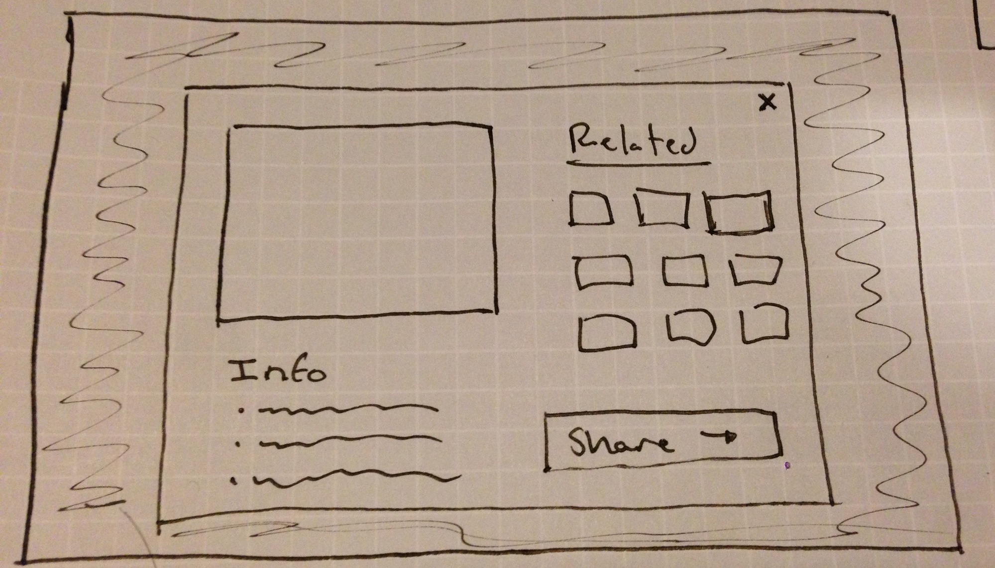
Large View
The larger view allows users with poorer eyesight to navigate with ease. It also attempts to display things to the user in a friendly way. The user will be less intimidated by the overly sized interface because they won't feel like they are missing something.
It sacrifices some efficiency by initially displaying media to the user one item at a time, however the option remains to see a grid like view of all the media.
The initial search for something can be made by person, event, or date. The calendar shows users which dates have files associated with them through color and mouse over pop ups. 
Joe
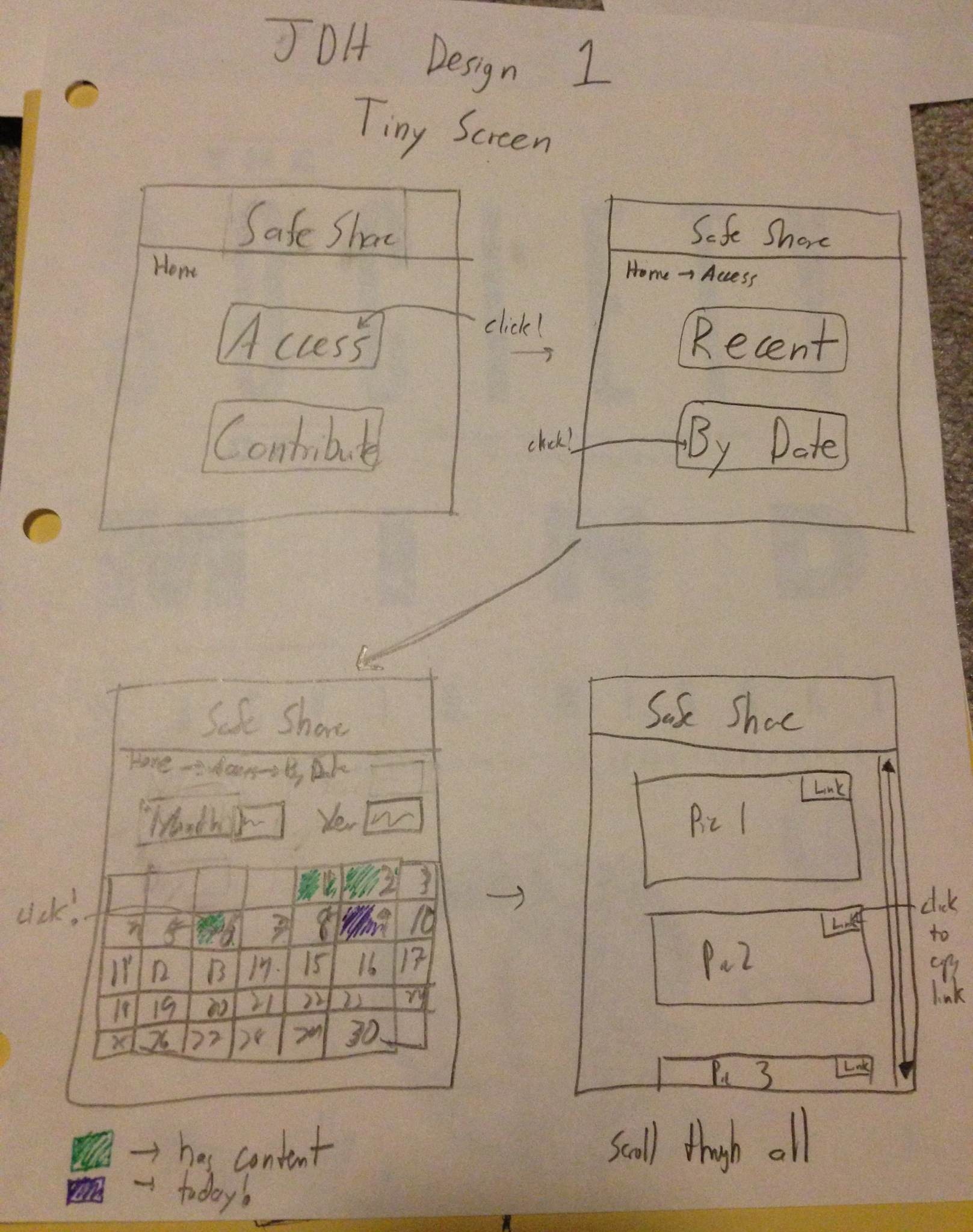
Tiny Screen
This design tried to tackle the extreme case of having a tiny screen, perhaps on a mobile device.
The process of finding a specific picture is done by searching through a calendar layout.
Sharing is accomplished by using the link provided for each picture. It is left to the user to share as they please.
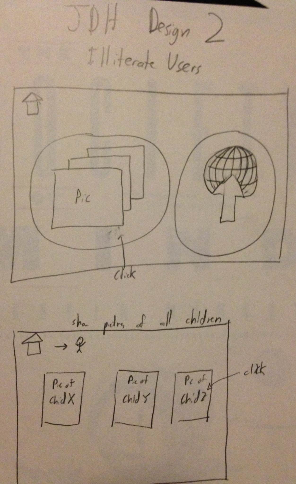
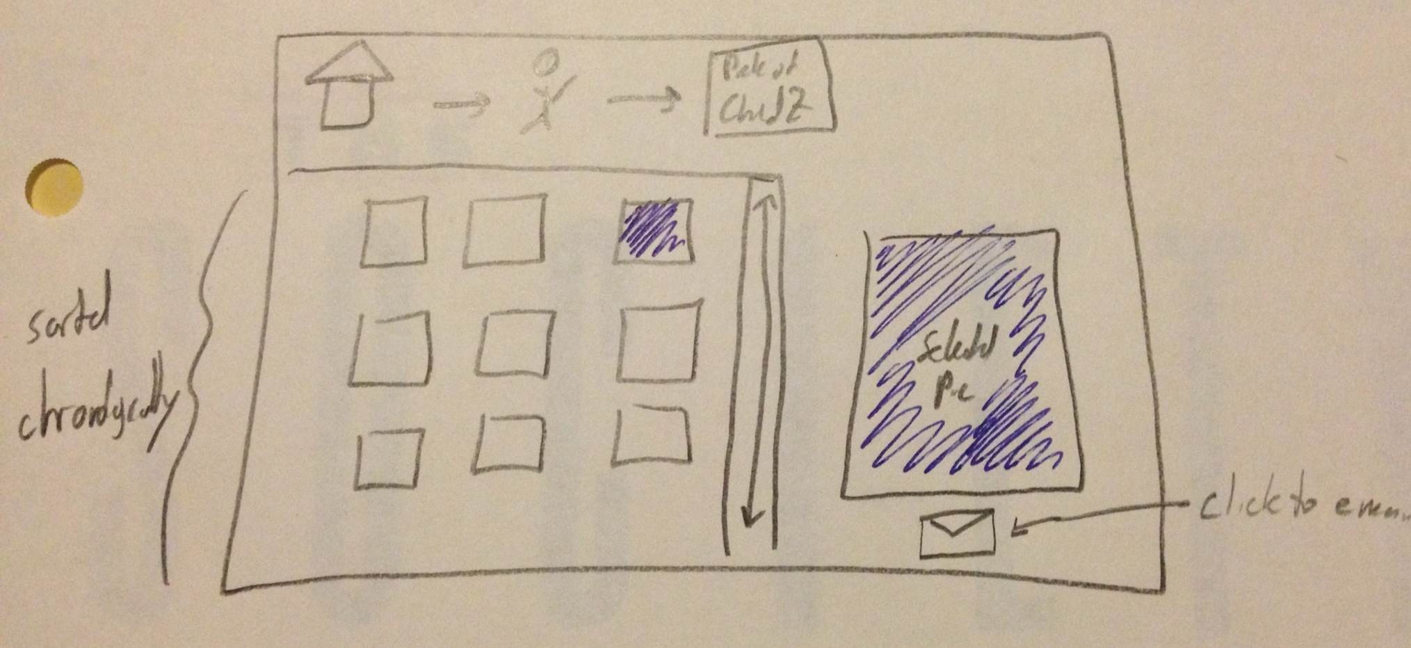
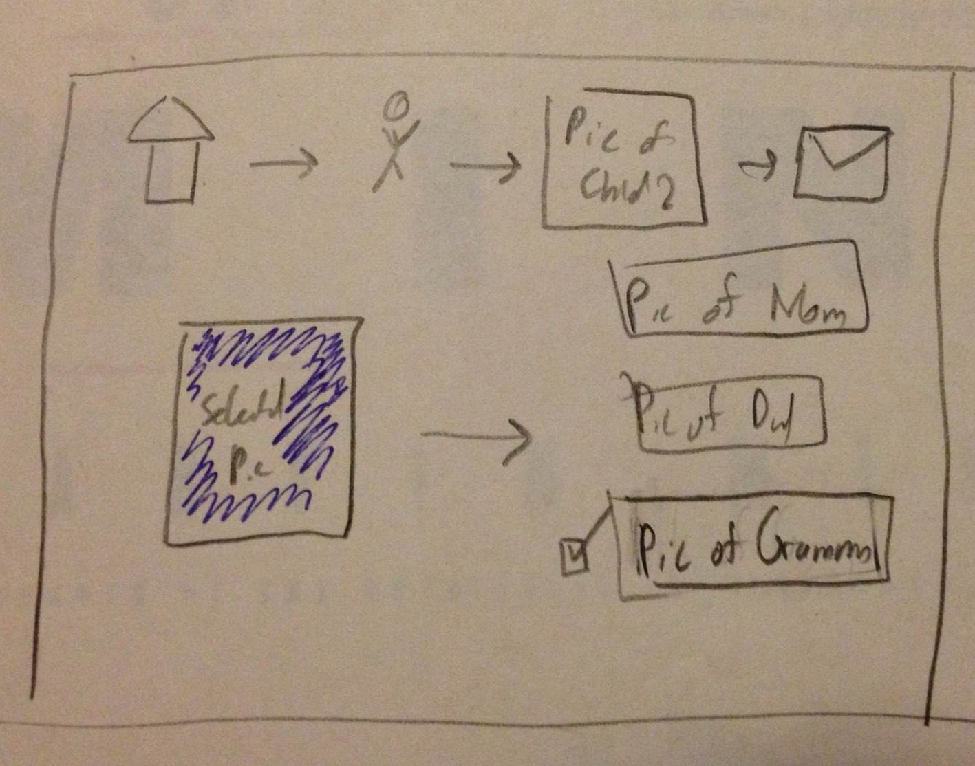
Illiterate Users
Tried to illustrate flow of site without text, so primarily with images. Visual breadcrumbs help understand where they are in the process.
Used pictures of children to illustration aggregation by person.
Pictures would be shown in chronological order which would hopefully be apparent based on the content. An envelope represents a link to email it. The recipients of the email are represented as pictures a well.
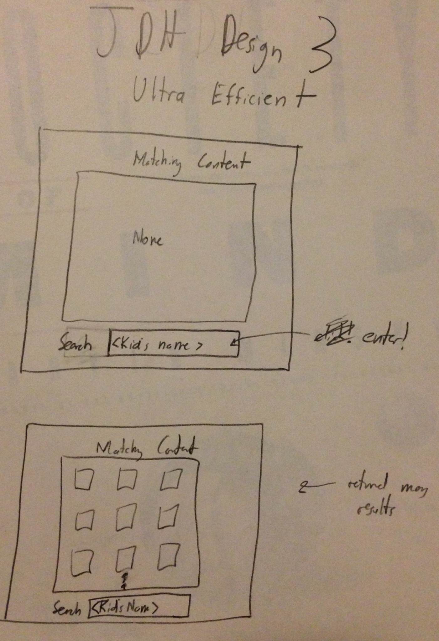
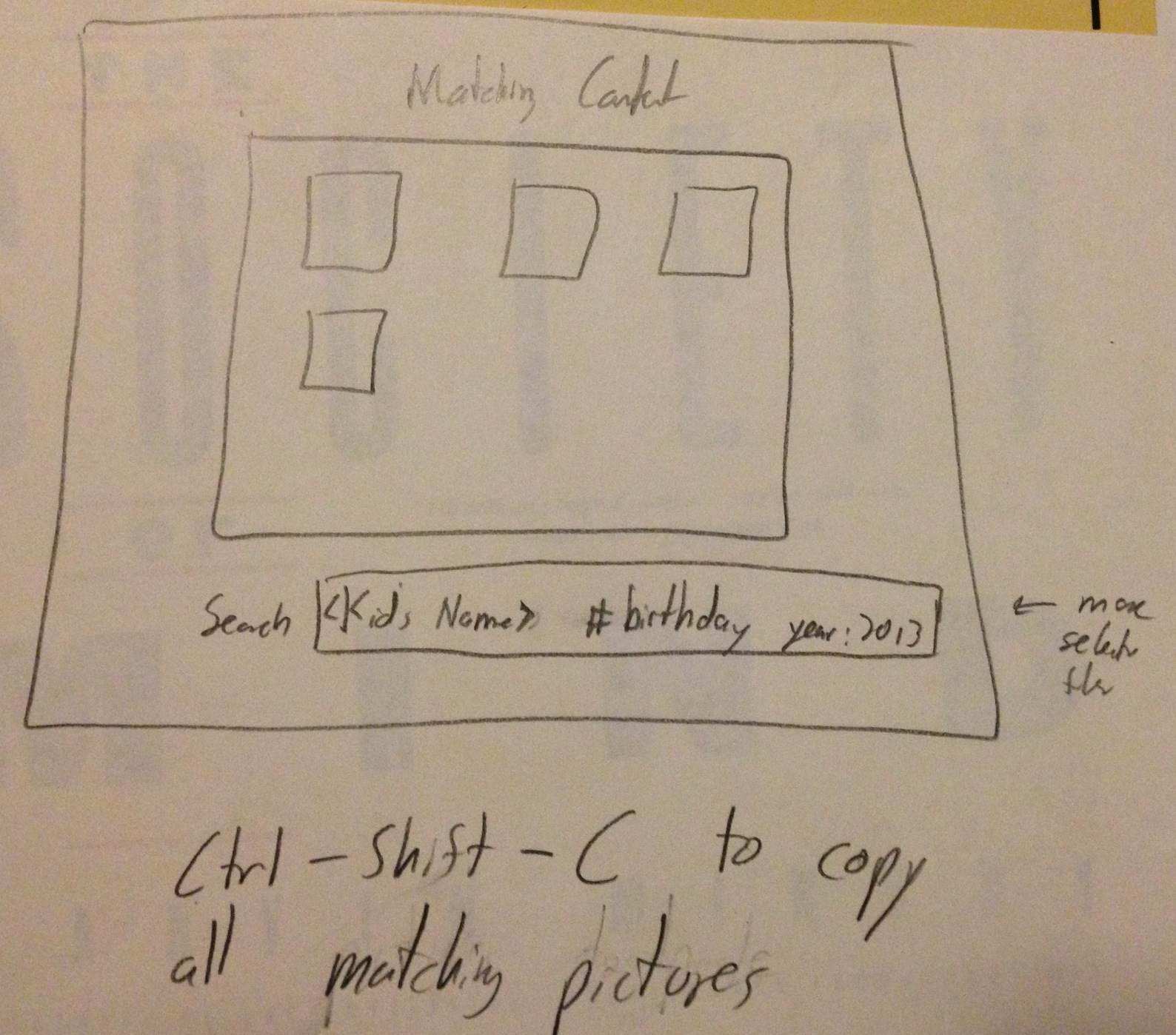
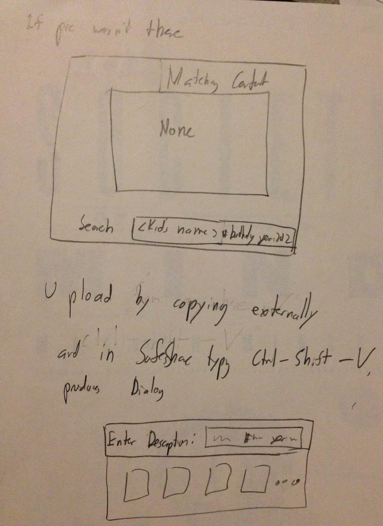
Ultra Efficiency
All manipulation is done through entering commands and hotkeys.
The command bar shows the current search query. Can use different keywords. A matching contents bar shows the pictures matching the query.
Hotkeys can copy links to images, then can be shared as the users wishes.
Design Markups
Storyboards and Designs
Design 1
Step 1
- Introduced to homescreen with information about spouse's uploaded content and sharing activity
- User wants to find picture so they go to browse
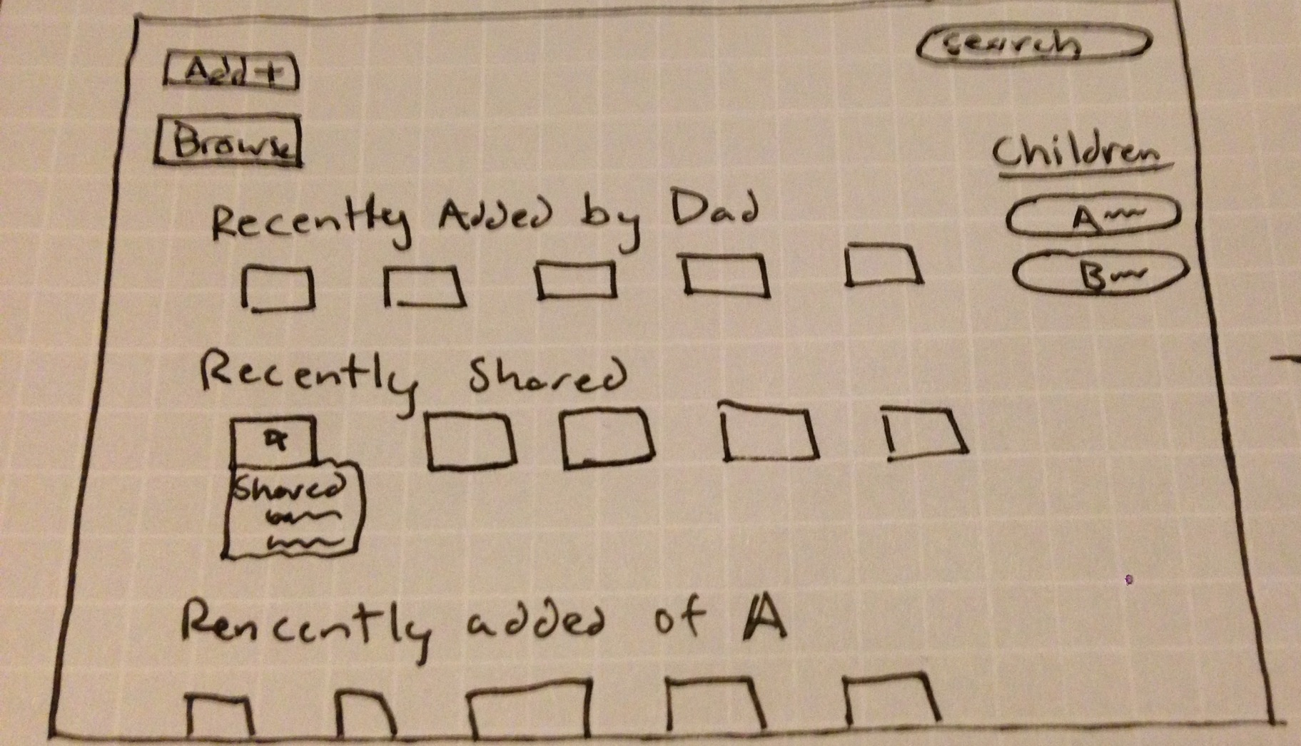
Step 2
-User is not sure on exact specifics of picture, but has an idea of a picture, so they browse.
- Mosaic displays random pictures, which is fast for sorting and fun to view.
Step 3
-User is not sure on exact specifics of picture, but has an idea of a picture, so they browse.
- Mosaic displays random pictures, which is fast for sorting and fun to view.
Design Highlights
- Design's overall theme is for someone who either has an idea for the content they want, but not a specific picture in mind, or they just want to browse for personal enjoyment.
- Home screen is designated for the dealing with the sharing of content problem. Gives updates on recently shared items, content recently added by spouse and access to child profiles.
- Still allows for functionality of searching for specific content and adding new content (not pictured).
Usability Analysis
- Learnability
- Pros
- Simple interface in terms of few buttons on home screen. This allows the users to know precisely what they can do.
- Mosaic is catchy for the user. They are likely to hover over it with mouse, and learn more about its functionality.
- We need to use this opportunity to inform them in some way.
- Cons
- Some users might not understand the mosaic can move adding new pictures. Arrows try to convey this information.
- Pros
- Efficiency
- Pros
- Showing random pictures at varying sizes allows users to process a lot of data at once. Clicking on picture can get them to related pictures.
- Cons
- Overall process is geared towards browsing, which is inefficient if the user has a specific photo in mind.
- Pros
- Safety
- Pros
- Users are processing a lot of data at once, but it takes a click to actually learn more, not just a simple hover.
- Pressing escape or clicking outside scope of sharing/larger view window goes back to mosaic (easy to undo mistake)
- Cons
- Pictures are close together for the mosaic and user could potentially click on wrong photo.
- Pros
Design 2 
Step 1
- user
Design 3
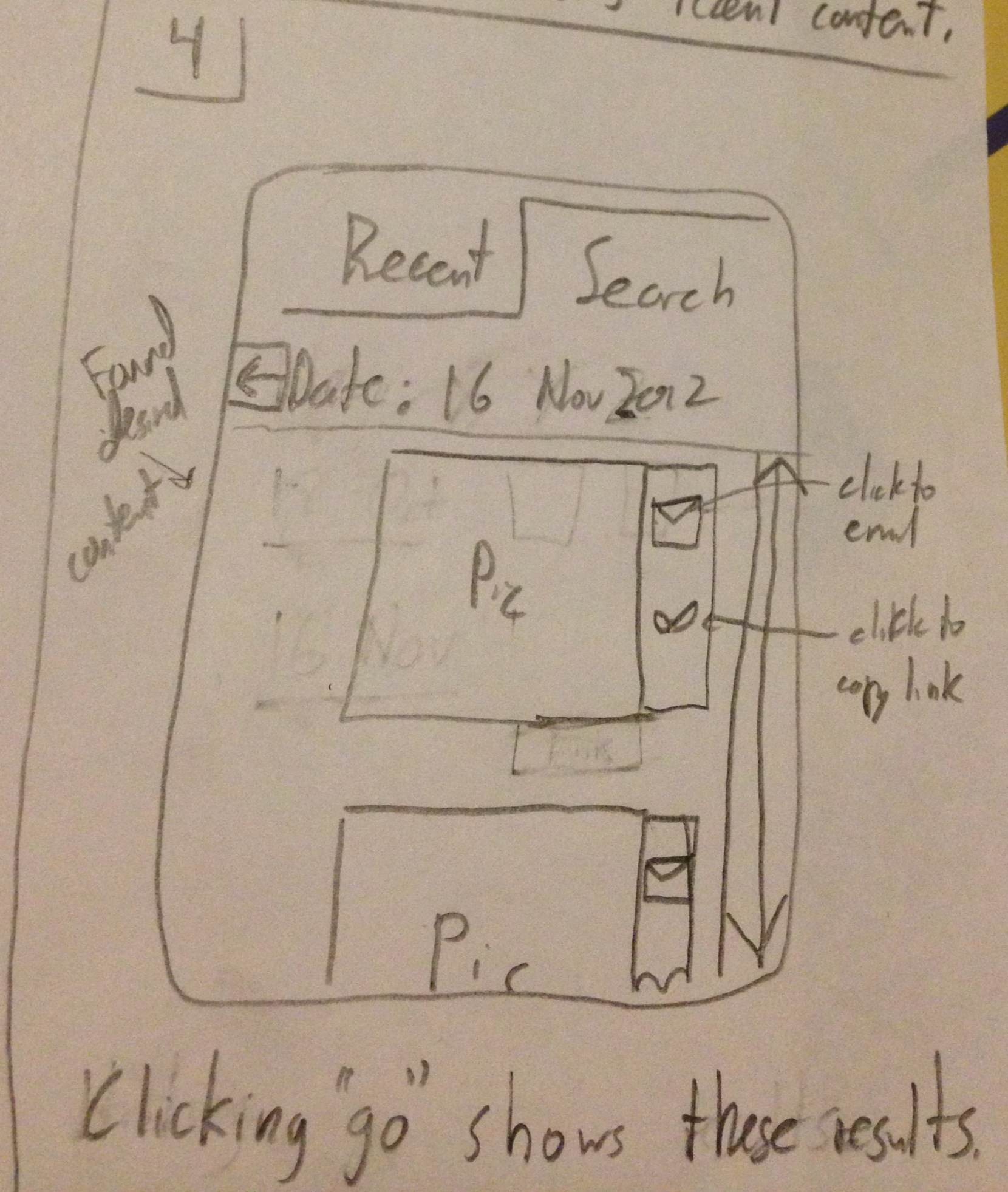
Step 1
- User wants to share pictures and has phone to do so.
Step 2
- This version defaults to showing the most recent content.

Step 3
- User can switch to selecting a particular date on which the content was captured.
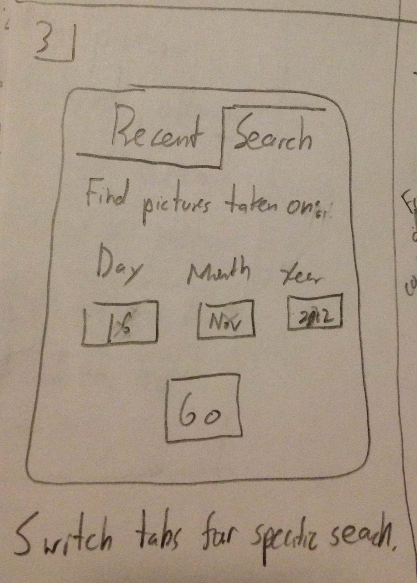
Step 4
- Once a specific date is set, the User can now see that in fact there are pictures and can choose which one to share.
- Sharing is possible through email or a link to the picture
Design Highlights:
- Judicious use of screen space due to smaller size
- This lead to less and simpler features i.e. primarily focusing on dates only
Usability Analysis
- Learnability
- Pros
- Text boxes are labeled indicating their function.
- Links and buttons should have the proper affordances to indicate their uses
- Cons
- Pros
- Efficiency
- Pros
- The efficiency of this interface stems mostly from the anticipation of user needs. The "Recent" tab provides immediate access to more current content which is presumably used more. Also, the buttons to email or copy or the pictures link are located next to the picture themselves as tasks commonly following viewing a picture or video.
- Cons
- Unfortunately, if many pictures occur on the same day, the user would potentially have to scroll through all of them if searching for something in particular. While this is better than simply searching through all pictures, it is something to improve in future iterations.
- Safety
- Pros
- The different modes for simply viewing recent pictures versus those from a specific date are clearly demarcated using the visible tabs at the top, hopefully minimizing mode errors.
- Cons
- Pros