GR2 - Designs
Scenario
Joseph is the manager of an MIT undergraduate dorm. He has just received word from the MIT housing administration that Ahmed wants to move in. He knows that several tasks have to get done in the following order:
- Find a vacant room
- Pick a move in date
- Send someone to clean the room
- Alert student and desk worker that room can be moved in to
- Student is given card access to dorm
- Student checks in and picks up key
These tasks all relate together so he can put them altogether under one task in DormMate. Joseph is able to quickly get through the first two tasks but now the room has to be cleaned by a janitor on his staff. Joseph send an email to Ahmed alerting him to the current situation. He tells the staff to notify him when the room has been cleaned. The next day the room is cleaned and Joseph is able to send a confirmation to the student saying that he is now able to move in on his own time. Card access is given to Ahmed, and the desk workers are also notified that Ahmed is allowed to move in. Ahmed takes a full week before finally packing his stuff and moving in. It's a good thing the desk workers have DormMate because during the week they had forgotten that Ahmed was allowed to move in, but the information was easy to look up. The student picks up his new room key and is on his way. Through DormMate, the desk worker checks off the subtask so that Joseph and the rest of the desk workers know that the task is completed.
Individual Design Sketches
Tran Nguyen
- Step-Specific Design: This design exploits the steps that the dorm manager or the desk worker need to complete the specific task, namely maintenance/repair request and moving in/moving out of students. All of the steps are put in a one place, so it is easy for the user to navigate and complete his task. Each of the bar will display a screen on the right for the user to edit.
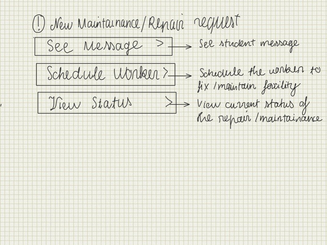
Screen 1: The top part display the notification showing that the user has new maintenance request. After the user clicks on it, the screen with all of the steps will display. Everything else is explained in the picture.

Screen 2: Similar idea with screen 1, putting all of the tasks in one place, and the form on the right will be updated after each option is chosen*. *
2. Easy navigation design and visual update design: This design puts all of the main tasks with all of the notifications and alerts on the main page. The user can select each of the alert and take action on it. The floor plan is a click-able map where the user can find all of the important information about each floor at a glance. Each room will be color coded for visual effect.
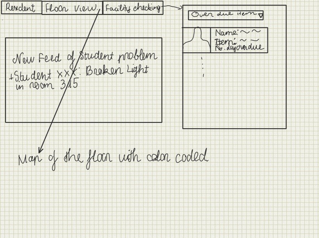
Home Page: The main page with tab view on the top of the page. First tab will display the list of residents with their information, second tab will lead to the floor plan view, and the last tab will display the current status of the facility.
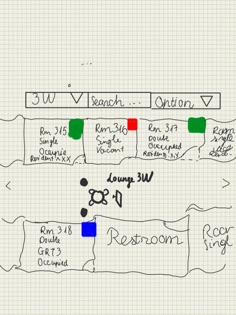
Floor plan view: This is the floor plan for this design, it's can be expanded, zoomed, and scrolled. The tab on the top will supported other features such as sending emails to the whole floor, update floor condition, etc. This screen should make it easy to search for information too.
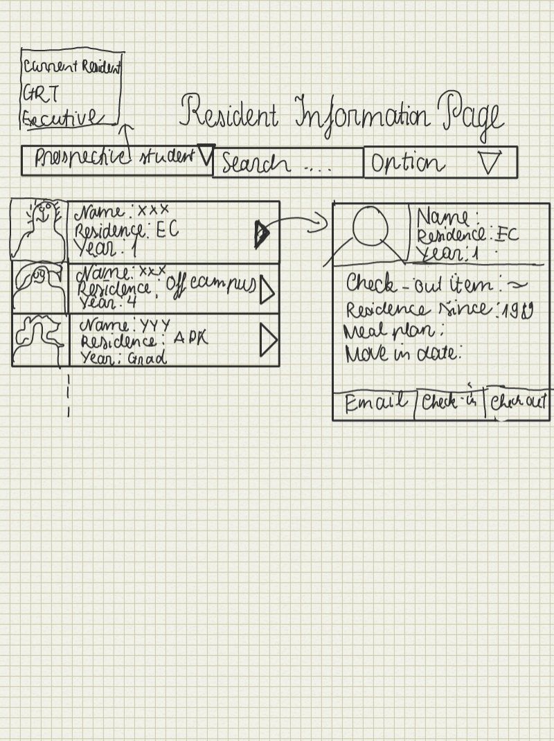
Resident Information Page: This is the screen for the dorm manager /desk worker to check on the list of residence and see their information along with the item they check out, move in date, etc.
3. Small screen design:This is for mobile or people with small screen. With this , the user can create task and doing maintenance with just a few clicks.
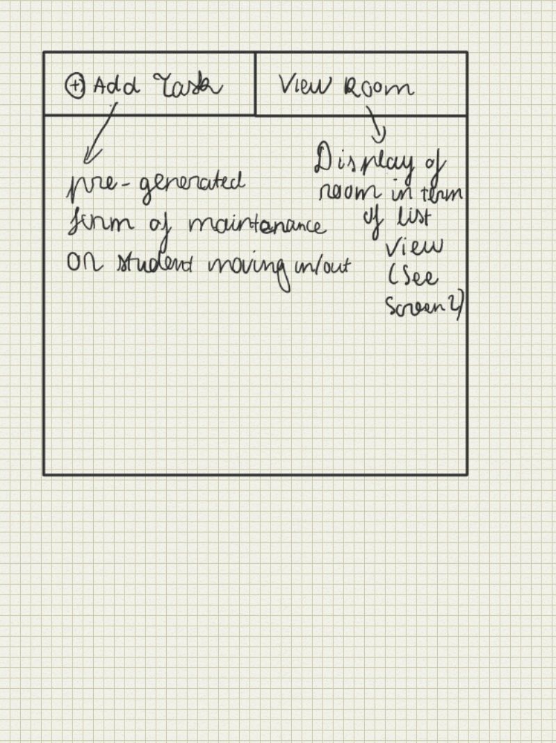
Main Screen: This screen will basically get the person finish the task if he view the website on a mobile device which the house manager we interviewed used very frequent. The tab for add task will generate a form with pre-generate view for him to complete his task quickly. The tab on the right will help him quickly access the information of the dorm through a list view.
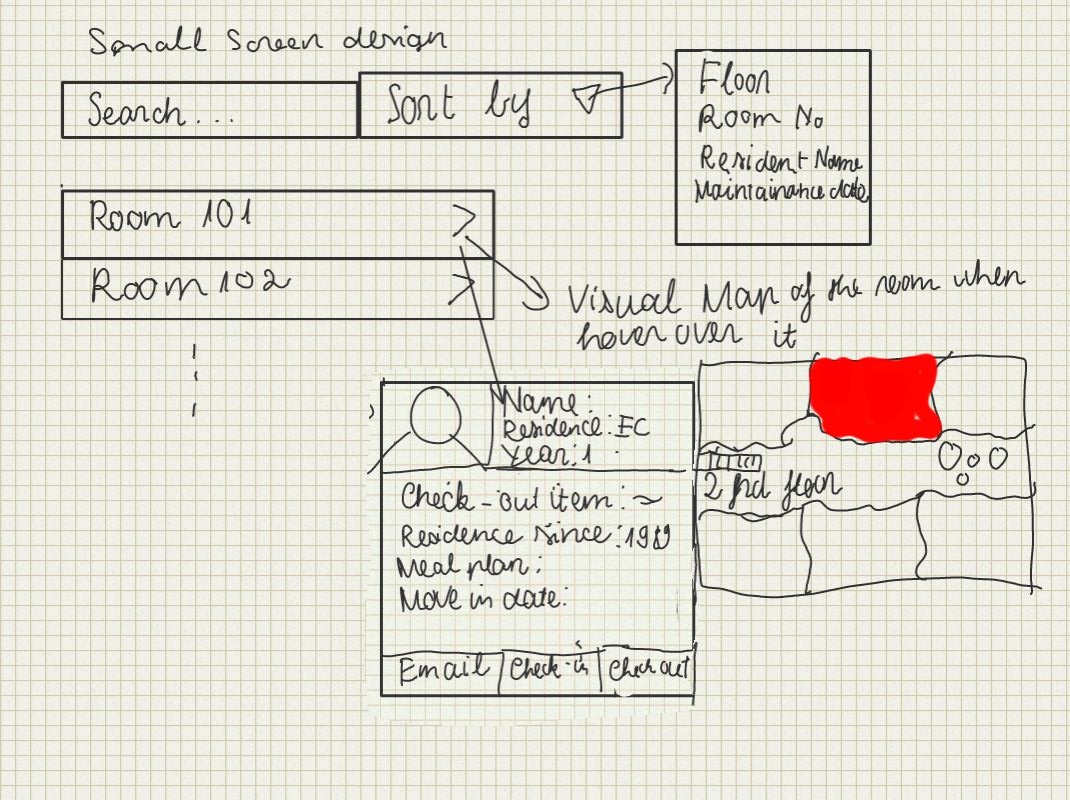
View Room: This view show the alternative view of the floor plan of all of the above design. When the user over over each room, it will display the small section of the floor plan where the room located with some useful information. If the user clicks on the room, it will display the detail information of the room such as dimension, current residence, check-out item, etc.
Daniel Martelly
|
The idea behind this design was to have all information and tasks focused around the room number. A user can see the history of a room in the hopes that the user may notice a pattern behind repairs indicating a more serious problem. In addition, when the user wants to initiate a new task, the user can click one of the new task buttons which will take them to a form which will be partially completed with default information based on the room. |
|
This design splits the screen into 3 columns. The first column is mostly static. Depending on the selection made in the first column, the second column populates with the appropriate information. The same thing happens between the second and third column. |
|
This is meant to be a small screen stretch. On this single drawing, there are 3 columns for 3 different pages that a user would use. There would be some sort of dashboard/home page which summarizes the most important information. Possibly, users may want to track particular tasks, and these tasks would always be present on the dashboard for quick access. Users can then go to a page dedicated for a particular category of task. These pages contain a list of all the tasks which can be selected to see the details. In order to add a new task, users would scroll down to the bottom of the page and begin filling out a form that is already there (no need to click an additional link). |


Sumit Gogia
Sketch |
Comments |
|---|---|
|
|
|
|
|
|


-
- Lookup tab allows for
- Lookup of rooms or facilities
- Name
- Id
- Location
- etc.
- Looks like a typical search with table
|
- Lookup of rooms or facilities
- Lookup tab allows for
Storyboard Designs
Design 1
|
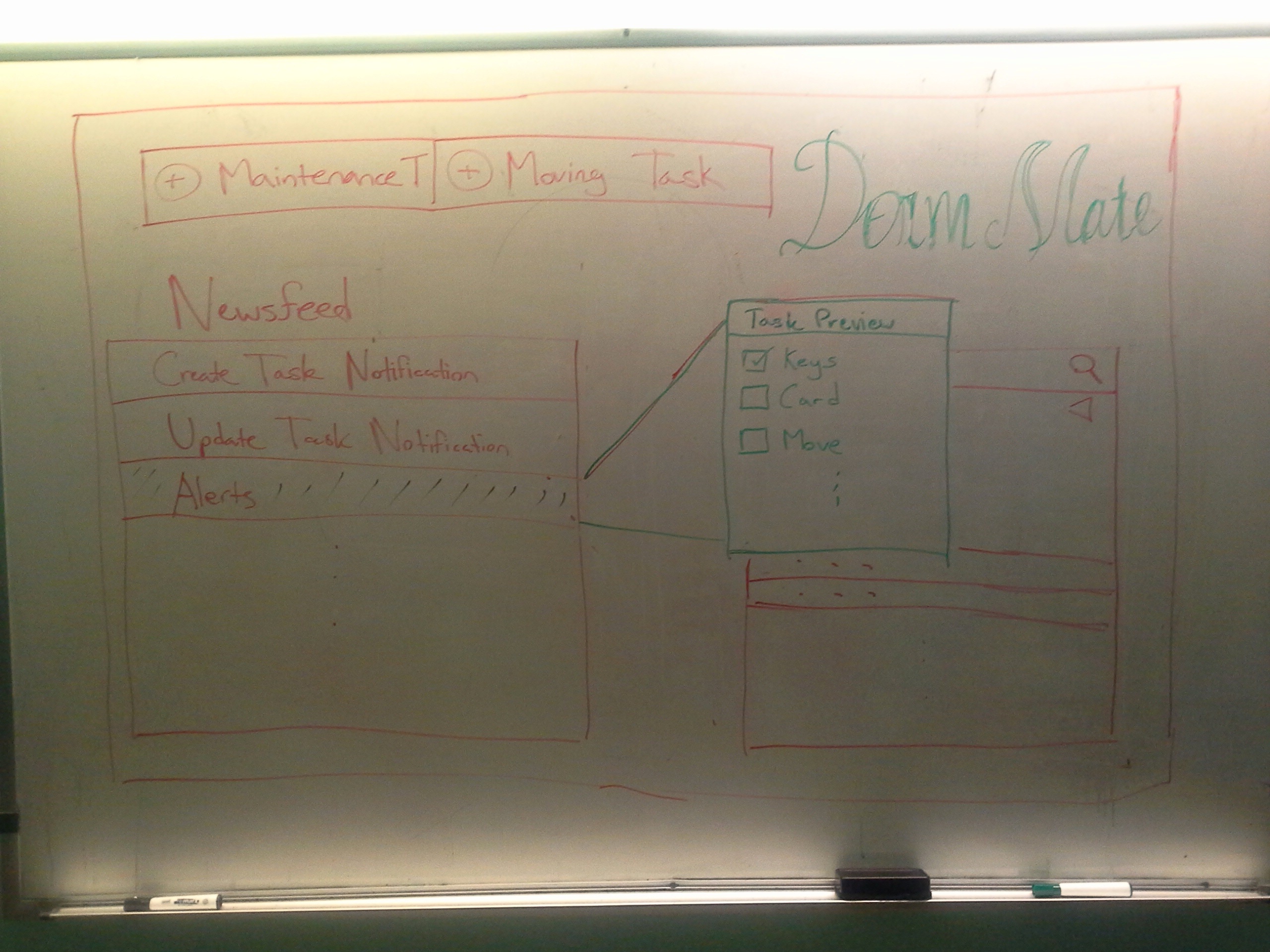
Home PageOn this page, users can see recent activity in the form of a news feed and a complete list of tasks which is searchable and can use filters. When users click on tasks from either box, a preview pop up comes up. This pop up contains a small preview of the task with the greatest focus being on a checklist of subtasks to be completed. |
|
Creating a TaskWhen creating a new task, users fill out a form on the left side of the screen. Although not shown here, the form should include a checklist at the bottom which can be expanded to add new subtasks as necessary. The right hand side of the screen is meant to contain easy access to information that is typically relevant to the given task. |
|
Floor PlanThe floor plan is used to give a general overview of each floor. Using color coding, users will be able to efficiently see which rooms are vacant and occupied and which rooms have pending maintenance or moving in/out tasks. |
|
|


Design 2
|
Main screen: This the design incorporate the idea of having a compact web page where the user can find most of their information on this page. The page is divided into three layer with the left most contains all of the notifications of the new update/alert and the tasks that still left to be done. It also have the option of the user to start a new task which will be displayed in the second layer.The second layer will contains the form to let the user fill out the important information quickly and send it to all of the party involve.The third layer will contain the relevant information where the user can refer to in order to get his tasks done easily such as looking up the list of vacant room, schedule a clean up date for a room, view the floor plan, etc. |
|
Floor plan: This floor plan is more compact and also display different information in each room than the previous floor plan. There is also list view of the room on the right hand side for searching. The room matches the search criteria will be highlighted for visual effect. |


Design 3
|
This design is for viewing on the mobile phone which is very common for busy person like house manager. This applies the idea of CRUD learning in the lecture. There are three separate screens:
|
