Scenario
Jane, a desk worker of 2 years at McCormick, is watching Twilight during her shift when Jillian, a resident, approaches her at desk to pick up a package. After unsuccessfully trying to find the package, Jane opens the Logbook on CollabDesk and writes an entry including a description of what has transpired.
When the next desk worker, Ben, arrives, he reads the new log entries on CollabDesk. He remembers seeing a package in an odd place behind desk, so he goes back and looks for it. After finding the missing package, he quickly finds the entry, responds to it, and marks it resolved.
Design Sketches
Patricia Saylor
|
LogFeed |
|
Logbook Metaphor |
|
Non-Computer Interface |


Divya Bajekal
|
Message Posting |
|
Tiny Screen Interface |
|
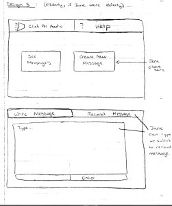
Design for Elderly Users |
Jonathan Lui
|
This design is designed to provide users with the most information. The left side of the screen has a list of unassigned tasks and the right side of the screen is a list of users and their tasks. At the bottom left of the screen a user can enter a new task. when you click on a user, a new screen appears that shows tasks that are expiring today, upcoming tasks, and any notes that were previously written. |
|
This design is one for the elderly. The bottom left of the screen displays directions for adding tasks, marking tasks complete, etc. The top right corner allows for new entries for tasks. At any moment all tasks are displayed either in the unassigned column or in the View Old column. |
|
This design is very simple and has not been done. The left side simply shows tasks that are unfinished. The right side of the screen shows completed tasks. Whenever a user clicks the checkbox on an uncompleted task, it moves to the completed column. |


Benji Xie
|
"Filing Metaphor": This design has categorization based on which users sent the message. |
|
"Hey Kids!": This adorable design also categorizes according to which users sent the message, but has little click-able sprites with pictures on the heads |
|
"Old School": This computer-free design has a segmented whiteboard where different people post in different parts of the whiteboard. No notes are thrown away by student workers; instead, completed tasks are signed and dated by the worker that completed the task and removed it from the whiteboard and placed in a bin where they are reviewed and discarded by the desk captain. |


Storyboard Designs
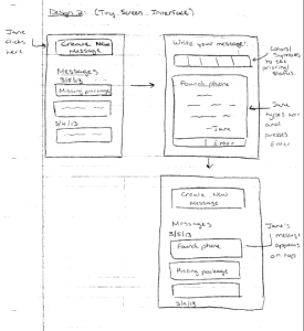
Storyboard 1 - Task Oriented
|
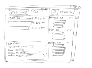
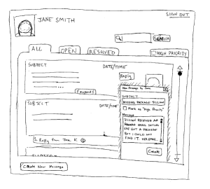
When Jane signs in she is welcomed by a screen that displays all of the incomplete tasks that have been assigned to her. On the right portion of the screen is a list of other desk workers and the tasks that they’ve been assigned. The purpose of the task oriented design is to overcome the bystander effect. Our main goal is information sharing. However, too often information is ignored by desk workers because it is not assigned specifically to a person. Assigning a task to a person helps overcome this effect by giving a desk worker a sense of responsibility over a task. |
|
When a Jane fails to find a resident’s package she can navigate to the bottom of the screen to add a new “Event”. She simply fills in the Title, Date, Assigned To, and Description. By default the assigned to is filled in with “ALL”. The "ALL" button will put the event into the general "ALL" tab. The "ALL" tab contains a history of the events. If Jane wants to assign the task to a specific desk worker she can simply type in the name and options will be pulled from the database. |
|
Bob arrives at his shift and logs in to CollabDesk. He recalls seeing a package in an odd location during one of his earlier shifts so he goes to the backroom to search for it. He finds the package and selects the “ALL” tab on the left pane to see if a desk worker previously reported the event. He sees the event as the first item under the “ALL” view clicks it. A box pops up with a detailed description of the event and he clicks the “Check box” to mark it as resolved. If he had a question about any part of the event/task he could go back to his main screen and click on the mail icon next to the worker's name who assigned the task and ask him/her a question. |
Safety:
In this design notice that there is no way to edit an existing event. If a user submits the wrong data the user must manually delete the entry and rewrite a new one. There are also several small ‘x’ marks on each event. If a user accidentally clicks one of the “x” boxes there is no way to recover the lost event. Notice that on each event/task the check mark and the "x" are very close to each other, which presents an issue to the user. The user could accidentally check the "x" when he/she meant to click the "check mark". Likewise, the user could accidentally click the "checkmark" when he/she actually meant to click the "x".
Efficiency:
This design allows users to easily assign and manipulate tasks between users. For example, to assign a task to a user, one simply has to drag the event under that user’s name. To unassign the task, one simply drags the event from the user’s list of tasks back into the main “ALL” group. However, if someone desires to delete all tasks or resolve all tasks a user must manually delete or resolve each and every task.
Learnability:
Several of the icons are consistent with other programs. For example, the envelope logo for sending e-mails is externally consistent with other programs. The “x” icon is a very well known icon for closing or deleting items. The “Add Event” box is also very self-explanatory. However, the dragging of tasks is non-intuitive until a user plays with the system for a long time. A user can drag a task from the main pane into the section under a user's name. This is a method that a user can use to assign the task to a specific portion.
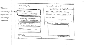
Storyboard 2 - Folder Metaphor
|
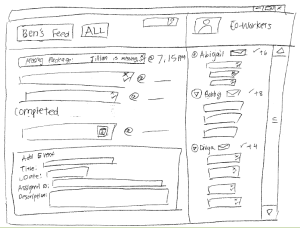
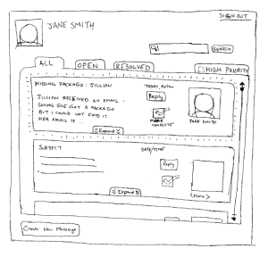
Log In: Upon login, Jane sees her desktop screen. The tabbed browsing allows for Jane to review all OPEN messages, ALL messages, or RESOLVED messages, as well as HIGH PRIORITY messages if they exist (an icon would appear to signify that). She can search messages or create new messages. She can see all the functionality without scrolling or going to another page. |
|
Write New Entries: After Jane cannot find Jillian’s package, Jane clicks CREATE NEW MESSAGE and an in-window dialogue box appears. Jane wills out the subject, decides this is not a “High Priority” message, and writes the message and clicks CREATE to add the note, which is now visible on the ALL and OPEN tabs. |
|
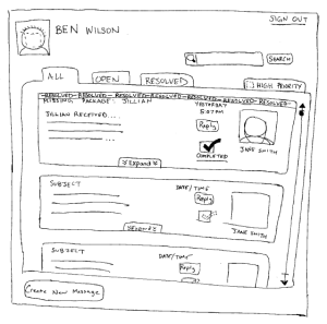
Read Old Entries: Ben signs in the next day and notices the note from Jane. Later in the shift he discovers the missing package, gives himself a high-five, and sends Jillian an email saying that he found the package. Ben clicks the MARK COMPLETE button to signify that the task has been completed and the message is now resolved. |
|
Search/Scrollling Through Old Entries: A search bar always exists in the same location (top right corner) and the tabs allow for users to go between different categories of messages |
Learnability
There is an emphasis on external consistencies and metaphors to promote learnability. The “filing” metaphor is familiar and has the external consistency of tabs (web browsers). The universal search bar is familiar and well-labeled with a “search” button and a magnifying glass for an added affordance to the functionality of the search bar. There is only one window so users cannot get lost with navigation, and all functionality is always shown.
Efficiency
Efficiency may be lacking, as the goal of this design is to have a very easily learned interface so student workers do not need a training course. Shortcut keys and perhaps simple customizability (changing tab order) would improve efficiency.
Safety
Errors related to message posting/editing should be recoverable. Messages are “resolved,” never deleted. Marking a message as “resolved” can be undone by clicking on the checkbox (may need to improve affordance). There are no buttons placed next to each other to deter description slips (REPLY is a button, whereas “Mark Complete” is a checkbox).
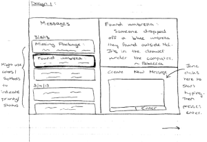
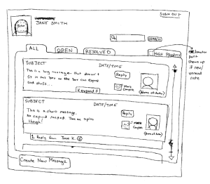
Storyboard 3 - Streamlined Preview
|
|
|
|
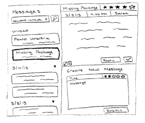
Safety
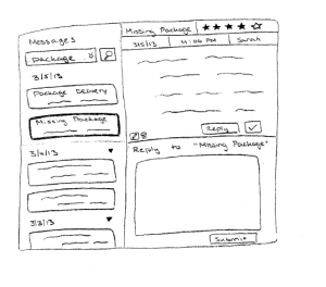
To determine which messages the desk worker has read, instead of just basing it on whether they scrolled over it, we will instead mark it as read when the user presses "Enter" while the focus is on that log title in the left pane. This way, if a user accidentally over-scrolls, they don't lose track of the skipped messages. We anticipated potential issues if desk worker makes a typo in the log entry, or if she accidentally created an extra log entry. To handle this, we allow users to edit and delete only their own messages, so as to prevent malicious editing of other people's messages.
Efficiency
Create New Message is always available and is very streamlined because it is one of the most frequently used features. You don’t have to click to open a new page, you can just start typing right away in the text box. As well, a lot of the little details like the date, time, and author are filled in automatically but can be modified if necessary. The left pane has a lot of information scent with the titles and short excerpts of each message displayed, but one downside is that you can only see one full message at a time. This can help not overwhelm the user with too much information at a time. A potential slow step is having to press enter to mark a message as read, particularly if the user is behind on reading the logs; however, we estimated that since each user works desk at least once a week, they should have at most around 10-15 messages to read, and the time to read a message will probably overshadow the time to press enter.
Learnability
The design is reminiscent of an email client where you have your list of emails on the left and you can view only one of them at a time. However, it differs by having a designated Create New Message, but this is easily learnable because it's always available and always in the same spot. Icons are grounded in familiar paradigms, like a pencil for edit and a trashbin for delete, and other buttons and areas are clearly labelled. One thing we think might be less obvious is the affordance for changing the time and star ranking when creating a new message.