Rocket Science - GR3
Our Prototype
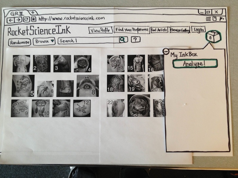
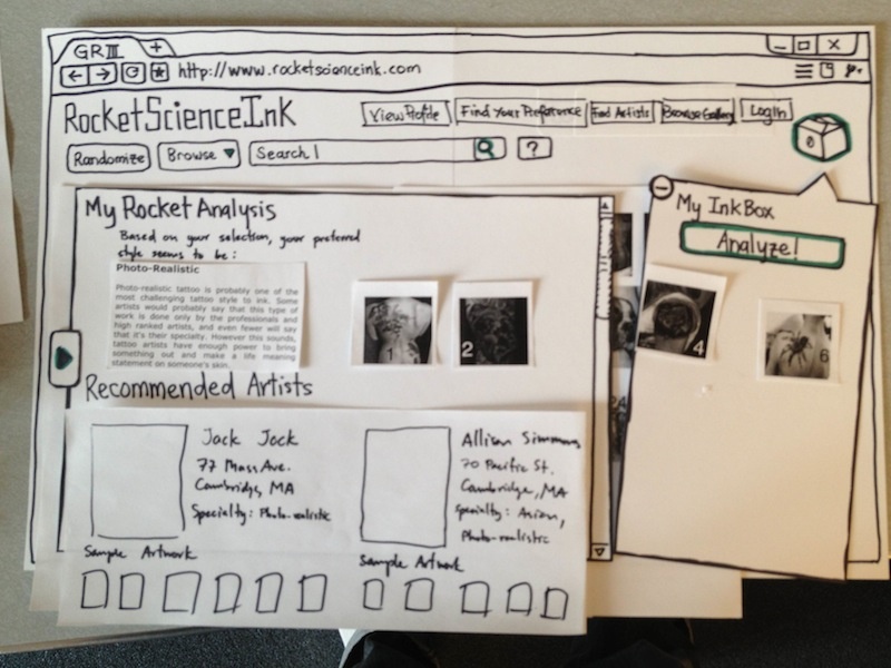
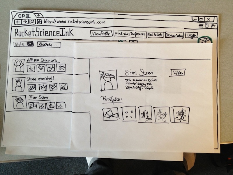
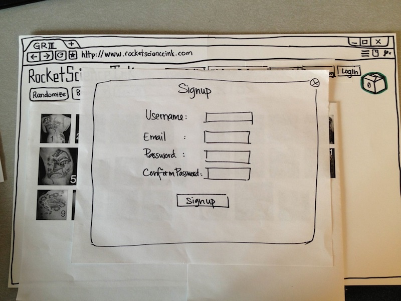
This is the picture of our first prototype:
Default First View - Browsing for tattoos
Preference Analysis View
Browsing for Artist
Sign up page
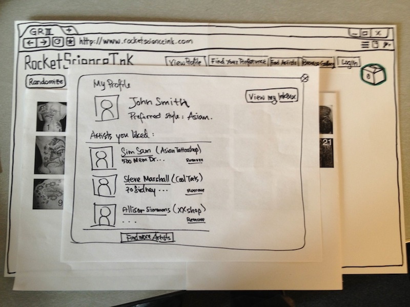
Profile page to retrieve saved preference
User Testing
Briefing
This is the briefing we gave to the user. We give the briefing orally to give the purpose of the application, the background information about the domain, and finally some other things:
- Our application is designed for users who are looking to get a tattoo for the first time. They do not know anything about the tattoo process, and may not have a good idea of what they way. The goal of this application is to assist these users to not only learn more about the different types and styles of tattoos, but also find an artist who can match his style and preferences.
- Our target user base is the young adult population who are most interested in getting a first time tattoo. Imagine that you are part of this population and age group (which you are).
- Finally, we would like to say thank you very much for helping us test our system. Note that:
- We are testing our system, not you. Our system is a prototype and we need you to help find these problems.
- If you run into some difficulties, that's great because it means there is some problem in our system
- We will be taking notes on what you are doing so we can improve our system, but you will not be voice or video recorded
- Finally, you can stop the test and leave at any time!
- Ok let's begin!
Scenarios Tasks
We created 3 main tasks which we presented to each of the users (6 in total). The first two scenarios involve the user to use our application as a first time user who are looking to learn more about tattoo process, while the third one involves a user retrieving their saved preferences after a busy week.
- Learn about the different styles of tattoos, and find the category which best fits your aesthetic preference.
- Find a suitable tattoo artist who will best fit your preference.
- You saved your tattoo preferences (collected designs and suggested sytles) on our website last week. In this task, retrieve these information before heading to a tattoo parlor.
Observations and Prototype Iteration
Positive Observations:
- Two out of three users commented that the use of the ‘box metaphor’ as a place to store their tattoos was intuitive and ‘is a familiar’ interface design.
- All three users commented that they liked how ‘clean’ and uncluttered the interface was. We appreciate that and improve it one step further by removing unnecessary buttons and using tabs instead (see changes we made).
With our first prototype, we conducted tests with 3 different users. We collected a set of observations and feedback. Based on this, we improved our prototype. These are the main changes that we made and their associated observations:
Observations leading to Improvements/Changes:
- In the Artist Search mode, two out of three users did not use the drop-down filter for artist selection. We realize that the drop-down menu looks small, so we increase it’s prominence and position.
- In the splash screen help message, all three users did not seem to notice or click the ‘Lets Go’ button. We fix this by animating the help sequence, and changing the ‘Lets Go’ button to ‘Click here to Begin!’.
- We have a ‘Smart-resize’ function which automatically resizes the gallery images based on their preference when users select images they like (these fly into their inkBox). However, two out of three users were initially bewildered as to what was going on, but they actually soon realized that the images were being resized. We believe this can be solved by animating the resize in-place. In order to make this less bewildering, we improved our initial help message, and we add a “Turn off Smart Resize” checkbox.
- All three users seemed to be slightly confused about the different modes of our application in the top right buttons. For example, there was confusion with “Browse Gallery” and “Find My Preference” - two users said aloud that they did not know immediately which to click and simply clicked to find out what each button leads to. In order to make it explicitly clear that each button uses a different mode, we changed these buttons into tabs instead and this will make the modes much clearer and further cleans up the interface. Lastly, the Login/User Profile page was also confusing (two out of three users were not sure if it was a popup or not), so we incorporated it as our third tab.
- All three users commented that they wanted more details in the Artist Profile, such as contact information. One of them tried to click the address with the hope of getting a map. We improve this by adding more contact information in the artist’s profile.
- Two out of three users were not sure what to do with the Analysis results. We therefore change the wording of the results given in the analysis, to explicitly say that the results are based on the selections of the user in his inBox and are just meant as a suggestion.
- Only one out of three people used the ‘inkBox’ button. We think that this will be less of a problem in real life by making it animated. Also, we make it more noticeable by adding an obvious floating rectangle around it to separate it from the rest of the page, and improve the visibility of our welcome splash help message.
All three users think that the front page (login page) which had 3 options was confusing. We therefore simplify it into two options: [Login] and [Browse as Guest]. We use one button “Begin Exploring” in the Browse as Guest part. This leads the user directly to the Gallery mode of our interface, along with the splash help screen to guide them along.
Apppendix 1 - Recorded Observations
Paste google doc here
Usa