Table of Contents
- #Table of Contents
- #Briefing
- #Scenario and Tasks
- #First Iteration
- Round 1 Analysis - Usability Problems and Changes to Prototype
- #Second Iteration
- Round 2 Analysis - Additional Usability Problems
Briefing
Thank you for volunteering to test our prototype for 6.813/6.831 User Interface Design. Our website is a tool designed for parents of school-aged children to coordinate carpooling for school and after-school activities. Our goal is to create an easy-to-use interface that makes it easy to set up carpools, helps users keep track of commitments, allows for scheduling flexibility, and ensures the safety of the children.
Scenario and Tasks
We have created three roles in which you will play the parts of the various parents participating in the carpool.
First Role
Your name is Jane, you have a son, Bob, who has signed up for Underwater Basket Weaving, and you want to carpool with other parents. You live at 1234 Fake St., Bakersfield, CA 93203. You also need to keep in mind that your family is going on vacation from 4/22 to 4/29.
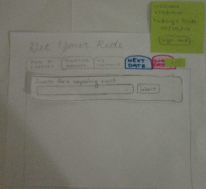
- Task 1: Visit getyourride.com to find and join a carpool for your son’s activity.
You have a feeling your turn to drive is coming up, but you aren’t quite sure when.
- Task 2: Get the next date/map for your next drive and confirm your availability. Out of curiosity, you also take a look at your schedule for the month.
A few weeks later, you have an unexpected death in your family on 3/26, but it is your turn to drive. You will need to reschedule.
- Task 3: Swap one of your dates for a new one.
Second Role
Your name is Vladimir, one of the other parents in Jane’s basket-weaving carpool. Jane has proposed to swap dates with you, and you need to accept her proposal to complete the swap.
- Task 4: Agree to swap dates with Jane.
Third Role
Your name is Alyssa, another one of the other parents in Jane’s basket-weaving carpool. It is your turn to pick up the kids, but the other parents want to know that their kids are safe. Luckily, we have a mechanism for letting them keep track of where you are on the pickup route.
- Task 5: Use the mobile app to allow the other parents track your drive.
First Iteration
Prototype Photos
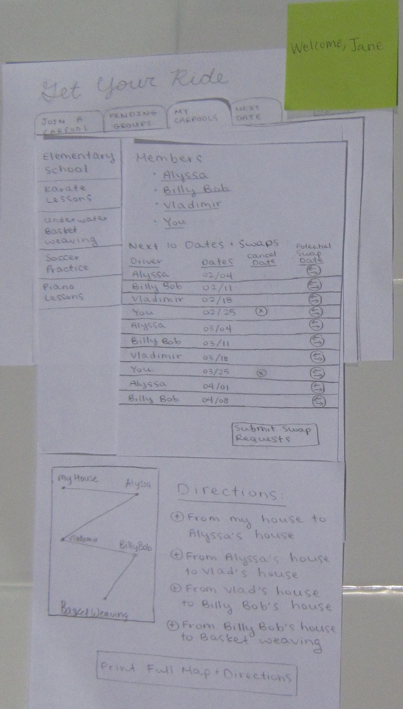
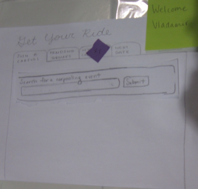
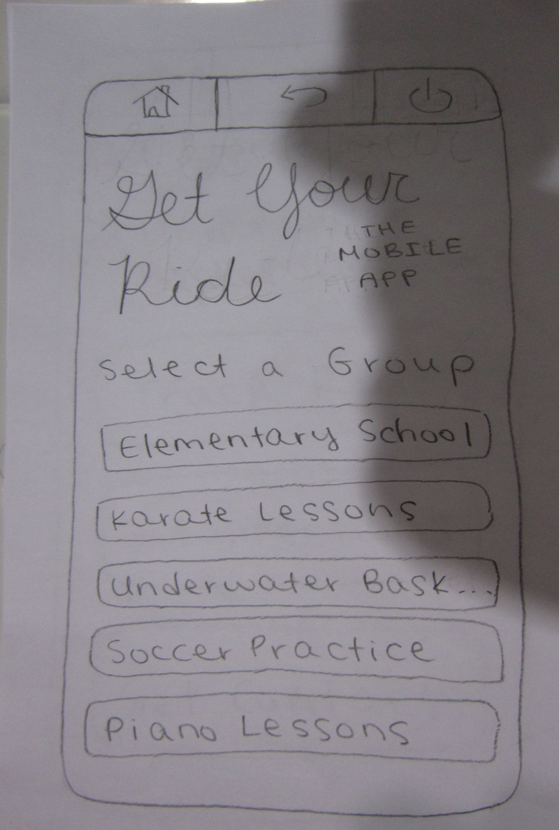
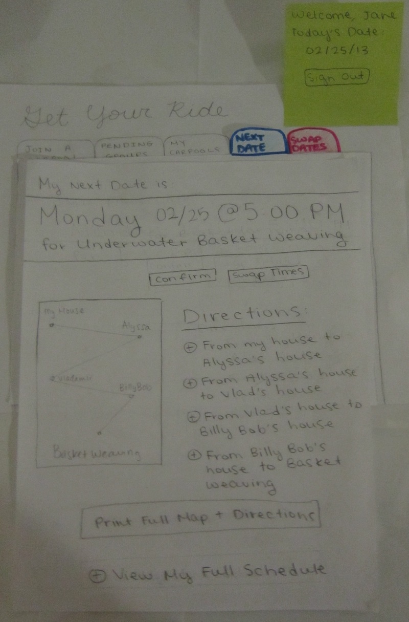
Our paper prototype consists of four tabs: "Join a Carpool," "Pending Groups," "My Carpools," and "Next Date."
For Task 1, as users move through the steps of setting up a carpool, additional panels will be added to the main screen. Each piece of paper is an additional panel. Not all panels are photographed here:
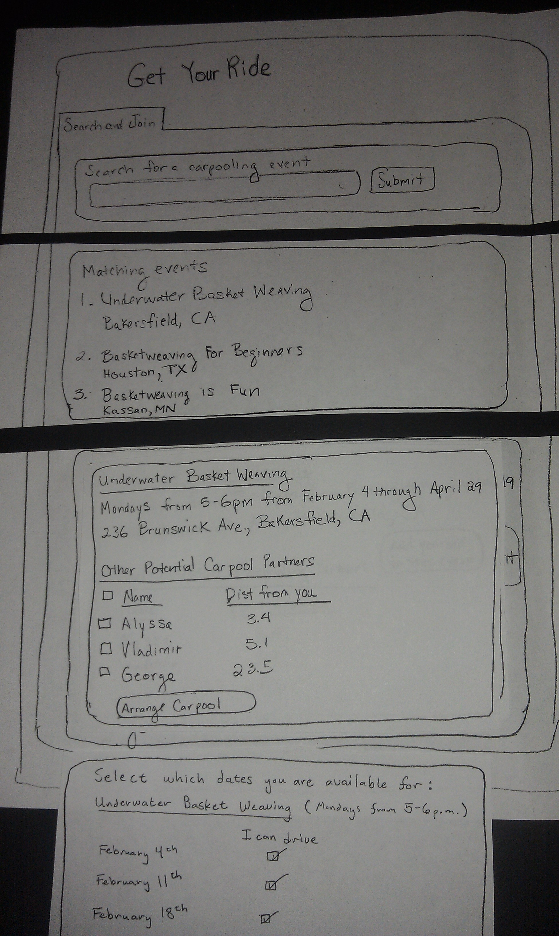
For Task 2, we expect the user to select the "Next Date" tab. This tab gives the user the next date that they are driving and a map of the route. There is an option immediately underneath the date for the user to confirm that they are driving. This allows the other parents to know that the driver has not forgotten, and that their kids will be picked up.
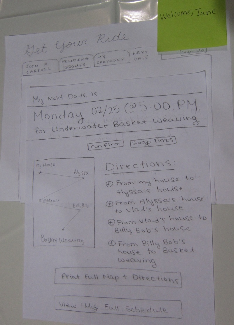
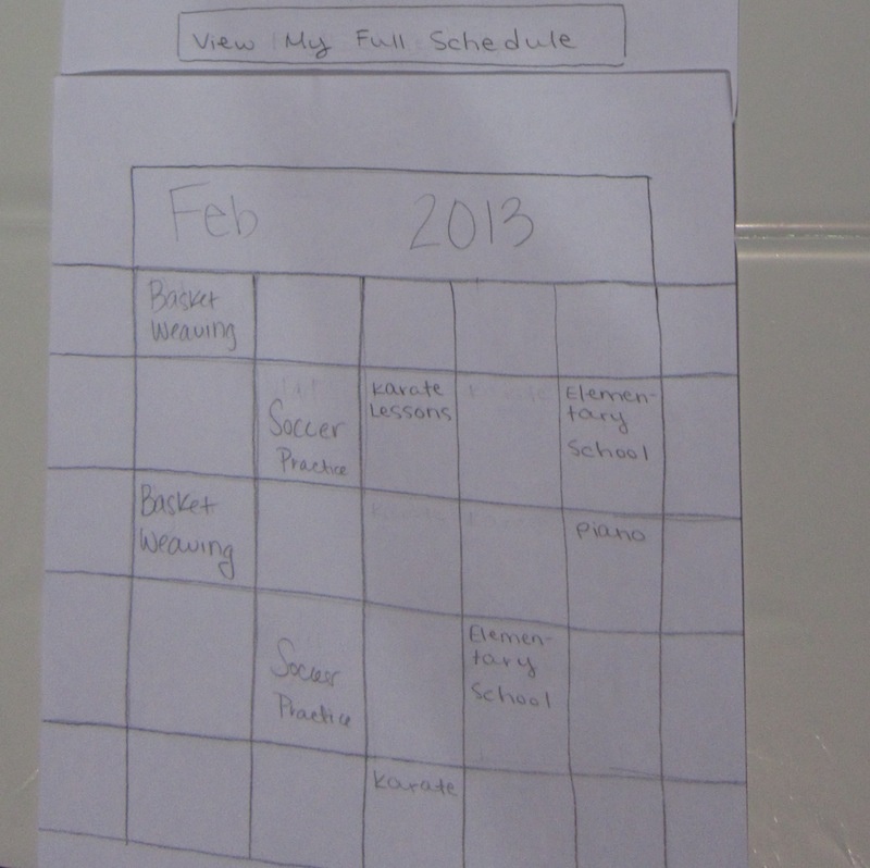
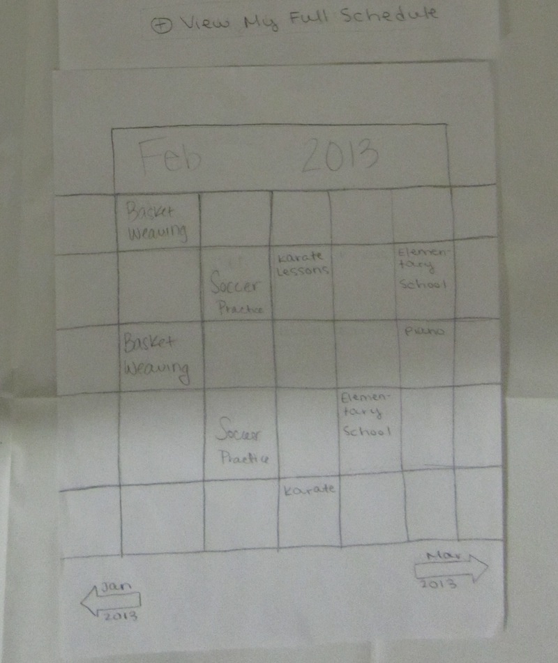
The "View My Full Schedule" button at the bottom of the screen allows the user to view their full schedule for the month (including all of their driving responsibilities from all of their groups) directly underneath.
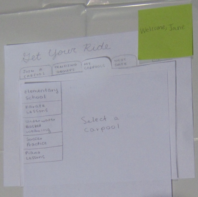
For Task 3, we expect the user to visit the "My Carpools" tab, which lists out all the carpooling groups that the user is a part of on the lefthand side.
Selecting one of the carpooling groups will load the group page, which details the list of members in the group, a driving assignment schedule, and a map of the route with directions. The user can use the schedule to perform swaps by selecting one of their dates and submitting all possible swap dates. The drivers assigned to the possible swap dates are then notified.
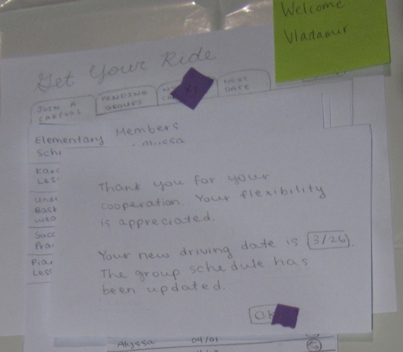
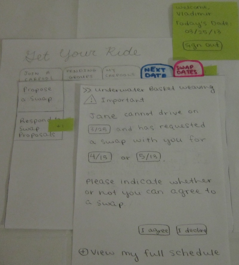
For Task 4, we expect the user to notice a notification on the "My Carpools" tab after logging in to the homepage. This is shown as a purple sticky in the photo.
After clicking the "My Carpools" tab, the user will find another notification on the carpooling group button for which a swap date has been requested. Clicking on that group will lead to a pop-up that asks whether the user can accept the swap date request.
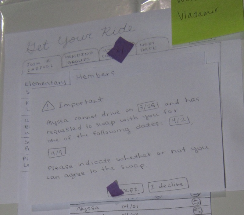
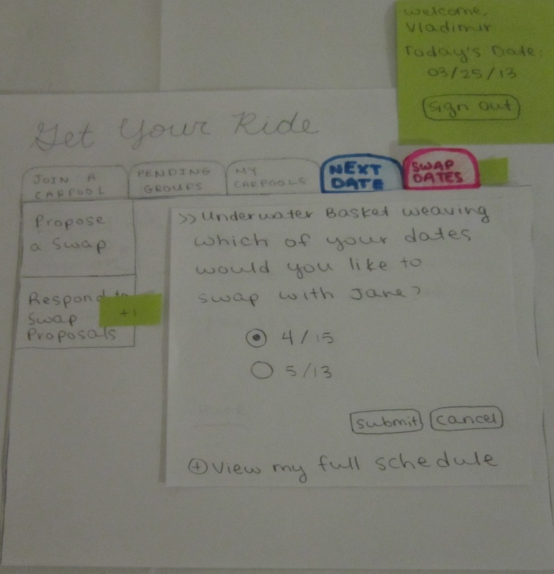
Clicking on "I accept" will lead to the next step in the pop-up dialogue, which asks the user for what specific date they can agree to a swap. Clicking "Cancel" here would bring the user back to the previous "I accept/I decline" screen.
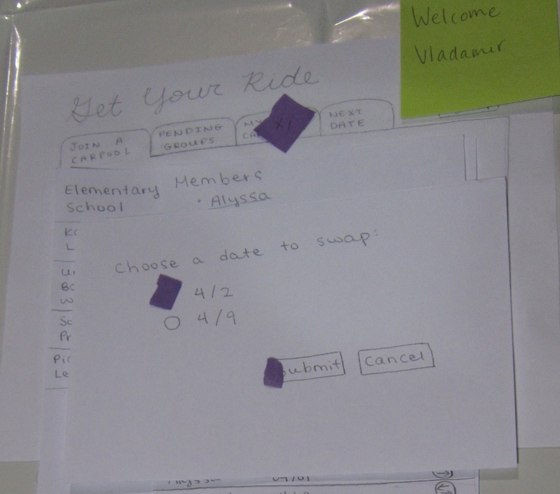
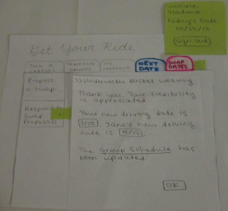
The final step thanks the user for their flexibility, informs the user of their new date, and completes the process.
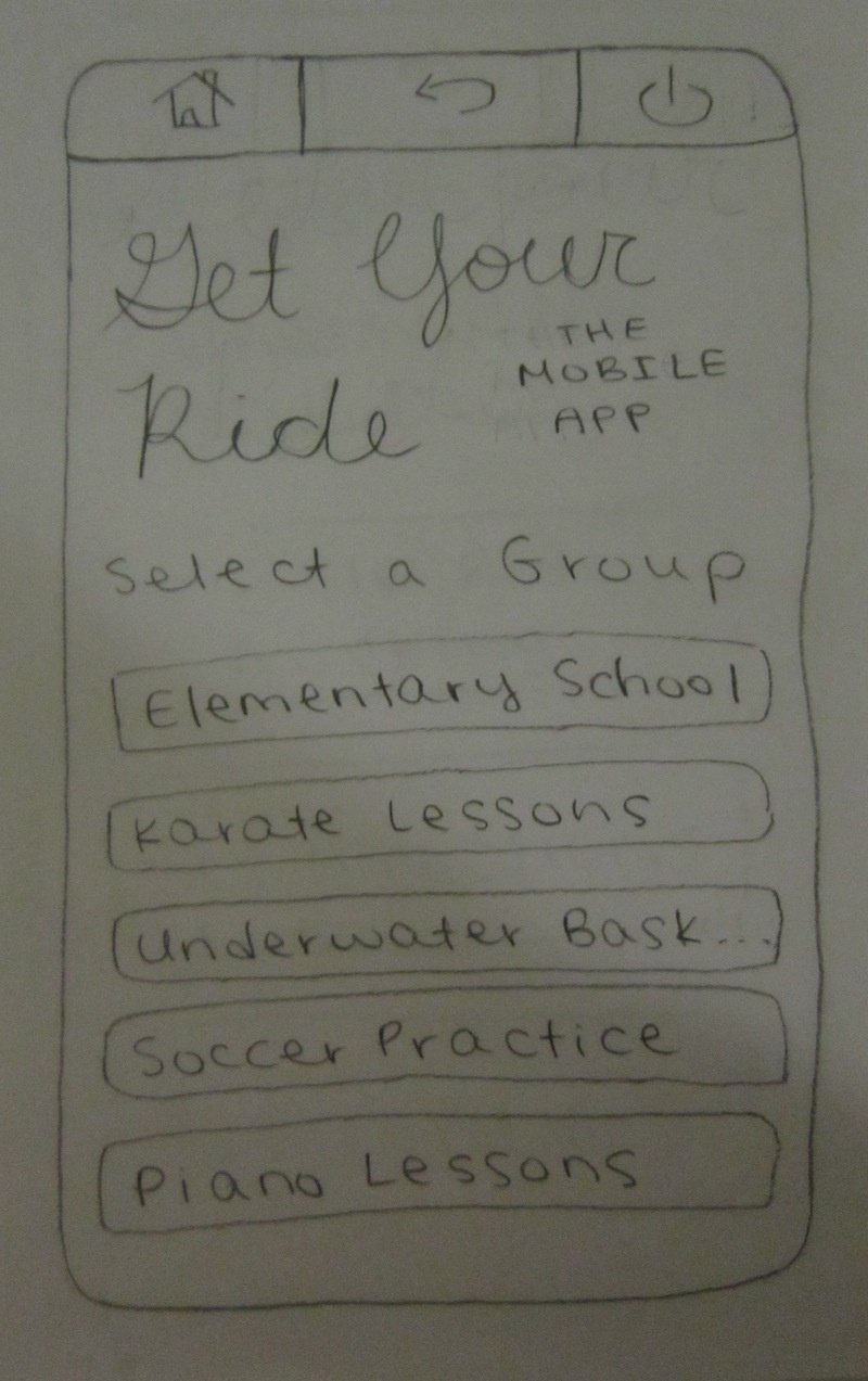
For Task 5, we created a paper prototype mobile app for the user to allow other parents to track their drive. (There are also other features on the mobile app, but they are fairly generic, so we chose not to test them.) The homepage displays a list of the user's carpooling groups.
Selecting one of the groups leads to the following interface.
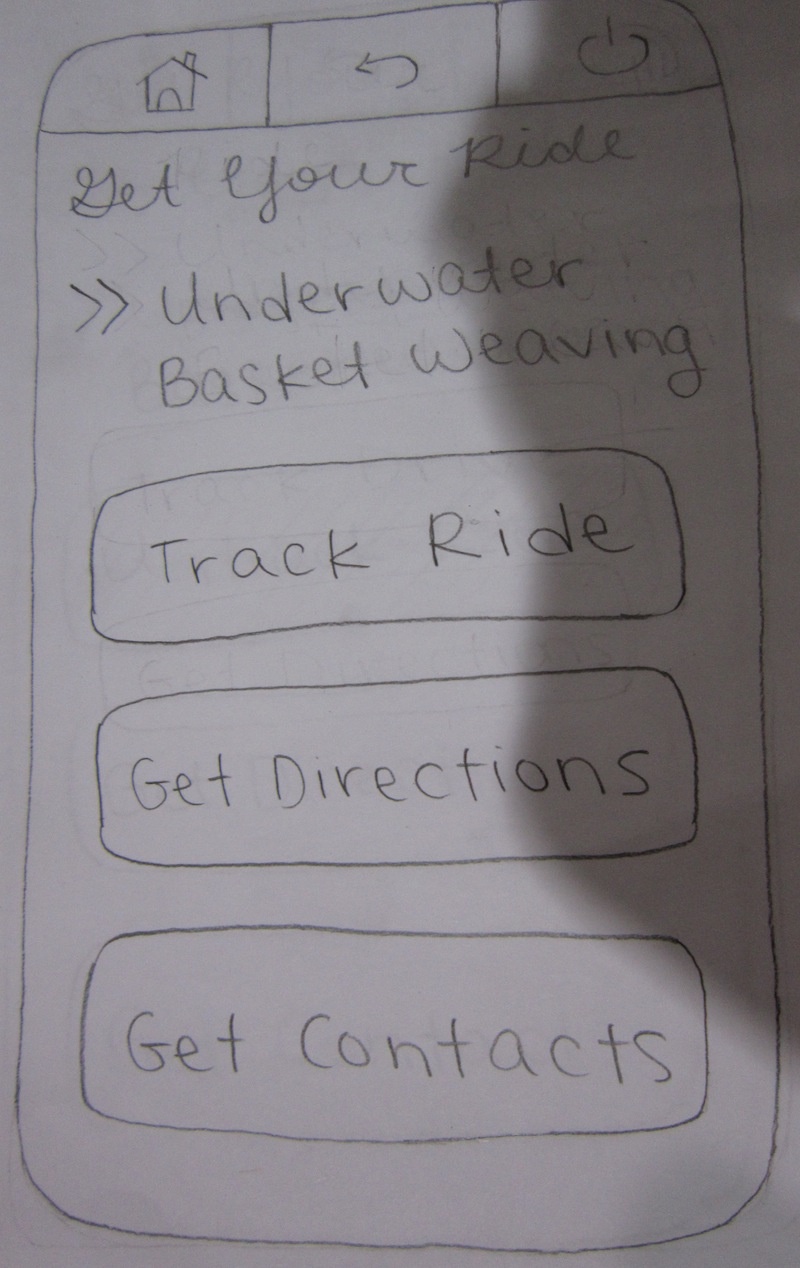
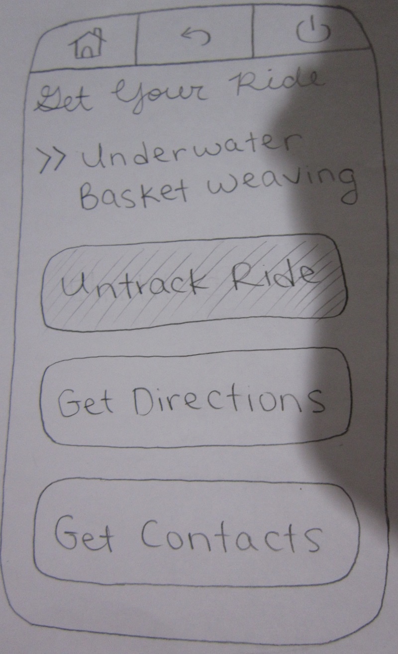
Selecting "Track Ride" enables ride tracking. It is a button that can be toggled on and off.
Observations from User Tests
To protect anonymity, we will refer to our three testers for this round as User A, User B, and User C.
User A
Task 1
- The user entered “Underwater basket weaving, Bakersfield, CA,” hit tab, and pressed submit. He mentioned that he would have expected the cursor to be in the text field by default.
- After entering his address, the user commented that he liked seeing that Alyssa and Vladimir were nearby. He noted that this motivated him to go further. He also asked how far the class was from his home and noted that the interface should have displayed that information.
- After clicking on the button for adding himself to the carpool, he felt confused because he wanted to know more about the people in the carpool first. He wanted to click on their names and see a profile. This was a safety issue; the interface was not providing adequate information prior to setting up a carpool.
Task 2
- The user quickly completed the task, but he remarked that he did not know how to make page options go away after completing the task.
Task 3
- The user selected the swap arrow on the date he wanted to remove and selected another arrow to complete the task, ignoring the cancel date column of selections. (We had intended for the user to select the date he wanted to remove using the cancel date column instead of from the swap date column; this showed us that the redundancy could potentially be confusing to users.)
Task 4
- The user noticed the notification on the “My Carpools” tab, which caused him to immediately click on it.
- The user remarked that he would ordinarily “tab out to view his calendar and tab back to confirm the swap date.”
- He remarked that clicking the final "OK" would make the "My Carpools" schedule re-update with the revised dates after reading the message, confirming that he understood what he had done.
Task 5
- The user remarked that “Track Ride” is a little confusing because he wanted to track his ride, not to track another parent’s. However, he was able to quickly run through all the steps.
User B
Task 1
- After the user entered, “Underwater basket weaving, Bakersfield, CA,” he commented that he felt the field was too generic and would have preferred to see a “Location” field in addition to a description field.
- After clicking on the first class, the user strongly resisted going further because he didn't want to carpool with people he didn’t know, for the safety of his children.
- Upon seeing that Alyssa and Vladimir were close to him, the user wondered whether they were close to him in the direction of the class or another direction. He suggested putting a map on the page.
- The user tried to select Alyssa and Vladimir, but didn’t understand why there were no checkboxes and failed to see the button to add himself to the carpool. Upon seeing that button, he clicked it, signed up, checked the boxes for Alyssa and Vladimir, and proceeded.
Task 2
- Upon selecting the "Next Date" tab, the user re-read his task description. The user seemed a little confused after selecting confirm. The facilitator told the user that there was currently no feedback at the time.
- Afterwards, the user remarked that he was initially tempted to select the “My Carpools” tab.
Task 3
- The user recalled seeing something about swapping in “Next date” and selected the “Next Date” tab.
- While selecting the date he wanted to swap and the new date to swap with, the user was confused with the language “you” and the option to swap with yourself.
- The user remarked that the swapping was very tricky and needed facilitator guidance to complete the task.
Task 4
- The user selected “My Carpools” because the notification was catching his attention.
- On the second pop-up screen, he initially clicked “cancel” because he wasn’t sure which dates were his, indicating he was not able to understand the date selection.
- The user was confused because in task 3, he only selected one date to swap, not two. He remarked that it was not clear in task 3 that the user was supposed to select as many dates as possible.
Task 5
- The user quickly completed the task, but he remarked that there was confusion with the vocabulary “Track Ride” since he would be doing that to track someone else’s ride, not his own ride.
User C
Task 1
- The user didn’t understand the “distance from you” column but clicked it anyway.
- He didn’t like entering his mobile phone number and presented big questions about trusting the other potential carpool partners.
- He didn’t understand why all of the dates were checked by default. He figured since he was setting up a carpool, he should only need to check a few of the dates.
Task 2
- The user completed the task following expected steps, but he felt confusion between selecting the "Next Date" tab and the "My Carpools" tab.
Task 3
- The user forgot which date was next, so he navigated back to the "Next Date" tab to view the date.
- Initially, the user only selected a single date to swap. After receiving an error message, he then immediately selected another date to swap with.
Task 4
- The user noticed the notifications.
- The user noted that the pop-up display during the swap was slightly confusing, and that there should have been a more clear indication of which date he was swapping to and which date he was swapping from.
Task 5
- The user quickly completed the task, but like the other two users, noted confusion over the wording.
Round 1 Analysis: Usability Problems and Changes to Prototype
Learnability
- Because some users mistakenly looked around in "My Carpools" before noticing the "Next Date" tab, we decided to highlight the tab to make it more obvious.
- Some non-native English speaking testers were confused by the wording on the "My Carpools" tab. We had referred to the user as "You" when assigning pickup dates on the schedule, which could be misconstrued as a person's name in some languages. In this new prototype, we decided to simply refer to the user by their name instead.
- Originally, we didn't want to include instructions because, as discussed in class, a good user interface does not require much explanation. However, swapping dates is not a regular function, and all of our testers had trouble with that task. The same can be said about choosing your availability when setting up a carpool. We decided to include more descriptive instructions for availability and the swapping interfaces, sacrificing efficiency for the sake of learnability.
- Users had a lot of trouble figuring out how to swap dates. We decided to scrap our original design altogether and add a separate tab specifically devoted to date swaps so that the function could be more easily accessed (also ties in with efficiency).
- Because all three users complained about the wording for the ride tracking interface on the mobile app, we changed "Track Ride" and "Untrack Ride" to "Enable Ride Tracking" and "Disable Ride Tracking," respectively, to make the button labels more intuitive and improve learnability.
Efficiency
- Some users wished that the date were displayed somewhere on the interface. We chose to add a date display after "Welcome,_______."
- It was noted that the calendar would be more useful if it weren't limited to a single month. We added the option for the user to browse between months.
- Some users thought that it would be helpful for additional information to be displayed on the full schedule. We decided not to go forward with this suggestion because we wanted the interface to be as simple as possible, providing only the relevant information.
- Users wanted to be able to view their schedules before agreeing to a swap, so we included an option to allow them to view their full carpooling schedules on the same page, improving efficiency through anticipation.
Safety
- Although we attempted to address safety in tasks 2 (having the responsible parent to confirm, so that other parents would know their children hadn't been forgotten) and 5 (allowing other parents to track the responsible parent's drive), we failed to address safety considerations in task 1, the initial group formation. Users were concerned about the safety of their children: why are the class details visible to the public; parents don't have any information about Alyssa and Vladimir before selecting them. We decided that by having a teacher or coach give out a code in order to sign up for carpooling on the site, we could significantly lower the chances of encountering people with questionable intentions.
- Some users were frustrated with the lack of undo options on both the calendar loading and date swapping interfaces. We added the option to toggle the calendar between expanded and contracted states. We changed the date swapping interface from a pop-up screen to its own tab, so that users would be able to navigate away and return at will.
Second Iteration
Prototype Photos
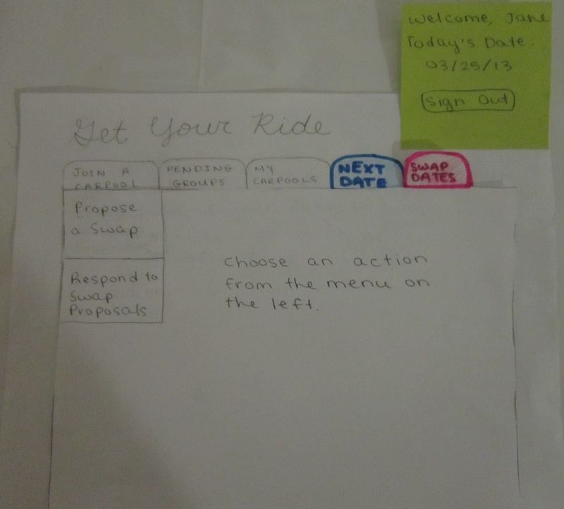
Our revised interface consists of five tabs: "Join a Carpool," "Pending Groups," "My Carpools," "Next Date," and "Swap Dates."
For Task 2, we expect the user to perform the same sequence of actions as they would have done with the first iteration prototype.
The "View My Full Schedule" option now lets the user both expand and contract the schedule.
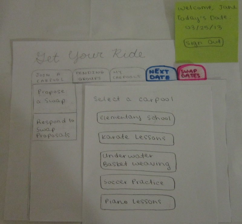
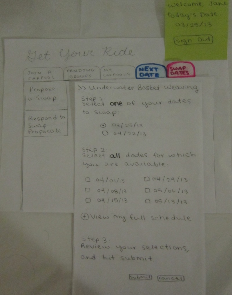
For Task 3, we expect the user to click on the "Swap Dates" tab. Here, the user can either choose to "Propose a Swap" or "Respond to Swap Proposals."
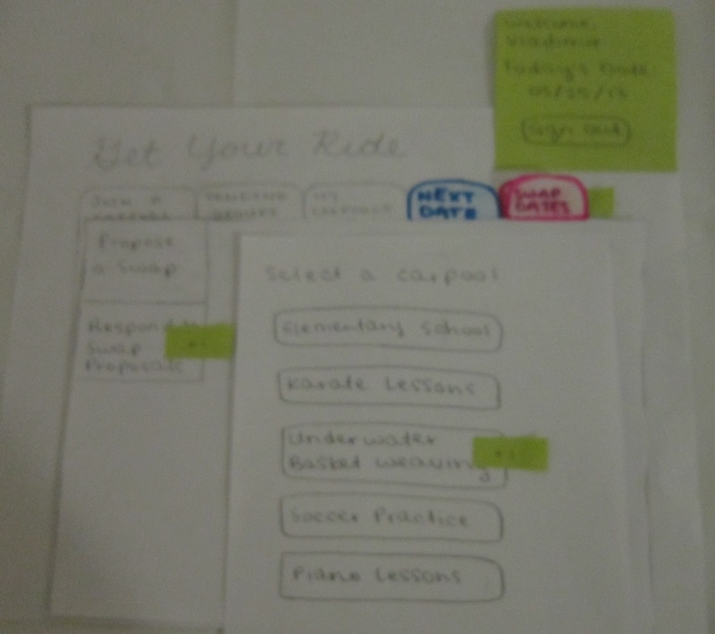
Clicking on "Propose a Swap" pulls up a list of the user's carpooling groups. The user should select the group for which they need to swap a date.
This then leads to a form that asks the user to first select the pick-up date of theirs that they cannot make. Then, the user must check off ALL possible times that they could potentially swap with. There is an option for the user to consult their full schedule before submitting. The reminder to check over the responses attempts to improve the safety of the interface.
For Task 4, we expect the user to see a notification on the "Swap Dates" tab after logging into the home screen.
After clicking on the tab, we expect the user to find another notification on the "Respond to Swap Proposals" button.
After clicking on the button, the user will find a list of their carpooling groups, with a notification on the group in which someone had requested a swap.
Clicking on a group will lead to a form asking whether the user can accept the swap. An expandable schedule is available for reference.
Clicking on "I agree" leads to a similar result as that of the first iteration prototype. However, we attempted to make the instructions clearer and left an expandable schedule for convenience.
Clicking on "Submit" again leads to a similar result as that of the first iteration prototype. This time, we made it clear what the user's and the swap proposer's new driving dates were and included a link to the updated schedule.
For Task 5, the workflow is exactly the same as that of the first iteration prototype. The only change was the labels on the buttons.
Observations from User Tests
To protect anonymity, we will refer to our three testers for this round as User D, User E, and User F.
User D
Task 1
Task 2
- The user thought that the "My Carpools" tab should also included some feature like "Next Date" for each respective carpool. This would allow for easy access of viewing of the next time to drive for any of the user's carpools.
Task 3
- The user found the swap date radio buttons confusing because he had not previously seen the carpooling schedule under "My Carpools." He found the wording confusing because he didn’t understand exactly who he was swapping with, suggesting that the interface should include the name of the driver under the swap dates.
Task 4
- The user thought that there was redundancy when agreeing to swap first and then choosing the specific date afterwards. He noted that although changing the interface may raise some safety issues, it may become slightly more intuitive.
Task 5
- The user found the interface very intuitive but had questions about how we would implement it. He was simply asking out of curiosity, rather than offering criticism.
User E
Task 1
Task 2
- The user did not notice that the task had mentioned confirming the date, so it took him a significant amount of time in order to locate the confirm button. However, the user thought the interface was very intuitive otherwise.
Task 3
- The user selected the "Swap Dates" tab to complete the task. He only had issues deciding between which of the dates to choose.
- He commented after the task that he would like to mark dates as unattendable when setting the schedule. For example, he said that because of the vacation constraint from when he initially set up the carpool, he would not have had to have that as a scheduled date (one of the dates to swap was 4/22, which was included in the original vacation constraint).
Task 4
- The user really enjoyed the notification tabs. He thought, especially from a parent’s perspective, that the notifications easily guided him to the important task at hand. It reminded him of Facebook, he commented.
Task 5
- He thought that there could be more information displayed at all times. Although we wanted to keep the interface simple in order to communicate the information well, we may choose to add more navigable activities.
User F
Task 1
Task 2
- The user liked the highlighting done to the tabs they thought they would be frequenting, such as "Next Date" and "Swap Date." The user would have liked to see more information in the full schedule, such as which parent was driving which day.
- He also mentioned that the tab for next date should have some small indication of when that next date is.
- He asked about the “+” buttons on the map after the fact, and liked the idea, but stated that there should be an intuitive way to display all of the driving directions at once, like Google Maps would, but for multiple destinations.
Task 3
- The user commented that the interface seemed “too simple” and felt suspicious that something was being hidden from him. He wanted to know which parents he would be swapping with depending on the date he selected because he may have had friends who were easier to deal with than random parents he met via a website.
- The user asked that when a user sends swap date requests to multiple other parents (by selecting multiple boxes for swap dates), what would happen when a parent accepts a swap request and there are still other open requests?
Task 4
- Much like a previous tester, the user mentioned the redundancy again. He thought that a user who had used this portion of the interface more than once would be annoyed with having to first accept the swap and then select the date. At this point, the user mentioned that he would really like the feature of syncing his Google Calendar with his full schedule, so he could decide based off of his other events if the swap was feasible.
Task 5
- Like other testers, the user completed the task easily and did not much to say here. He just asked if there would be more functional activities for the mobile app.
Round 2 Analysis: Additional Usability Problems
Learnability
- For some users, highlighting "Next Date" might not be enough. Perhaps it should be the default tab because it is likely to be the most frequently used tab (which ties in with efficiency). Also, since users read from left to right, the higher priority tabs should be located to the left.
- One user noted that the driving directions interface should more closely resemble Google Maps.
Efficiency
- There should be a shortcut to "Next Date" from "My Carpools."
- One user noted that we could display the next date without necessarily requiring the user to visit the tab. We could implement a tool tip here.
- The date swapping interface for agreeing to swaps should not be divided between an acceptance step and a date selection step. It should all be in one place.
- As in Round 1, users in this round also wanted more information to be shown on the calendar. Perhaps syncing with Google Calendar would solve this problem.
Safety
- We originally decided not to include the names of the people responsible for the swap dates in the swapping interface because we thought it would be irrelevant and we wanted to maximize efficiency. However, most users wanted that information to be revealed.