- Design: Describe the final design of your interface. Illustrate with screenshots. Point out important design decisions and discuss the design alternatives that you considered. Particularly, discuss design decisions that were motivated by the three evaluations you did (paper prototyping, heuristic evaluation, and user testing).
- Implementation: Describe the internals of your implementation, but keep the discussion on a high level. Discuss important design decisions you made in the implementation. Also discuss how implementation problems may have affected the usability of your interface.
- Evaluation: Describe how you conducted your user test. Describe how you found your users and how representative they are of your target user population (but don't identify your users by name). Describe how the users were briefed and what tasks they performed; if you did a demo for them as part of your briefing, justify that decision. List the usability problems you found, and discuss how you might solve them.
- Reflection: Discuss what you learned over the course of the iterative design process. If you did it again, what would you do differently? Focus in this part not on the specific design decisions of your project (which you already discussed in the Design section), but instead on the meta-level decisions about your design process: your risk assessments, your decisions about what features to prototype and which prototype techniques to use, and how you evaluated the results of your observations.
Design
Patient
Final Design |
Description |
|---|---|
|
This is an overview of the homepage of the patient app. It shows the user (patient) the pills events he is yet to take today, with the ones in red indicating that he has passed the time to take the drug, and the ones in yellow indicating that the drug is yet to be taken in the future. The navagitation bar on the top can lead you to other sections of the patient app, such as "Manage Pill" (editing pills), "See History" (see the list of medicines the patient has already taken or missed), and "contact doctor" (allows the user to communicate directly with the doctor. By default, the homepage only shows the drugs the user needs to take today. If the user wants to see more, he/she can click on "See next day's pill" to see future medicines. User can repeatedly click on this button to see more into the future. |
|
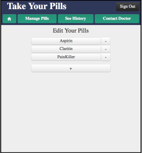
This is the "manage pills" main page. From here the user can delete a medicine, add a medicine or click on a medicine to edit it. This part is mostly unchanged from the start. |
|
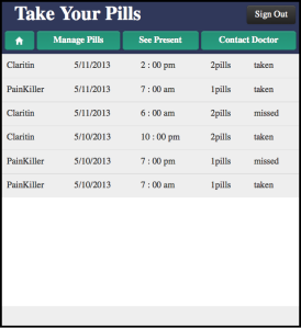
This is the "See History" Page. It shows the drugs the user has taken or missed. It looks like the main page, but with not checkbox and colors. |
|
This is the page will user edit the information of the drug. It is the same page the user needs to fill in to edit the drug. |
|
This is the contact doctor page where the user can select which doctor to contact (if he/she has multiple) |
|
This is a the message page where the patient can message with the doctor. The patient can see all the chat history with the doctor. |


Doctor
Page |
Description |
|---|---|
|
|
Implementation
Evaluation
Briefing
Patient:
You are a patient taking several drugs at different times of the day but sometimes you forget about them.. You want to keep track and be reminded to take them correctly by using this mobile app.
Doctor:
You want to hear immediate feedback from your patients about their medications. The doctor version of Take Your Pills allow you to communicate with your patients and check if they have
Scenario Tasks
Patient:
You are Amy Fox.
- You want to add Tylenol to your medications. You take 2 pills of Tylenol everyday at 2PM and 6PM, starting from today to end of July.
- You want to add cough syrup to your medications. You take 1 spoon of syrup every 5 hours starting from now to end of June.
- You realized that you actually made a mistake about Claritin. You want to remove it from your medications.
- You want to take pain killer three times a day instead of two. You add a time 12:00pm for painkiller.
- You missed your pain killer that you were supposed to take at 7am. Record the miss.
- You took aspirin. Record the take.
- You are having a headache for no reason. You are not sure if this is related to any medicine that you are taking. You want to contact your doctor.
Doctor:
You are Dr. Williams
- Check if there are any new notes from your patients.
- It seems that your patient Amy is having a headache. You want to check her medication history especially that of painkiller for this week.
- You think Amy is having her headache because she missed painkiller. You want to tell her about it.
- You want Amy to take ibuprofen instead of painkiller. You remove painkiller from user’s drug list and add ibuprofen starting from today to end of May, 2 pills, every four hours.
Reflection
Our group spent a lot of time and effort designing the look of the user interface and really went into the details of the app. How should a user take a drug? How should the user design a drug? How many messages should the user be allowed to send to the doctor everyday? These are the questions we spend a long time discussing but I think it's worth the time to do it, because those are the key decisions to make for a good user interface.
The paper prototyping and user testing iterations really helped us to pinpoint the usability problems our interface has and helped us improve our paper prototype. It wasn't a easy task, but eventually we made a paper prototype that was intuitive to the user. We took the advantage of the light weightiness of the paper prototype and tried different versions until we're satisfied with our design.
Something the our group came up short is the actual implementation stage. When designing user interface on paper prototype, we didn't pay attention to how we can implement it on computer, and only thought about what was the best interface we can think of. This is the right thing to do, but some of the features that we thought about are not implemented on computer prototype and the final implementation, because of lack of skill and time. For example, the history page is supposed to be a scroll down which we don't know how to do. When implementing our actual app, mistakes and glitches always come up and things are not as perfect as they are on paper prototype. Choosing the color and changing the color can be challenging and lining up different sections of the app isn't an easy thing to do. We chose a very primitive backend (with pain json file) and that also took us a long time.
Despite a lot of technical difficulty, we still implemented a working app in time and adjusted it according the the feedback from the users. We changed the history color to gray, had a much better calendar widget for selecting dates, and changed the wording in several places to make it more intuitive for the user. In general we did a pretty good job, and one lesson to be remember: paper prototype is one thing, actual implementation is another. If we started our implementation earlier (maybe even at the paper prototype stage), we can have a better sense of what can be done and what cannot be done, and our interface would be better.