Table of Contents
The Prototype (Photos)
As defined by the presented tasks, our users spent most of their time in the Calendar View (creating classes and assignments) and in the Mobile App (marking an assignment as completed).
The following picture shows a user working on Task #4 (adding a personal assignment). The calendar in the center is a dialog that pops-up when the user clicks the empty space on a given calendar date. The smaller post-it notes (in red and green text) are the assignments themselves, which were created on earlier tasks.
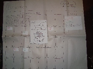
Fig. 1. User working on task 3.
The next picture shows a user working on Task #5 (marking an assignment as completed, using the mobile app).
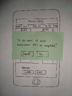
Fig. 2. User working on task 5 (mobile version).
Both pictures are from the second iteration of our prototype.
Briefing
Our application is a collaborative to-do manager, specifically designed for the painless management of school assignments. TAs, instructors, and classmates can add assignments to a shared class feed. Assignments from trusted sources are added automatically to the tasks list; assignments added by classmates can be optionally added to the student's schedule. Personal (private) classes and assignments are also supported.
The key motivations for using our application are:
- Every semester, many students have to independently (and redundantly) organize and catalog all of their assignments;
- Everyone must work throughout the semester to keep it up to date;
- Our application allows for collaborative to-do lists - only one person has to input the assignments;
- By sharing the workload among all classmates, our app makes it much quicker and easier to organize your classes.
- It is much harder to forget an assignment when all classmates share a common agenda.
Scenario Tasks
Our scenario covers the basic usage of the application, including creating classes and assignments using the web interface and completing an assignment using the mobile interface. The tasks presented to our users were:
- Go add 6.813 to your schedule. The assignments are: PS1 on the 11th, PS2 on the 16th, and GR1 on the 26th. Make it public so others can use your feed.
- Your 6.005 TA told you that he created a feed for all of the 6.005 assignments. Find and add his feed.
- You finished PS1 for 6.813---go and mark it as completed.
- You decide to add a personal assignment, "Reading: Learning Java," to 6.813. Go add it to your schedule for the 13th.
- Later, when away from your computer, you finish the Java reading. Go on your phone and mark it as completed.
Observations
The next sections present a summary of the observations collected from all users, for each iteration of the prototype. As a reference, the raw observations are also listed in Tables 1 and 2 below.
Summarized Observations - Iteration 1
- Having new calendars appear on-the-fly/as-needed on the "new class page" confuses people (they have to pause and understand what it is);
- Assignments on the phone are too small – even with the large prototype, users are mis-touching;
- While there are multiple ways of adding new assignments (clicking on a date square or on the class list on the right) users don't know this – they just have to guess;
- Consistency among the interfaces is good – the second time users see the calendar view, they understand how to use it;
- We don't have any method of notifying users when they make an error (such as missing a section on the new class form);
- People seem to read the error messages (this might change with a computer prototype);
- Lack of enter can be confusing on auto-updating fields – this needs to be a quick change;
- We definitely need to be crossing out assignments (not removing them);
- On your calendar, make a distinction between public and private events (user suggested color, icons would also work);
- We need to be consistent with our wording (Find vs. Search vs. Create);
- While color is useful, some users had trouble finding which "PS1" assignment they were supposed to remove.
Summarized Observations - Iteration 2
- Even though the mobile metaphor is slightly different now, users don't have any trouble using it;
- Adding plus buttons on every element that can add new assignments might clutter it a bit, but it really helps the users learn the interface;
- Making users explicitly add further assignments on the creation page is fine and less confusing;
- All calendars need to have dates on them;
- Some confusion between "Name" referring to assignments instead of class. On the creation page, name should be closer to the text box it represents;
- One of the slowest tasks has consistently been the selection of 6.005 from the search list. We should make sure that the font for title of the class is larger than the rest of the search result;
- Having both a "search" and "add a class" buttons seems to be fine. Maybe search could also search through all of your assignments;
- Finding the correct assignment to complete is much faster with the addition of class name;
- Some would really like to be able to add it to an external calendar (useful feature, but might hurt the push capabilities that make this useful);
- Plus button next to class works really well, communicates it's action;
- One user tried to add an assignment without adding any classes first. They didn't have a good grasp of our model, and we might want to highlight or bring notice to the "Add class" button if this happens.
Raw Observations - Iteration 1
Table 1. Raw observations from the three participants in the first iteration.
|
User 1 |
User 2 |
User 3 |
Task 1 |
-no confusion between find and search |
-no confusion between find and search |
-added right away |
Task 2 |
-clicked add to do the search. search needed? |
-clicked on the right feed quickly |
-pause at find that class, then hit add new class |
Task 3 |
-clicked on the task to complete it right away |
-clicked on the wrong class (6.005 instead of 6.813) |
-properly clicked on ps1 to mark it as completed |
Task 4 |
-slightly confused on how to add an assignment / task to a class |
-clicked on the date that he wanted the assignment due |
-quickly clicked on 6813 to add an assignment |
Task 5 |
-basically do the same thing as task 4 |
-clicked on the right thing |
-clicked on assignment to mark it as complete |
Feedback |
-no feedback |
-wouldn't want the assignment to go away, wanted a checkmark / cross out |
-pretty intuitive |
Raw Observations - Iteration 2
Table 2. Raw observations from the three participants in the second iteration.
|
User 4 |
User 5 |
User 6 |
Task 1 |
-found add button quickly |
-got right button instantly |
-searching for add button |
Task 2 |
-hit search button instead of add button |
-went to add a new class to find the new feed |
-isn't really sure how to find an existing feed |
Task 3 |
-clicked on the assignment right away |
-selected task appropriately |
-clicks on the assignment |
Task 4 |
-hesitated, then selected the plus button to add a new assignment |
-clicked on the plus button next to the name of the class instead of the plus buttons on the date |
-pause on figuring out how to add the assignment |
Task 5 |
-selected the assignment |
-little slow, color would be useful |
-pausing before hitting anything |
Feedback |
-asked if old assignments will be removed or crossed out |
-plus button on the date instead of the class |
-confusion between search and add a class |
Prototype Iteration
Based on our observations from Iteration 1, we identified several opportunities for improvement. Smaller changes were performed between users, while more significant modifications were deferred to the next iteration.
On the main overview page, we noticed that users were having a bit of trouble figuring out how to add new assignments. They generally got it, but it was through a guess and very non-obvious. We decided to include plus buttons on every element that can be selected to add an assignment (next to the class list and on every date square). After this change, users were less confused and completed task 3 more quickly.
On the class creation screen, users were confused by the "New assignment" boxes that appeared as they typed (AJAX). It's probably distracting to have elements appear just as the user begins to type. In the second iteration, we added a large "Plus" button at the bottom that would cause new assignment boxes to appear. Users were much more familiar with this and had no issues understanding its use.
Different classes often label things identically (i.e. PS1 was on the calendar twice). While the two assignments are different colors, it takes users a moment to find the assignment, check that it's the right one, and then go back an delete it. This is a slowdown, and may cause errors in prolonged use. We decided to add a short class name (i.e.. "6.813 - PS1"), and users appeared to take less time on this task.
In the first iteration, one user tried to hit save without selecting a public / private type. This made us realize that we never decided what to do in the case of error. We planned to use a red marker and highlight errors in the second iteration, but the situation didn't come up again.
We noticed that, even with the oversized prototype, users often clicked on the wrong assignment due to small size. We decided to re-work the mobile screen to only show a few days at a time. Users understood this (even though it didn't have the full-month view that they originally learned). As far as we could tell, their aim was better in the second iteration, although it bears further testing with a real-sized computer prototype.