Design
Our main design decisions were mostly based around a desire for our website to be simple and internally consistent. Some of the problems we had with our early designs stemmed from our attempt to use standard layouts, such as tabs and sidebars, as affordances for navigation. The change to a header design after the paper prototype solved many of the high level navigation problems our users had been finding. Most of the changes we made between the computer prototype and the current design (as detailed below), smoothed out small, but important issues, such as button placement, or added to the overall simplicity and elegance of the look of our page.
Home page
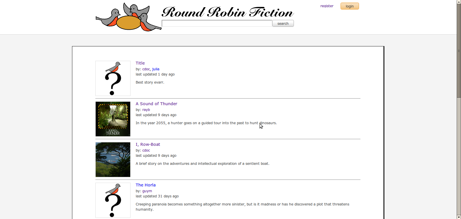
We decided to make the main portion of our web site have a page-like border instead of having contents fill the entire screen. Since using this website would involve a lot of reading, having the (mostly text) contents gathered at the center of the screen would make it easier to read, as the distance between the end and beginning of a line is shorter. The layout also looks like a physical piece of paper, so it adds a sense of familiarity to users who are mostly used to reading things from paper pages.
We also included an option for users to add a picture for their stories. The pictures appear as thumbnails next to the title and other information of the story on the search result page, enabling the authors to give potential readers a quick visual impression. We made sure the the images were contained in the fixed-size boundaries to maintain the organized look of the page. Using fixed-size images also means that the titles of search results are lined up vertically, facilitating the user's ability to quick scan the results.
Page for a story
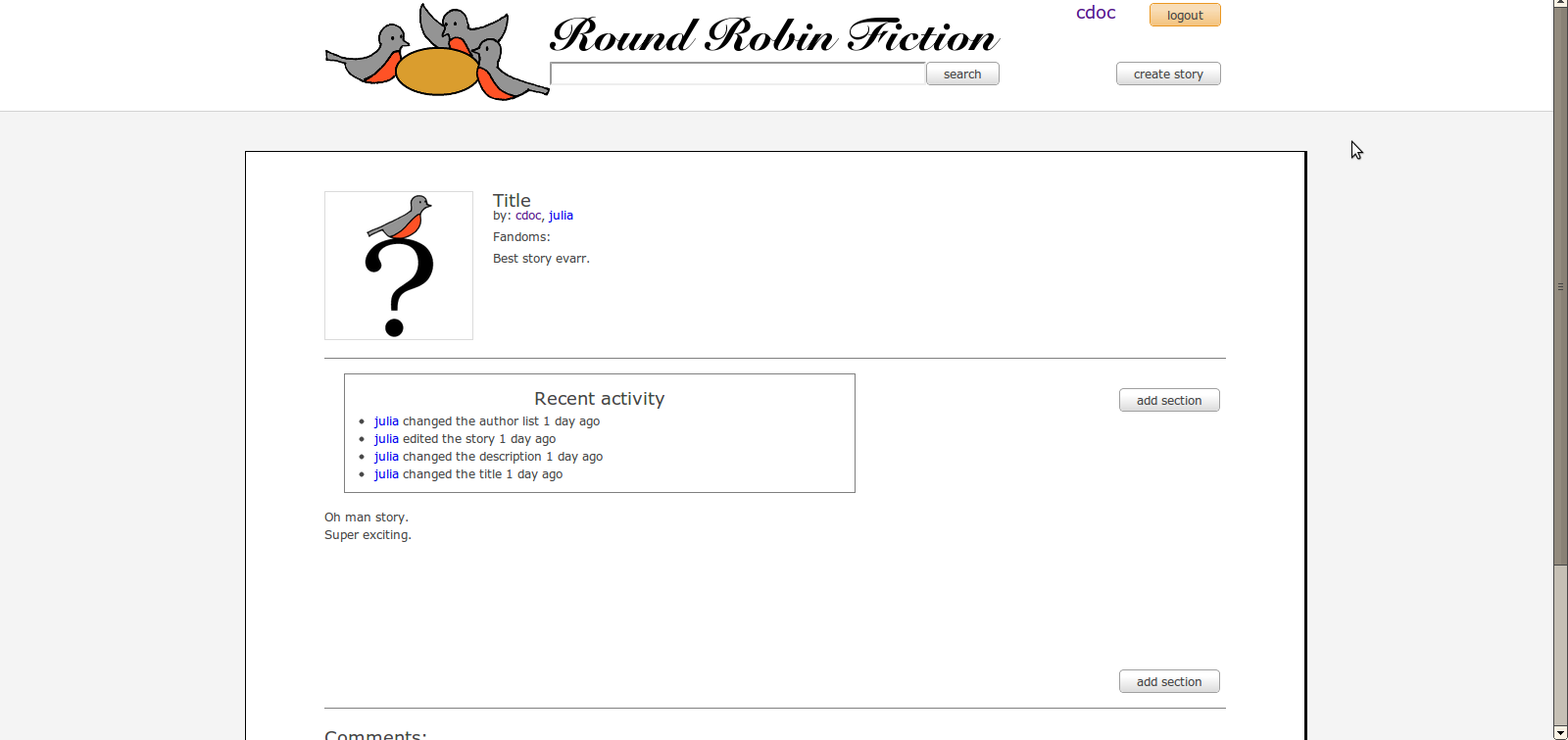
There have been user comments that since Round Robin Fiction enables multiple users to work on single story, a user should be able to see what happened to the story since one last left it. Log of recent activity, which lists details of recent changes to the story, was added to meet the need.
When users tried to create new stories, they were often thrown off by presence of two 'add section' buttons next to each other and also confused about where the content is supposed to appear. We dealt with this by having a default blank space where the text is supposed to appear and having some default text in there.
Text editor on a story page
Based on the feedback from the computer prototyping, we added 'submit' button to the text editor instead of making the small 'save' icon function as the submit button. The size and placement of the submit button was chosen to give it an appropriate affordance. We kept the save button, so that users can intentionally save drafts of their work without posting the draft to the story. Since a user may also accidentally navigate away from an editing page without submitting or saving, the text in the editor is autosaved regularly. As with livejournal posts and comments, when the user returns to the story they had previously been editing, the draft appears in the editor.
User page
To enable users to look at list of stories a particular has user worked on, we created a user page that is reachable by clicking on usernames. Since user pages are fairly normal, and in a writing community, users are likely to want to read work by authors they like, we felt that this page, though simple in design, would be important, and even expected by our target user population.
Implementation
We built the website using Apache Tomcat and MySQL on a Linux machine. We found JSP's and Servlets extremely easy to create and use, which made development go pretty quickly. We used JSP's for serving out the pages with lots of HTML and only used Servlets for handling asynchronous requests. We also used some classes as Beans to abstract away the database queries. Interface behavior was done with a lot of CSS and Javascript, relying heavily on AJAX to avoid frequent page refreshes. Most of the Javascript was home-brew, but we did use JQuery-ui for its autocomplete functionality. The only problem with the implementation was that we could never get Database Connection Pooling working properly with Servlets, which caused the website to occasionally (once a day or so) lose the ability to query the database until restarted. Obviously, this is a huge issue from a website usability standpoint, but since it didn't directly impact the interface (and since this is a user interface class), we decided not to pursue a bug fix. For the most part, we had no problems with the systems used in our implementation; the only issue was that we were building everything ourselves (Java backend, CSS, Javascript, etc), which took a lot of time.
Evaluation
Background
We aim to construct an online interface for authors to easily collaborate on and share original and fan fiction. The target users are amateur writers who want to work together, mostly for fun, but sometimes also to improve their writing. Collaboration is a major component of the site, with various authors having the ability to append sections to a single story. Each story has one or more administrators, who are responsible for adding and removing authors, and deleting any abusive comments. Depending on the style of stories the administrators want to write, authors can either have permission to 'write,' meaning add sections to the end of the story, or 'edit,' meaning alter the current text of the story.
Our website is directed at registered users, so please feel free to log in as any of the existing users. For all the users on the site, their passwords are the same as their usernames.
Tasks
- Find and read the story 'The Sound of Thunder'
- Comment on this story
- Create a new story
- Add the author 'cdoc'
- Add some text to your new story
Evaluation Results
User 1
- She did not realize she would have to log in to comment on a fic. This could be fixed by having text next to the comment saying 'You must log in to use this feature.'
- User assumed Comments could be found at the bottom of the page – which is where they were.
- While creating a story, she found it irritating that the default text didn't disappear when the text boxes appeared. For example, she had to delete 'Insert Your Title Here' when changing the title of the fic.
- When experimenting with the search functionality, she thought it would be useful to have a 'No results found.' page.
- Overall, she said the design was very clean-looking, but that the title font was difficult to read.
User 2
- She thought the size of pop-ups for editing authors and fandoms were too small and somewhat hard to use. She also said it would be nicer if changing the picture for a story could be done by simply clicking on the image, not clicking on the small 'edit image' box after hovering over the image.
- Since it's very easy to get into text editing mode(simply clicking on the text, which could happen by accident), she felt that it should also be able to get out of the text editing mode quickly. One such way could be making the click outside the box switch the focus away from the editing box.
- In general, buttons on text editor/meta data editor were too small while the text editing space seemed a bit too big. She liked the size of the comment window.
- Overall design looked simple and pretty okay.
User 3
- She was annoyed by the fact that we required passwords to be of a certain minimum length.
- After creating a new story, she searched the page for a good 5 seconds before finding where to click to edit the title.
- Used the "edit" text editor to add the first section to the story. While trying to save the changes, clicked "Add section" which brought up the "add section" text editor. She eventually managed to successfully complete the actions, but was very confused by this behavior. A simple fix for this would be disabling the "edit" functionality when the story is blank. That solution is probably sufficient, but if users are still confused then we may need to redesign how the "edit" feature looks and is triggered.
Reflections
In testing our design on a variety of users, it was surprising to see how different peoples' expectations were very different. For example, in this last round of user tests, a User 2 found clicking on the story text an irritating attribute (she wanted to get out of it quickly), whereas we implemented that functionality because at the paper prototyping stage, many users attempted to click on the text to edit the story. Although some reactions may be universal, our experience has shown that there can also be much variation in user expectations.
Since our project was focused on giving users a forum to write, we wanted to design an interface that did not interfere with their work. Since the functionality required for each page was simple, we aimed to create a very simple site. This proved remarkably challenging, both practically and aesthetically. Streamlining the user actions required several levels of user testing and heuristic evaluation to design – at every stage, we found that our ‘simple’ arrangement of the buttons and links was confusing to some of the the testers, and would be better placed elsewhere. However, with a simple design as a goal, elsewhere was sometimes hard to find. Similarly, while the layout of our page appears very simple and understated, choosing colour and a layout that neither looked bare nor created unnecessary cognitive dissonance took a very long time. In general, however, we did find that simple layouts were helpful for the users, as they could quickly see all the options and possible decisions.
If we were to create a new project, we would want more user input, and more frequent, finely grained input. We feel that the first problem discussed (that different users have different expectations), would be alleviated if the volume of user tests were increased, since we would then be able to determine which expectation was held by the majority of our prospective users. We also felt that recreating the entire design for every user test meant that user input was less frequent and less effective than it might have been. For example, our paper prototype had the most problems with the story page, and it might have been useful to have a quick mock-up of the new design for just that page (either in paper or as a computer prototype), without any real features, just to check that our new design fixed the problems of the old and did not create any new difficulties. Similarly, our task were very story-centric, so the the user testing illuminated problems with the story page, but not as many problems with the main page, since the test users did not interact with it extensively. As such, the heuristic evaluation provided a lot of useful feedback about the main page that we had not considered before. If there is some part of the design that does not play a large role in user testing, it would be nice to be able to get a heuristic on just that page early on in the project, so that any problems with it will not interfere with the testing of the other pages, and can be fixed quickly. Sending only that part of the site for testing would decrease the strain on the evaluators and the creators, hopefully allowing them to create the best possible interface.


