GR3 - Paper Prototyping
Stephen Chang, Sarah Han, Samvaran Sharma
Briefing
Competing against friends is fun, but putting together a formal tournament is often a tedious task. Organization through methods such as email and Google Docs, or even paper and pencil are time-intensive and have low degrees of automation. BrackeTracker is a site that aims to fix this issue by streamlining the creation, upkeep, and management of these competitions. On our site, you will be able to create tournaments, invite your friends to them, visualize the progress of tournament members, and keep track of match outcomes, head-to-head records, and more. Through use of our site, we hope to help take the hassle out of tournament organization so you can spend more time playing and less time worrying!
Scenario Tasks
Create a Tournament
|
Search for/Join a Tournament
|
Update a Tournament
|
Manage a Tournament
|
View a Tournament
|
Create a round robin tournament with your friends Moe and Curly
|
Join the "Office Ping Pong" Tournament
|
You have completed your match against Moe. Update the score in the tournament
|
Make Curly an Admin for the tournament and then boot Dave from the tournament
|
Check the status of the "Office Ping Pong" tournament
|
First Iteration
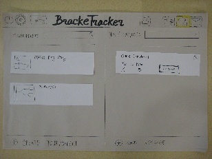
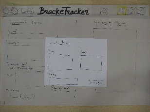
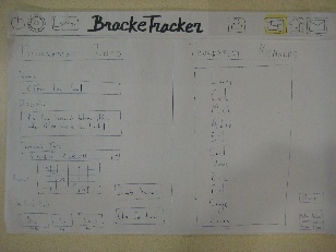
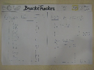
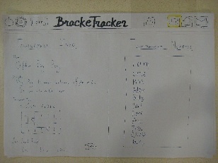
Home Page |
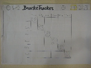
Specific Tournament Page |
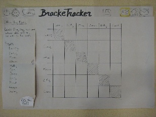
Tournament Page with Sidebar |
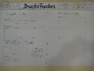
Create Tournament Page |
Invite Members Popup |
Filled out Create Page |
Friends Page |
Join Tournament Page |
|
|
|
|
|
|
|
|
Observations on First Iteration
User |
Create a Tournament |
Search for/Join a Tournament |
Update a Tournament |
Manage a Tournament |
View a Tournament |
Overall Comments |
User 1 |
- Assumed that if the join period was left blank that it would close immediately and only
invited people would be a part of the tournament.
- Assumed that if the join period was left blank that it would close immediately and only invited people would be a part of the tournament.
- Wanted some sort of confirmation that they had completed creating a tournament
|
- There was no “JOIN“ button on the tournament info. page, which led to confusion about how to join a tournament.
- Did not think that the separation between your tournaments and global tournaments was necessary for the search results. Suggested just have all results on one page.
|
- User was confused about where they should click to update score, on tournament image/where in the round robin image vs. on the expanding sidebar.
- Tried to click on the names visible in the tournament image.
- Felt that it seemed odd to have both a score and winner/loser option.
|
- User was confused about where they needed to go to manage tournament details (i.e. boot a player, make a player an admin)
- Was not sure if the player names were clickable.
- Wanted feedback as to whether or not their action was completed. (i.e. if player was actually booted or made an admin)
|
|
- User felt that the bi-panel homepage setup was not needed. However, also mentioned that this could be due to the tasks given, since most of them did not require interaction with the notifications half of the homepage.
|
User 2 |
- confusion about the significance of the join period.
- wanted confirmation that the task was done.
|
- confusing regarding the results of the search. Suggested having both search results from your tournament list and all global results.
- Order of password popup & tournament info page seemed confusing. Suggested that we change the order so that you click join on the tournament info page, which then takes you to the password popup.
|
- Clicked on the score box on the tournament page.
- Questioned if both score both and checking off winner/loser was both necessary.
|
- Wanted some sort of feedback as to whether or not Moe was made an admin.
- Suggested having an icon next to people's names to differentiate b/w player vs. admin
- Removing player should result in immediate removable of name from the player list.
|
|
- Is there a concept of friend?
|
User 3 |
- Confusion about the difference b/w email and friends on the invite members popup.
- Confusion about the necessity of filling out the join period.
- Wanted feedback to confirm that the tournament was actually created. Perhaps have a create button.
|
- Confusion regarding the results of the tournament search. Initially thought that the tournament search box was for on your own tournaments. Also, did not click on the see all results.
- Tried clicking on the tournament icon located on the header bar.
- Suggested potentially having tabs on the search results to differentiate b/w local and global search results.
|
- Confusion regarding how to dispute a score/ who is in charge of updating scores if incorrect. Suggested possibly having both approve and reject buttons for the score update popup.
|
- Wondered why the list of players/tournament info sliding sidebar was not visible by default.
- Suggested different ways to draw attention to the side bar including: (1) animating sliding out/in (2) having a boucing/glow effect when initally loads (3) checking the browser width & determining if there is enough screen real estate to show both the tournament info and the tournament visual.
|
|
- Don't have affordances that do nothing.
- What do all the icons in the header bar do? i.e. Is the logout button going to turn off my computer?
|
Prototype Iteration
Create a Tournament |
Search for/Join a Tournament |
Update a Tournament |
Manage a Tournament |
View a Tournament |
Overall Changes |
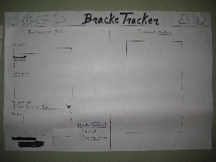
- Added a "Create" button - would be replaced with the text "Created" once clicked
- Initially grayed out "Close Join Period" button until tournament was created
|
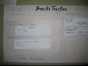
- Added the two panel search results - top panel for your tournaments, bottom panel for all tournaments
- Clicking the tournament from search results would bring user to tournament info page instead of immediately prompting the user to join the tournament
- Clicking on join from tournament info page would pop up the password prompt
|
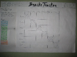
- Changed the order of the "winner" radio buttons and "score" text boxes
- Added "optional" next to the score column
- Added "Reject" button onto the notification
- Removed ability to close the notification without accepting or rejecting the request
|
- Added checkboxes to the names
- Color coded the names
- Animate side bar to show when page loads. Disappears immediately after
|
|
- Gave the Tournaments panel on homepage more real estate
- Took out messages and tournament icons on the header bar
- removed search bar for notifications
- Removed send message capability
- Can't close notifications without taking prompted actions (e.g., "Ok", "Approve", "Reject")
|
Second Iteration
Create Tournament Page |
Tournament Page with Sidebar |
Search Landing Page |
Home Page |
|
|
|

|
Observations on Second Iteration
User |
Create a Tournament |
Search for/Join a Tournament |
Update a Tournament |
Manage a Tournament |
View a Tournament |
Overall Comments |
User 1 |
- Confused with their name vs. tournament name on form
- confused with friends vs. email
|
|
- Tried to open sidebar and click on player's name to update score
- Didn't fill in score
- Didn't notice the notification from opponent to approve score
|
- Noticed the sidebar animation, went straight there
|
|
- Thought logout symbol was a power button
- Suggested to switch location of icons on top bar
- Was confused what the friends button did
|
User 2 |
- Confused with their name vs tournament name on form
- Thought friend name and emails corresponded with each other
- Suggested to change "Close join period" button to "Start Tournament"
|
- Suggested to put "Join" button on top of page in case description was very long, might not know there is a "Join" button if not immediately visible
|
- Ignored notification
- Suggested a visible state change after the score was sent for approval
|
- Wondered why side bar would ever disappear if there's space for it
- Tried to click name in bracket to boot/make manager - supposed to go to side bar
|
|
- Thought logout button would close the application
|
User 3 |
- Also entered their own name instead of tournament name
- Didn't know what password box was for, skipped it because noticed it wasn't required
- Wondered why the join period was grayed out at first
- Suggested put the invited members' names in the members box after invitations were sent
|
- Initially confused what the search bar at top did - would it search his tournaments or all tournaments
- Confused with the layout of the search results page - wasn't consistent with other sites he used. Said he doesn't read all the labels as a heavy internet user
|
- Only user in this iteration to notice notification message
- Didn't know what tournament the match was for, didn't want to approve it because he didn't know
- Didn't know which box in the round-robin grid to press first (he could have done either)
|
- Suggested having some color-coded key to explain what the colors for each player meant.
- He did accurately guess what each color was
|
|
- Same issues - power button, left-right layout of top icons
|
Third Iteration
By the end of the second iteration, we had been able to weed all major problems out of most of the pages, reaching a point at which further iterations of paper prototyping would add little to our insight. However, our "Create a Tournament" page was not at this level yet - users still had trouble completing the primary task without confusion, and we noticed some consistent mistakes being made by all three testers of our second iteration.
Create a Tournament |
 |
Third Iteration Observations
User 1 |
User 2 |
User 3 |
- User had little issue creating a tournament
- Questioned how the "password" system would work (ie. is it shown in the email?)
|
- User noted external consistencies helped him - had little issue
- Wasn't sure about preview section until he clicked on the drop down menu
|
- User had no major issues
- Noted that "close join period" button should perhaps be "start tournament"
|
Reflections
Paper prototyping proved to be an invaluable lesson. Not only did paper prototyping help us iteratively think through the UI design and implementation for BrackeTracker, it also provided us with insight on the process of creating a successful User Interface. We learned that certain features, such as the icons on our header bar, which we thought had clear meaning, did not clearly convey the messages and affordances we expected. Through observing users work through various tasks we were able to develop a better understanding for the aspects of our design that dealt with factors such as learnability, efficiency, and visibility. We realized that we needed to emphasize certain aspects of our design, such as including animation for our sidebar, while getting rid of other aspects that users did not find as important, such as the notifications search bar. Furthermore, observing and talking with users after completing the tasks enabled us to pinpoints areas in the overall process flow of our design that needed further clarification such as the tournament search paradigm. The overall process of paper prototyping allowed us to weed out any major problems that were present in our design. However, there are limitations to this approach - it lacks the fidelity to allow us to test some of the finer details that will only be present once we move on to digital drafts. The observations, feedback, and improved prototype design will enable us to create a better computer prototype in the next stage of our design process.
fin

1 Comment
Sacha Zyto
"Prototype: the iteration seems to have been useful. Great !
Briefing & scenario tasks: simple and clear. Good ! Tasks are short and high level
User testing observations: substantial number of usability problems were found.
Presentation: very clear
Overall: Comment from meeting:
how did/will animation help in managing a tournament ?
what current issues do you have unresolved ?
How does ""create a tournament"" look like when some values are filled in (what does preview do?).
Discussion at the end was very appreciated !
"