GR6 - User Testing
Design
Login Page
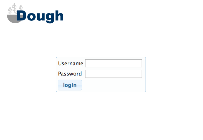
For the purposes of this class, we designed our login page to be minimalistic and efficient. This way, returning users would be able to log into the page and view information as quickly as possible. However, had this been a project we were trying to market to a wider audience, it would've been a good idea to include more information about what Dough is and how it works. Nothing on this page (except maybe the symbolism in the logo) says what services the website offers or entices new users to sign up. In fact, we did not even include a "sign up" function because it is common for new websites to only allow sign-ups through email for beta testing.
Home Page
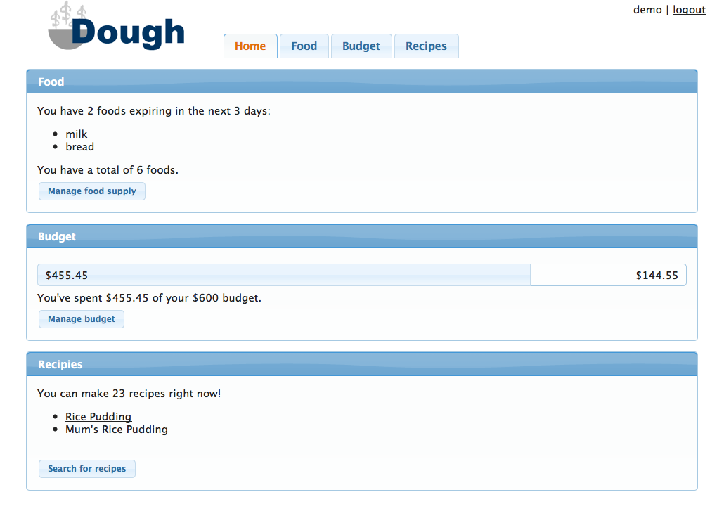
The layout of our homepage has not changed much through the different iterations of our design. We wanted to include a brief summary of each of the three areas of the website (food, budget, and recipes) to the user to improve efficiency. After reading evaluations of our computer prototype, we decided to reduce the width of the page content (on the homepage and all of the other content pages as well) to a specific number of pixels, and we centered this content on the page. This ensured that on high resolution screens, important information would still be easy to read (not stretched across the full span of the screen). As a result, the budget progress bar on the home page is much easier for the user to parse. Also as a result of our computer prototype, we made sure to turn the recipes listed under the "recipes" section into hyperlinks. This reduced the cognitive load on the user when trying to look for recipes because they did not have to remember the recipe name and then search for it on the recipe page. It was also suggested during paper prototyping to list both foods that are expiring and the total number of foods in the "food" section. We also decided to clarify what we mean by "expiring soon" by listing the actual time frame (3 days). This increases visibility.
Foods Page
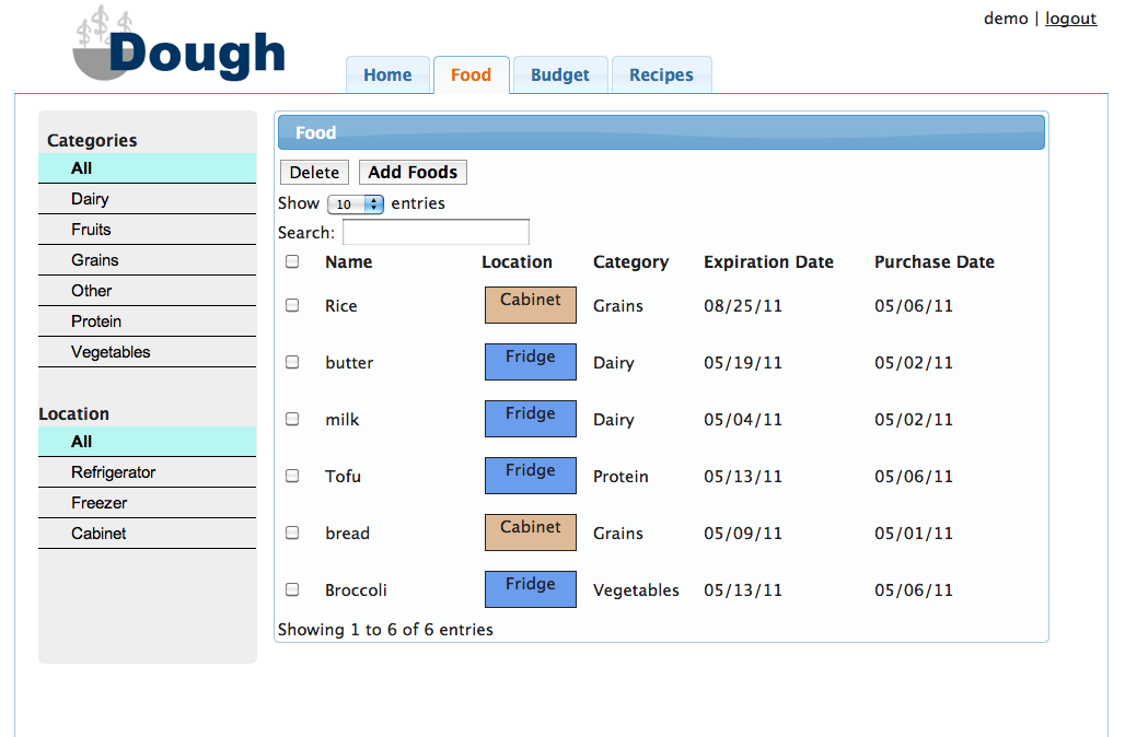
The foods page was the most difficult to design due to the amount of information we wanted to display to the user. In contrast with our previous design iterations, we removed a lot of the buttons at the top of the food list panel (recipe search, tags, select). We did this to either simplify the design (by keeping recipe search functionality entirely on the recipe page) or eliminating confusing/unintuitive operations (tags and select). We also decided to make the list of foods sortable by all of the categories, but we were unable to include proper icons to indicate that the list is sortable. Hence, the functionality is there, but the affordance is not.

In our final implementation, we made several alterations to the "add food" modal dialogue box. We changed the "tags" section to a more explicit "location" section and included icons for each of the possible locations. We also included a default purchase amount of $0.
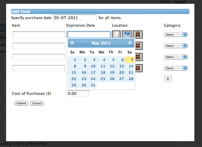
We felt that calendars for date entry, a feature we included in the computer prototype, was a critical design decision for both efficiency and error prevention. It allows the user to quickly view dates in a way that they are familiar with looking at them (consistency with real world) and pick them out quickly. They are also less likely to make an error because there is more visual feedback about their date choice. For all of these reasons, we opted to include this in the final implementation.
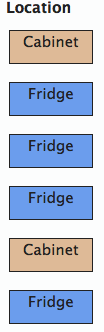
We decided to color-code the various food locations in our final implementation. We feel that the use of a visual variable here (color) makes the page easier to interpret.
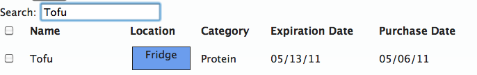
We included a search bar for quickly finding food. This improve efficiency when a user is looking for a very specific food item.
Budget Page
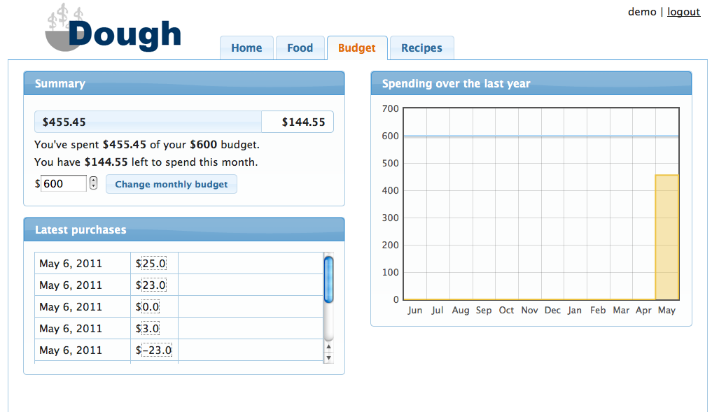
Due to suggestions from computer prototyping, we redesigned our budget page to no longer contain nested tabs. All information is immediately visible to the user but still separated conceptually by the different subsections (summary, latest purchases, spending over the last year). This makes it more apparent to the user what information is contained where.
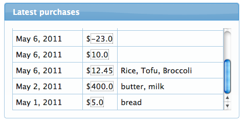
Through paper prototyping, we learned that it is important to make previous purchases editable, so we included this functionality in our final design. We tried to give the values the affordance of being editable by putting a dotted box around them. We also included a summary of foods that were in the purchase. This makes the system more visible and reduces the cognitive load on the user because remembering which purchase is which is now recognition rather than recall.
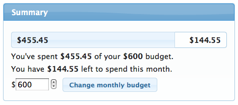
We included the functionality to change the budget right on the budget page rather than in a modal dialog box. This is very beneficial for efficiency reasons, but it allows the user to very easily change goals they have made. For instance, if they find that they're going over the food budget, they can very easily just up the budget to account for it. Hence, in this case, it is arguable that efficiency here is not exactly the best thing.
Recipe Page
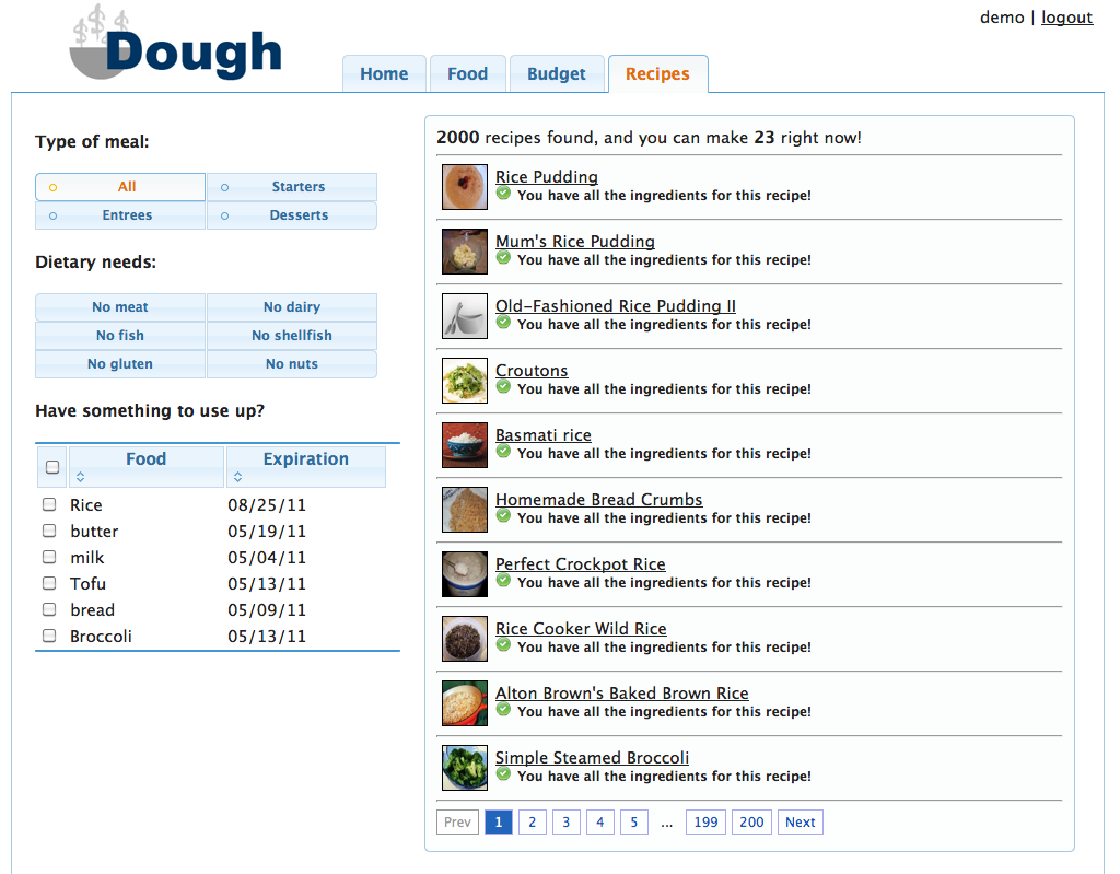
The overall look of the recipe changed was changed quite a bit from the computer prototype to make efficient use of the available space. We increased the span of the portion displaying the recipes and reduced the clutter of the search options portion by grouping options more effectively. We also used jquery UI buttons instead of standard radio buttons/check boxes to improve the overall look and increase the area a user can click to select an option.
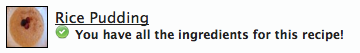
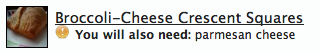
While our computer prototype only included links to recipes, our final implementation also has pictures of recipes to improve visibility. We also included a list of additional necessary ingredients so that the system can make a wider variety of suggestions to the user. We achieve visibility here through the use of icons (shape and color visual variables).