Paper Prototype (First Iteration)
Home Page |
Home Page (Green Expanded) |
Home Page (Both Expanded) |
Main Menu |
|---|---|---|---|
|
|
|
|
Transaction (Search UI) |
Transaction (Scroll UI) |
Transaction Individual (Scroll UI) |
Transaction Individual (Search UI) |
|---|---|---|---|
|
|
|
|
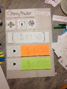
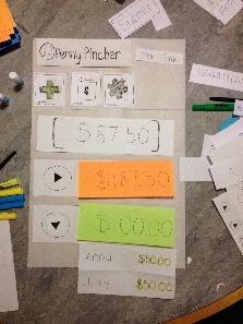
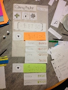
Transaction Amount |
Individual User Transaction History |
Individual User Transaction History (w/ Dispute Option) |
Individual User Transaction History (w/ Disputed Transaction) |
|---|---|---|---|
|
|
|
|
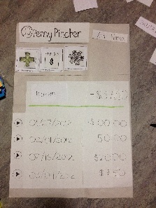


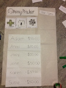
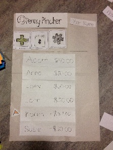
Summary of All Transactions |
Summary of All Transactions (/w Disputed Transaction) |
|---|---|
|
|
Briefing
Thanks for agreeing to help us out! What you see here is part of a project we’re working on for the User Interface Design class (6.813). Today, you’ll be helping us test a new system for keeping track of outsanding expenses among friends and acquaintances. This system, called PennyPincher, is a means of recording and monitoring transactions among individuals and groups. We’re testing particular parts of the system which allows you to post new transactions to declare that someone owes you money, dispute a transaction you think is incorrect, and view a history of all transactions you’ve been a part of.
Here’s how it’s going to work: We're going to present you with a paper prototype of the mobile web app, which is fairly rough representation of what the mobile site might look after we build it, but on a much larger scale. Depending on the type of mobile phone you are on, the stylus will be your mouse or your finger (for touchscreen phones). We'll give you a few short tasks and ask you to try to execute them on this "web app". As you click on things, We’ll physically change the website to respond to your actions. Let me briefly introduce you to our team. My name is __, and this is ____ and ____. After we get started I'll be controlling the "computer" and they're going to be taking notes to identify areas where we need to fix our system.
Also, keep in mind that we're testing the computer system and design, we're not testing you. The system is at an early stage of development and is likely to have problems that might make it hard to use, so we need your help to find those problems. Please feel free to think out loud to help us understand your thought process, too! Your test results will be completely confidential, and you can stop at any time you want. Do you have any questions we can answer before we begin?
Scenario Tasks
Task 1: Adding a transaction
(Version A)
You went to lunch with a friend, Joey, and since he was short cash, you had to foot the bill (which you have decided to split evenly).
You want to add a transaction that shows that Joey owes you.
(Version B)
You went to lunch with a couple of friends, Karen and John, and since they were both short of cash, you had to foot the bill (which you all have decided to split evenly).
You want to add a transaction that shows that Joey and Susie owe you.
(Version C)
You went to lunch with a couple of friends, Joey and Susie, and since they were both short of cash, you had to foot the bill. It came out to $60. Karen insists she pay $40 since she ordered a courmet entree. John just got a soda so he owes $5.
You want to add a SINGLE transaction that shows Karen and John owe you the correct amounts. (Note, you will be financially responsible for the remainder)
Task 2: Dispute a transaction
You believe that one of your friends, John, mistakenly thinks you owe money and has posted an incorrect $10 charge for lunch at UBurger, when in actuality, you've already payed him back.
You want to dispute the $10 transaction that John has made.
Task 3: View summary page and individual history
You want to see a full list of people with whom you have made transactions with. After, you want to view all of the transactions made with Adam.
Observations
The following observations are notes that we took during the user testing
User 1
Task 1A (Scroll Interface)
- User had some difficulty with this Task since he found the home page to be a bit confusing.
- User kept on looking at the sections that drop down and list the current transactions instead of looking at the three main action buttons at the top.
- After some trial and error, the User finally figured out to press the add button.
- User added other users into the transaction pretty swiftly and quickly.
- User was confused about the "include me" button, since had mentally subtracted himself out of the total bill amount.
- User had little to no trouble on the transaction page and understood what "custom" and "even split" meant in terms of the application.
- User did complete the task successfully, but had hiccups throughout the entire process.
Task 1B (Search Interface)
- User did not have issues with the search interface and the process went smoothly considering that the user had figured out how to do the task already.
Task 1B - User had much less difficulty on this task because he user had now figured out how the system works.
- Overall process was pretty smooth and user didn't make any errors.
Task 2
- User had to think for a little while on the home page before he realized that the "red" and "green" sections provided drop down menus.
- User figured out how to get to a page that displays all of his transactions with Joey pretty quickly after he discovered the dropdown.
- User finds the transaction that he does not agree with and disputes it with ease and no confusion.
- User now tries to go back to the home screen. He hesitates for a split second, but quickly realizes that the "Penny Pincher" logo is also a link to the home page.
- Overall process was pretty smooth once the user discovered the dropdown menu.
Task 3
- User presses the calendar action button at the top with no problem.
- User clicks Karen and finishes the task easily.
Overall Comments
- User was displeased with the front page layout because he just found it jarring and confusing.
- User was completely confused by the +/- notation for money owed to you and money you owe. Had some major issues figuring out and feels there could be a better notation for it.
- Besides these main problems, User found the tasks to be intuitive and easy to use overall.
User 2
Task 1A (Scroll Interface)
- User had no issues with this task and performed it as if he designed the application himself.
Task 1A (Scroll Interface)
- User had no issues with this task as well. Search and autocomplete were intuitive to the user.
Task 1B - User once again had no issues with this task. He performed it without any trial and error.
Task 2
- User had no issues completing the task at hand and performs the dispute action without trial and error.
- After completing the task, the user tried to go back to the home page but had some trouble.
- User was unsure of if there was a back button or any sort of method to go back. However, he manages to discover the Penny Pincher logo/link to go back to the home page within 2-3 seconds.
Task 3
- User completed this task with no trial and error
Overall Comments
- Home Page
- User didn't like the overall position label (the total amount you are in the red or green).
- User felt like the overall position could have been the last transaction and recommended that a label like "Balance" would definitely help the user understand what it actually means.
- User also wanted the overall balance to be color coded.
- User didn't like the arrow icon for drop down menu. User felt like it could be a play button and was therefore a bit confused.
- User liked the drop-down idea and felt it was a good way to get around having less screen space on a phone.
- User felt like the icon for viewing all transaction kind of looked like a calendar; suggests putting the rings on the side and not the top
- List of Transactions
- User felt that the +/- was confusing. He feels that color coding values with red and green is much more intuitive and should be done throughout the application.
- Scrolling Interface vs Search Interface
- User liked the very clear scroll interface to find usernames to add to transactions.
- User did not like the include me option and felt like it could be confusing to some users.
- User recommended that we move the include me option into the names section of the interface (closer to the bottom) instead of where we had it (closer to the top).
- User preferred the search interface over the scrolling interface due the fact that long list of names can be very painful to scroll through .
- Splitting of Money
- User understands the "custom" and "even split" options.
- User brings up a concern with custom splits and mental mathematics
- What if the users are splitting something more complicated than even integers?
- Suggests that we have some sort of recommendation when there is only one person left.
- Example
- Total = $68.47 for three people
- First person: User puts in $20 dollars
- Second person: User puts in $25 dollars
- Third person: User gets recommended by the system to put $23.47 dollars.
- Example
User 3
Task 1A (Scroll Interface)
- User immediately found the “Add Transaction” button, navigated through the “Add Transaction” page, and completed all necessary fields to submit the required information to add a transaction as stated in the task.
Task 1B (Search Interface)
- User immediately found the “Add Transaction” button and arrived at the “Add Transaction” page.
- User was confused by the search drop down menu due to the way it was depicted in the paper prototype.
- User expressed curiosity and confusion when the “Submit” button changed to “Next” when multiple users were selected for the transaction.
- User pressed the “Next” button, and on the second page of “Add Transaction”, User pressed the “Back” button to see what the system would do.
- User tried to edit the total transaction amount on the second page of “Add Transaction”.
- User could not edit the total transaction amount until going back to the first page of “Add Transaction”.
Task 2
- User selects John from the expanding menus on the home page, and navigates to the transaction history page with John.
- User selects the correct transaction and pressed the “Dispute” button to dispute the transaction.
Task 3
- User immediately selects the “Summary” button on the home page and selects Adam.
Overall Comments
- User did not have any general comments.
User 4
Task 1C (Search Interface)
- User immediately found the “Add Transaction” button, navigated to the “Add Transaction” page.
- User initially does not include himself in the transaction, but decides later to include himself.
- User manually types in numbers and does computation by himself.
- User completes all necessary fields to submit the transaction.
Task 2
- User selects the “Summary” button on the home page.
- To dispute a transaction, User presses the arrow and then the “Dispute” button.
- User comments that he wants actual labels, clearer signs that a button is depressed, and directory style links so that it’s easy to get back.
Task 3
- User selected the “Summary” button on the home page and selected Anna to view transaction history.
Overall Comments
- User did not have any general comments.
User 5
Task 1A (Search Interface)
- User immediately found the “Add Transaction” button, navigated through the “Add Transaction” page, and completed all necessary fields to submit the required information to add a transaction as stated in the task.
- User included himself in the transaction and clicked the “Next” button because he wanted to see his own name as part of the transaction.
Task 1C (Search Interface)
- User filled in fields for amount and users involved in the transaction and clicked the “Next” button to enter individual amounts.
- User liked the autocomplete for entering the amount of money.
Task 2
- User navigated to the transaction history page with another user and successfully disputed a transaction.
- User was confused about disputing a transaction because he was thinking about it in terms of the net transaction rather than individual transactions.
- User wanted to see the name of the item.
Overall Comments
- User did not have any general comments.
User 6
Task 1A (Search Interface)
- User immediately found the “Add Transaction” button, navigated through the “Add Transaction” page, and completed all necessary fields to submit the required information to add a transaction as stated in the task.
Task 1C (Search Interface)
- User immediately found the “Add Transaction” button, navigated through the “Add Transaction” page, and completed all necessary fields to submit the required information to add a transaction as stated in the task.
Task 2
- User navigated to transaction history page with specified user, selected the correct transaction, and pressed the “Dispute” button to successfully dispute the transaction.
Task 3
- User initially navigated to the home page to expand the “You Owe” and “You Expect” pull downs.
- User quickly noticed the “Summary” button at the top of the page and pressed the “Summary” button to successfully view the transaction history with another user.
General Comments
- User wanted more clarification on the color coding of the transaction amounts and what “-“ and “+” mean in front of the amounts. These are changes that we have already decided to take into consideration after previous user tests.
Prototype Iterations
Throughout the user testing process, we encountered many suggestions and observed a number of changes we could make to produce a more user-friendly PennyPincher application. Outlined below are changes made during the various iterations and corresponding descriptions:
Iteration Alpha (after User Testing Round 1)
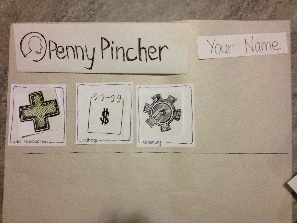
- Menubar Icons: both the icons for the “Add Transaction” and “Summary” pages were scraped and changed to better reflect the information each of the pages ultimately displayed.
- “Add Transaction”: This icon was originally a large plus-sign. However, many users noted that this was confusing as it wasn’t entirely clear whether it was designed to add a transaction, add a friend, or if it even indicated any “add” feature at all. The plus-sign was replaced was an image of a receipt with a scaled plus-sign to the right. (Upon use in subsequent user tests, it was well received and claimed to have been easily understood.)
- “Summary”: The icon was originally a steno-spiral notebook with a dollar-sign on the page. The feedback that first round users provided clearly indicated that there was a lot of confusion as to what that symbol represented; was it a calendar? Some sort of calculator? Or an interactive notebook of sorts? Upon careful consideration of what information was displayed, the new icon is what looks like an address book; a non-spiral bound notebook with tab dividers. (User tests that followed this change received positive feedback and indicated no outstanding misunderstandings of what the icon represented)
- Selection of people involved in a transaction (on Add Transactions page): One of the efficiency problems we aimed to solve was finding a way to reduce the number of new transactions needed to be posted for a group of people (say that 10 people were splitting a bill; it would be much easier to put in 1 transaction for 10 people, than 10 transactions for 1 person). This introduced the problem of choosing a type of selection method. For our first round of user testers, we created two different features for adding people to a transaction; one was search-based while the other called for mulit-selection list box. After testing both interfaces and collecting feedback, it was decided that the unanimously favored search method would prevail and the multi-selection list box would be scrapped.
- Addition of Labels: Users were confused when first shown the home screen of the web application as it was unclear to them what the dollar amounts and colors indicated. “Green means good,” one user thought aloud, but it was obvious that it was much more difficult to determine what value meant what (even with color tags) without explicit labels. The addition of labels was definitely a good choice.
- “Undispute” button: One user asked about what happened if a transaction dispute was incorrectly initialized. We then realized that as a safety measure, to protect against this type of mistake, we needed to implement and add an “undispute” feature to compliment the “dispute” tag.
- “Back” button on Add Transactions page: For transactions involving more than a single individual, a second input field page is necessary to complete an “add transaction” task. However, when a user made a mistake in the first page and didn’t realize it until he navigated to the second page, he wasn’t able to go back and make changes as there was no “back” button to revisit the previous page. This button was added in, as it is also an issue of safety. (Upon the addition of this button, we noticed that it was used by other users at various times as well)
Iteration Beta (after User Testing Round 2)
- Consistency of color-labelling throughout the site: PennyPincher uses color to display transaction values as well as to show meaning of transaction type (whether you owe someone or whether someone owes you). The app also used +/- indicators in conjunction with the color, however the +/- indicators caused more confusion than aid. We decided to get rid of them and ensure that there was more color consistency throughout the entirety of the app to convey transaction-type information. Users commented that the colors were much more conducive to helping their understanding of what each transaction indicated than did the +/- signs.
- “Success!” Confirmation Page for adding a new transaction: following a successful submission of Add Transaction, the user will now be provided with immediate feedback letting them know that the transaction was successfully added. The addition of this will prevent confusion and unnecessary clicking to check to see if the transaction posted correctly.
- Auto-generated amount for custom bill splitting among a group: One task required users to input custom amounts for the various individuals within the group. It was noted that auto-calculating and generating the last individual’s contribution toward the total bill would be helpful in that the user would not be required to do extra math. We added this during the second round of testing and those users greatly appreciated the addition of that feature.
- "Home" icon to Menu bar: Some users were confused as to how to navigate back to the home page (the initial landing page). It was not initially obvious that clicking on the PennyPincher logo and icon at the top of the menu bar was an interactive button (versus a static picture). Thus, it seemed appropriate to add in a more explicit icon to direct users back to the home page (User 6 interacted with this icon a few times during the final round of user testing).
- Add "Me" to list of Added names on Add Transactions*: *Most users were first initially confused by the "include me in bill" radio button or ignored it. Although it was eventually acknowledged and generally understood for most user tasks, some users claimed that they wanted to see their name or a "me" indicator in the Added field to explicitly show that they (the user) were a part of the transaction.
Iteration Gamma (after User Testing Round 3)
- Linked-Directory List: This feature was thought of after the final user tester. A few users wanted to know how to “go back” to a previous page. As a web application, the user could choose to hit the “back” button on the browser, however we felt that it would be useful for a user to be able to see where they were in the site map and navigate back to previous pages with ease.
** NOTE: "User Testing Round 1" is for Users 1-3; "User Testing Round 2" is for Users 4-5; "User Testing Round 3" is for User 6. **