ElderConnect
Connecting family members via the web.
<style>
.pagetree2 a
.hidable
</style>
<script>
function showhide(section){
var ele=document.getElementById(section);
if(ele.style.display!="block") {
ele.style.display="block";
document.getElementById(section+"show").innerHTML = "Hide this design";
} else
</script>
GR2 - Designs
Scenario
Preconditions and Assumptions
- Grandparent is able to open browser and access url.
- Hardware is already functional (webcam, speakerphone).
- Grandparent uses the same computer at home every time. Browser is able to store cookie so that grandparent never needs to log in.
Our original three tasks in GR1 were specific to three different modes of communication: email, phone, and videochat. We re-evaluated these tasks and decided that, rather than mapping to 3 modes of communication, the tasks should pertain more to the user’s high level need and thus be independent from any particular communication means. We have thus revised our three tasks to be the following.
- Establish a connection
- Communicate asynchronously
- Communicate synchronously
Scenario
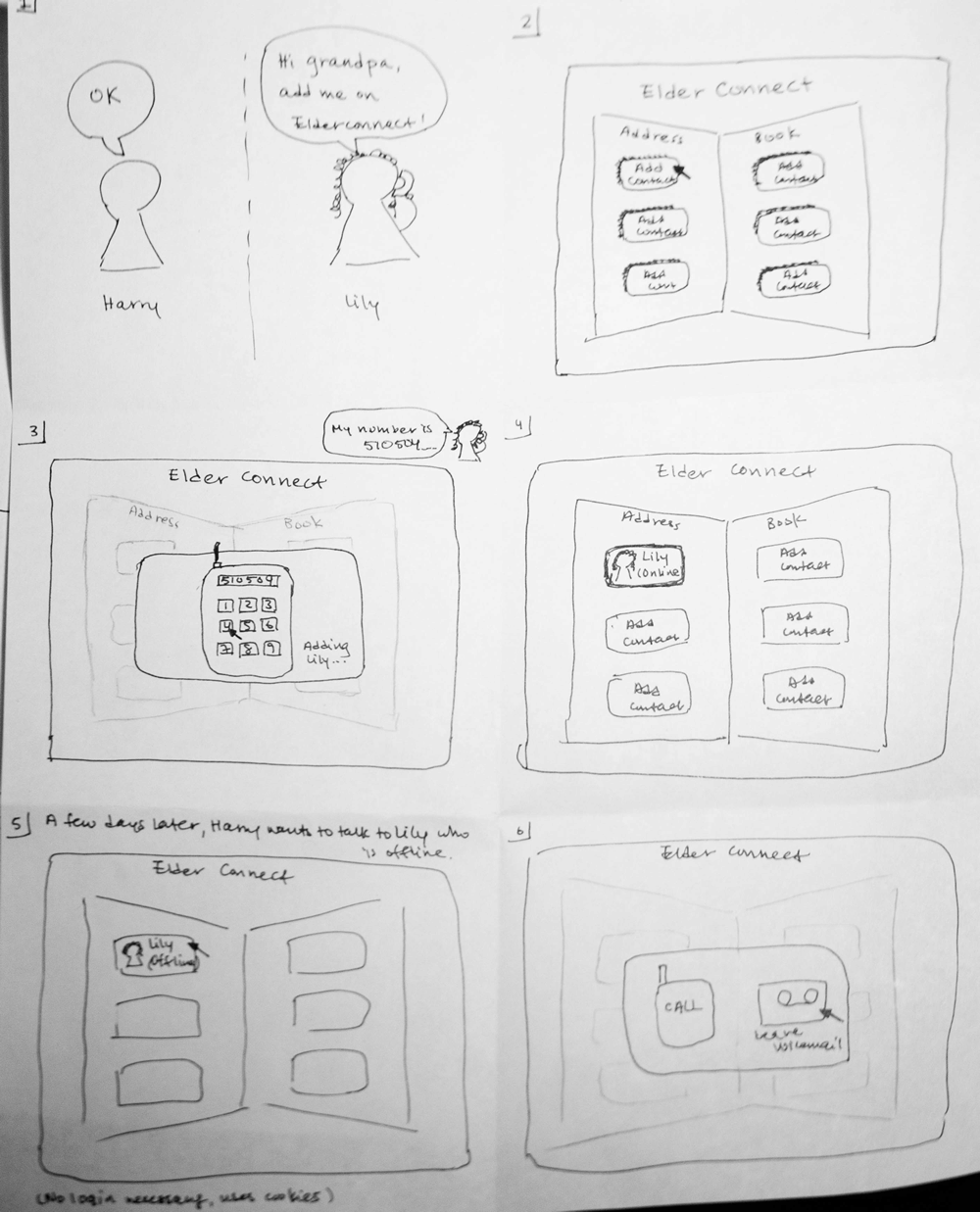
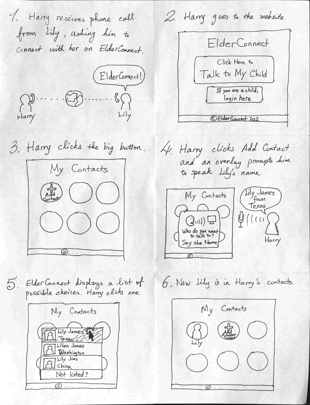
Harry is a 70-year-old Californian whose granddaughter, Lily, goes to college in Boston.
One day, he receives a phone call from Lily asking him to connect with her on ElderConnect. Harry goes to the website and, while talking on the phone with Lily, connects with her and she is added as a contact (Task 1).
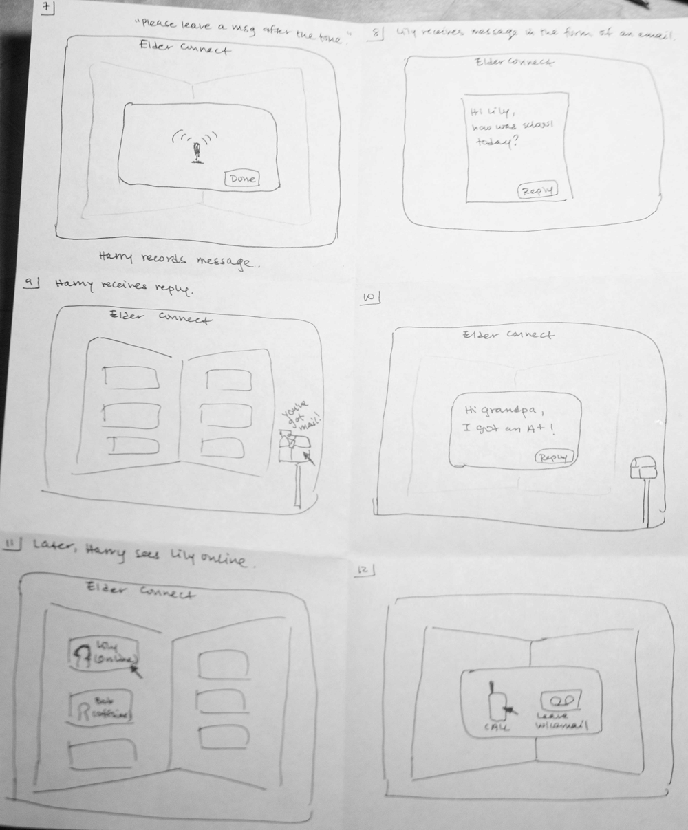
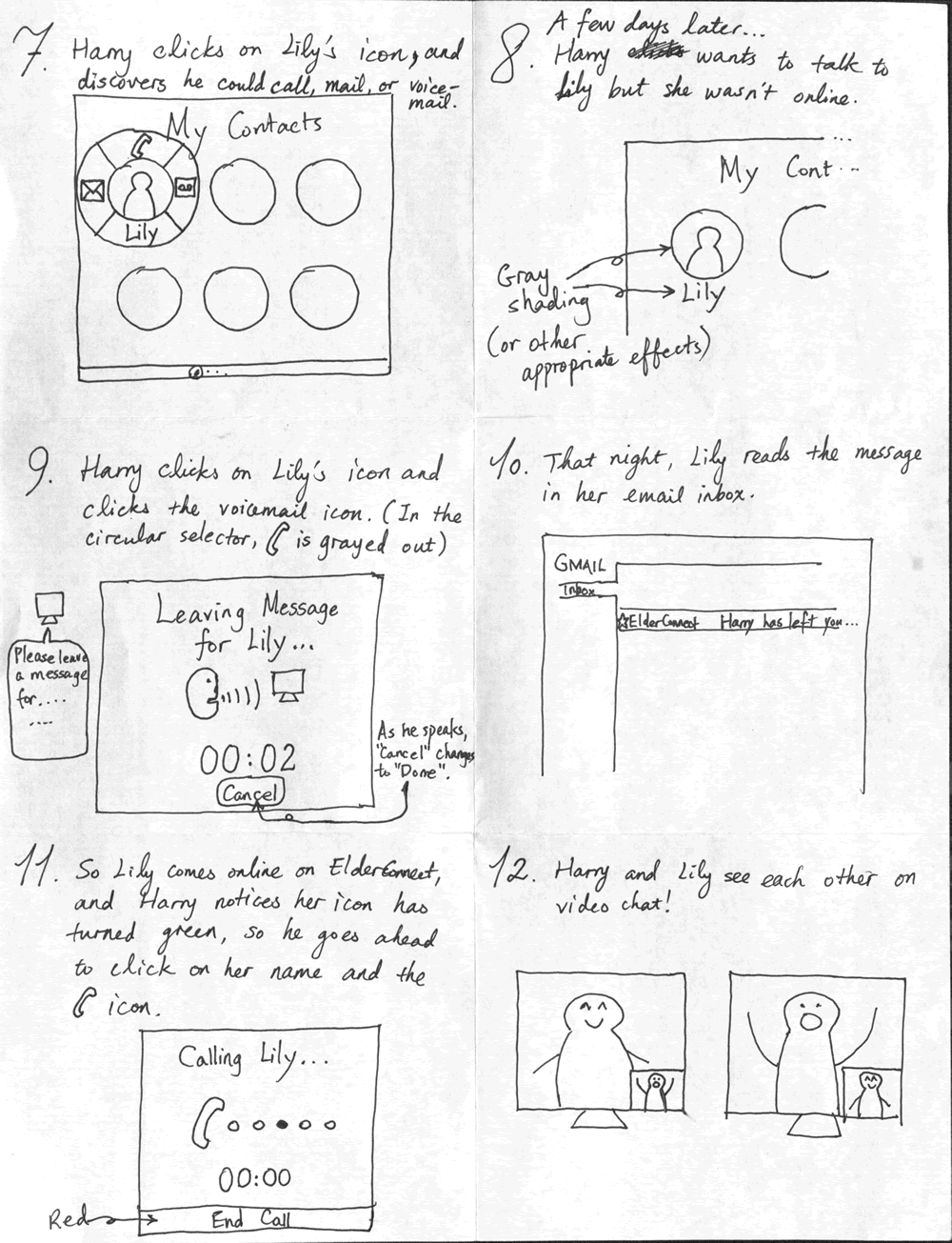
A few days later, Harry wants to talk to Lily but since she isn’t online on ElderConnect, he sends her a message that she can read later (Task 2).
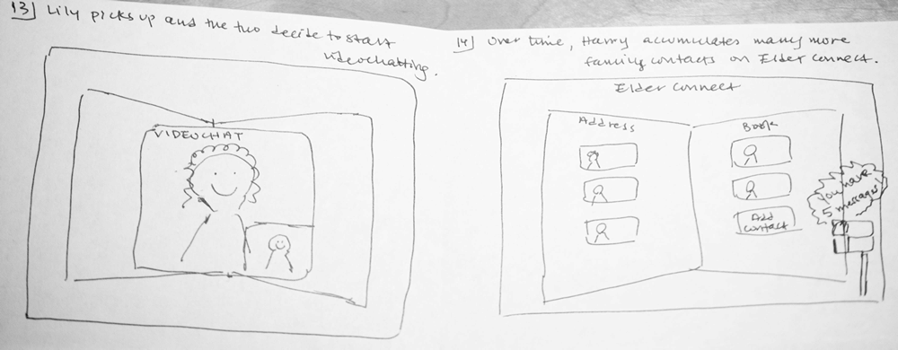
That night, he goes online again and Lily happens to be online as well, so they chat about her school day (Task 3).
Designs
We present three designs:
- Address book metaphor
- Phone metaphor
- Voice search and action wheel
“Address book” Design
Storyboard
Design Highlights
- Grandparent carries out all actions through the interface of an “address book,” which contains clickable buttons corresponding to each contact. All mode of communication options (including adding a contact) appear as overlays on top of the address book, so that the address book is always in sight.
- Mode of communication is purposefully asymmetric to meet different needs. When grandparent sends voicemail, it is voice recorded on the grandparent’s side but sent as text/email to the grandchild’s side, to accommodate grandchild’s busy schedule.
Usability Analysis
- Learnability
- Pros
- Address book metaphor and mailbox metaphor together maintain some external consistency with grandparent’s existing method of keeping contacts, and thus lowers the learning curve.
- Cons
- Address book metaphor combined with dialing the desired contact may confuse a new user. In real life, one does not add to a paper address book by dialing the person’s number.
- Pros
- Efficiency
- Pros
- Grandparent never needs to type on the keyboard.
- Recording a voicemail is less time intensive than typing an email (provided the speech interface is easy to use).
- Younger family member receives voicemail as text, so can check message while doing other activities.
- Cons
- Grandparent must always go through a two-step process of selecting the desired contact before selecting the mode of communication (call vs. send voicemail).
- Pros
- Safety
- Pros
- Because the main page is never out of sight (all other functionality appear as overlays), cancelling an unwanted action is more visually intuitive; the “default” mode is always visible.
html: Notify your Confluence administrator that "HTML for Confluence" requires a valid license. Reason: EXPIRED </div>
- Because the main page is never out of sight (all other functionality appear as overlays), cancelling an unwanted action is more visually intuitive; the “default” mode is always visible.
- Pros
“Phone Metaphor” Design
Storyboard
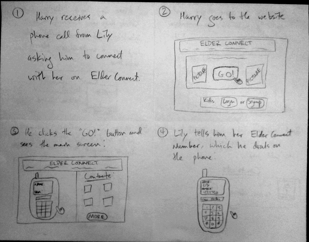
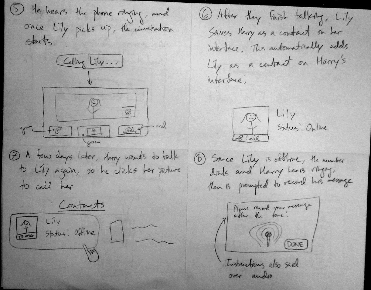
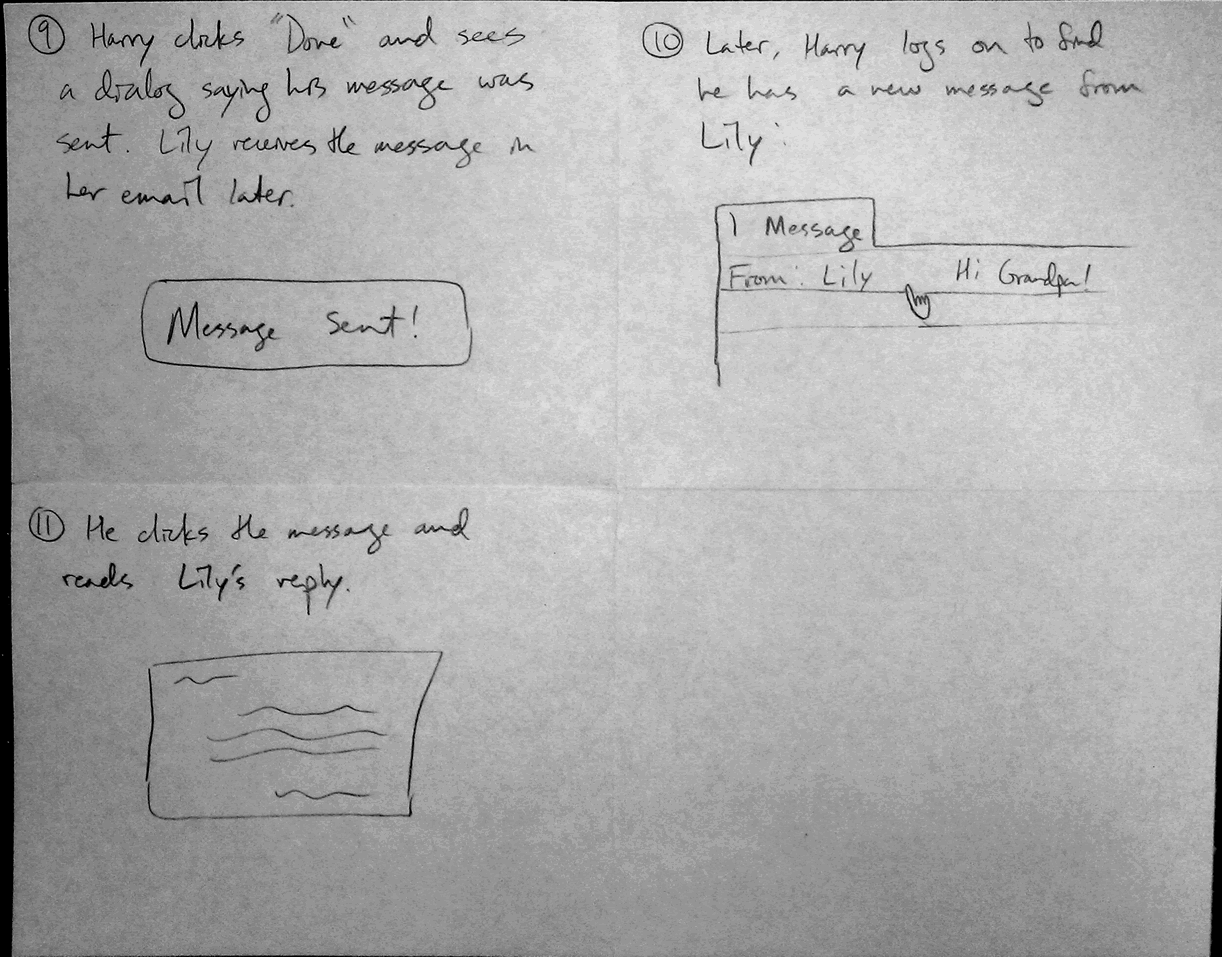
Design Highlights
- Phone metaphor used to simplify connection to new or existing contacts. Elderly are already used to the concept of a phone number.
- Once a contact is saved, “one click dialing” makes it really easy and quick to call someone.
- Phone integrates well with idea of voicemail messages: when desired contact is unavailable, automatically "goes to voicemail" to leave a message.
Note: The scenario is slightly modified for this design. Instead of establishing a connection with the grandchild and then talking with them later, this design starts with a conversation, and then a contact is stored. This maintains the metaphorical consistency of a telephone in the user interface.
Usability Analysis
- Learnability
- Pros
- Metaphorical consistency helps the grandparent understand the basic concept and functionality of the system, thereby lowering the learning curve
- Basic controls only - no complex actions beyond pointing and clicking
- Cons
- If they don't know how to use a phone, then this interface fails completely
- Automatic addition of contacts may seem confusing initially
- Pros
- Efficiency
- Pros
- Easy one click calling and messaging
- No need to type at any point in time
- Voice chatting and recording are quick and simple
- Can sort contact shortcuts by most frequently called to make calling common contacts even faster
- Cons
- Delay for phone dialing and audio feedback may annoy experienced users
- If you have a lot of contacts, it may be difficult to find a specific one, unless searching is somehow implemented
- Pros
- Safety
- Pros
- Can clearly see the numbers as you are dialing them
- Button feedback allows for certainty when clicking an item
- Large buttons help those with poor motor skills still accomplish the tasks
- Cons
- “One click dialing” means you can end up calling the wrong number before you get a chance to cancel
html: Notify your Confluence administrator that "HTML for Confluence" requires a valid license. Reason: EXPIRED </div>“Voice search and action wheel” Design
html: Notify your Confluence administrator that "HTML for Confluence" requires a valid license. Reason: EXPIRED <a href="javascript:showhide('design3');" id="design3show">Show this design</a>
html: Notify your Confluence administrator that "HTML for Confluence" requires a valid license. Reason: EXPIRED <div id="design3" class="hidable">
- “One click dialing” means you can end up calling the wrong number before you get a chance to cancel
- Pros
Storyboard
Design Highlights
- Gets rid of abstract ideas such as account number. Instead, on the elders’ part, the interface identifies a younger user by their picture, name, and location.
- Gets rid of the requirement of an initial phone conversation. Instead, an elder user only needs to speak the name and location of the person to talk to.
- Uses an action wheel to minimize the need for mouse movement.
- Uses the mental model of a contacts list and avoid using metaphors that may end up being misleading.
Analysis
- Learnability
- Pros
- Not many (different types of) clickable buttons on the interface at any given time. The user can easily see what actions are possible and make a simple decision.
- No abstract concepts such as an account number or email address. Searching for a contact is done by speaking the person’s name.
- No technical jargon except possibly “click”.
- Very simple interface at any given time. No two different concepts shown at once (when there is an overlay, the background is assumed to dim).
- Cons
- Lack of metaphor and thus little external consistency with the real world.
- A user may not expect that the computer can comprehend human voice.
- Pros
- Efficiency
- Pros
- No initial phone conversation needed. Just search the person by voice.
- No keyboard strokes necessary (except for sending an email, which is optional).
- The action wheel makes mouse navigation more efficient.
- Cons
- Two clicks instead of one are required to call, email, or send voicemail to a person.
- Audio prompt of “Please leave a message …” may be inefficient for experienced users.
- Pros
- Safety
- Pros
- Any time an overlay is present, the user may cancel the action in case it is a mistake by clicking the background.
- If the person has spoken a name incorrectly or slipped his tongue, the search can be repeated by clicking “Not Listed?” or clicking the background.
- If the wrong person is called, simply click End Call (which is a big button).
- Cons
- A voicemail cannot be cancelled once some message has been spoken. (This can be fixed by introducing another button)
- The user may not realize that the background is clickable when an overlay is present. There needs to be some hint of that, or a X button at the corner of each overlay.
html: Notify your Confluence administrator that "HTML for Confluence" requires a valid license. Reason: EXPIRED </div>
- Pros
1 Comment
Edward Oscar Benson
Very nice work trying out different approaches, and nice presentation. Some of the illustrations could use a bit more context (e.g., when the illustration is just a giant button.. how does this relate to the UI? Is it in a modal dialogue? Does the window get replaced with a huge button? Was this button there all along? -- don't take these design elements for granted)