R3 - Paper Prototyping
Prototype Photos

1. This is the Home
screen of our Smart
phone app.
It contains a Action
bar on the top and a
map on rest of the space
showing user's and user's
friends' current location. |
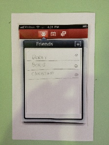
2. Tapping on the first icon
in action bar displays the
list of friends in a pop up
window.
There is a "+" button on
top right corner of this pop
up window, which takes
user to "Add a friend" page. |
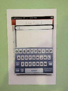
3. This is "Add a Friend"
page.
It contains a Search
bar on the top and
Keyboard at the bottom.
The search is adaptive and
incremental, and results
start showing up as the
user type.
If the user scrolls through
the search results the
keyboard hides away and
when user taps on the
search bar the keyboard
appears again. |
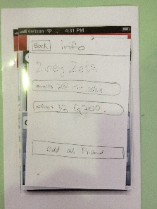
4. This is the "Profile" page.
If the owner of this profile is
not added as friend in
user's list, the button on the
bottom says "Add as
Friend", but if that person
is users friend the button
is labeled "Show current
Location on Map" |
5. When user taps on third
button on the action bar,
this Notification pop up
window opens up.
When there is a new
notification, a bubble shows
up on the action bar button
with the count of new
notification on it. |
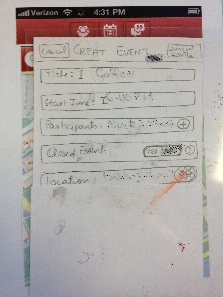
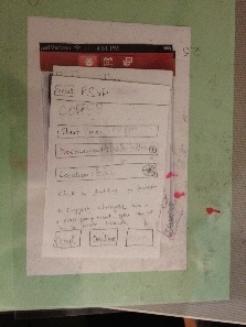
6. When user Taps "+"
button on the pop up
window "Events" (pops up
through the 2nd action
button) this "Create event"
page sows up.
it contains the following
fields
1. Title
2. Start Time
3. Participants
4. Closed Event
5. Location
|
7. Select Participants |

8. Two participants selected
|
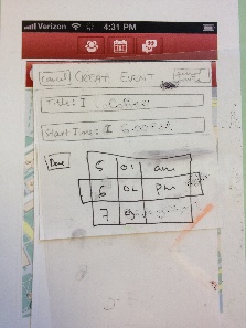
9. Setting time of an event
using ticker
|
10. This screen shows the
location connected to all
the invitees, when a user
set location for that event.
These lines are grey to
indicate that invitees have
not responded (RSVP'd) to
the invitation yet. |
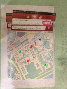
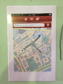
11. when user tap the
"Location" Field on Create
Event Page this map
shows up.
3 Pins( shown in red) drops
from the top on suggested
locations.
The user's current location is
shows using Blue dot.
Selected Participants' current
location is shown by multiple
Green dots on this map.
|

12. Browsing through the
available meeting places in
a Building. |
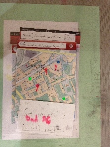
13. Confirmation pop up at
the bottom of Set Location
Page |
14. RSVP page, contains
the event details.
all the details have
affordance of being edit-able.
the buttons on the bottom
are enabled and disabled
depending on whether user
made a change
in the plan ot not.
|
15. View Event Location in
RSVP shows Friends
connected to the event
location by colored lines
representing their RSVPs
(red green and gray)
Currently showing red and
green only |
Briefing
Discover.Me is a mobile phone application which we are developing. Its aim is to allow a user, such as yourself, to be able to find and locate an approved list of friends so as to be able to be up-to-date with their real-time location. The application will subsequently allow you to, based on the proximity of you and your friends, quickly and easily create an event; specify its time and select a location from the suggested list created by app based on your preference, and send invitations out to friends whom you'd like to meet with. The application will thus allow all participants to have a better knowledge about the geographical location of the event and facilities available over there, as well as easily view who the invitees and what their responses are (i.e. are they coming or not). Ultimately, we aim to make spontaneous, closely-located based events amongst friends fast to create, easy to disseminate and clear to invitees what the responses are.
Scenario Tasks
Finding a friend in your friend's list |
Adding a friend to your friend list |
Creating and Inviting Friends to an Event |
Creating and Inviting Friends to a Closed Event (With Application Suggesting Locations)
* Introduced in Round #3 only |
Responding to an Invitation by Proposing a Change In Time |
Responding to an Invitation by Proposing a Change in Location |
Imagine that you are an individual named Alice, currently using Discover.Me.
You would like to find out if your friend, Zoey Zeta, is currently in your list of friends
|
Imagine that you are an individual named Alice, currently using Discover.Me.
You know that a friend of yours, Zoey Zeta, is not currently in your list of friends. You would like to add her as a friend in the application. |
Imagine that you are an individual named Alice, currently using Discover.Me.
It is currently 4:30 P.M. in the afternoon, and you would like to invite your friends Zoey and Christine for Coffee at Building 26. |
Imagine that you are an individual named Alice, currently using Discover.Me.
It is currently 4.30 P.M. in the afternoon, and you would like to invite only your friends Zoey and Christine for Coffee at a location close-by to all 3 of you. |
Imagine that you are Zoey, currently using Discover.Me.
You have received a notification from Alice, who has invited you to an event. You know that you are only free at 6:00 P.M. You would like to propose a change to the event time to meet at 6:00 P.M. instead. |
Imagine that you are Zoey, currently using Discover.Me.
You have received a notification from Alice, who has invited you to an event. You know that would only want to attend an event if it's held in Building 11. You would like to propose a change to the event location to meet at Building 11 instead. |
Observations
Prototyping Round #1
Overview of Usability Issues Observed
Finding a Friend in your Friend List |
Adding an Individual into your Friend List |
Creating and Inviting Friends to an Event
|
Responding to an Invitation by Proposing a Change In Time |
Responding to an Invitation by Proposing a Change in Location |
General Comments |
Users had trouble identifying the Action Bar icons as buttons, indicating a lack of affordances indicating that they were indeed buttons. Users were distracted by other buttons on the action bar and search bar, which surprised the user. This may have increased the time required by our user to make the correct selection.
|
Users wanted a shorter process for adding one or more friends. They found the disabled buttons on the "Add a friend" window to be distracting, even though they were place there to maintain consistency. Users remarked that "Show on map" presented an ambiguous meaning, indicating a lack of exerternal consistency, and likely that the user possessed a different conceptual model of what the application would do versus what they expected it to do. (i.e. Does it show a person's office location or their current location?) Users were surprised +when the application repeatedly returned to the home page. Users also suggested that the search feature should provide a better cue of its functionality, perhaps by presenting more +information scent as to how they ought to perform the query (i.e. search by name? or search by MIT username? or does it search all substrings and returns a set of possible candidates). In particular, they were unsure whether the search feature looked for a location or a person. |
Due to the hand-drawn nature of the fields and buttons, users exhibited apprehension and some confusion about the affordances provided by them. In particular, some users preferred tapping on the fields, while others preferred tapping on the icons which were positioned at the right-most edge of the fields. The lack of hotspots contributed to this. Users also felt that there was too much detail to be entered when creating an event, indicating that it might become an efficiency issue should they end up using the system on a frequent basis. For example, the time zone and meeting end time are unnecessary for initiating an impromptu meeting. Users also found it difficult to update events, which indicates that our application UI lacks robustness to support slight user tweaks.
|
Users were surprised to receive another confirmation box after sending an RSVP. They also found that the event details page lacked any visual cues as to how to begin proposing changes to the various entries. As a result, users erroneously closed the window and began searching for another way to begin proposing changes in response to the event invitation, posing a safety error. |
Users were not presented this task. |
The system can be intuitive at times, but forces the user to make extra clicks. There is further ambiguity about the functionality of certain features, such as the back and close search bars. Users searching for friend names wanted to know the level of detail applied in the search feature. For example, this additional knowledge would help them in deciding whether to search for a friend by their nickname or email address.
|
Detailed Observations
User |
Finding a friend in your Friend List
|
Adding an individual into your Friend List |
Creating and Inviting Friends to an Event |
Responding to an Invitation by Proposing a Change in Time |
Responding to an Invitation by Proposing a Change in Location
|
User's General Comments |
1 |
- [Learnability: Different Conceptual Model]
When the user first attempted to find Zoey in their contacts, they attempted to type in the search bar rather than going to the friends icon.
|
- [Efficiency]
Consider implementing a bulk add, there are currently a lot of steps per friend request which will make adding a lot of people annoying.
- [Learnability: Lack of Affordance]
The buttons look grayed out and are hard to notice.
- [Learnability: Information Scent, Feedback]
User would like a way to confirm the person, some way of identifying that the result in the friend search was the correct person. At the time the user had typed and the single result was Zoey.
- [Learnability: Lack of Affordance]
When the user clicked the “Show On Map” button on Zoey’s profile, they were unsure whether this represented Zoey’s current location or her office. Suggested renaming the button to something like “Where is Zoey?”
- [Learnability: Lacking Internal Consistency,
Safety: Non-reversible action]
User tapped on the dot representing Zoey’s location and her info came up. When he pressed back it returned to the home page. The user expected it to return to the map with Zoey on it.
|
- [Learnability: Different Conceptual Model]
The user clicked on the friends icon, figuring they would be able to contact them through there.
- [Learnability: Different Conceptual Model, External Consistency]
The user was uncomfortable with a calendar for impromptu meetings since they felt that a calendar event wasn’t needed for an event in 30 minutes.
- [Efficiency]
Felt that there was a lot to type in the event information screen. Decided to skip putting a title to the event.
- [Efficiency, Safety]
Suggested an add and invite button when inviting people to an event. Eg: Was inviting Christine and Zoey to coffee when remembered they wanted to invite Miranda to coffee as well but had forgotten to add her. Would have to back out of this menu, step through the process of adding Miranda as a friend, then recreate the event.
- [Learnability: External Consistency]
After inviting people to the event and returning to the create event page, the invited field said “3”. User was confused as to what this meant. Was this three people including the user as well or were there three other people invited. Suggested Facebook style listing: list a few guests by name then say “and X others”.
- *[Learnability, Efficiency]*
Why is there a time zone?
- [Efficiency]
Wondered what the purpose of end time was for an event like coffee. Use of end time will depend on what we expect people to do on the app.
- [Safety, Efficiency]
At the time, the confirm location popup covered the map. Suggested this was bad as the user could no longer see the map. If they looked away for a second they no longer knew the location of the event. Proceeded to tap back to examine the location. Location was deleted when he merely wanted to double check it.
|
User was not presented this task. |
User was not presented this task. |
- Would like to see the current location of people.
- Are the routes drawn by the map accurate? This could be incorrect depending on when the last time the person was tracked, whether they had signal, or if there phone was on.
|
2 |
- [Learnability: Bad Affordances]
Was distracted by the other buttons other that the Friend List icon.
|
- [Learnability: Internal & External Consistency]
Would like consistency when searching for friends. Can you type their name? User name? Consistency in the results. Does the name come up or user name?
|
- [Learnability: Bad Affordances]
Original bright buttons on top bar did nothing.
- [Learnability, Efficiency]
The pins on the map should say who that pin represents.
|
User was not presented this task.
|
User was not presented this task. |
- Consistency. What is the user looking? I.e the name issue
- Maybe list name and user name in search, highlighting what matches the users input. I.e if the user types in Rob, result shows Rob Miller rcm, where rcm is his username and Rob is highlighted.
- The icons look grayed out.
- Consistency. Some menus had back buttons while others did not.
- Not sure of the purpose of the search bar. In the home map, is it to find a person or location.
|
3 |
- [Learnability: Affordances]
Did not exhibit difficulty in locating the Friend List icon, and picked it correctly on the first try.
|
- [Learnability: Different Conceptual Model]
The user first checked the location of their friends before creating an event, otherwise the tasks were performed as expected with little comment.
|
- [Learnability: Information Scent]
User indicated that the menu for "Creating an Event" looked complicated.
|
- [Learnability: Internal Consistency]
Expressed surprise that after pressing "RSVP", that a confirmation dialog asking whether the user wanted to "Accept", "Reject" or "Propose Change".
|
User was not presented this task. |
- The system is pretty intuitive
- Occasionally there were a few extra clicks, such as the confirmation boxes
|
Prototyping Round #2
Overview of Usability Issues Observed
Finding a Friend in your Friend List |
Adding an Individual into your Friend List |
Creating and Inviting Friends to an Event
|
Responding to an Invitation by Proposing a Change In Time |
Responding to an Invitation by Proposing a Change in Location |
General Comments |
Users were able to identify the icons used in the Action Bar much better, due to the improved affordances provided by the images used, which resembled real-world buttons.
|
Users found the procedure to be intuitive. They also found it easy to complete the work flow by making selections on several consecutive pages. However, users were briefly confused when the application returned to the home page. They had expected some visual indicator in response to their selection, indicating a lack of feedback to confirm that the Add request was indeed sent.
|
The Notifications Icon in the Action Bar bore resemblance to speech bubbles, which made users think erroneously that it should be the way to "respond" to an event invitation. This indicated a lack of external consistency of the icon used. Users, however, would identify the Calendar Icon and correctly associate it with anything related to Events. Otherwise, the work flow was intuitive and enabled the user to complete all tasks. Some users indicated that more information could be provided by the application in helping them make a decision for selecting a location, for example, they wanted to know the distance between two locations marked on the map.
|
Users quickly understood how to respond to invitations, indicating good learnability. However, some users felt the UI was too simple. In particular, making the "Accept without changes" button available even after use made resulting changes prone to error. |
The map feature lacked appropriate affordances, making it unclear how to change the selected location. Some users attempted to drag the pin to change location, while some tried to click on different location. These were a result of unclear affordances of the static images on the paper prototype. Others tried tried tapping on the name.
|
Users liked the ability to visualize their friends' location when creating new events.
However, they suggested adding a feature to specify whether an event was closed or open to friends of friends.
|
Detailed Observations
User |
Finding a friend in your Friend List
|
Adding an individual into your Friend List
|
Creating and Inviting Friends to an Event |
Responding to an Invitation by Proposing a Change in Time
|
Responding to an Invitation by Proposing a Change in Location
|
General Comments |
1 |
- [Learnability: Affordances]
User did not exhibit difficulty in locating the Friend list Button. Picked it out correctly on the first try.
|
- [Learnability: Misleading Affordance]
It looks like you can edit the users profile information.
- [Learnability: Lack of Feedback]
After the request to Zoey was sent, the user expected the app to return to the friends list showing he had sent an invite to Zoey rather than returning to the home page.
|
- [Learnability: Misleading Affordance]
The notifications button looks like a messenging button.
- [Efficiency]
If you have this information of your friends, why not just text them to meet up?
- [Efficiency]
Liked the drop down windows for friends, events, and notifications.
- [Learnability: Confusing the User]
Thought there were too many fields in the create event page.
- [Learnability: Unclear Affordance]
The user took a while to notice the check boxes in the invite friends page.
- [Learnability: Unclear Affordance]
User was unaware how to get the time wheel off the screen.
- [Learnability: Lack of Affordance, Different Conceptual Model]
User would like to change the name of a location. When they clicked building 26, they wanted to change it to something that conveyed more information such as 26-204.
- [Learnability: Lack of Feedback]
Would like a pop up notification that fades away informing them that the invite was sent.
|
- [Safety]
Having an “Accept Without Changes” button seems error prone when changes are made.
|
User was not presented this task.
|
- User liked the idea of being able to visualize the locations of his friends when creating the event.
|
2 |
- [Learnability: Affordances]
User did not exhibit difficulty in locating the Friend list Icon. Picked it out correctly on the first try.
|
- [Efficiency, Learnability: Lack of Feedback]
After sending the friend invite, the user would go to friends to see some confirmation that the invite was sent.
|
- [Learnability: Unclear Affordance]
Unsure how to get the time wheel off the screen.
- [Learnability: Confusing the User]
Didn’t see much need in an end time.
|
User was not presented this task.
|
- Clicked and dragged event pin rather than clicking on a new location.
|
- Liked the lines connecting the people to the locations
- It was not obvious that event proposals could be changed, only knew because it was a task.
- Was not obvious that you could click the map to change the event location.
- A “Propose Change” button might make it more obvious that you can change the details of the event.
|
3 |
- [Learnability: Affordances]
User did not exhibit difficulty in locating the Friend list Icon. Picked it out correctly on the first try.
|
- [Safety]
User didn’t bother to read Zoey’s profile.
|
- [Learnability: Confusing the User]
Don’t need to have a time zone in the event page.
- [Learnability: Confusing the User]
Need accurate text for the search bar on map, at the time it said to search for friend location.
- [Learnability: Lacking Affordances]
Can it show the distance of the people from the event?
|
User was not presented this task.
|
- [Learnability: Unclear Affordances]
Couldn’t tell that you can change the event location by clicking the map. Instead tried to click on the location field of the event notification.
- [Learnability: Unclear Affordances, Confusing the User]
When the user got to the map to change the location they said that it didn’t seem like you could. Assumed you could drag and drop the location pin.
|
- Allow people to invite their friends to an event. Possibly use open/closed meetings.
- When inviting friends to an event you could sort them by distance or by frequency of events you attend together.
- The app is somewhere between informal and full contact management. The right way to do things may not be easy.
- The tasks were intuitive but might want to reevaluate the tasks that we are aiming for so we can identify what we are missing or how to make the app better.
- The app could possibly suggest places to meet or store personal defaults.
|
Prototyping Round #3
Overview of Usability Issues Observed
Finding a Friend in your Friend List |
Adding an Individual into your Friend List |
Creating and Inviting Friends to a Closed Event (With Application Suggesting Locations) |
Responding to an Invitation by Proposing a Change in Location |
Users no longer had problems identifying the top row of buttons as buttons they should be tapping on to launch sub-menus, indicating that they were providing better affordances as buttons. Users also were drawn to the search bar in order to identify if a friend was currently present in the Friend List. The idea that the search bar should be used to look for someone, and not simply check the Friend List indicated that the users had a different conceptual model as to how the system should be used. Some wanted the menu icons to perhaps have text, or better information scent, to make them confident that they were going into the right menu. The icons used were generally recognized as "Friends", "Calendar" and "Conversation", indicating that there was some external consistency in their usage. As a result, most users learnt by doing/exploring. |
Most users had no difficulty identifying the "plus"-icon being the button that had to be used in order to begin adding a new friend. Their familiarity with the flow and usage of the menu indicated good internal and external consistency. |
While some users made use of the suggested locations for the meetings, some preferred to specify their own locations, and were unsure of whether the system would support their actions, indicating a lack of affordance, and confusing the user. |
Users found the instructions on the menu useful in accomplishing their tasks, though they did spend time reading it. We suspect that expert users will not experience the same lack of efficiency. Some were unsure about the behavior that would occur in order to propose a change to the event location, but were assured when they found the word "Propose" used. The "Revert Change" button being greyed out confused some users, and one user commented that changing it to "Undo" might be clearer, indicating a slight lack in external consistency, because we were not speaking the user's language. |
Detailed Observations
User |
Finding a friend in your Friend List
|
Adding an individual into your Friend List
|
Creating and Inviting Friends to a Closed Event (With Application Suggesting Locations)
|
Responding to an Invitation by Proposing a Change in Location
|
General Comments |
1 |
- [Learnability: Affordances]
User mentioned that buttons at the top resembled buttons.
Did not exhibit difficulty locating the Friend List icon.
|
- [Learnability: Information Scent]
Wondered aloud about what the "Pending" graphic meant.
|
- [Learnability: Different Conceptual Model]
Attempted to look for Building 26 on the Home Screen first.
- [Learnability: Lack of External Consistency]
Was unsure about how to dismiss the keyboard after typing in "Building 26" into the Search Bar on the Home Screen.
- [Learnability: Different Conceptual Model]
Tapped on Building 26 to try to initiate event on it.
- [Learnability: Unclear Affordance, Internal Consistency Lacking]
Wondered what the graphics indicating "Food", "Facilities", and "Quiet Area" meant.
|
- [Learnability: Different Conceptual Model]
Wondered aloud about wanting to find a way to message the Organizer (Alice) about proposing a change in time.
- [Learnability: Unclear Affordances]
After opening up the "Propose a Change" menu, user click on "Cancel", because he was not aware that the fields were changeable by tapping.
|
- Found some of the buttons unclear because they were hand-drawn.
- User mentioned that was used to having a physical "Back" button on a device, a opposed to soft-buttons rendered by the application.
|
2 |
- [Learnability: Affordances]
Did not exhibit difficulty locating the Friend List icon
|
- [Learnability: Different Conceptual Model]
Didn't realize that it was searching a directory initially.
- After finding the user, the user didn't tap to view the profile and subsequently add "Zoey". Thought the task was completed.
|
- [Safety]
Tapped on Done before selecting location.
- [Efficiency]
Didn't like the confirmation boxes which were popping up. Found them to be doing too much second guessing.
- [Learnability: External Consistency]
Mention that as an iPhone mobile user, found the flow to be intuitive.
|
- [Efficiency]
Managed to find out what needed to be done after reading the instructions.
|
- Found the application interface intuitive.
|
3 |
- [Learnability: Different Conceptual Model]
Tapped on own location on the map initially to figure out what it was for.
- [Learnability: Different Conceptual Model]
Tried searching for "Zoey Zeta" in the search bar.
- [Learnability: Learning by Exploring]
Went to Friends Icon in Action Bar after realizing that "Zoey Zeta" was not in Friend's List.
|
- [Learnability: Unclear Affordances]
Did not see "+"-button to add participants. Tapped on the field instead.
|
- [Learnability: Information Scent]
Switched between "Closed Event" to "Open Event" to understand the difference.
|
- [Efficiency]
Managed to find out what needed to be done after reading the instructions.
|
- Mentioned that clearer buttons would have been preferred.
|
4 |
- [Learnability: Different Conceptual Model]
Tried searching for "Zoey Zeta" in the search bar.
- [Learnability: Learning by Exploring]
Tapped on Notifications Icon first, then Events Icon, then Friends.
|
- [Learnability: External Consistency]
Wondered aloud about what would occur if multiple "Zoey Zeta"s were in the directory.
|
- [Learnability: Unclear Affordances]
When adding participants, didn't tap on Checkboxes, but on the arrows instead.
- [Learnability: External Consistency, Unclear Affordance]
After entering the View Profile screen after tapping the arrow, was scanning for the Back button.
- Picked location based on where his persona was located, ignoring suggested locations.
|
- [Learnability: Confusing the User]
Was not sure what "Revert" meant, said "Undo" would have been clearer.
|
- Found some of the buttons unclear because they were hand-drawn.
|
Prototype Iteration
Design |
First Iteration |
Second Iteration |
Third Iteration |
Action Bar Icons/buttons on home page |
Action bar contains icons for Friends, Events and Notifications. these Icons are of the same color as action bar but in darker shade and are outlined.
There are few extra buttons on action bar. |
Action Icons are replaced by prominent and easy to locate buttons.
extra buttons are removed. |
Action bar design retained from the previous iteration. |
Default text Search bars to provide cue on what to search. |
Search bar is location on the top of following pages:
- Home page
- Add a Friend page
- Select Participants for an Event
- Select Location for an Event
All these search bars have the same default text "Search" in them. And the searches performed in this app are adaptive and incremental.
|
Search bars now contains a Cue about what can be searched e.g.
Home page: "Search for Friend on Map by Name"
Add a Friend : "Search for Person by Name or MIT account ID"
Set Location : "Search for location by Building Number"
|
Default text retained from the previous iteration design. |
Confirmation Dialogue/ Message |
A Confirmation Dialogue window appears after these three user actions:
- user taps "add as friend" button on a Persons "Profile".
- user taps "Send Invite" button "Create Event" page.
- user taps "send rsvp" button on "RSVP" page.
|
A Confirmation message appears for a short duration and fades away.
|
Retained from the previous design iteration. |
Completing a task takes user back to ... ? |
Completing a task such as "Adding a friend" or "Creating an event" or "Checking notification and accepting/declining an invitation" takes a user back to home page. |
Completing a task takes user back to the relevant pop up menu.
For example:
Completing the task of "Adding a friend" takes user back to Friend list pop up.
likewise "creating an event" takes user back to Event list pop up. and "sending RSVP response" takes user back to Notification pop up. |
Retained from the previous iteration. |
Event page |
Contains fields for data entry for:
- Title
- Start Time
- End Time
- Time Zone
- Participants
- Location
|
Simplified and now contains fewer data entry fields.
- Title
- Start Time
- Participants
- Location
|
A new options is added, to specify if the event is closed or not.
invitees can add more participants if event is not "closed event" and the "+" button against participants in RSVP page is enabled.
|
Setting time of Event |
Time is by default set to one hour later and can be changed using the numeric keypad |
Taping on "Start Time" field displays a Ticker.
End time is omitted. |
Start time is by default set to one hour later, and has the affordance of a click/tap, and when tapped will bring up the ticker.
Ticker now also have a button labeled "done" which when pressed will hide the ticker.
|
Time zone in Create Event page. |
For consistency with other smart phone application "Time zone" field is there in "Create Event" page. It is by default set the user's current time zone and is un-editable. |
Time zone field is dropped |
Time zone field is dropped |
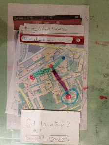
Setting location of Event. |
Location can be typed in or selected on map |
Location can only be selected on map.
Map displays the location of all the selected participants for that event. |
The "Location" field in "Create event" page has affordance of tapping, and tapping it will bring out the map view. this map contains a point for all the friends listed in "Participants" field and 3 pins drops from the top on suggested buildings.
Filter can be set by user to tune the suggestions made by application. A button labeled "Filter" is displayed on top right corner of the "Set Location" page. This button bring out a pop up with list of filter criteria and a hide button. this pop up is popped out by default for better visibility/learnability.
User can click on any building and tap on the enlisted meeting places available in that building to select it as location for their event and can also type in the meeting place name as "others".
Selecting a location in list will bring user back to map view and a Confirmation Dialogue will show up at the bottom of the page with name of location on it. |
RSVP work flow - View Event Details and Send RSVP
|
A button on View Event Details page takes user to a separate Send RSVP page. which then contains three options "Accept" "Decline" "propose Changes". |
Event details and RSVP response buttons are on the same simplified page.
Event details have affordances showing that user can edit event details and propose changes are added.
Until user modify any detail of the event the buttons on the bottom of the page are labeled "Accept" "Decline" and "Revert(Disabled)".
Once user make a change these buttons are labeled "Propose Changes" "Decline" and "Revert (enabled)".
|
Page design retained from the previous iteration.
"+" button against "Participants" field is disabled if the event creator specified the event as "Closed"
|
1 Comment
Sacha Zyto
Comment from meeting:
- suggested to match user expectations (ex: Am I looking for a username or a firstname/lastname): maybe an easy way out of this dilemna is to display both.
- Change button visibility (saw you did that).
Overall: Excellent work !