Briefing
Parents often want to know where their kids are, and kids don’t want to have their parents worry, but kids can’t always answer the phone to verbally communicate to their parents where they are (sometimes, they don’t want to). This often creates tension between the kids and the parents. Our app aims to solve this problem by having the parents’ peace of mind be only a click away. There are two applications: one for the parent, and one for the child.
For the first portion of the evaluation, you will be a high school student (Bart) using our app to communicate with a parent. For the second portion, you will be Bart's mother, Marge. There will be a clear break when we switch interfaces for us to ask questions and you to provide any feedback you have on the child interface.
Remember, we are testing the interface, not you! Anything that you are unable to do is our interface failing, and has no reflection on your abilities whatsoever.
Scenario Tasks
We have two big user classes for our application, parents and children. We tested each user in both roles. On Day 1 we had them all be parents first, and on Day 2, children first. These were the tasks we used on Day 2; on Day 1 they were a little less comprehensive and less clear.
Parent Tasks
You are a parent, and your name is Marge.
Task 1: You expect Lisa to be home now, but she isn’t here. Please ask Lisa to check in now.
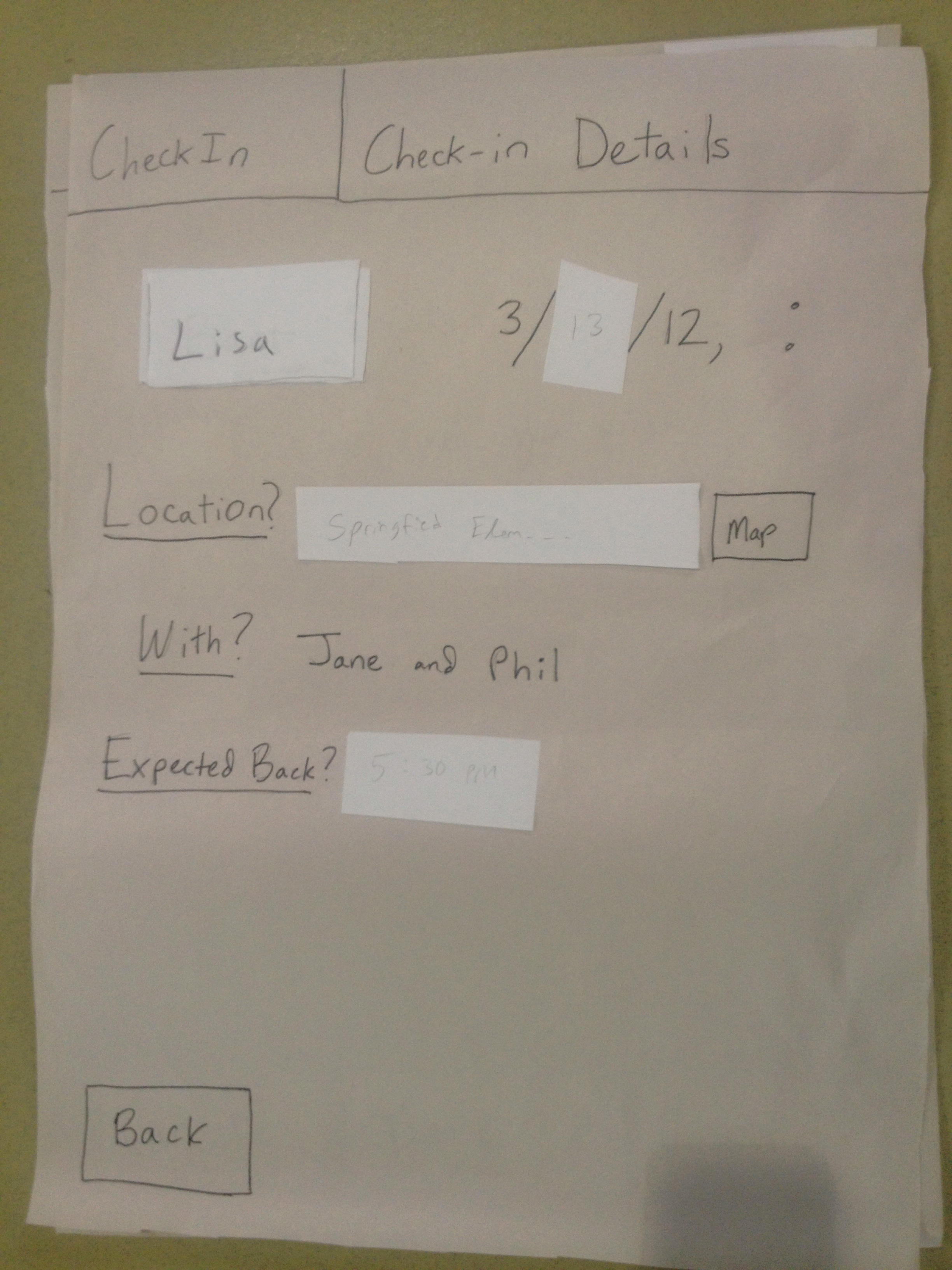
Task 2: You want to know where Lisa was when she last checked in. Please view the details of Lisa’s latest CheckIn and tell us where she was last.
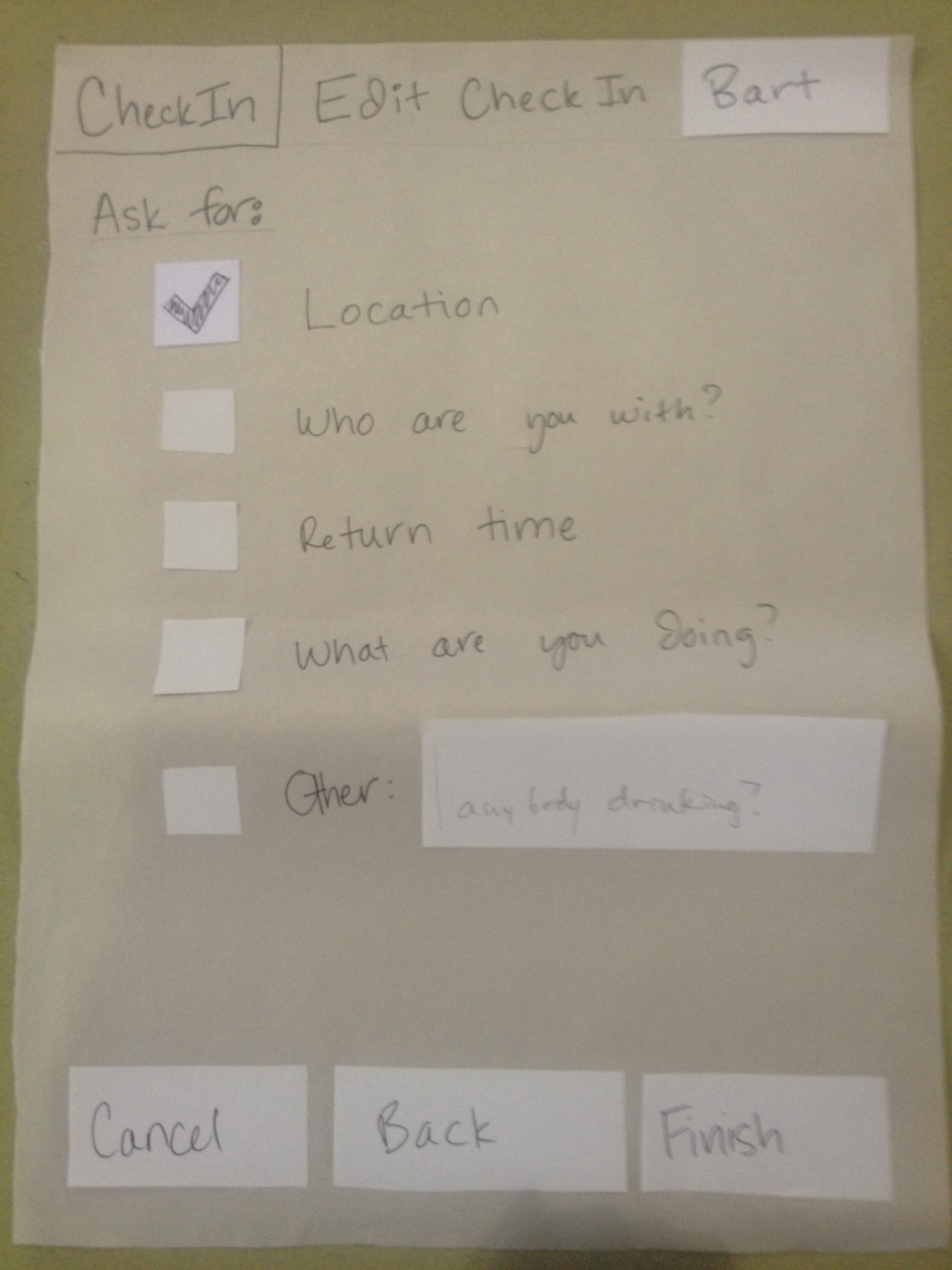
Task 3: You know Bart is out at a party. Please ask him to check in later today at 10pm and ask him which friends he is with, so you’ll know he’s ok before you go to bed.
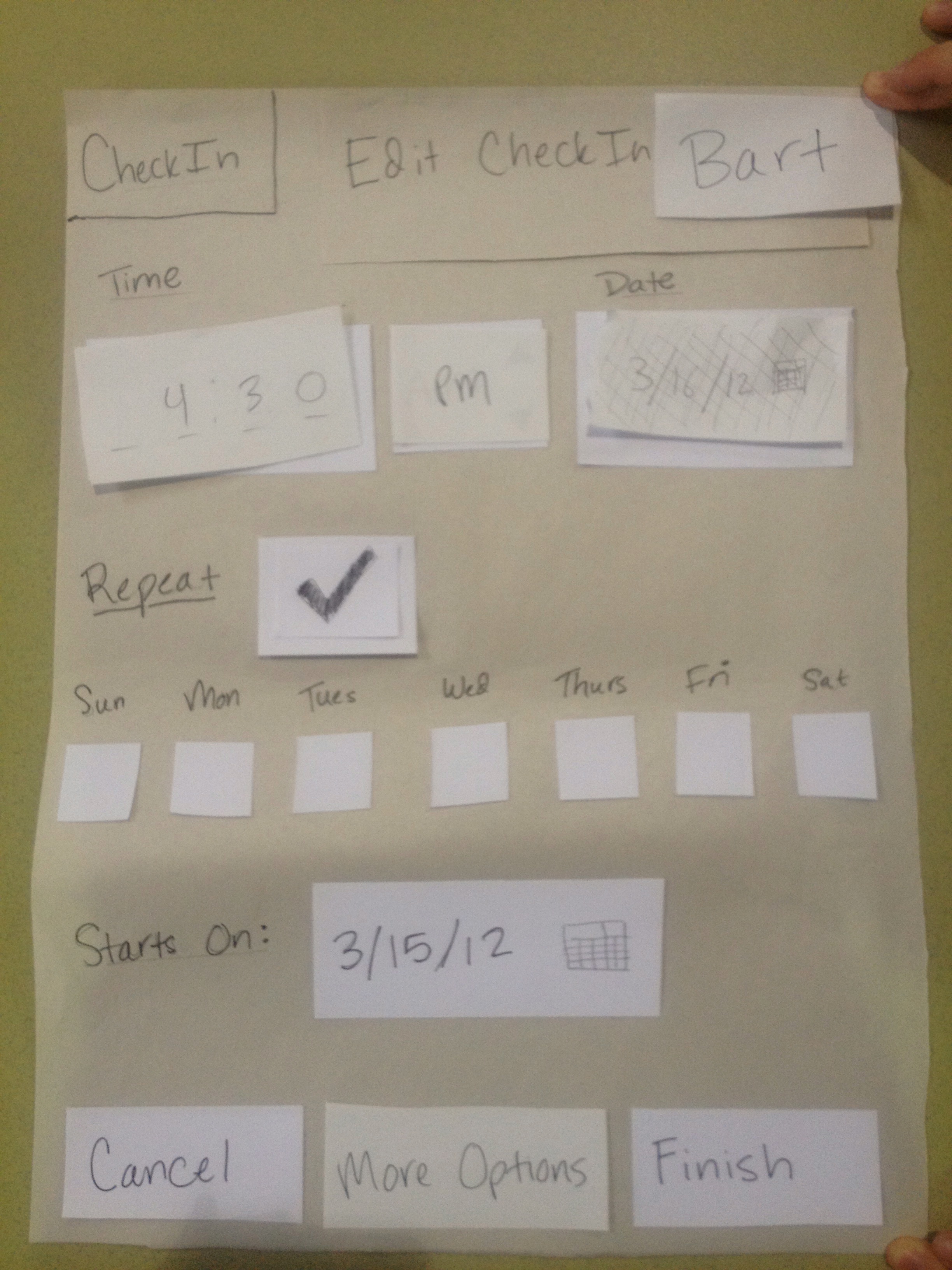
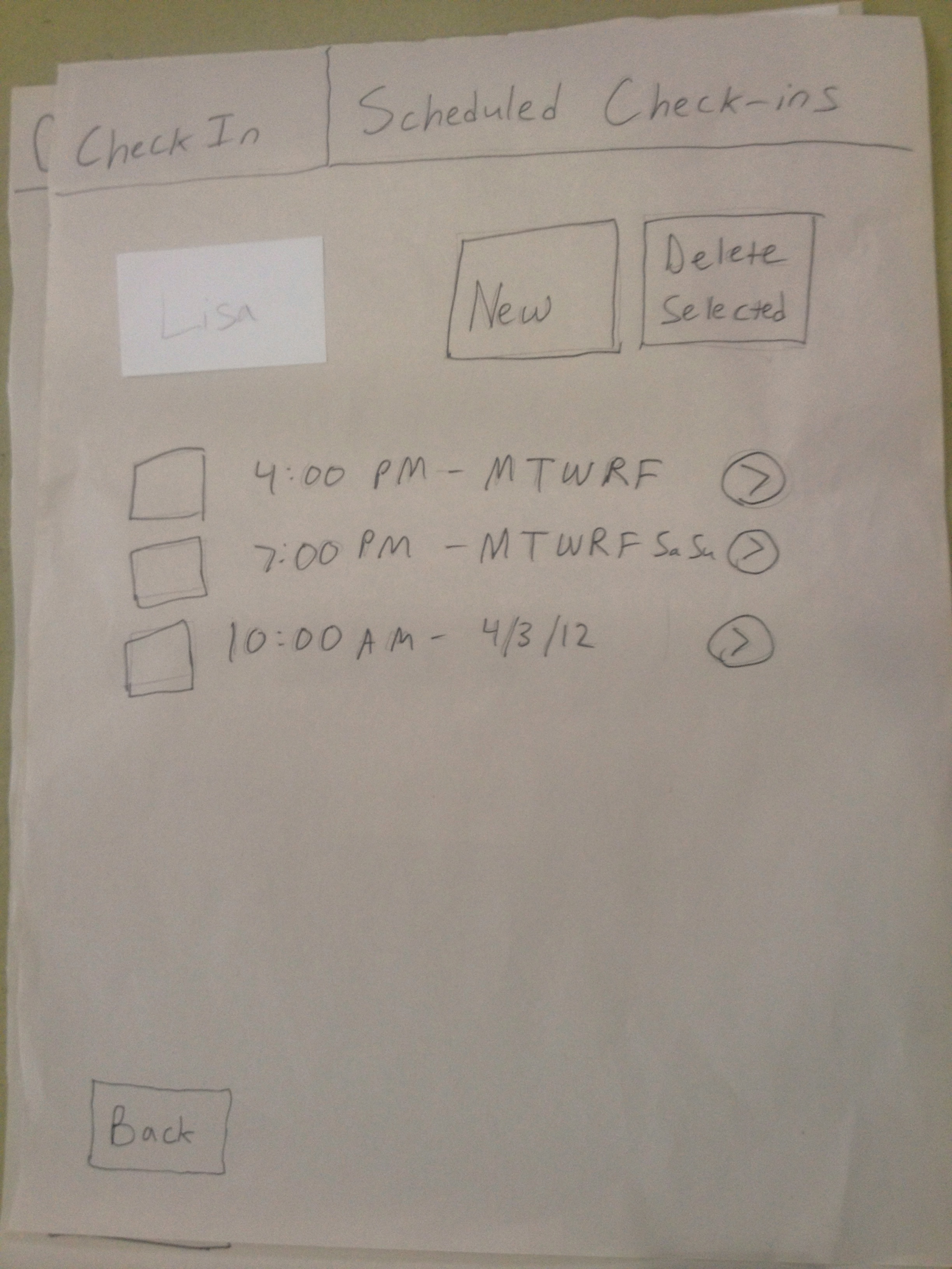
Task 4: Lisa just joined a soccer team, and so she’ll be getting in late many days because of practice. Please schedule a CheckIn every Tuesday at 6pm for Lisa.
Child Tasks
You are a child, and your name is Bart.
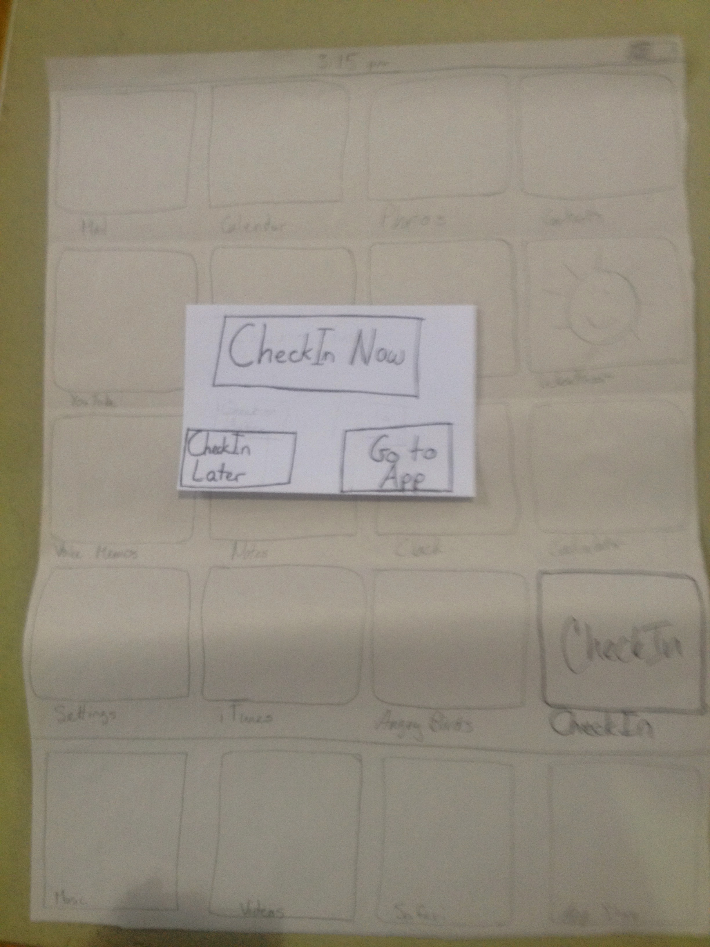
Task 1: You are using your phone when suddenly you get a message from the app. Your goal is to let your parents know that you are ok by replying to their CheckIn request.
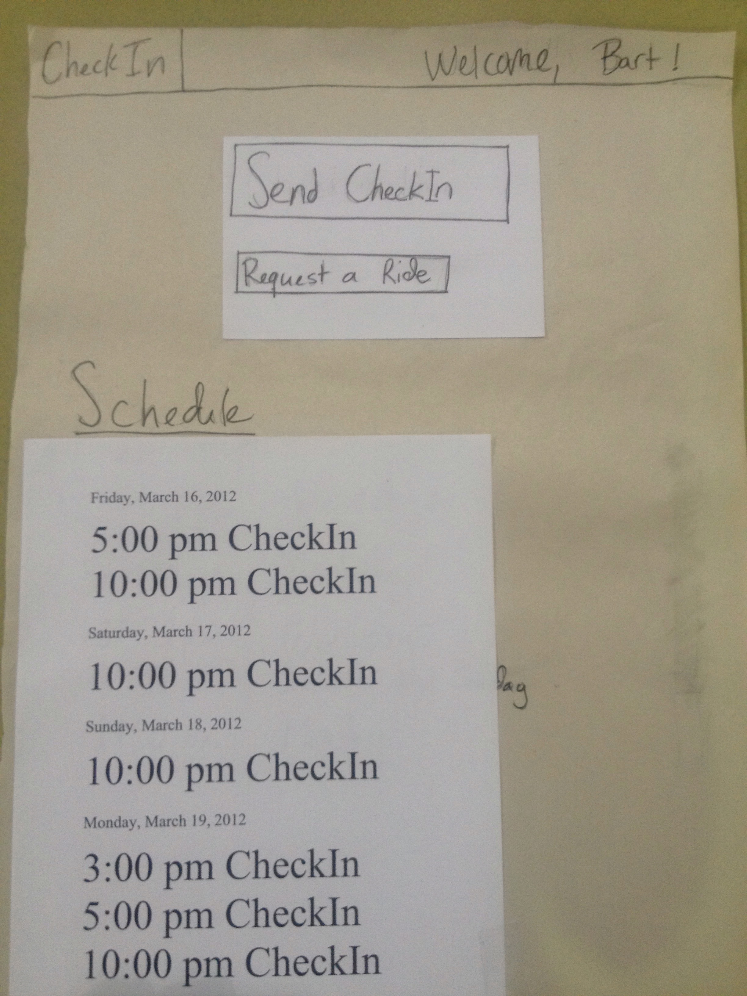
Task 2: Later this afternoon, you want to check when your next CheckIn request is. It is now 4:45 on Friday. When is your next CheckIn?
Task 3: You realize that your next CheckIn is within 15 minutes, so you decide to CheckIn now so you do not need to worry about it later.
Task 4: Tonight, you are at a party. You receive another request to CheckIn and decide to do so.
Task 5: The party you are at starts to get crazy, and you would like to leave. Please request a ride.
Prototype Iteration
We made changes to our prototype both between the rounds and within the rounds, between users, when there was something confusing that we could easily fix. Here is a list of our changes, and when they occurred:
Parent
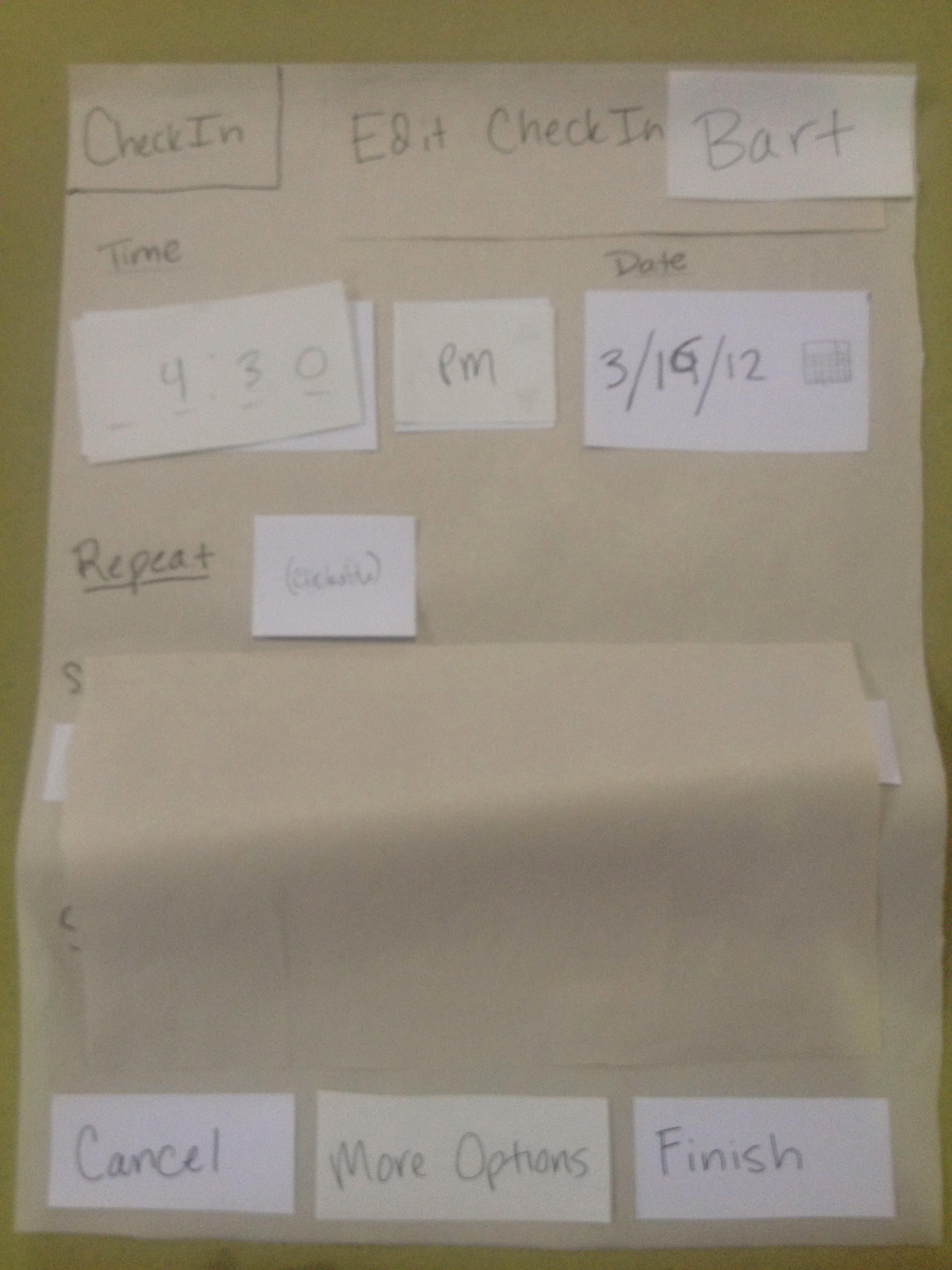
- (after Day 1 User 1) New task added: schedule a repeated check-in, for every Tuesday. Added default time (now) to “Edit CheckIn” screen. Changed the navigation buttons from “Next” to “More Options” and “Previous” to “Back.”
- (after Day 1 User 2) Removed “now” from “Request Check-in Now” button on parent’s screen
- (between Day 1 and Day 2) Removed “settings” from “Scheduled Check-in Settings” button on parent’s screen. Showed specific date grayed out if “repeat” was selected while editing a check-in request.
- (after Day 2 User 1) Changed “Scheduled Check-ins” to “Edit Check-ins” on button on parent’s screen
Child
- (after Day 1 User 1) When a CheckIn popup occurs and the parent has not requested any additional information for that CheckIn, clicking CheckIn now completes the action. Previously, the user had to go to a different screen and submit the CheckIn from there.
- (between Day 1 and Day 2) Changed the child’s “schedule” of checkins to a list of upcoming checkins divided by date (as displayed in the phototype photo). Previously it displayed upcomming checkins by indicating when they would be repeated.
- (between Day 1 and Day 2) Changed child tasks to final versions found here, which are more comprehensive and clearer.
We have a great deal of feedback from Day 2 that we will decide about implementing in the next step of the process.
Prototype Photos
These photos were taken at the end of Day 2.
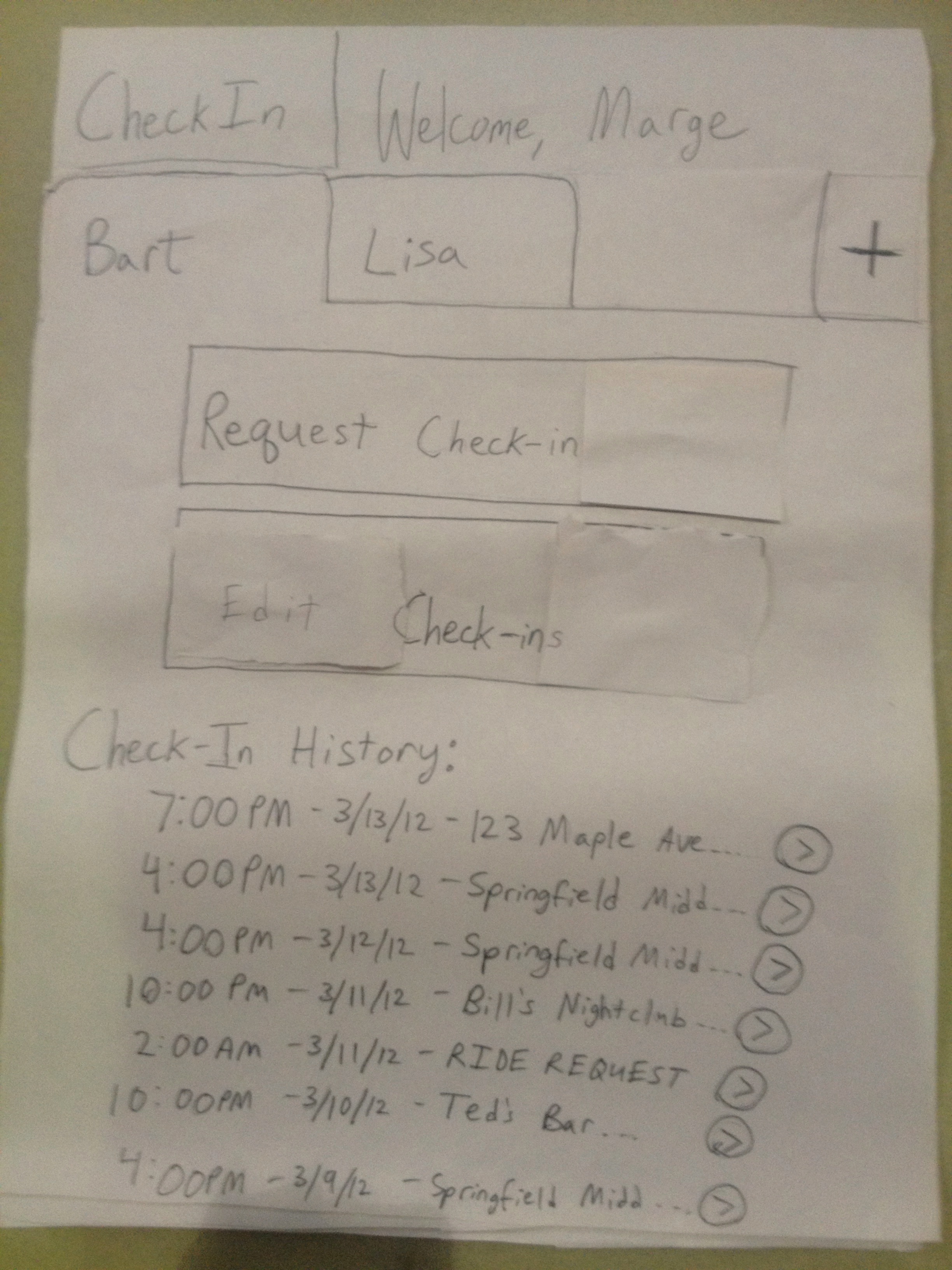
Parent Application
Home page for parent Marge
Creating a new CheckIn for child Bart
Creating a new CheckIn for child Bart with repeat events
Adding more options to child Bart's CheckIn
Viewing scheduled CheckIns for child Lisa
Viewing last CheckIn information for child Lisa
Child Application
Pop-up on home screen on phone for child
Home page in application for child Bart
User Observations and Feedback
Here are our observations of each user. We also asked each user for feedback after they played each user role, and allowed them to give feedback as they were doing the tasks.
Day 1 User 1
Observations:
- Parent
- Was confused about whether she had to set the time, since there was no default time.
- Instead of clicking “Scheduled CheckIn Settings,” the user clicked “Check In Now,” even though the task was to set up a scheduled CheckIn (the task could be accomplished from either screen, but this was not the intended screen)
- Child
- All tasks completed easily.
Feedback:
- Parent
- Thought having a date after “Starts On:” and a date in the “New CheckIn” screen to be confusing.
- Thought the wording of the navigation button “Next” and “Previous” to be confusing.
- Child
- The “Check In Now” button on the pop-up on the phone’s home screen should submit the CheckIn without any further prompting if no more information is required.
Day 1 User 2
Observations:
- Parent
- Like the first user, this user clicked “Check In Now” to schedule a CheckIn later instead of clicking “Scheduled CheckIn Settings”
- Did not understand how to make a CheckIn repeat, and thought that he might have to click all of the Tuesdays on the calendar pop-up. Upon prompting (“What other buttons do you see on the screen?”) he noticed the “Repeat” button near the bottom, clicked it, and completed the task.
- Child
- All tasks completed easily.
Feedback:
- Parent
- Said that the wording for the “Request CheckIn Now” button is ambiguous.
- Did not like the use of “Settings” in “Scheduled CheckIn Settings,” since “Settings” sounds like editing lower-level features (managing accounts, changing background color, etc.), instead of the higher-level features (creating a CheckIn)
- Child
- The “Request a Ride” button does not seem to give much information about its actions (What does it actually do? The child has no information about this.).
- Didn’t think the schedule of times on the home page of the application was nearly as useful as putting upcoming CheckIns there.
Day 1 User 3
Observations:
- Parent
- Like previous users, clicked “Request CheckIn” button to create a new repeat CheckIn instead instead of clicking “Scheduled CheckIn Settings.”
- Child
- All tasks completed easily.
Feedback:
- Parent
- Noted that the workflow on a Windows phone is stack-like, so going to “More Options” should not have allowed him to send the CheckIn with the “Finish” button in his mind.
- Wasn’t sure what the difference between “Back” and “Cancel” was from the “More Options” screen.
- The “Finish” button’s action was ambiguous; something like “Send Now” would clarify to the user what action the user was taking.
- If online, he said that all of the options should be on one page.
- Child
- Thought it was confusing that there was no feedback after clicking “Check In Now” from the pop-up on the phone’s home screen.
Day 2 User 1
Observations:
- Child
- A little confused about why the check-in box just went away after hitting the button. We probably need some kind of temporary feedback about success.
- Unsure if checking in ever happens in a way other than the pop-up box. Didn’t think about opening the app without some prompting.
- Confused why you’d check in early. Probably didn’t realize check-ins can be queued up, since on Day 2, we had users be children first (it would be obvious if they had been a parent first).
- Parent
- Wonders why the UI is different between parent and child
- Error in requesting more info on check-in - hits “finish” without “more options”
- Hesitation on which button to use to set up a repeated check-in (request vs. scheduled)
Feedback:
- Child
- Should indicate what “check-in later” in the pop-up box will do
- Would like default values in check-in fields, e.g. last entry, be able to select from some previous entries, …
- Parent
- Suggests a different wording on the “scheduled check-ins” button
Day 2 User 2
Observations:
- Child
- Decided to “go to app” instead of just doing the one-click “check in now” for our first task. This works fine, but would have been easier for the user the way we envisioned.
- “Return time” line has no AM/PM (probably would be better as a free-form text box, then child could be descriptive, e.g. “after game ends, probably around 9”)
- Parent
- First user to explore beyond what he had to do - he looked at checking the repeat box and seeing what “more options” were even in the first task
- Used “request check-in” to initiate scheduling a repeated check-in, not “edit check-ins” as we expected, but this is fine.
Feedback:
- Parent
- What does the “edit check-ins” (formerly schedule) button do? But the UI for that screen is nice, e.g. repeat scheduling consistent with google calendar
Day 2 User 3
Observations:
- Child
- Surprised that different check-ins ask for different information
- Unhappy at having no choice about submitting location
- Parent
- Upon realizing that this had a different UI, expressed the desire to be able to see the child’s UI as well, i.e. be able to see exactly how they have to/can enter information (suggested that during edit check-in, parent be able to see a preview of how it looks to their child)
- Made mode errors - did not realize he had to switch tabs to send check-ins to different children. First time he entered the screen incorrectly, saw the child’s name and realized he was in the incorrect place, and fixed it. Second time, did not realize.
Feedback:
- Child
- Child should see which parent the check-in is from/going to - might affect their answers
- Make sure the top bar of phone is visible to them, so they can see the time
- The word “check-in” on each entry in the child’s upcoming check-ins is redundant
- There is a lack of consistence between the wording of the “check-in now” button on the pop-up and “send check-in” in the app, but they do the same thing
- Would like to be able to select from past answers to check-in questions (like Day 2 User 1 wanted too)
- “Submit” is bad word choice for sending a check-in, has connotations
- Can we handle the case where GPS fails on the child’s phone?
- Parent
- Too easy to make mode errors and set a check-in for the wrong child! Need the child’s name to be salient. Suggests we should also allow the parent to switch to another child by clicking the name and selecting a new one (we originally didn’t like that idea because it makes flow odd... i.e. you click request on Bart’s page, and when done, you’re returned to Lisa’s). If we don’t want that, the name should be salient but not afford clicking. Another suggestion to avoid these was to include a small picture of the child (which also makes the UI more human).
- There is false consistency between the “edit check-ins” button and the title “edit check-in” on the window where you set one
- Instead of showing the current time/date by default, show “now”/”today”, and in the history, instead of the date, use “today”, “yesterday”, “n days ago” (up to some point, then just the date). RC thinks showing “now” on the check-in creation screen is especially important, because they may stay on the screen so long that the time showing is no longer “now”, but they shouldn’t have to go change it. But we’ll have to ensure it’s clear that they can choose a time if they want.
- “Finish” is bad word choice, “send” would be better (or perhaps “save” for non-immediate ones?)
- User says he probably would not have looked at “more options” and would prefer just scrolling to see them, even on a phone
- On home screen, would rather see some upcoming check-ins than see as much history as we showed - split the rest of the display to do this (then perhaps we could get rid of the “edit/scheduled check-ins” button and just have a “more/edit” button at the bottom of that section).