Prototype Photos

Main Screen. After our splash screen is displayed, the user sees this screen. They can create a new sketch, or browse their old sketches. The options menu shown at the bottom can be accessed by clicking the phone's menu button.

Settings Screen. The user is presented with this settings screen after they click the Create New Sketch button. This lets them customize their sketch.

Edit Mode. The initial values of this screen are pre-populated based on the selections from the Settings screen. The user drags the notes from the top bar onto the staff to place them. When placed, the program plays the pitch. The user can drag the note up or down to adjust its pitch and placement on the staff. The measure bars are added automatically. The V next to the notes shows a dropdown menu with more notes. The least recently used note is then replaced with the new choice. The Rests button toggles between showing the notes and the rests of similar value. The Record button brings up the phone's record interface and the user can sing into the phone, which then places notes on the staff.
The buttons at the bottom are similarly used by dragging them to notes to modify the sketch. If the user clicks the mp it brings up a Dynamics menu and the user can select a new value to drag onto the staff.
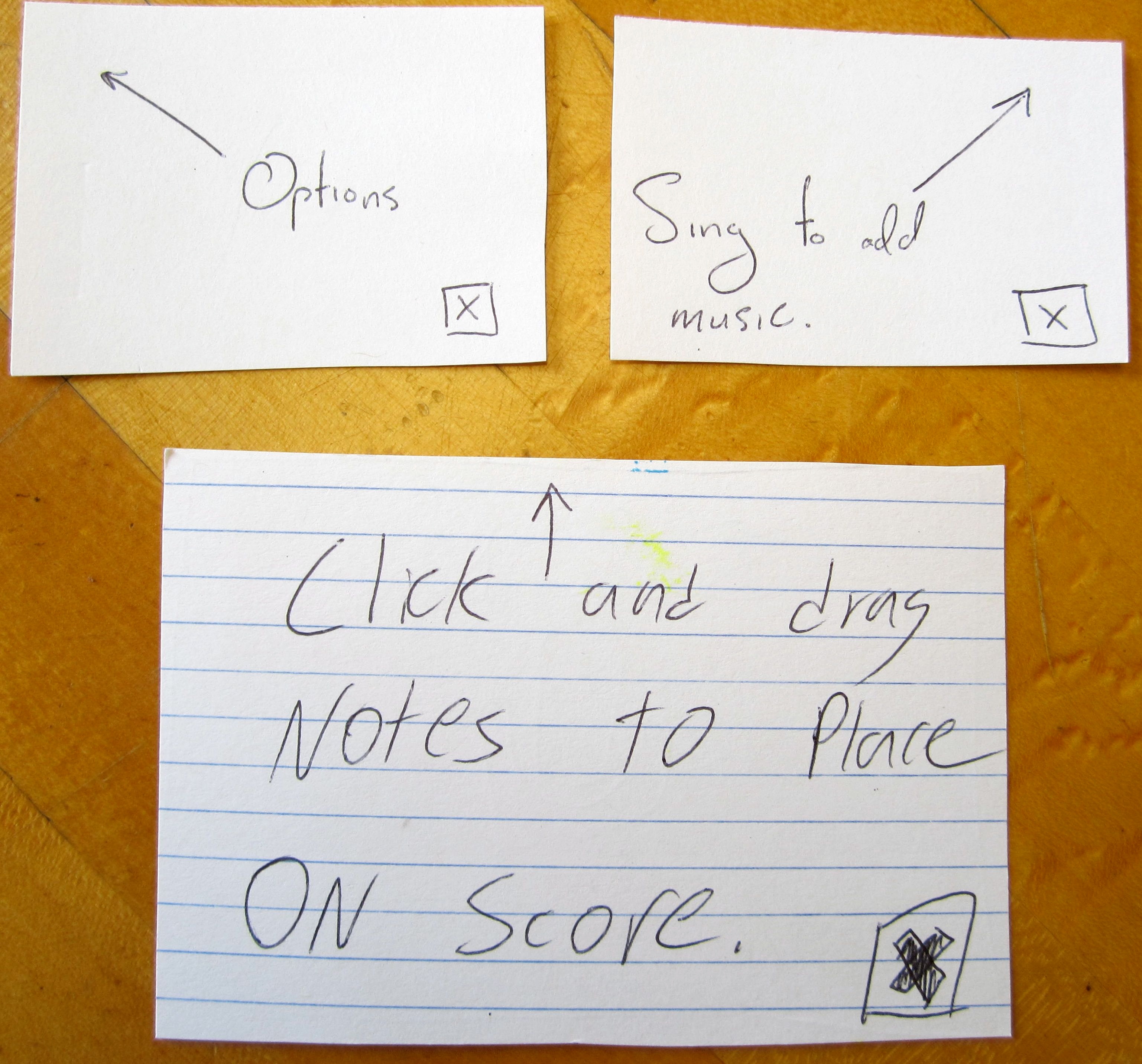
The Options box pops up the first time the user ever creates a new sketch. The other boxes pop up the first time the user clicks on the notes or the record button.

These different option menus are brought up when the user clicks corresponding parts of the staff (the clef, time signature, tempo marking (not shown), expressive marking (not shown), and key signature).

This shot shows the Options menu, accessed by clicking the phone's option button. Undo reverses the last action. Save saves the sketch (the name was specified on the Settings screen before the sketch was created), and then tells the user that it has been saved. Close takes the user back to the main screen. Play switches into Playback mode.

Playback Mode. Pressing the Play arrow changes it to a Pause symbol and plays the sketch. A cursor shows the user where it is playing. Pressing << or >> moves the cursor one note in the specified direction and plays that note, so the user can step through the piece.

The options menu for playback mode. Edit moves the user back into Edit Mode. Close takes the user back to the main screen. We added Save because we found that users wanted to be able to save their sketches from this mode, despite the fact that they cannot actually edit the sketch from this mode.
Briefing
You are a music student. You have music in your head that you want to write down, but you do not have your computer or a pen and paper. You do have your Android phone. You open up our app and see this screen. (First screen in placed in front of the user.)
Scenario Tasks
- Create a new piece of music
- Browse through your files to find the one you just created
- Listen to your sketch
Observations
Initial usability problems:
- Users didn't know to "drag-and-drop". Many thought that the note selection was moded.
- There was no option for a dot on a note.
- Many users were confused by the "Speak Now" interface. "Speak" was not a clear word. Many users tried to say "cee" instead of singing it. Unfortunately, this is provided by the OS and we cannot change it.
- First user did not edit the name of the composition
- "Save" was not clear (and was hidden for non-Android users).
- Rests were not available
- It was not possible to save from playback mode
- The "more notes" carat was not clear to users.
- Meter was not clear, placing bars didn't make sense to users.
Our general observations were that:
- Many users did not understand the drag-and-drop interface. This may have been influenced by the paper prototyping (users are much more likely to touch a phone screen than gently arranged pieces of paper). However, once they figured it out, navigation and note placement was very clear.
- Many users, especially non-Android phone owners, did not understand the usage of the built-in Menu button. This made saving and successful navigation extremely difficult.
- Once users had seen each screen once and understood the general workflow, navigation was deft and easy. Since the time required to get to this point diminished greatly by the 6th user (after several design iterations), we believe that the current design is very effective. Although most phone application users have a low tolerance for confusing workflows, we believe that the "time to fluency" with our application design is low enough that it will be successful.
We have also included a public document that lists the raw observations and iterative design changes that we made as we went through each user test.
https://docs.google.com/document/d/19hrRuZWynYfpp41_lAAxiRQtrpMXEUebG4TXOI5Crow/edit
Prototype Iterations
Changes that occurred in design:
- Keyboard shows up in "settings" screen (for ease of using the paper prototype; this would be the default behavior on a phone when the cursor is in a text box)
- "Exp" was replaced by a slur
- Placed pop-ups describing what the user was able to do.
- Determined that meter bars would be placed automatically by the application
- Rest / Note mode was added
- Save button was added to playback mode, and feedback is given on a successful save. Also, a prompt occurs when the user tries to close without saving.
- Upside down carat for "more notes" was replaced by ellipsis.