GR6 - User Testing
Design

Final Design
Our application has four main components, maintaining friends list, managing events, receiving notifications, and the map view.
kindly find below the snapshots for our final design.
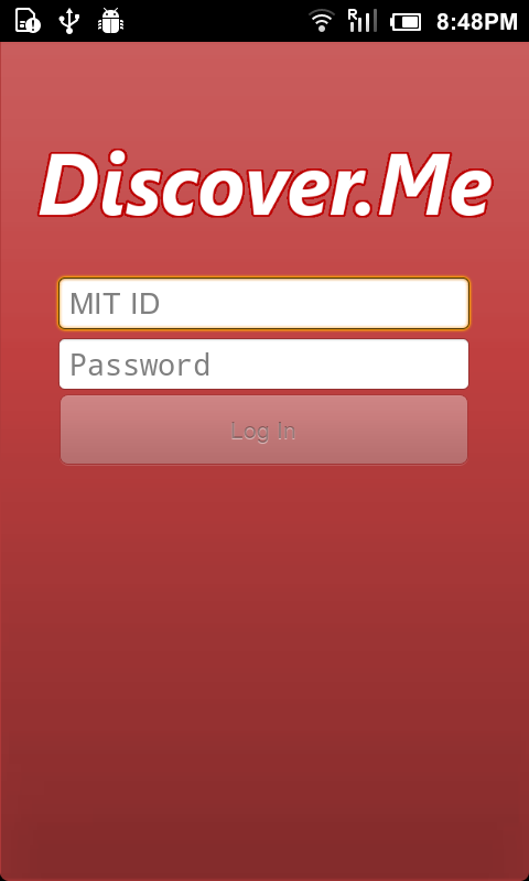
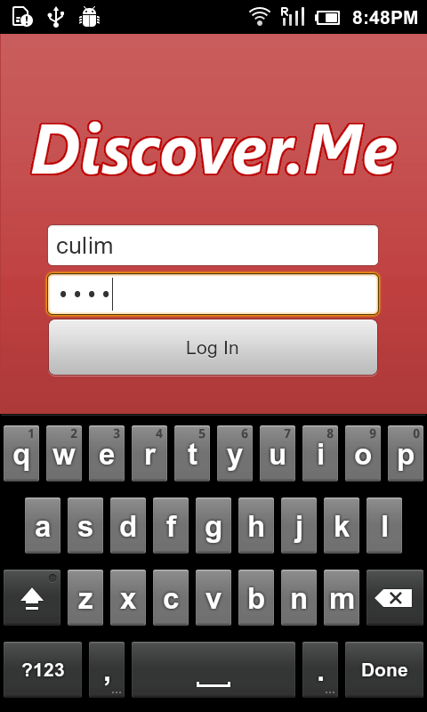
1. Login Screen |
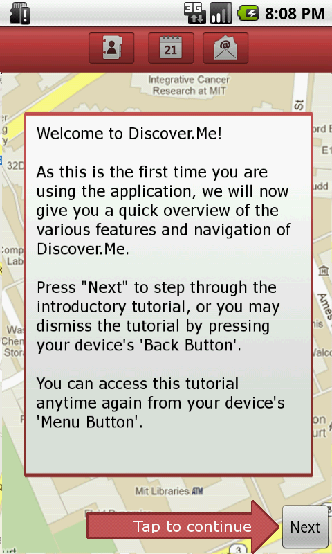
2. Tutorial Screen
|
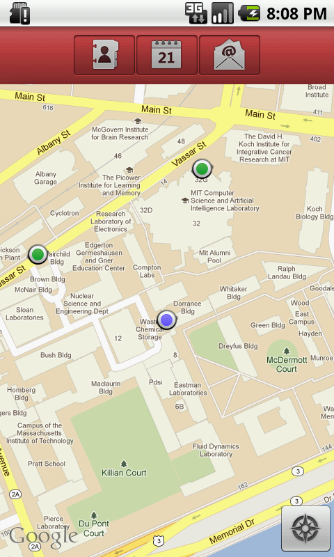
3. Home page: position of user
is denoted by a blue dot, while
location of friends is shown as
green dots.
|
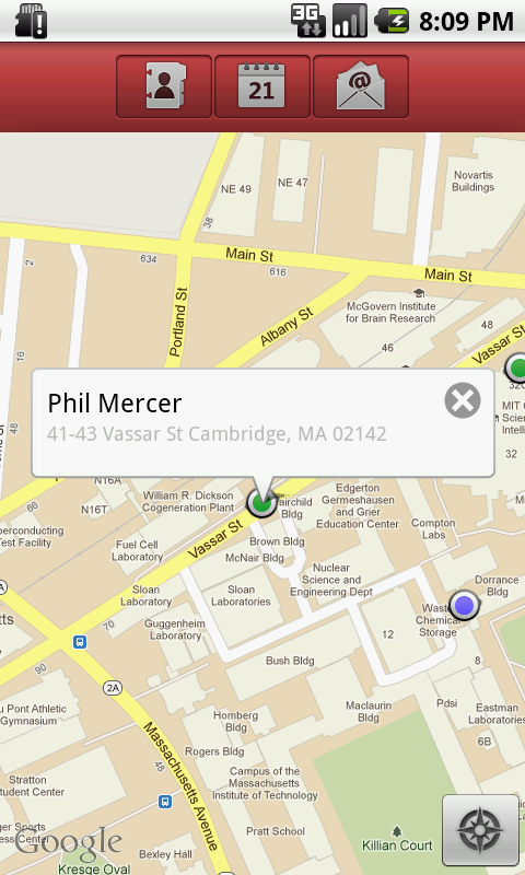
4. Detail Bubble: tapping on a
do opens a bubble containing
the person's name and location
details |
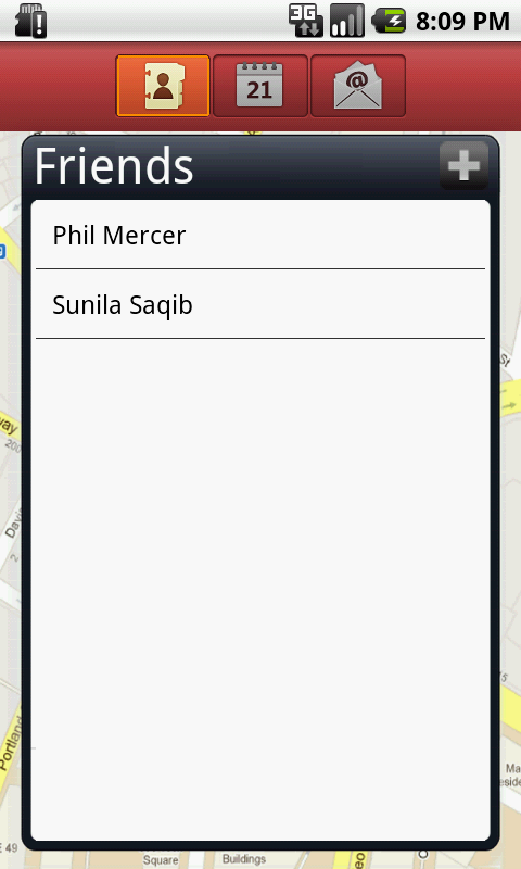
5. Friends' list
|
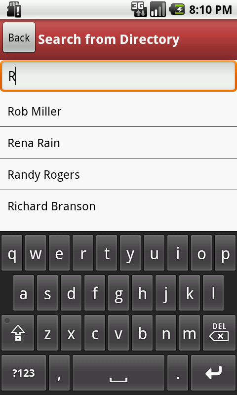
6. Search page to search from
friends from directory. |
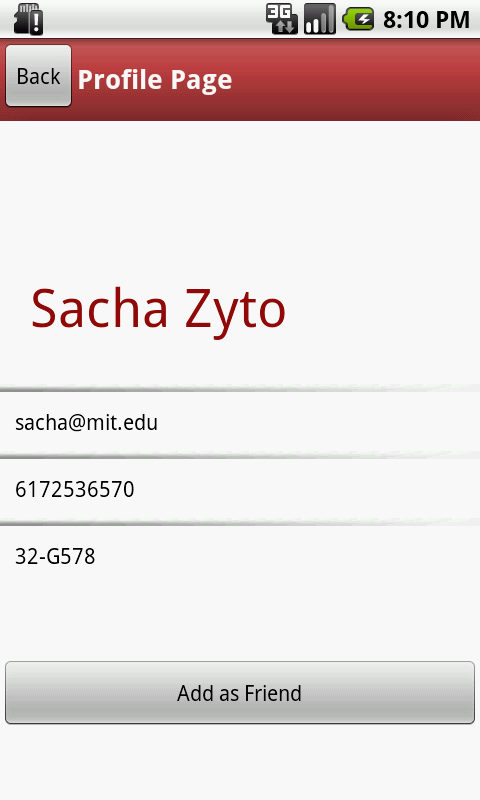
7. Profile page of a person
currently not added as friend
|
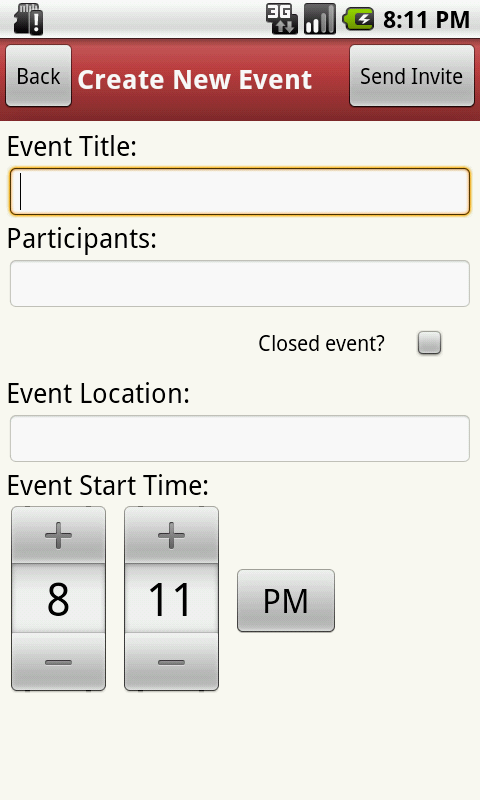
8. Event initiation page
|

9. Participants selection page
|

10. Location Selector
|
|
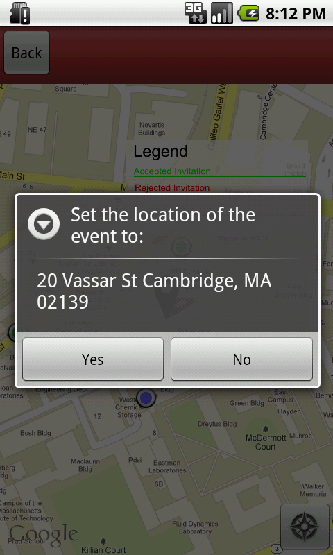
11. Confirmation message on
selecting a location
|
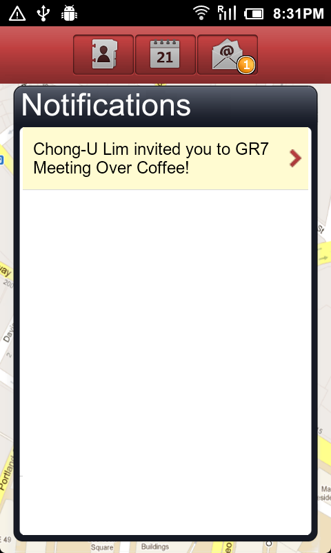
13. Notification page:
A bubble appears on Notification
button when new notifications
are received unread notifications
are highlighted in beige
background
|
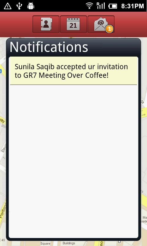
13. Notification page:
un-clickable notification does not
have arrow on right. |
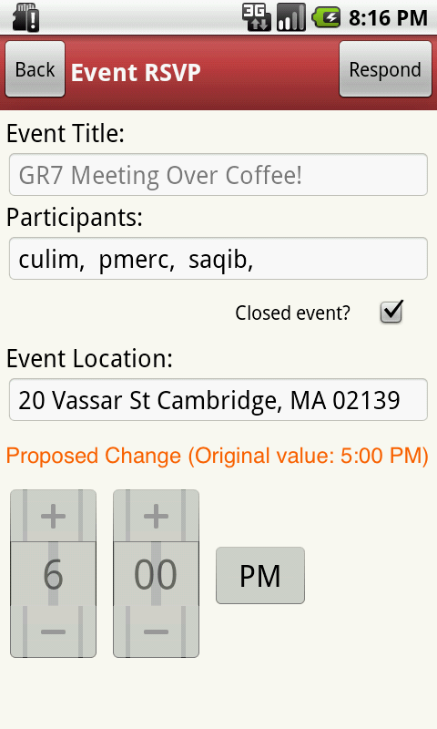
14. View Proposed Change page
the modified field has label in red
color and original value in
brackets for comparison. |

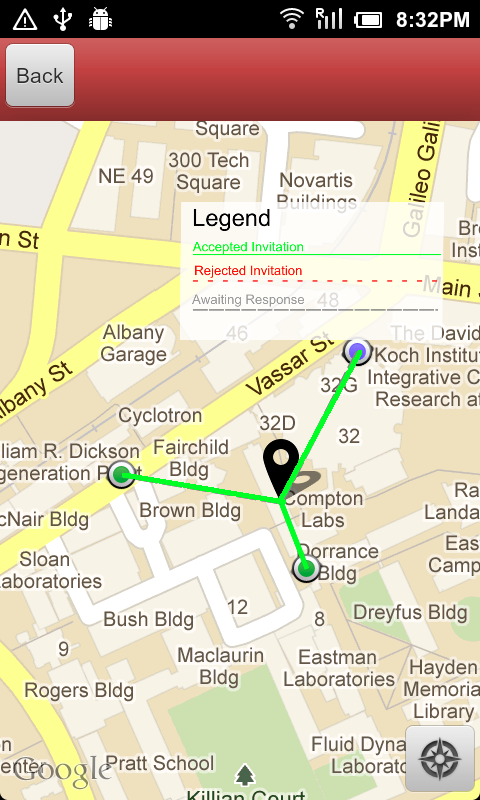
15. Event when viewed on map
shows the RSVP responses
from all invitees in form of color
and textured line connecting them
from the venue.
A small legend on top of screen
explains what different colors
and textures stand for.
|
Design Decisions
Title |
Screenshot |
Alternatives |
Description & Justification |
1. Title Screen |
|
- Our first implementation of the title screen actually centered the form fields.
|
- We opted to shift the form fields to be slightly higher (40% way down the screen), because we realized that otherwise, the soft-keyboard would actually occlude the Log In button. (Pilot Testing)
|
2. Tutorial Screen |
|
|
- One of the biggest issues raised from our heuristic evaluators was that the application's minimalistic design and gave users a slight learnability problem when confronted with the application for the first time. The evaluators suggested for some kind of tutorial or instructions to walk first-time users through the the main features of the user interface. We thus implemented a by-passable tutorial screen which walks users through the various icons and what they meant on the home screen, as well as explanation of the icons on the map view. (Heuristic Evaluation)
- Based on our user tests, many of them showed approval and were welcoming of the tutorial screen. (User Testing)
|
3. Bubble showing the details of the person have a close button on top right corner
|
 |
- tapping on a dot denoting a persons position opens a bubble showing the details about that person.
- previously this bubble was dismissed by a second tap on the dot.
- our new design have a small "x" at top right to close the bubble.
|
- people found it hard to figure out how to close the details bubble, because of the missing affordance, even though this feature is externally consistent with google map applications.
- to alleviate this problem we made the close button visible.
|
4. Profile Page
|
|
- previously all the profile details were enclosed in a bounded text box.
- in our new design we removed the boundaries.
|
- people confused these bounding boxes as editable text box, therefore choosing a contrasting representation for details was necessary to establish the difference.
|
5. Map view of event
|
TODO : snapshot with all three kinds of responses
|
- previously the RSVP was indicated only by difference in color (red, green and gray) of the connecting lines.
- now it is indicated by both colors and texture. and a legend is displayed on upper right corner to help users learn the meaning.
|
- choosing only color as indicator proved to be ineffective because it was hard for color blind people to distinguish these colors.
|
6. Notification Page
|
 |
- originally all the notifications were displayed in similar manner, irrespective of whether they are click-able or not.
- now the notification which may require user to perform an action or have further details to show have a tine arrow on right, giving the affordance to show more.
|
- users faced difficulty in understanding why tapping some notifications redirects them to another page while on some nothing happens.
- to let user distinguish these different kind of notifications visually we placed an arrow for the notifications which are click-able.
|
7. View Proposed Change page |
|
- the field of proposed change is highlighted in red and the original value is shown in brackets so that user can recognize the change instead of trying to figure out which field is different.
|
- originally there was no indication for the change in event details that is proposed. and user had to remember the original values and compare it with the new one to figure out what the proposed change is.
- this violated the recognize instead of recall Nueman heuristic. therefore we provided the visual contrast to indicate the change.
|
Implementation
Client Application (Front-End)
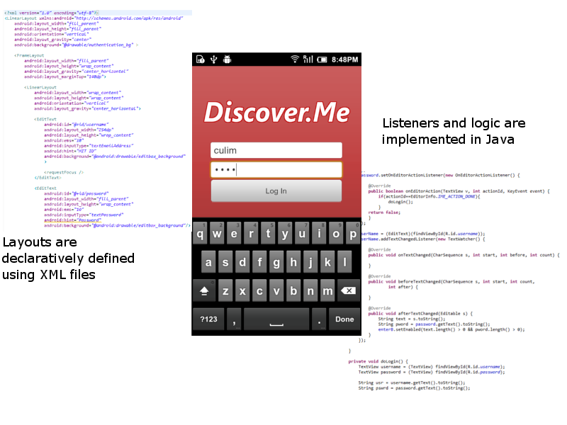
Discover.Me was developed as a native Android application using the Android SDK. Eclipse was used as a development environment, and we made use of the emulator and 3 different Android devices for testing. Java was used as the programming language, and all the views were programmed from scratch. We made use of default Android components (EditText, TextViews, TimePicker, Button, ImageButton, etc.) in order to maintain consistency with the Android platforms design guidelines. Image assets were hand-created using GIMP and PhotoShop, and some of the icons were gathered from freely available icon packs. We made use of the Android Google APIs in order to render the map view, as well as for getting geographical and location based information. Each view seen in the application (called an Activity) is created using a mixture of declarative and programming approaches (as seen in the figure above). Locally persistent information is stored on the device's storage, and directory or database intensive information were stored on a local SQLite database on the device. The device also caches information sent from the server in order to speed up queries. For example, the directory is loaded from the server, and then locally cached on the device in order to make searches much faster, and this was crucial to enable our suggested/autocomplete search functionality in our application to work efficiently.
Server Service (Back-End)
In order to ensure data stays persistent, we made use of a PHP server as a back-end service to store the user's information which is sent from the device. We implemented an asynchronous thread on the client which frequently sends information, such as the user's location, to the server which would then proceed to push the information to all other devices. This was used in order to enable multiple users to keep track of one another's location. Our notifications service also used the same system in order to send notifications about an action one user performs to another (i.e. Alice creates an Event and invites Bob. The event information is pushed from Alice's Device to the Server. The Server stores the information and generates a notification to Bob. Bob's device will pull the updated notifications and visually displays it to Bob.). Several PHP scripts were written in order to perform actions such as Creating an Event, Proposing a Change to an Event, Sending a Friend Request, Deleting a Friend, etc. Data-related storage were stored as .txt files on the server, and were prefixed with the user's MIT ID. For example, the list of Charlie's friends would be charlie_friends.txt.
Evaluation
Conducting the User Test
The users were given a set of tasks to do which were similar to those from GR3, which covered the main use-cases and tasks which we expect our target population of users would do. One member of our team served as one of the test user's friends in order to provide the end-to-end communication between each other. We provided a sample device for the user to use, and gave them the option to download the application onto their personal devices if they chose to. We presented the user with a set of tasks to perform in order to observe them using Discover.Me in action.
Task List
- Launch the app and run through the tutorial.
- Given a chance to explore around the interface to acquant with the device.
- The user was told to search for a pre-specified person (Phil Mercer) in the user directory and to add him as a friend.
- The user was told to inform us when he was aware when his Friend Request had been approved.
- The user was told to create an event and invite Phil to it, at a location he felt would be close enough for both himself and Phil. The scheduled time would be 30 minutes from the time at which the task was being performed.
- The user was told to inform us when he was satisfied and assured that Phil would be coming to an event.
- Phil (Our team member) would send an event to the user. The user was then told to propose a change to the event, and particularly to schedule it at a time 1hour away from the original time.
- The user was then told to inform us when he was satisfied that his proposed change had been accepted by the originator, Phil.
User Population
Users were picked randomly among friends and acquaintances who had not used the system before. We re-affirmed that they matched our target population by posing several questions with regards to how they went about organizing impromptu meetings. As an example, our facilitator posed the following questions:
- Have you ever been in a situation where you wanted to organize a quick, impromptu meeting amongst friends whom you knew were located relatively close to you?
- Describe, briefly, how would you go about doing so currently?
- How would you keep yourself informed of everyone's responses?
- How would you keep yourself informed of all proposed changes made by all your participants
- How would you enable all participants to each know the responses of every other participant
- How would you go about informing all participants of any proposed changed to the event.
Task Briefing
Users were given a quick overview of Discover.Me, which included the motivation for improving the creation of impromptu meetings, locating participant whereabouts and being able to easily view the RSVPs of each participant. The users were also shown the video which we used for the Madness Demonstration, as it included an overall picture of Discover.Me, as well as a voice-over.
Usability Problems
Overview of Usability Issues Observed & Proposed Solutions
Presented with the Tutorial Screen
|
Finding a Friend in your Friend List or on the Map |
Adding an Individual into your Friend List |
Creating and Inviting Friends to an Event
|
Responding to an Invitation by Proposing a Change In Time |
General Comments |
- The tutorial screen was welcomed by all our users. The only issue was with the visibility of the "Next" button.
Solution: Instead of having both an arrow AND a next button, we could make the arrow itself a button and change its text to say "Click here for next tutorial". This will help serve double-duty, acting as both an instruction as well as providing the affordance of a button.
|
- The user wanted a way to locate a friend on the map easier.
Solution: Provide the ability to go to a friend's location via the Profile page, i.e. with a button stating "View Current Location".
|
- The on screen message confused some users as it said "Friend has been Added", when it actually meant that the request had been sent.
Solution: Reword the on-screen message to say that the friend's request has been sent.
- The users automatically knew that the notification received about the friend accepting the request was actionable, but there was a case where the user was then tempted to press "Delete Friend", as it was the button that stood out the most upon reaching the Profile page.
Solution: Help safety by placing the delete functionality into the options menu (Activated by pressing the device's physical menu button) which would only then appear on the screen. We could also highlight the choice a different color like "Red" to bring the user's attention to that as an important choice, (i.e. externally consistent with what the Facebook mobile application does to indicate that a user wants to log out). We can also maintain safety by bringing up a confirmation dialog prior to actually deleting the friend.
- Upon successfully adding a new friend, some users expressed an interest to know where the user was on screen. However, the newly added friend merely gets added onto the map without much feedback.
Upon adding a friend, we can actually make the notification actually pan to where the newly added friend is. Also, we can do something like what other applications do and provide a sort of "dropping pin/dropping down" animation which would help bring attention to where the newly added friend is located.
|
- The user wanted to be able to select a place by address or name rather than by selecting the location on the map.Solution: Provide a search bar to type in the desired location and place a marker on the map based on the input. * The user didn't notice the Done button when selecting a location on the map and instead hit the Back button.Solution: Make the done button more prominent.* The user wanted to be able to add notations about the event, such as specific room numbers.Solution: Provide a field to allow users to add messages/comments to the event.
|
- The user was not aware of the Propose Change button and went to RSVP expecting Propose Change to be an option.
Solution: Make the Propose Change button more prominent or include this functionality within the RSVP option.
- The user wanted to give a reason behind the proposed change.
Solution: Provide a field to allow users to comment why the change to the event was suggested.
- The user wanted to differentiate between accepted events and those with a pending proposed change.
Solution: Incorporate an indicator to inform the user that a proposed change is pending.
|
- The user wanted to block proposing changes within a certain time before the event.
Solution: Allow the user to input a time after which they will not entertain changes. If the current time is passed that then the Propose Changes button can be deactivated for the other users.
|
Detailed Observations
User |
Presented with the Tutorial Screen |
Finding a friend in your Friend List or on the Map
|
Adding an individual into your Friend List |
Creating and Inviting Friends to an Event |
Responding to an Invitation by Proposing a Change in Time |
User's General Comments |
1 |
- The user had no problems with the tutorial.
|
- User exhibited no difficulties identifying the correct icon in the action bar, thanks to both the the tutorial and the correct affordance provided by the button.
|
- The on-screen message said "Friend has been Added". The user was then surprised to find his friends list still empty.
(Confusing the User)
- When the notification bar displayed the counter, the user then understood that he had actually sent a request and had just received confirmation.
(Good Visual Variable)
|
- Expressed an interest in being able to specify a place by name, which would then pan the map to the location.
(Efficiency)
- The user hit the Back button instead of the Done button, losing his selected location.
(Safety)
|
- Did not exhibit difficulty in performing the task -- found it intuitive to follow based on the application's general workflow.
(Internal Consistency)
|
- Generally found the overall interface useful and intuitive.
|
2 |
- The user was tapping on the arrow image pointing to the next button, as opposed to the next button itself, in trying to proceed to the next step in the tutorial.
(Confusing the User, Unclear Affordance)
|
- The user wanted to have a way to search for a friend, either through the friend's list or a search bar. This would improve the efficiency of locating someone as opposed to manually tapping each marker.
(Efficiency)
|
- Upon receiving the notification that his friend had added him, the user proceeded to tap on the notification, as he saw the ">" arrow.
(Good Affordance)
- The user was tempted to press the "Delete Friend" button, and he said that it was the first thing that came to his mind when he saw the profile page.
(Safety)
|
- Expressed a wish to have free text area to add a some comments to the event invitation, much like most applicaitons that send invitations to others.
(Matching the Real World)
- Hoped for a way to be more specific in selecting a location (i.e. Room Number or a particular floor).
(Matching the Real World, Efficiency, Visibility)
|
- Expressed a wish to have free text area to add more information as to why a change was being proposed.
(Matching the Real World)
- Wanted to view events which he/she had proposed a change for in the Events List with some sort of indicator that they were pending.
(Visibility)
|
- Expressed a wish to be able to prevent users from proposing a change too close to an event.
- Was generally interested in conveying more information with regards to his action to his friends.
|
3 |
- The user had no problems with the tutorial.
|
- The user expressed concern that in the event that many of his friends were clustered close to one another, that it would be hard to locate a particular friend. He later discovered that the map's zoom levels implemented direct manipulation for panning and zooming, and expressed satisfaction.
(Learning by Exploring)
|
- The user wanted to know where his newly added friend was after adding him. However, the friend took a while to locate where his friend was.
(Efficiency)
|
- Expressed an interest in being able to specify a place by name, which would then pan the map to the location.
(Efficiency)
|
- Did not not realize that the propose change button was there. Proceeded to RSVP "Yes" without making the change, thinking that the part where a suggested change came after the RSVP.
(Visibility, User Model of System)
|
- Initially thought ">" in the notifications list meant that the notification was new.
(Visibility)
- When asked about how he/she was able to distinguishing whether notifications were read/unread, user realized that the beige tint in the background was already triggering that knowledge unconciously.
|
Reflection
The most important lesson we learned thougth this project is that when you are a part of the development team of a system, it is hard for you to make a unbiased critical review of that system in terms of learnability and usability even if you consider yourslef part of the userbase.
while going through the design iteration we have learned a lot about the diversity of the behaviour and thought processes of our user base, and their feedback at different stages of design and implementation was criticle ingredient in achieving the final userfreindly version.
To evaluate the results of our observations at each iteration of testing, we did another iteration untill finally we started receiving consistent positive responses from the users.
We tested all design alternatives for major tasks in paper prototyping, and requied to do only minor affrodance refinements in later testings. and therefore the number of iteration we did in paper prototyping was greater than the number of iteration we needed to do for computer prototype before achieving consistency in users' response. However we noticed that on each iteration of testing, as the interface became more polished than before, we found new usibility concerns through user testing which went unnoticed in the previous iteration. therefore if given another chance, we would use more realistic yet low fedelity sketches for paper prototyping. there are many such open source mobile app paper prototyping software available which we didn't know about at that time.
by using these software we could increase the clearity of different views and provide a polished view for users feedback at much earlier stage, further reducing the iteration cost of computer prototyping.
1 Comment
Sacha Zyto
on GR5:
Presentation: very good. Keep that positive attitude !
Usability: great usability fixes: legend and dashed lines instead of red/green, better affordances for editable controls, 1st time tutorial !
Completeness: Good: UI seems complete enough for user testing of the scenarios... at least outside so you won't get into GPS issues :)
Answers to our questions: good !
Overall: congratulation in the award ! It is well deserved.
on GR6:
Overall Wiki presentation: Starting w/ final design is a big help to see ""current status"" of the project (BTW: great that you implemented highlighting the change on screen #14 since we spoke for GR5 !)
Design description: Starting w/ final design is a big help to see ""current status""
Implementation: good
Evaluation: excellent. Summary of findings followed by details is a great way to expose the new usability issues.
Reflection: good & thoughtful. It would be interesting to go though all the issues that were spotted this time and sort them by ""whether they would have been easily discoverable on paper"", or not. If you get lots of issues in (1), then yes, more paper prototypes would have helped, but if not, it means that it was time to move away from paper prototyping.