Design
I. Home Page
The PennyPincher logo and home button appear at the top of the page in the header, and both link to the home page. At the bottom of the page, a footer menu holds three buttons, which allow the user to add a new transaction, view their transactions summary, and edit the user settings. Simple images label these three buttons. The header and footer menus appear on all pages in the PennyPincher mobile web app, so that the user can easily access any of the necessary pages quickly and efficiently.
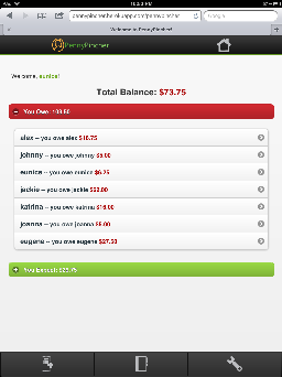
The home page displays a welcome message to the user, the user's total balance, and two drop down accordion menus. The user's total balance is the difference of the amounts displayed in the two accordion menus. The amount in the red accordion menu is negative. If the user's total balance is red, then this amount is negative, and shows that the user owes more money than he or she expects from other people.
When the PennyPincher home page is loaded, the top accordion menu already appears expanded, so that the user will know that these are accordion menus. The accordion menus are also labeled and color coded. The top accordion menu shows the amounts the user owes to other users. It is red and is labeled "You Owe:". This red accordion menu displays the net amount that you owe other users. The bottom accordion menu shows the amounts other users owe the user. It is green and is labeled "You Expect:". This green accordion menu displays the net amount that other users owe you. With labeling and color coding, users of PennyPincher will learn the meanings of the colors which are used throughout the web app. Furthermore, including the labels allows for users who may be color blind to still know what both accordion menus show. The "You Owe:" accordion menu appears before the "You Expect:" accordion menu because owing money to other people is usually an immediate or more urgent thing that people want to take care of. Furthermore, the menu is red to show a "negative" balance, since a majority of users will associate the color red with something negative that they may need to take care of immediately.
Within each accordion menu, PennyPincher provides a list of users and amount that you owe the user or the amount that the user owes you. These fall under their respective accordion menus. Tapping on any of these users will bring you to the page which will show you the details of your transactions with the selected user.
II. Add a Transaction Page 1
Required Title, Total Amount, and Description of Transaction
The add transaction page contains fields for the user to enter the title, total amount, and description of the new transaction the user wants to create. These fields are required and if they are completed, PennyPincher will alert the user.
Choosing People Involved in the Transaction
When adding a new transaction, the user has the choice to be included in the transaction. The "Add Transaction" form contains a checkbox labeled, "include me in transaction". If the user checks this checkbox, the "People in Transaction" list beneath the search bar will contain "Me" to show that the user has decided to be included in the transaction. To add another user to the transaction, the user uses the search bar, labeled "Search Names". The search bar uses autocomplete, which is populated by a list of all users. To include another user in the transaction, the user simply taps a user's name to select that user. This user's name is then added to the "People in Transaction" list. Additionally, PennyPincher is also set up so that a user cannot appear in the "People in Transaction" list more than once. This eliminates the possibility of users being charged twice in a transaction. If the user made a mistake and accidentally added a user to the transaction, the user can just tap and hold the user's name in the "People in Transaction" list to delete this user.
The design decision behind this particular implementation of searching, adding, and removing users was due to fact we used Jquery Mobile for implementation as well as the fact PennyPincher is made for mobile phones. By implementing autocomplete, we hope to save users time away from the pesky little mobile phone keyboard and more time simply tapping the screen. By tap-hold to remove user feature was supposed to originally be a "swipe-right to remove user" feature, but we changed it last minute due to the inconsistent performance of Jquery Mobile's "swipe-right" feature. The decision behind using a special, mobile-only event (tap-hold) instead of using standard checkboxes was due to the fact that we wanted to make the user interface as minimalistic as possible as well as avoid the "fat-finger" issue that many mobile phone applications face.
-Adding a Transaction with One Other Person
When the user is only adding a transaction with one other person, and all fields of the transaction are ready for submission, the user can hit the "Submit" button at the bottom of the "Add Transaction" form.
-Adding a Transaction with Multiple People
![]()
When the user has indicated that he or she is adding a transaction involving multiple people, the "Submit" button of the form is dynamically changed to a "Next" button at the bottom of the "Add Transaction" form. When all users involved in the transaction are selected and all transaction fields are ready for submission, the user can hit the "Next" button to go to the next page to determine how to split the amount between users and finalize the transaction.
III. Add a Transaction Page 2
![]()
![]()
![]()
![]()
On the second page of the "Add Transaction" form, which is only reached when there are multiple people involved in the transaction, there are two radio buttons at the top of the page for the user to indicate either an even split or a custom split of the transaction amount amongst those involved. The second page of the "Add Transaction" page is defaulted to even split, which makes it more efficient for a user to split the bill evenly. Submitting the transaction brings the user back to the home page, and a notification at the top of the page let's the user know that their transaction was successfully added.
IV. Summary of Transactions Page

Clicking the middle icon of the bottom navigation bar takes the user to the summary page. Here, the user can view his or her net balance with all of the other users that he or she has transactions with. The interface is a simple list interface, and when a list item is clicked, it takes the user to the individual summary page of that particular user.
V. Details of Transactions with User Page


The details of transactions with user page gives the user of the application a detailed breakdown of each transaction he or she has with a particular user (in this case, the particular user is "bina"). The view is organized in with collapsible rows to preserve screen space especially on mobile devices. The top level collapsible is the date of the transaction. Within this collapsible holds the titles of different transactions that occurred on that date. Each transaction collapsible holds a "settle" or "dispute" button. Transactions where the user owes "bina" money are disputable and transactions where the user paid for "bina" can be settled when "bina" pays the user back. When a transaction is disputed, a flag icon appears on the transaction collapsible as well as the date collapsible as well, making it easily noticeable to the user. When all transactions of a particular date are settled, the view automatically refreshes, popping the newly settled date down into the "settled transactions" section, and the color of the top level collapsible changes to green.
The option to "dispute" or "settle" a transaction is shown as a checkbox. An alternate design that we considered was using a toggle switch. However, we decided that a checkbox would be more intuitive for a user to tell if the transaction has been disputed or settled. The flags and "settled transactions" section also helped make the status of the transaction clearer to the user.
Implementation
Important Design Decisions
The most important design decision that we made early on was to use Jquery Mobile. Jquery mobile provides a very sleek interface as well as a myriad of API commands that work on mobile devices. By using Jquery Mobile, we were able to implement a clean, sleek user-interface that's finger-friendly. Another important design decision was to use the Django web-framework. Django made it very easy to implement a simple backend to handle data-processing and storage without having to deal with SQL.
Implementation Problems
Although Jquery Mobile made front-end design easier and Django made back-end design easier, linking the two together turned to be more difficult than we originally imagined. One of the largest problems we ran into was performing an AJAX request upon the tap of the "dispute" or "settle" buttons. Since the AJAX request was performed by Jquery, the AJAX request would often not work, causing the entire Jquery method to breakdown and the UI to not update correctly. Besides this issue, however, other implementation problems lied in the use of Jquery mobile, but were all eventually resolved through trial-and-error. In addition to this, we found that while we initially used a binary toggle button to represent "dispute/undispute" and "settled/unsettled," we found that checkboxes functioned much better in terms of programability and cleanliness of interface.
Evaluation
The user testers we found were all volunteers from outside 6.813/6.831. Below is the briefing that we provided along with the tasks we asked them to perform. We decided not to provide a video demo as we felt that PennyPincher was already of minimalist design and funcitonality; watching a video would hinder us from discovering how first-time users would “learn” how to use the application.
Briefing
Thanks for agreeing to help us out! What you see here is part of a project we’re working on for the User Interface Design class (6.813). Today, you’ll be helping us test a new system for keeping track of outstanding expenses among friends and acquaintances. This system, called PennyPincher, and we’re testing parts that allow you to post new transactions to declare that someone owes you money, dispute a transaction you think is incorrect, and view a history of all transactions with a particular individual.
Please keep in mind that we're testing the computer system and design, we're not testing you. The system is at an early stage of development and is likely to have problems that might make it hard to use, so we need your help to find those problems.
Please feel free to think out loud to help us understand your thought process, too! The results will be completely confidential, and you can stop at any time you want. Do you have any questions we can answer before we begin?
Scenario Tasks
- Task #1: Determine how do you owe katrina
- Task #2: Determine how much marco owe you
- Task #3: You went to Urban Outfitters with yolo. He was short on cash and promised to pay you back so you spotted him $5. Create a new transaction that reflects this.
- Task #4: You went to grab dessert with Alex and Jackie that you initially paid for. The total bill (you included) cost $12 and you’ve decided to split evenly. Create a new transaction that reflects this.
- Task #5: You want to see all the transactions you’ve had with alex; navigate to the summary page with Alex.
- Task #6: alex has paid you back for the dessert trip you went on earlier. Mark that transaction as “settled”
- Task #7: katrina posted a transaction stating that you owe her $3.25 for midnight snacks at verdes, but you’ve already paid her back! Mark that transaction as “disputed”
- Task #8: (a) start a new transaction and add marco, eugene, katherine, and aaron. (b) you then realize that eugene and katherine actually weren’t involved in the transaction.. remove them from “selected names”
Testing Overview
The users tested were a Junior course 10 female, a Senior course 6 male, and a Graduate course 15 male. Because the PennyPincher target audience consists of college students or those who have recently graduated (people for whom even a couple of dollars is pretty important) this sampling adequately represents the user population quite well. The users were all briefed with the briefing shown and the tasks performed are also listed in the Scenario Tasts section. A demo was not performed as we did not think it necessary with the minimalist. Further, we wanted to see the learnability of our application.
One of the usability problems that consistently arose was ambiguity for what the "include me" radio button in the "add transaction" section of the application represented. While all users finally understood what it was there for after the first transaction, there should be a way for us to let them know (perhaps via a dialogue or help message) about its function. While we strove hard to fix a number of the usability problems discovered during the paper prototyping and computer prototyping, there were still some things that were unavoidable and we still had some responses and suggestions as follows:
1. The "include me" button is still a bit confusing initially, but all users managed to figure out its functionality after performing one transaction. Interesting enough, when asked how to improve this, none of the testers could provide good suggestions.
2. The testers suggested that there be options on the summary page for how the transactions are listed (by date, reverse by date, name, title, etc). We will definitely take this into account in the next round of implementation.
3. On the first transaction page, the "tap-hold" to delete functionality was not universally liked. Some testers had to read the instructions and think for a bit in order to figure out exactly how to delete a user from the transaction. Overall, the general consensus was that an "x" button to the right of each list element would be easier to understand and use.
Color-Blind Test: We asked a color-blind (red/green) user to test out the application. The user said he could distinguish between the red and green coloring scheme on the home page but felt that the grey icons used in the navigation toolbar looked pink (he wasn't sure if it was grey or pink).
Specific Results
User 1:
Task 1 and 2: easy, no problems
Task 3: said “hmm.. this looks like it might add something..”; at first added $ sign to the total amount input field, corrected after received an error prompt on submit; “what does “include me in transaction mean?”
Task 4 and 5: easy
Task 6: confused about the organization by dates
Task 7 and 8: easy
User 2:
Task 1 and 2: No problems
Task 3: toggles the include me button a few times, “I don’t know what this means”; initially doesn’t add description until prompted by error on submit--wants to have it made obvious that it is required (or not make it required)
Task 4: easy after getting accustomed to it from task 3
Tasks 5-8: easy
User 3:
Task 1 and 2: easy
Task 3: confused about “include me” button and selected it; upon entering second transaction page, he understood and corrected the selection by inputting custom split
Task 4-8: easy
Reflection
The development of the PennyPincher application was a long-term, iterative process. Throughout the course of this semester, we discovered the incredible value that lies in user feedback. Every single one of us has gotten many requests for "user testing" before, but none of us really understood how necessary these tests are in developing a great user interface. If we could do it all over again, we would definitely take more time in paper prototyping the single user summary page as well as the overall summary page. The reason for this is after implementing our computer prototype, we realized there were still some grey areas in the design in which we have no agreed on or solidified. Since paper prototyping is much easier than computer prototyping, we would definitely take more time in considering all of the views that the user will use equally, instead of focusing most of our attention on views where there will be a lot of user input. Along with more detailed paper prototyping for each view, we would definitely reconsider the way we tested each tester. Our biggest mistake the first time around was not asking enough questions to the testers and assuming that if the tester doesn't say anything, that the feature/design was "good." Next time around, if we have any doubt about a particular design decision, we will make it a point to ask the user about it, even if the user passed a particular task using that exact feature/design. The lesson learned here is that is best to write and develop a product that will be usable for most people, focusing on usability risks that are likely to arise.
Additionally, if we were to extend or continue this project, we would add a lot more granularity for types of transactions and filter functionality. The summary page, for instance, currently only features a simple aggregated list of all users. However, it would be helpful for users to specify whether they would like to see an overview of all the transactions based on date (and with that in which "recency" ordering) and/or title as well. The "custom split" feature on the "add transaction" section would be fully implemented such that filling in certain boxes would auto-fill the remaining amounts.
Overall, we as a team thoroughly enjoyed the iterative design and implementation process throughout the semester. This semester-long project really gave us all some insight into how difficult it really is to develop a user interface that satisfies the majority of the user population.