Charitable Connections
Group Members
- Emily Kuo (ekuo8)
- Gil O'Neil (goneil)
- Max Stein-Golenbock (msteing)
GR1 - User Observation and Analysis
GR2 - Designs
GR3 - Paper Prototyping
GR4 - Computer Prototype
GR5 - Implementation
GR6 - User Testing
Client Design 3
Description
For our third design, we aimed for the opposite end of the spectrum from our first design. Where our first design took all the control out of the user's hands with a wizard, we wanted to put all the control back into the hands of the user with this design.
The landing page for this design showed the two main features of our site, browsing businesses and creating events, as well as a visually appealing graphic.
The graphic was a representation of our business and charity connections network in the form of a graph. Charities and business would be represented by nodes of different shapes, and when a business sponsors an event for a certain charity, there would be an edge between that business's node and that charity's node.
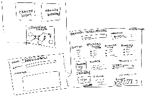
For this model, we decided that each business would have two important attributes: points and quota rating. A business would earn points for donations. Larger donations would earn more points. So, points would reflect the frequency and size of a business's donations. The quota rating would represent how much a business has donated thus far compared to its donation quota. So, a business that has a large quota rating is probably more willing to donate than a business with a low quota rating. If a business has reached its quota, it has zero quota rating and is probably unlikely to donate any more.
The browse businesses page was inspired by yelp's search results page. A user could filter results by relevant criteria such as location, size, points. The businesses would populate a list underneath the filters, with each business having its own row to display information. If a user is logged in, then clicking on a "connect" button below the business would pop up a message dialog box so the user could contact this business about donations. If the user is not logged in, then clicking on the "connect" button would show a preview of the message functionality and prompt the user to log in or make an account. These messages that the user could send would be filtered by our system so that only legitimate requests could actually reach a business. This feature addresses the complaint that several businesses raised in our interviews of being overrun with requests to donate.
The create event page would be similar to our last design, for an illiterate user. We think that design provided a simple, interactive and interesting interface for the user.
Analysis
In terms of learnability, this application may have some issues. It does have the benefit of consistency to other applications like Yelp, but learning what each property means and the options available for each would take some time. We attempt to ease this process by using images to help. The issue of learnability of the options also poses as an efficiency issue. The user could be overloaded by so many options that they don't know where to look for anything. They would like have to scan through a bunch of options before they found the one they were looking for. Contact with the businesses is a plus for efficiency though, we allow the user to click on a button while browsing businesses and a popup window appears that he or she can write a message. The user never leaves the page so can send a message to multiple companies without going back and looking again. The application is pretty safe for filtering businesses because if a mistake is made the user can either recheck or uncheck the option that was the mistake. There is some safety risk for sending messages though. Since messages would be sent from the popup if the user exited out without sending the message would be gone, unless we found some way to keep that message information, also there is no way to undo a message send. The one way we remedy is this by keeping a history of correspondences, so the user can check their sent message and resend one that corrects the issues in the first communication.