Design and Implementation
The interface we designed is meant to be task-centric; that is, rather than focusing on allowing the users (dorm management staff) to most easily view static information about the dorm (i.e. information about rooms and who's living in them), it is meant to allow the users to most easily view and manipulate "tasks" (i.e. information structures about the people currently moving in or moving out). We felt that this was the most efficient for management, since users seemed to want to know what needed to be done at a given time more than the state of the dorm at the given time (though later in user testing, we did receive a small amount of feedback indicating the other way around might be useful).
To accomplish this sort of interface, we broke it into 3 separate webpages, which we called a main page, a floor plan page, and a task creation page. The main page is intended to present information about the current tasks on hand, and have continuous updating on whether select parts of move-ins and move-outs have been completed, allowing the user to know right upon entering the page what has most recently been accomplished, and also efficiently look through all current tasks for relevant ones and manage them. The task creation page is meant to allow users to create move-ins or move-outs and store in the system for convenient management later, and the floor plan page is meant to allow management staff to quickly understand positional and macro-scale information about rooming throughout the dorm.
We felt that these three pages were necessary because the goals provided by each of them provided unique information which users indicated would be very useful, their functions are fairly separate, and putting the information from multiple of them into one page seemed to make it convoluted.
To implement our interface, we used web programming technologies such as HTML, CSS, Javascript, JQuery, Boostrap, for our frontend, as well as Parse to store our database of constructed objects. These were used since we felt that the web was necessary for management staff to be able to use the application on their own devices and still communicate with each other, and these first five were standard tools in web programming that made our frontend implementation straightforward; Parse we used for our backend because of familiarity with it, and satisfaction with its robustness for this project.
Main Page
Design
The main page is the default landing page for users. Its main use is to keep track of the current tasks which may be complete or incomplete.
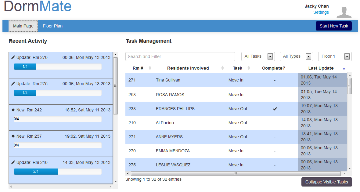
Figure 1: An overall view of the main page.
Users receive a news feed of recent changes in the "Recent Activity" column on the left. On the right, users can look up specific tasks or types of tasks by using the search box and drop down filters. In addition most columns are sortable. When the page is first opened the default sorting is based on the last time a task was updated. The reason for this is that we figured that users would be changing a few tasks multiple times.
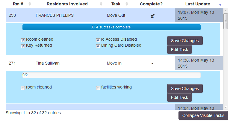
Figure 2: When a task row is clicked, additional information about the task is displayed. 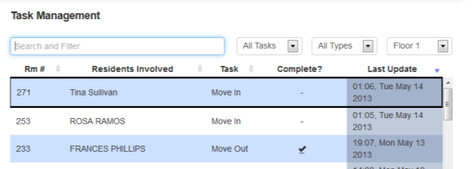
Figure 3: After a task is created or edited on the Task Creation Page, that task will be highlight with a border for 5 seconds upon returning to the main page.
When a relevant task is found in the table on the right, a user can click the row to see more information. The details displayed include a progress bar which indicates how many of the subtasks have been completed. Users can also easily update the subtasks by clicking the appropriate checkboxes. They are then able to click the "Save Changes" button so that the changes are pushed to the server. In order to give some feedback, the progress bar is updated when the button is clicked. There is also a button called “Edit Task” which takes a user to the task creation page. When returning to the main page from the task creation page, the task which was just changed gets a bold border for 5 seconds before disappearing. Another feature worth pointing out is the "Collapse Visible Tasks" button. The table used remembers which row details have been opened. This can cause clutter if a user has been looking at many tasks. The "Collapse Visible Tasks" is a simple way to close all the details of all tasks so that the clutter is gone.
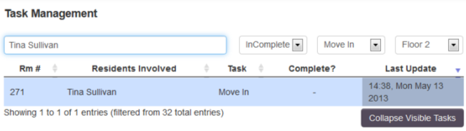
Figure 4: Showing off the possible filters that can be used.
There are several filters in effect. Users can use the search box and type in a name, a room number or almost any other query to narrow down the results. In addition, there are designated drop down menus which are used to filter based on whether all the subtasks are complete or not, what type of task it is, and what floor number we are examining.
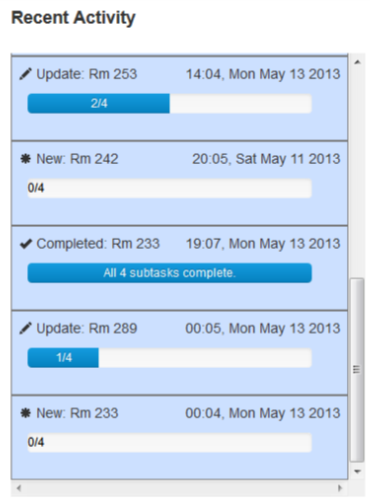
Figure 5: A close up of the notifications section.
The recent notifications column shows recently changed tasks. The notifications are automatically sorted by date. Currently a notification shows the room number, the date and a progress bar. Ideally, a future iteration would show which subtask was checked off most recently. However, our backend currently does not support this feature so instead we have used the progress bar. Clicking on a notification will automatically filter the table on the right and show the details of the tasks.
Implementation
Implementing many of the features of the table on the right was very easy thanks to an external library called DataTables. Once the API was learned many challenges were easily overcome. DataTables takes care of filtering based on search text. It can also deal with filters restricted to a single column. This feature was used for filtering using the drop down menus. In addition, it knows how to deal with showing details when a row is clicked. In order to populate the data table, all the tasks for a given floor are downloaded in a local copy and the data is added to the table one by one using an API call. When a task is updated, the local copy is changed so that the internal state is accurate and an update request is sent to the the Parse server we used. The reason we keep track of the local copy is that the Parse server can take several hundred milliseconds to make a change. This delay would most likely be noticeable to the user and undesirable.
When the "Edit Task" button is pressed, the object ID is passed as an argument in the URL and the page is changed to the task creation page. After submitting the changes, that same object ID is passed back to the main page. This object ID lets the main page know which task to highlight in the table for feedback.
The recent notifications column uses a similar local copy technique as used for the table. Only the top 15 most recent tasks are used for the notifications. The message is generated based on the completeness of the subtasks. If no subtasks have been completed, a task is considered to be new. If all subtasks have been completed, a task is considered to be complete. Anything else is considered an update on a task. In the future a better implementation may take into account what subtasks were completed and when.
Task Creation Page
Design:
The form contains standard information that the dorm manager need to fill out when a resident moves in or moves out of the dorm. There are two main tasks including Move In and Move Out. The information on the page changes dynamically depending on the type of the task. This page will be visited very frequently by the user, so it's designed to be efficient for filling out information. The Useful information panel will contains auto-fill information that help the user speed up the filling out task. One of the important decision for this page is to fit the two panels into two scroll views without overflow the information to the whole page. The user can choose to scroll each panel separately without moving the whole window. It's because we want to user to make good use of the auto-fill function, so they can scroll the left panel up and down while keeping the right panel statically in the view port. Figure 1 demonstrates the interface of the Start New Task page.

Figure 1: The start new task page.
One of the importance decision that effects the design is the affordances of this right panel. Many users mentioned that there wasn't enough affordances to show the auto-fill function of the information on the right. Therefore, we have decided to put a place holder on the input where the auto-fill information supposed to fill in when the user hovers over those information. Figure 2 shows the result of the auto-fill functionality. We chose this as our implementation for its simplicity over other methods such as having a tutorial pop-up or changing color or boxing around the auto-fill result.
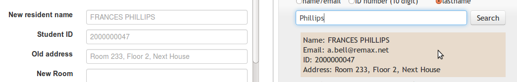
Figure 2: Auto-fill information when hover over item.
Another important feature is when the user submits the form, if there are some missing fields, the user will receive a pop up noticing them about these fields. The user can have the option to go back and fill out those missing fields or save the form any way. Figure 3 demonstrates this functionality. This confirmation dialog will help prevent user from making mistake when submitting form. We choose this decision instead of preventing the user from submitting the form at all and have the missing fields highlighted at the beginning of the form because the user might want to leave those fields blank to fill in later. In addition, different dorms might have different requirement for required field, so providing them with confirmation dialog will help them decide on their own which field they want to keep.
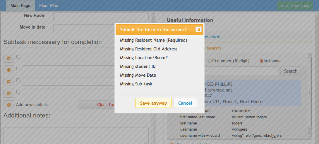
Figure 3: Missing fields notification when submitting the form
In order to follow the CRUD model presented in class, we decided to let the user edit the task. The page will be pre-filled with the most recent updated information. Figure 4a and 4b demonstrates the edit task functionality of the website.
 ------------>
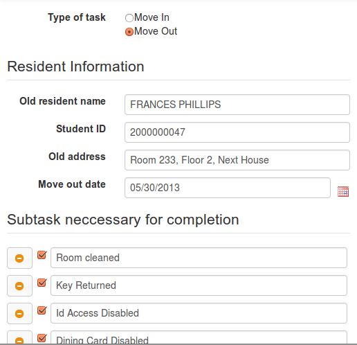
Figure 4: Edit Task functionality
Implementation
This page follows the model view control (MVC) model. The database for MIT directory search is kept in a separate Javascript file since this field is static, and the information on the resident is stored on the Parse database since it will be dynamically changed over time. We utilize the convenience of JQuery UI in creating dialogs and drop-down menus. We also make use of Twitter Bootstrap for organizing the layout. All of the controller for listening to action are added separately in order to follow the MVC model and to keep the code modular.
In addition, since there are different informations presented for each type of task (Move In versus Move Out), we decided to dynamically repaint the page instead of reload the page from scratch. This will help the user preserve some of the information that are shared between these two tasks.
The information about vacant rooms is update dynamically through Parse. For example, if a person moves into a room, we update the current list of residents of that room and remove it from the list of the available rooms.
The MIT directory is designed to match with the current MIT directory on web.mit.edu/people to help user with recognition because most users are familiar with this interface already. After the information is generated, the action listener is attached to the result to auto-fill the form.
The list of suggested tasks is static data collected from the suggestion of the users. We also decided to add the default task button to speed up the filling process.
The back end of this page is supported by Parse. There are three types of objects that currently are present on the server: Resident, Task, and Room (See Figure 5). Each of these objects has a reference to the other objects so that whenever one object changes, it will also change the other. After the user submitting the task to the server, a task object will be created with each attribute corresponding to a field in the form. Then, the room and the resident will also be updated on the server to reflect the task i.e if a resident Move In to a room, the room becomes occupied and remove from the available room and the resident gets added to the system.
For the updated task, we also have to make sure that we do not created duplicate object on the server since Parse doesn't automatically check for that.
Since there are three main pages sharing the same source of information, we need to make sure that changes on one page will be reflected on other pages too. For example, if a person moves out, the main page will show that as a pending task and the floor plan also have to indicate that the room is now vacant. All of the information uploading to and downloading from the server are text-based, so the retrieving time is almost instantaneous which enables the user to see the current update from the server at no time. In addition, to respect the anonymity of 6.813, we also use fake data for our database which introduce some inconsistency among information. However, this doesn't present any usability problem for the user.

Figure 5: The current state of the parse server.
Floor Plan Page
Design
The Floor Plan page was designed to address an issue that dorm management staff had noted about having difficulty determining positioning information about rooms on both macro- and micro-scales. As shown here, the page includes the navigation bar present throughout our entire interface for consistency, safety, and user control; the rest of the page is used for addressing the problem just mentioned. In the center we placed a large image of the floor for visibility, and because it is the most important part of this section of our interface - on the right side of that we horizontally aligned tables of useful on-hand information; on the left we placed extra UI elements (also horizontally aligned) for helping to navigate to other parts of the building besides the current floor; and above we placed a search bar for helping to navigate the floor plan.
The choices for alignment were mainly for the sake of aesthetics, since separation of the UI elements already seemed clear to us and users; however, positioning was important. We placed the search bar on top so that it'd be very visible, static on-hand information on the right since it fell into the same category and would be easer to process, and the floor switcher on the left since we wanted it to be both visible and because it was dynamic content.

Figure 1: A screenshot of the entire floor plan page. You can see each of the elements described on the image.
The image in the center shows current floor of the floor plan of the dorm being managed*;* it is annotated with colored labels (described with the legend) so that the user can gather information from quick glances as color is a good visual differentiator. Because floor plans might be large and difficult to understand at a glance, we also made sure to have the image be both pannable and zoomable, so that the user could examine particular areas of a floor more carefully if they wanted; we decided to make the interface work similarly to Google maps both for the sake of external consistency and efficiency (shoutout to Google). The zooming is done by moving the slider on the top left of the image, and the panning is done by either holding the mouse down over the arrows in the top left, or by using the mouse to do real-time panning.

Figure 2: A closeup of the image of the pannable, zoomable floor plan.
In addition to the other wonderful features of the floor plan we've already discussed, we also made the floor plan clickable, with click events over rooms generating dialog boxes (top left corner on center of room) displaying information about the room. The current interface had information only about the room number and the residents staying in the room, but it is likely in the future more relevant information will be included to help the management staff with making rooming decisions. From the dialog, a user can create a new task by clicking on the large button present on the dialog, and can also exit out of the dialog by clicking on the X-button. The dialog was created this way for external consistency; for safety, we made sure that multiple dialog boxes could not pop up on the screen and crowd each other - we also made sure that the dialog scales and moves with the image when panned or zoomed.
On the right you can see a floor-switcher; we created this piece of dynamic content for the sake of helping users navigate floors in a floor plan (as indicated by the name), since we felt that there was only space to put one floor in the viewport at a time. The selected floor is highlighted differently, and each floor is represented by a text box which has the affordances of a button, for external consistency. We chose the colors for the sake of unity with the rest of the interface, as well as because the blues we chose for selection, highlighting, and deselection were all discernible.


Figure 3: Screenshots of the dialog which pops up on clicking the floor plan (left) and the floor switcher (right).
So that the user would be able to discern the information provided by the color labels on the floor plan, we have a large legend on the right side - since color doesn't inherently indicate any meaning in floor plans or our context, our heuristic evaluators and users found that something like this was necessary (information scent).
For efficiency, we also included the floor statistics table - horizontally and vertically aligned with a large header and line width mostly for the sake of aesthetics and readability. We included the floor statistics table below the legend due to information scent - when viewers see the necessary legend, their eyes easily move to the table below.


Figure 4: Zoomed screenshots of the legend and floor statistics table.
Lastly, we have a search bar on this page for helping the user navigate the floor image efficiently. The search bar has the typical affordances and benefits of search bars, like autocomplete for safety, as well as border highlighting to indicate selection. The user can search by room number, or name of resident - on selection, the floor plan automatically pans so that the room selected (or room of the resident) is close to the top left corner of the image (next to borders so it's visible), and also pops out the dialog for the room (for visibility of the changes).

Figure 5: The search bar for the floor plan.
Implementation
Because the UI elements on this page are fairly simple, they were made almost exclusively with personal HTML and CSS, though the navigation bar, as with the other pages, was made with Bootstrap, and autocomplete was done with JQueryUI. All dynamic content was implemented with JavaScript, with JQuery being the only external library used.
Upon opening, the page stores all the data on rooms after calling the Parse backend, and stores it in an array; at this point, all arrays and objects needed for operations like searching and simple looping are created by looping through this room array and manipulating the information stored in it. After this has been done, all operations which might need to be performed on the page are available; before this, nothing can be done (for the sake of safety, otherwise error messages get thrown). We decided that doing a large amount of local processing of the data obtained from the backend for convenience was better because it was faster than querying the Parse server.
The visibility of the floor plan, along with its color labeling, and the ability to pan and zoom it were implemented using two canvases - one was used as an invisible buffer, and the other just drew the image in the other canvas with the appropriate transformation based on the continually-updated scaling and panning parameters. This was required for appropriate efficiency, since otherwise there would be large amounts of clearing and stroke-level redrawing being done extremely often, which would be visibly laggy. The parameters were updated with mouse press events. Mouse clicks had listeners which checked the coordinates of the click, transformed them, and compared them to the coordinates of other rooms to see which room the click corresponded to - this then helped to generate the dialog.
The floor switcher was just implemented in HTML and CSS as a list of buttons, with JQuery click events being registered by the system and changing the floor image rendered in the viewport, as well as the arrays used to generate the labels for the rooms. CSS was used to ensure it didn't have the same look as normal button HTML elements, since switchers typically have a different look or feel.
The legend was implemented as another Canvas, for the reason that drawing the example color labels with the HTML5 Canvas was easy and still very efficient.
The floor statistics UI element was just implemented as an HTML5 Table, since the structure lent itself well to the function of our table (rows, columns, etc.). It was also straightforward to dynamically change the table with floor switches and on loading (since floor statistics depended on the stored data) with JQuery by using class and id selectors with the table being a pure personally-written HTML element.
Lastly, the search was implemented using JQueryUI's Autocomplete. This was done for the ease of the syntax, because it seemed robust, and because it gave all the control we desired in selection from the stored data.
Evaluation
Test User Selection
We selected our test users by the same criterion we used to select people for testing our paper prototype, since the user classes for our problem had not changed since then. Essentially, we had two major user classes, dorm managers and desk workers, and so we found users from those to test our prototype. We had just one of the users from previously test our interface this time to help see whether the fixes we had for problems before were found to be helpful by the users, and to make sure that we didn't have regression; this user was a desk worker, and we call him User 1 from here. For the second user, we asked a house manager we had not interacted before, from another dorm, to evaluate our interface; we felt that since they were new to the interface, they'd be able to evaluate our interface from the perspective of a total beginner. For the final user we tested for this iteration, we asked another desk worker from the dorm we live in who had not used the interface before; this time again for the sake of having a beginner test our interface, and also be from the desk worker class rather than the house manager class.
Test Briefing
Most of our users were the same ones we used for testing our paper prototype and so were already familiar with the scenario and the purpose of our interface. Nevertheless, we reminded them of the following scenario:
“You are a desk worker or dorm manager and you plan to use this interface to keep track of the progress of various tasks going on in the dorm. Right now, you’re focusing on helping residents move in and out, and keeping track of general housing information.”
Test Tasks
The following tasks were given to the user on paper. Additional prompting would given when it was observed that the user was having particular trouble completing a task.
Task 1: Document Completion of Subtask
- Background: Frances Phillips is in the process of moving out of the dorm. He has just returned his key to you.
- Task Detail: Update the system appropriately.
Task 2: Determine Information about a Floor
- Background: The house master is curious about how many vacant rooms there are on the second floor.
- Task Detail: Find a way to look up number of vacant rooms on the 2nd floor.
Task 3: Start Moving a Student In
- Background: Tina Sullivan has requested to move into Next House on August 30th, 2013. You want to begin the move in process for her. Additionally, she tells you that she wants to live somewhere on the 2nd floor. Make sure all the fields are filled in and assume default subtasks.
- Task Detail: Make a new task for Tina Sullivan
Task 4: Start Moving a Student Out
- Background: Andrea Reyes wants to move out of Next House. She says she expect to move out on May 23rd, 2013. You want to begin the move out process. Make sure all the fields are filled in and assume default subtasks.
- Task Detail: Make a new task for Andrea Reyes
Task 5: Identify Resident
- Task Detail: Who currently lives in room 266?
Test Observations
User 1: Desk Worker
Task 1
- The user seems surprised when the task search autocompletes name, indicating a learnability issue, particularly with external consistency maybe.
- The user didn't seem sure that the task was updated when they clicked the "save changes" button, indicating a possible issue with safety; seemed like a feedback issue.
Task 2
- No critical incidents; the user finished the task straightforwardly, and with ease, as expected.
Task 3
- The user tried to search for Tina and create a new task through the main page's task management box; he didn't seem to realize that the box has no knowledge of anything but created tasks, and that he had to use the "Start New Task" button for a little bit; this seemed to indicate a problem with learnability as the user seemed to think that instinctively static data about the dorm should be searchable.
- The user didn't pay attention to the "useful information" section on the create new task page until he got stuck on filling out information like the student ID; at this point, he stalled and the facilitator had to interrupt and notify him of the useful information section; afterwards, he finished the solved the problem quickly. This again seems to present a learnability issue, since the user instinctively seemed to want to fill out the form without using any external elements of the page.
- The user also felt unsure of using the "Default Subtasks" button for auto-filling because he felt that it would clear the subtasks which had been filled out - this indicates yet another learnability issue.
Task 4
- The user didn't think to use the MIT directory for auto-filling information until he stalled for a few seconds and the facilitator prompted him; he seemed to be unsure of how the directory search was used, and decided it wasn't what he needed. This then seemed to be another learnability issue.
- After submitting the new task and returning to the new page, the user seemed unsure as to whether the task had actually been submitted to the system - this marks a safety issue, since the user had problems with system visibility.
Task 5
- The user didn't think to use the floor plan until the facilitator prompted him to use other parts of the site; he then proceeded to finish the task quickly. It seems he was confused about exactly what kinds of information the floor plan and main page provided. Again, this seemed to be another learnability problem.
User 2: Dorm manager
Task 1
- The user seemed confused about how the filters worked, and quickly asked the facilitator to explain them, after which he did; the filters seemed to be complicated and unfamiliar to the user, indicating that perhaps the interface needs to be more simple.
- The user didn't immediately understand what the 0/4 on the progress bar meant - this seemed to be a problem with external consistency for her; she seemed unfamiliar with what the progress bar indicated. This was another learnability problem.
Task 2
- The user spent 1 minute on the main page to look for floor information, and she tried to use the search function of the main page to look this up. She seemed to think that the task management box was something of an omnibox, including information about all residents and what rooms they were in rather than just current task information. This again presents a learnability issue.
Task 3
- The user took a while to figure out how to start a new task. She stated that she was unfamiliar with doing rooming assignments herself due to the nature of the dorm she worked at. It seemed again like she was unused to working with rooming herself, and that she expected all functionality to be present on the main page, namely in the task management box. This seemed to be another learnability problem.
- The user never used the auto-fill functions of the "useful information" section of the create task page, and instead opted to create the task without filling in most of the fields (clicked "save anyways" after the safety prompt). She didn't seem to realize that the "useful information" section existed at all, rather thinking the form was all that she had to fill out, and only on her own knowledge. This again presents a learnability problem, most likely with external consistency.
Task 4
- The user quickly navigated to the start new task page this time, but still didn't use the auto-fill functionality. Again, the issue is the same as previously; she seemed to think that the form was all that existed on the page.
Task 5
- The users tried to search for the information on the resident in the main page first, again seeming to think that the task management box is an omnibox. Eventually, the facilitator prompted her to use the floor plan and she found the information quickly afterwards. This issue was the same as in Task 2.
User comment
- User wants to have the room and resident information on the main page (resident centric rather than task centric) so that she can quickly look up information such as the requirement in task 5.
- Resident name should be separate into first Name and last Name.
- The user thinks having room size (in square foot) might be useful.
- The overall reaction is positive.
User 3: Desk Worker
Task 1
- The user finished this task very quickly without any problem.
Task 2
- The user at first looks for the floor information on the main page, and only after suggestion from the facilitator navigates to the floor plan to look up the relevant information, after which he quickly solves the problem. Like the previous users, he didn't seem to realize a page other than the main page existed until it was pointed out; he noted that this was possibly due to the coloring on the navigation bar, which made it difficult to see the tabs that were unselected. Again, a learnability issue.
Task 3
- The user didn't notice the "useful information" section on the right-hand side, and so first filled out partial information. This represents the same problem as previously faced with users.
- The user moved to the floor plan page when he felt that he couldn't immediately fill in the information on the form; he then returned to the form after finding the information, but at that point his information had been cleared. It seemed that the user thought that his information would be saved on the form when he came back to it; this seemed to be a safety issue.
Task 4
- The user has no problem with finishing this task, and no critical incidents are noted.
Task 5
- The user had trouble at first finding the information, looking on the main page, and trying to use the "task management box"; when prompted by the facilitator, he found the information quickly on the Floor Plan. Again, this seemed to reflect the same issue as with previous users thinking the task management box is an "omnibox".
Iteration Considerations
- Since people seemed to have a lot of learnability issues rather than any efficiency issues, one idea is that we have a tutorial of some sort, or a guiding version of the interface for first time users so that they can become familiar with the system; more specifically, most people seemed to have issues with not knowing what tools existed for them, and so this seems like a good idea to try in the future.
- Another consideration we have is possibly to take the main page and make it omniscient; that is, right now, the main page is only for managing current tasks in the system, but multiple users seemed to feel that they could use the task management box for all sorts of queries, such as looking up arbitrary room or resident information. We are considering adding additional fields to the data structures and accordingly changing the objects in the data tables to support this functionality, or possibly adding different "modes" to the search box so that the functionality exists and is well organized, though at the slight cost of efficiency.
- We found a major safety issue with the 3rd user when he navigated off the task creation page and lost all the information he had filled in the form; we think that creating a modal dialog for this case to notify the user of what they're doing should be an appropriate fix, as we have with the form submit button.
- For the cases of task submission and task updates not being visible, we think that just doing something like highlighting the border of the inserted task or update to the main page should be sufficient for indicating the changes; this seemed to work for other parts of our interface.
- For the problems with the new task button not being visible, we think that changing the color to something more outstanding, or making the button bigger so that it's more visible may be a good idea.
- For the issue of the "useful information" section of the interface not being used, though the introductory video/interface first proposed should help, we also think that possibly adding something like a large, light arrow in the center of the page between the two columns may help to indicate the relationship between them.
Reflections
We all got a great deal of experience with web programming through this project. We learned how to html, css, and jquery effectively and how to debug the problems we had. One consistent challenge that we ran into was clashes of external libraries. We learned to be very careful of external libraries especially when trying to mix them together. In addition, it would have been nice to receive some guidance on how to organize our files. For all of us, almost the entire code for a page was on one file or split into the html file and .js file. It would have been nice to know how UI programmers break up their coding process. Also, Sumit learned that linear algebra comes in handy when working with movable, zoomable maps.
One thing we wish we had done earlier on is narrowed the scope of our project. Originally, we were too ambitious. As a result, when interviewing our user group to discover their needs, we were not able to dial in on a single problem and really understand it. We found during our last round of user testing that users tend to assume a room centric model different from our task centric model. Perhaps we would have realized this earlier on with a narrower scope.
We also learned a lot about the UI design process. We truly came to appreciate the paper model after realizing how long it took to make the computer prototype. Looking back, we think it might have been helpful to improve the feel of the paper prototype if we had used the whiteboard paper so that users could write and erase things easier. Also, it might have been useful to have two paper prototypes to compare side by side. Of course, this would have taken too much time which was not available during the semester. Finally, we learned about the importance about briefing our test users effectively. We found that throwing our users into the interface without giving a tutorial taught us a lot about learnability. However, our interface would not have many new users all the time so our time would have been better spent examining other usability aspects instead such as efficiency.
1 Comment
Unknown User (jks@mit.edu)
Overall: Great progress on your project, DormMate. You built a really compelling website, with tons of impressive functionality. Your reflection tells me you've learned about the value of searching for the right problem to tackle. Even now, I think your website be more explicit about its focus on move-in/move-outs, rather than 'tasks' in general. Nevertheless, great job.