
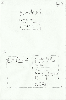
Group Members
- Stephen Suen ssuen
- Kathy Fang kfang
- Yi Wu wuyi
- Connie Huang connieh
- TA: Katrina Panovich
GR1 - User and Task Analysis
GR2 - Designs
GR3 - Paper Prototyping
GR4 - Computer Prototyping
GR5 - Implementation
GR6 - User Testing
GR2 - Designs
Scenario
Tiffany is a 24-year-old software developer working in San Jose, California. She is engaged to Brian, a nurse who works double shifts to make ends meet.
Because of financial reasons, Tiffany and Brian decide not to hire a wedding planner and opt to organize the event themselves. Tiffany takes the lead in planning the wedding, but is overwhelmed by the number of tasks to accomplish in such a short period of time. She uses Hitched to make a timeline of all the tasks and milestones that lie ahead (Task 1).
Because Brian works long hours, he cannot help with wedding planning, but would still like to keep up with Tiffany’s decisions and offer input. Tiffany’s best friend and maid of honor, BFFany, wants to help in the planning process. Brian’s mother, Lucille, constantly nags Tiffany about her progress and disagrees with many of Tiffany’s choices. Tiffany wants to make sure she can satisfy everyone else involved in the process by getting their input in an organized way (Task 2)
Tiffany synthesizes all the feedback and incorporates it into her timeline. At each stage of the process, she updates the involved parties when decisions are finalized (Task 3).
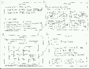
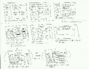
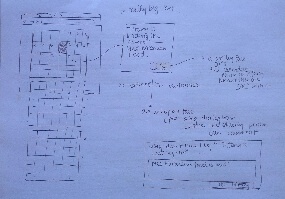
Individual Sketches
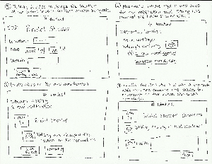
Kathy's Sketches |
Analysis |
|---|---|
|
Design I: Populating and viewing the timeline |
|
Design II: Log-in and home screens |
|
Design III: Searching and commenting on an event/task |
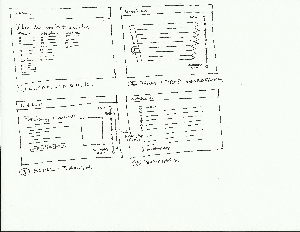
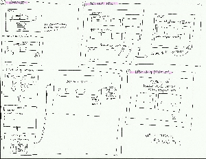
Stephen's Sketches |
Analysis |
|---|---|
|
Design 1: Linear timeline |
|
Design 2: Requesting feedback/notifying parties |
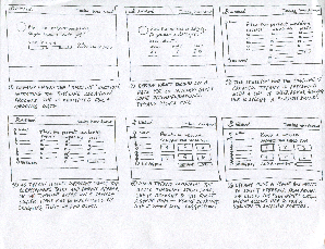
Connie's Sketches |
Analysis |
|
Design 1: The user first sees two options on the landing page: seeing sample timelines or creating one of his/her own using a quick start feature. |
|
Design 2: The user goes through a similar process of populating a timeline as Design 1's process, but in this design they will have the option to expand the timeline into child timelines that are more specific to a type of task (finding/booking catering, finding/booking a venue, etc.) because all of these have different schedules that each contribute to the overall timeline of things to complete. Under each child timeline is also the option to add to-do list type tasks for actionables that do not have a deadline (one flaw of the timeline is that every item on it needs some date associated with it) |
|
Design 3: This design is for the elderly. This is the interface a grandparent might use -- it is a simple calendar that only lists the important deadlines and dates that the bride-to-be is considering. Under each date entry, there is a smiley and frowny face. Clicking the smiley face will signal that the older user is happy with the choice. Clicking the frowny face opens up a box where they can send feedback about the event. |
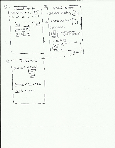
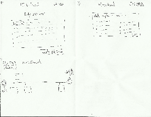
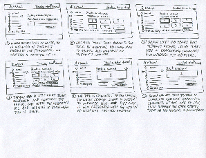
Yi's Sketches |
Analysis |
|---|---|
|
This is a design for the sign up page. The top screen is the home page, with a button to sign up at the center. In the right corner is the login button for returning users. When a user clicks on signup button, A popup screen will appear (bottom sketch) and it will have an option to sign up using facebook or making an account separately. |
|
This page has 2 of my designs. The top two sketches represent an interface to ask wedding party, family, etc for input. The sketch in the top left corner is a textbox with a editing bar at the top. After the user write her/his message, he will click on submit, which will lead to the sketch on the top right corner. He/she can choose the contacts to send the message to and click on send. The message will then to sent to the contact's email or facebook depending on previous preference. |
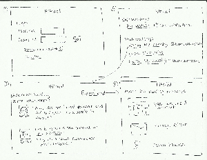
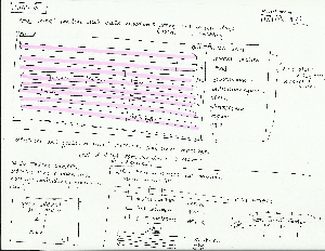
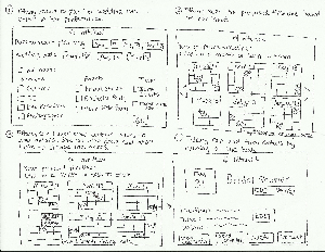
Team Storyboards
Storyboard I
Analysis:
Learnability
- Relies on the calendar metaphor, which typical users are familiar with. The interface has external consistency with popular existing applications, such as Google Calendar or iCal. For example, users can view events by hovering over a date.
- Uses menus and forms, as well as direct manipulation. This increases learnability because the interface relies on knowledge in the world, as opposed to knowledge in the head.
- Notifications are shown upon log-in, so they are less likely to be missed.
Safety
- Users can drag and drop certain events on the calendar. This allows them to alter event deadlines that they previously approved at any stage of the planning process.
- Users can delete or edit tasks, and send notifications of these changes to wedding guests.
Efficiency
- Checkform enables users to choose multiple events to include in their timeline (i.e, bridal shower, bachelor party, etc), rather than add each event on a new page.
- Users can see multiple months at once, instead of seeing only individual months or days. This allows them to make changes quickly in multiple months (i.e., dragging and dropping multiple event deadlines in different months)
Storyboard II
Analysis:
Learnability
- Uses the menus and forms and direct manipulation interaction styles. Reliance on knowledge in the world and constant feedback increase learnability.
- External consistency with common color connotations (red = incomplete, green = complete) make it easy to tell which tasks are complete and how much of the full timeline is done.
- Users can see comment notifications directly on the timeline, so it’s immediately obvious which timeline items are generating the most discussion.
Safety
- Tasks and events can be reorganized and edited throughout the process, even after being confirmed. Changes are reversible and thus the interface is safer overall.
- Other users can see what the primary planner has done and comment on items even if feedback hasn’t been explicitly requested. They serve as safety nets during the entire process.
Efficiency:
- The “custom build” screen lets users quickly populate the timeline in bulk even though details may not be fully set in stone.
- Tasks are scheduled based on a sample timeline and shortlisted suggestions are given for each choice, expediting the wedding planning process by doing the preliminary legwork.
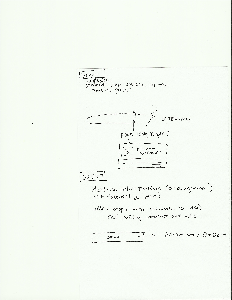
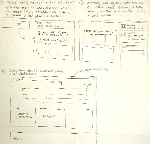
Storyboard III

 *
*
Analysis:
Learnability:
- Utilizes a set of timelines (progress bars) that relies on knowledge in the world to master. Getting input from other user classes and sending out final decisions are both done through email, which is integrated into the site.
Safety:
- All events and tasks on the timelines can be dragged and dropped to the correct place. Users can also delete and retrieve old timelines and tasks as different aspects of the planning process change. However, the safety of getting feedback and delivering decisions is lower because of the ease of error when emailing.
Efficiency:
- Timelines are stacked so the user can choose to focus on the overall timeline that aggregates all tasks, or a sub timeline that helps them visualize all the deadlines and milestones of a specific aspect of the wedding (guests and invitations, catering, etc).
- Each timeline also features a task management system to quickly add actionables to a timeline that may not have a deadline.
- Using email and private links to relay information between the wedding planner and the relevant parties is efficient because every user already has an email.
1 Comment
Katrina Marie Panovich
Hi guys,
Thanks for all of your hard work on GR2! Below are my notes from grading feedback. Grades should be up soon.
Preliminary designs: You guys didn't adhere to the scenario in all of your storyboards. For instance, there wasn't always much information about what BFFany's role was in using the site. I'm also not convinced that you should spend a whole lot of time thinking about account creation, though how the user decides what actually goes into their wedding planning process is really interesting. I'd also like to encourage you guys to keep thinking about how and when you might want to use -- or not use -- the calendar/timeline metaphor. I think there are probably some ways of talking about this information that are different and perhaps beneficial.
A few things to note going forward, for all of the groups:
- Try to make sure your wiki is organized. Don't be afraid to create a table of contents, for instance.
- You may want to refine your scenario for GR3. Note that you're going to be using your scenario to brief your users, so you may want to make it a bit more task-oriented.
- Login and basic account creation are not a good use of your time for prototyping, unless you're planning on doing something really interesting with it. You can assume that basic signup flows work fine. (For you guys, deciding what stuff goes into the wedding planning process is indeed a good thing to prototype.)
Good luck! Let me know if you have any questions.