Designs
Scenario
Paul Quimby is a second semester freshman who is trying to choose a major. He's decided he wants to be course 6-3 and is excited to plan out his remaining 3 years at MIT. Paul needs a tool to help him do this, so he's decided to try out our program. Paul must first specify that he wants to be Course 6-3 to ensure that he fulfills the requirements. He then must input the classes that he's already taken (and is taking) for the first 2 semesters. From this starting point, he needs to create a map. Paul uses the automated features of the program to generate a schedule. He then makes manual adjustments based on classes he doesn't want to take together and classes that he wants to take with his friends. He also wants to go out for the baseball team in the spring, so he wants to limit his spring semester to 48 units, but he's okay with taking up to 60 units in the fall.
1.5 years later...
Paul is now a junior and 2 of the classes he was planning to take in the fall have a conflict, so he must postpone one. He logs in to the program. He first marks and updates all of the classes he has completed over the past year. He decides which class to keep, and notes that the other cannot occur in the Junior year fall semester. He then uses the automated tool to help him generate a new schedule.
Designs
Design 1:
Paul begins by launching the FourPlan program. The initial screen prompts him to either create a new map or open an existing map. Whereas this is his first time ever using the software, he presses the ‘NEW’ button.

Before the application can generate a course map, it prompts Paul for some basic information about the degree (degree start year, graduation year, major, and concentration in the major). These fields are filled using combo-boxes, allowing Paul to select the data from lists. After he selects his major, the combo-box for ‘CONCENTRATION’ is generated with valid values pertaining to the major. When all of the fields are filled, Paul presses the ‘CREATE’ button. This solves some initial constraints and builds him a basic course map.

The map takes up the majority of the window providing a physical representation of each of the courses. The courses are arranged in columns, where each column relates to a semester. This UI design follows a Direct Manipulation approach. Though some courses may be fixed in place due to hard constraints in the curriculum (these courses are displayed in a different color to illustrate their fixed status), all other courses can be clicked and dragged around the map. On the map, each course is represented as a bubble that has some basic information about the course.

Clicking on a course will open more data about the course in the left-hand pane. The figure below shows the result of Paul selecting 6.005.

In the course pane, Paul can modify properties of the course entry. This allows him to jump the course to a different semester, note a course’s completion, and provide a grade for the course. For 6.005, he sets the FIX ON MAP field to YES. This guarantees that when changing other courses around, the constraint solver does not move 6.005 to a different semester.
At this point, Paul can edit his map in several ways. First, he can drag courses around to various semesters until he is happy with the results. Second, he can select and drag the ‘NEW COURSE’ from the top left onto any point on the map. This allows Paul to enter additional electives that the map did not populate. When adding the new course, it is added as a dummy course. Paul must select it and edit its data in the Course Pane. You can see below what happens when Paul creates a new course object when trying to add 6.813.

The last way in which Paul can update the map is to use the map comparator. He does this by selecting ‘COMPARE MAPS’ from the menu. This generates a second map containing the same courses but in a different layout. These two maps are different views for the same model and thus Paul can set the ‘FIX ON MAP’ field for each of the courses on the either of the maps. When he is done modifying the maps, he selects ‘MERGE MAPS’ from the menu, which attempts to merge the maps into one, solving any new constraints. The back end will prevent Paul from creating any conflicts (ie. not allowing him to change the fix status on one map, if it is already fixed on the other).

When Paul is done creating his map, he selects ‘SAVE’ from the menu and exits the program.
Later, when Paul is faced with his scheduling conflict, he relaunches FourPlan and is once again faced with the initial screen. This time he selects ‘OPEN’ and is shown his old map. The first thing Paul does is select each of the courses he has taken and edit their ‘COMPLETED’ and ‘GRADE’ fields. He then proceeds to resolve his conflict. He does this by selecting the course which conflicts and changes its ‘FIX ON MAP’ field to ‘CHANGE’. This forces the constraint solver to push the course to a future semester and thus pulls a new course over to the current semester. Another option would have been for Paul to click and drag courses around manually to resolve the conflict. When Paul is happy with his map again, he selects ‘SAVE’ and exits the map.
Design 1 Analysis:
Learnability: Whereas this interface follows a direct manipulation style, it has the advantage of being easily learnable. The user, just by clicking, around can immediately see the effects of actions such as dragging/dropping, selecting, and modifying. All possible controls are made visible to the user as they are available One downside is the process by which course maps can be compared and merged. The process is menu based and thus does not mirror the direct manipulation model of the rest of the UI, which may cause confusion for the user.
Visibility: This model of FourPlan, as mentioned above, demonstrates direct manipulation. Users are able to receive immediate feedback for all of their actions. Additionally, the use of the Course Pane guarantees that the user is in the correct mode for editing course information. Selecting a course causes its information to appear both in the Course Pane and also results in a visual confirmation by highlighting the current course bubble. One visibility problem of this design lies in the size of the map to be displayed. Though it is possible for the user to zoom out and see the entire map, the user would then lose the visibility of much of the course data. On the other hand, zooming in results in all the course data, but loss of courses from the view. This could pose a problem to a user trying to juggle around courses.
An additional point that falls somewhere between learnability and visibility is that this interface automatically generates an initial mapping. When this happens there are classes which must be taken during certain semesters and the user is not allowed to change the semester. (This can also happen when the user starts to lock courses to the map and increase the complexity of the constraint solver). Users may get frustrated by the fact that they are not allowed to move around certain courses. Though there is a visible color indicator of tightly constrained courses, users may want to understand why those courses are constrained.
Efficiency: This model is efficient for generating initial maps. For non-fussy users this can save a lot of time. However, for users who wish to add lots of courses, the add course feature may be time consuming in that they must first create a blank course and then manually edit the properties. Additionally the method for editing course information requires that the user first select a course, and then move their mouse over to the course pane in order to edit information.
Error Prevention: The lack of efficiency associated with the method for editing course information results in an error prevention benefit. By requiring that the user select a course in one place and edit it in a separate pane, it adds enforcement that the user is indeed editing the desired course. You can think of an alternate scenario where a user accidentally clicks on a course and later begins typing. Because of the focus of control, they are now editing course information. However, we prevent this by requiring an additional directed mouse click back over to the newly displayed fields in the Course Pane.
Design 2:
Paul launches FourPlan and the following window greets him. He selects Course 6-3 as his major, inputs 2008 as his entrance year and 2012 as his expected year of graduation, and presses continue.

Paul then sees the main window of the application. On the right is his current schedule. It initially starts out empty with 4 boxes (representing classes) per semester. On the left is a list of the MIT courses. Paul can scroll through this list or search in the search bar. Items can be added to the schedule by dragging the line in the list on the left to the space on the right. The figure shows the outcome of dragging “6.01” to a specified box in Semester 2.

The requirements tab on the left lets Paul see all of the requirements that he has not added to his schedule. Paul can also add courses from this list by dragging. Here, we see that Paul has added all of the classes he has already taken to the schedule. He has clicked the lock for each. (Since he has already completed the courses, their positions in the schedule are locked.) Paul can also use the lock to “fix” the positions of courses as he adds them to future locations in the schedule.

The next figure demonstrates how Paul can expand each requirement to see more information and specify things like which semester he wants to take the class.

The wishlist tab lets Paul select classes that he wants to take outside of the requirements list. For example, here he could specify what HASS classes he wants to take (or a broad list he can later choose from) and the scheduler will work to fit them in among the requirements.

Paul could create his schedule by hand, clicking and dragging all of the courses into slots, but he decided to use the automated tool to help him out. He does this by clicking the Auto-Generate button in the upper right corner. A window like the following appears. The current and proposed schedules are set side-by-side. The changes in the new schedule are highlighted (or in this case, starred). Paul can choose to accept changes or not. He can also accept only selected changes by using the checkboxes. By selecting “Accept” the new schedule will be displayed in the main window.

When Paul has advanced in his academic career and encountered a conflict, he can open the program and will see the same schedule where he left off. Paul will need to click the lock icons next to the classes he actually took to confirm their completion, or update the courses accordingly. To resolve the conflict that has occurred, Paul must first select which class he wants to keep. He can then edit the course preferences (using the button in the top right) as shown in the following figure. This will let the user specify fine level controls, such as “NOT in Fall 2011”.

Paul can continue to iterate on the schedule (using both the manual and automated methods) until he is satisfied with the result. (At least, until the next conflict...)
Design 2 Analysis:
Learnability: The interface is built around a form-based layout, where the user can drag and drop classes onto empty holes in the schedule. The outcome should thus look very similar to a spreadsheet, but there are more advanced tools to help the user build the schedule. Thus it should be learnable because it's based around something the user already knows.
Visibility: The main interface is intended to promote visibility of the current schedule draft. The draft is also visible in the right pane, while the user can switch through ways to add classes on the left. The requirements pane in intended to increase visibility by displaying course requirements, but only those that have not already been added to the schedule so that the user knows which ones still need to be added. Additionally, the window to compare schedules helps promote visibility by letting the user know what changes/additions the automated scheduler is going to make rather than just changing things automatically. The thing that may not be as visible are the more advanced options for specifying constraints on a given class.
Efficiency: While dragging and dropping should be fairly intuitive, it may be annoying to have to search the catalog in order to add each class (for classes not on the requirements list). If we move forward with this design, it would make sense to also allow the user to type a class directly into the box (but only accept if the program finds a valid match).
Error Prevention: The “Compare Schedules” window should help mitigate errors, at least, errors caused by the automated scheduler doing something the user didn’t expect and overwriting part of the schedule, since the user has the opportunity to check first. The addition of an ‘Undo’ feature could also allow the user to step backwards through schedule changes. On a larger scale, the scheduling tool is only as good as the current data it has about requirements, so there should be a way to update these requirements regularly. (We are abstracting this task away for the purposes of this assignment.)
Design 3:
Paul launches FourPlan and a wizard begins asking him questions about his preferences for scheduling, citing reasons why these questions are relevant. Questions include previous classes he has taken, intended major, what classes he wants to take that fit the degree requirements, and other questions that the constraint solver thinks are useful. If Paul doesn’t want to answer a question or thinks it will be irrelevant later, he skips it. A typical question might look like figure 3-1.

Figure 3-1: Example Multiple Choice Search Question
A different template will be needed for different types of question such as “Yes/No”, “Yes/No/Maybe”, “Select X of Y”, “Search for X from BigY”, “Enter X”, but there is a small finite list of these question types that can be used with dynamically generated data from a constraint solver. All elements in these questions that refer to definitions or external links should provide links to definitions (like the term “AUS”) or use a mouseover display to display information about a course.
After a while the system thinks it has enough information to plan out a schedule Paul will like and Paul is shown a proposed schedule in a new interface. For each course, Paul can see a list of reasons why the system thinks each class should go where it suggests, showing other options for where it can go. Paul decides to make some preference changes so he uses a direct manipulation metaphor to drag and drop classes from one semester to another, but the vast majority of his schedule has already been generated to his preferences. Viewing his schedule looks something like figure 3-2.
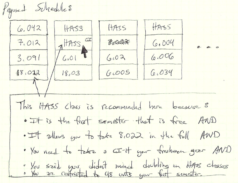
Figure 3-2: Schedule Review Interface
A year later Paul decides to use FourPlan again and is asked some questions about the events that have happened in the year between his last plan and the current date. FourPlan alters its internal state to reflect the courses that were completed and updates its plan, asking a few questions to resolve new issues that have arisen due to a conflict. Paul makes a change using direct manipulation based on his outside knowledge of courses that work well together.
Design 3 Analysis:
This interface’s big concept is “Ask as few questions as possible and do the work for the user.”
Learnability: This interface is particularly learnable because it has exactly one thing of interest on the screen at any time, and there is a clear call to action. The current question is the only thing the user needs to be concerned about, rather than modes, tabs, panels, or menus. If the user is confused, they can skip a question.
Visibility: The major theme of this interface is visibility into the software’s constraint solver. Sometimes very logical and practical decisions made by a computer can be reduced to a solution a human can’t explain. Instead of trying to find out why the system suggested an unusual plan, users often get frustrated. Therefore this interface is explicitly designed to show its reasoning behind every step. For example, when asking questions this design always begins with a reason such as “The 6-3 degree track requires you to take 2 AUS subjects.” This explains why the system is asking which AUS subjects Paul wants to take. Furthermore this system also helps deal with more complicated situations such as when Paul has already specified he wants to take 6.805, which is an AUS. In that case this interface would ask “The 6-3 degree track requires you to take 2 AUS subjects, and you already have already indicated that you want to take 6.805. Please choose 1 additional AUS subject to take:” This sort of dynamic behavior helps give the user positive feedback about the process, since it is clear the interface is listening to the user’s inputs. This theme is further echoed when the user is shown the end result of the wizard. If a user mouses over a course, the constraint solver can show exactly why it picked to put the course in that semester. Instead of being confused, the user can query any decisions that seem odd.
Efficiency: One criticism of this interface is that it requires a leap of faith on the part of the user; the interface doesn’t make it easy for Paul to enter a bunch of things he has already decided. This could frustrate a particularly competent student who just wanted help on part of his schedule. One way around this would be to start with a set of questions about what things the user already know he wants to do. The constraint solver could then take those classes as givens. With this improvement, the interface is efficient because only the minimum number of questions needed by the constraint solver will be asked.
Another criticism is that until the questions are complete, there is very little evidence that Paul is making progress other than watching the number of questions he has answered increase. Constraint solving often involves major changes to the solution near the end of the constraint input process. Therefore this interface doesn’t do a particularly good job at keeping the user engaged through a big slog of questions. One possibility would be to show a schedule-in-progress, but this would take up screen space and potentially be highly annoying if every question radically changes the output. I suspect this aspect of visibility is one that will simply need to be a tradeoff; either the user sees an artificial measure of progress like a progress bar based on the number of questions, or the user simply doesn’t get any notification at all.
There is also a risk that the constraint solver might be slightly incomplete. In a particularly annoying edge case, users might be forced to game the system by guessing at what questions really mean and giving false answers so that their intended results will happen. This will only be fixed by making sure the constraint system is implemented thoroughly.
Error Prevention & Error Recovery: Minimal error prevention is implemented by checking that the user is giving reasonable responses to each question. It is also the case that no choices made by the user are expensive to undo. Should a user incorrectly answer a question, they can simply back up and change their answer. In this case, excessive error prevention such as confirmation dialogs is not worth implementing, because the cost to fix an error is so small.
1 Comment
Anh Dang Viet Nguyen
- Good scenario that has meaningful tasks and settings.
- Well written analysis with thoughtful criticisms.
- Designs are diverse and have both pros and cons. Direct manipulaiton is a good idea, highlight new changes on the interface is always a good feedback for users.
- For the first design, you may want to put course description close to the bubble you clicks on. Another thing you can consider to add to the designs is some visual indication of which course is required for which course.