Scenario
Design 1
Design 2
Design 3
Scenario
John is a computer science major at MIT. He goes to mancourses.mit.edu to choose his classes for the upcoming fall semester. The website automatically logs him in based off of his MIT Certificate. The last time he logged in, he had inputted the classes that he has taken already. Now, he can view the classes he still needs to take in order to complete his major and the General Institute Requirements. He notices that two of his required classes are only offered in the fall, so he preregisters for them since he has the prerequisites required to take each course. He chooses three other classes to complete his schedule based off of the course evaluations, and then finalizes his semester schedule. John uses Google Calendar frequently, so he selects the option to sync to Google Calendar so that he can view his course schedule along with all of his other events.
Now that he has chosen his schedule for the upcoming semester, he decides to plan ahead by seeing which classes he still needs to take in order to graduate. From this list displayed on ManCourses, he can see dependencies of certain classes on other classes. Using this information, John creates a tentative schedule for each remaining semester that he has at MIT. Now that he knows that he can graduate without taking more than 4 classes per semester, he decides to crack open an intoxicating can of “root” beer and relax for the rest of the day.
Design 1
Overview
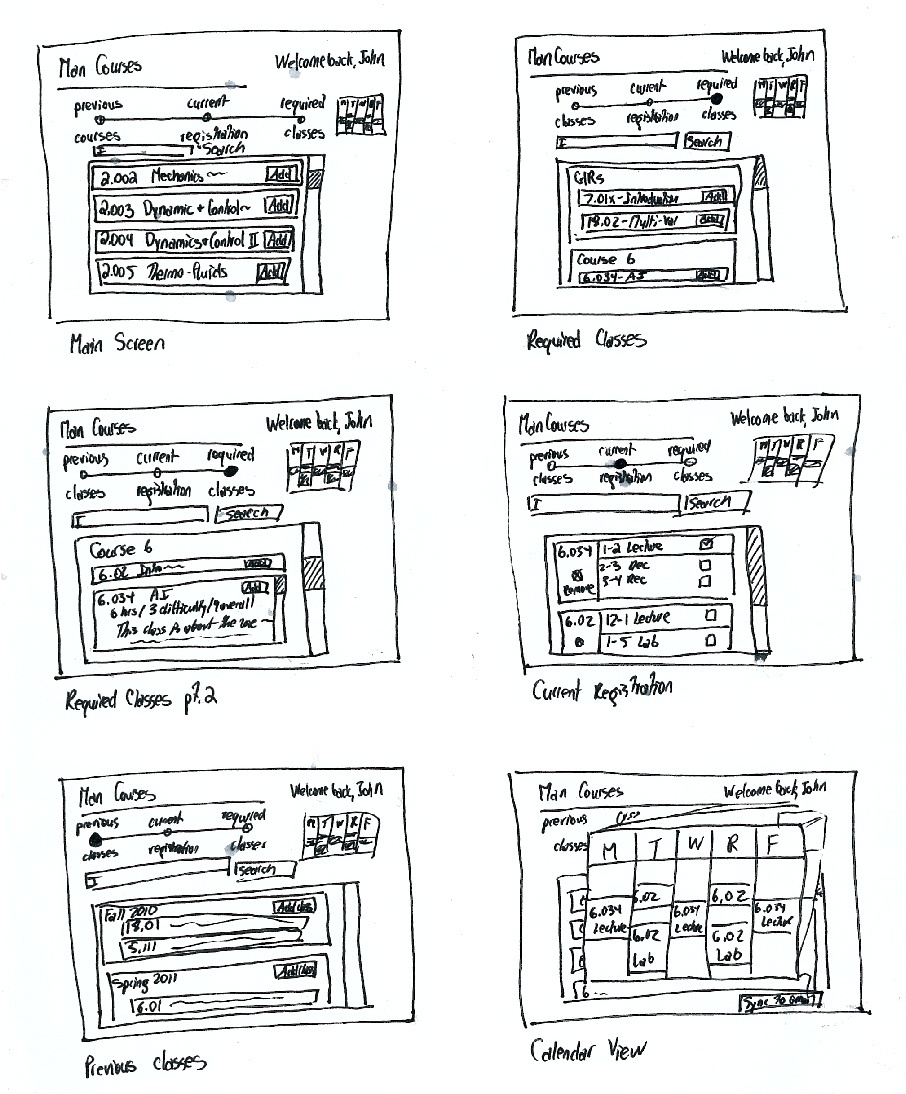
This interface is partitioned into two frames: a search frame, where searches can be made and results displayed, and a main frame that allows the user to tab between three displays: degree requirements, current selections, and projected schedules, which typically should not contain any information a user might want to access simultaneously with another display. The goal of this design is to streamline the user experience by anticipating the information a user will most want to view all at once to make decisions.
Storyboard
1. Upon logging in, John is greeted with a search bar and a main frame containing a graphical summary of the completion of his degree requirements.
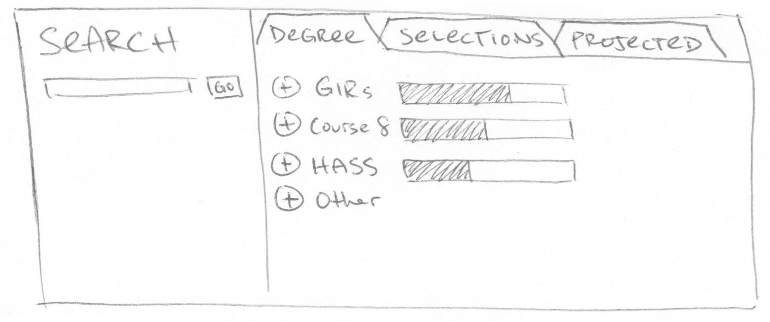
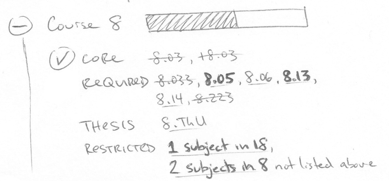
2. He expands the relevant tree node to view his degree requirements, which will distinguish between classes that have been taken, classes that are not offered this term, and classes that may be selected this term.
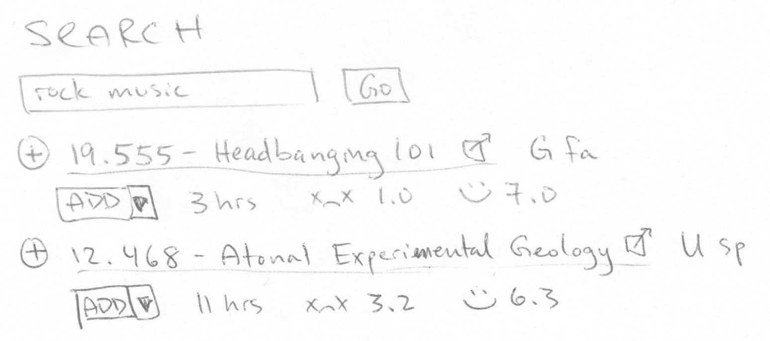
3. If John clicks on one of the hyperlinked requirements, the search frame will produce a list of expandable results similar to this example. The unexpanded class only displays very basic information and class ratings.
![]()
4. John adds 8.08 by clicking on the "add" button, which instantly changes to a "remove" button.

5. After adding another physics class, John searches for other classes in the Search field. He receives another list of results from which he can choose.
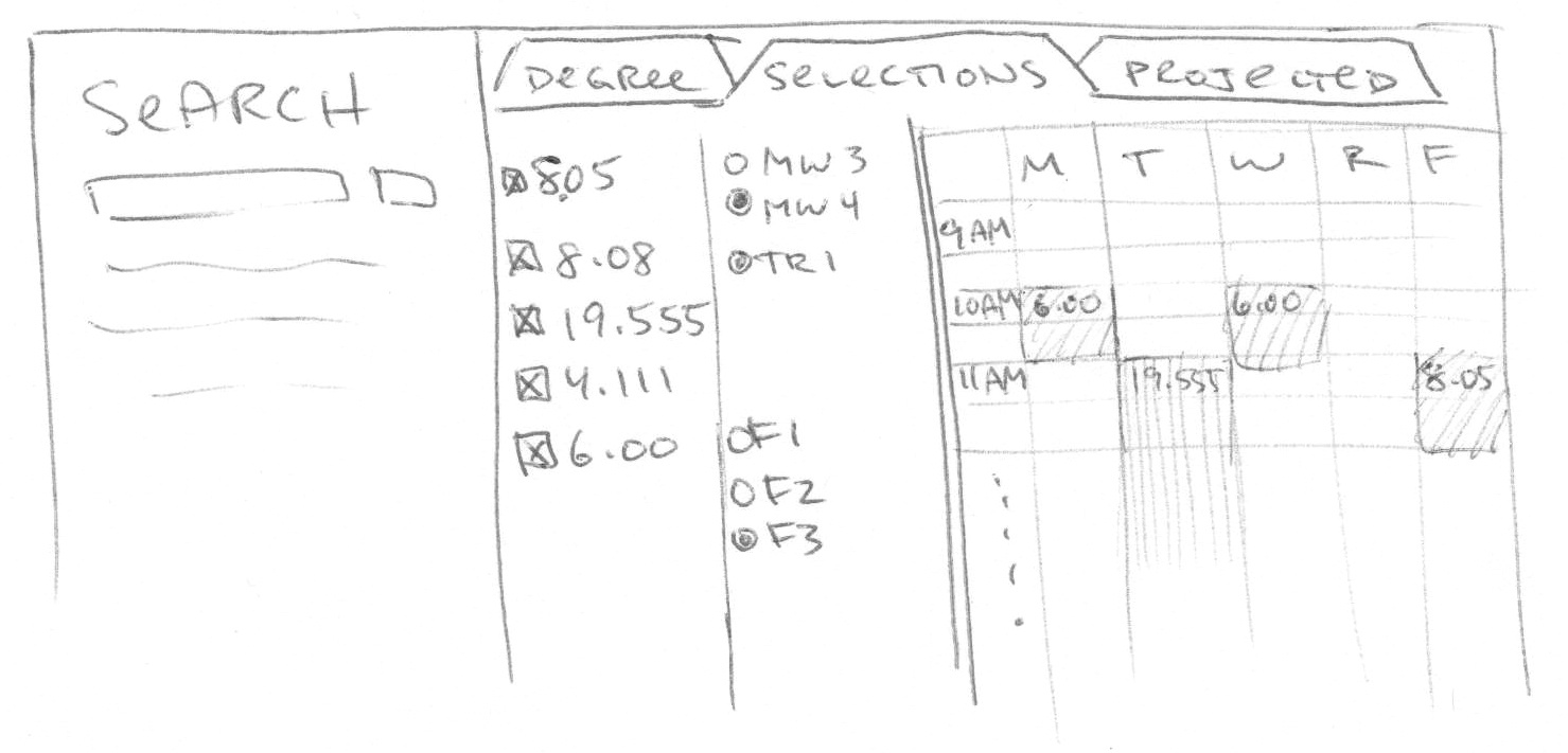
6. John decides to look over his schedule by clicking the "Selections" tab in the top of the main frame. He sees a list of the classes he has selected, recitation options, and a weekly schedule.
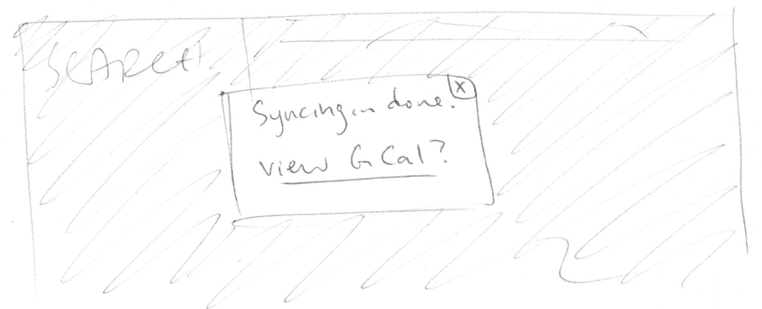
7. Having finalized his schedule, John syncs his classes with his Google calendar.
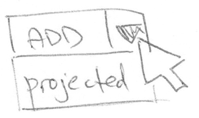
8. John tabs back to his degree requirements, retrieves classes to take later in the search results, and places them in his projected schedule.
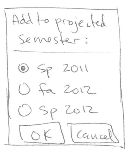
9. Clicking on the "add to projected schedule" button produces a popup allowing John to choose the relevant semester.
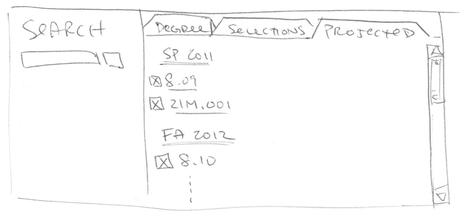
10. John can now view his projected schedule by tabbing in the main frame. He can remove classes from this page.
Analysis
This design should be extremely learnable for MIT students, as the search results, degree requirements, and current selections are formatted very similarly to the current equivalents. It will not allow for errors if implemented properly; for example, double-booking can be prevented by deactivating the option to add a class in a pre-booked time slot. We may include an option to turn off this feature for the benefit of overzealous classtakers.
Some visibility is compromised in this design, since users cannot view their current selections at the same time as their degree requirements. Efficiency is also suboptimal if users wish to view many class descriptions at once, since they must click individually to expand details, but the design is highly efficient for quickly browsing through classes. We can improve efficiency by experimenting to determine what content should be included in class summaries.
One major benefit of this design is that it is fairly versatile, so we should be able to easily make post-implementation tweaks to improve efficiency and visibility without changing the overall scheme.
Design 2
Overview
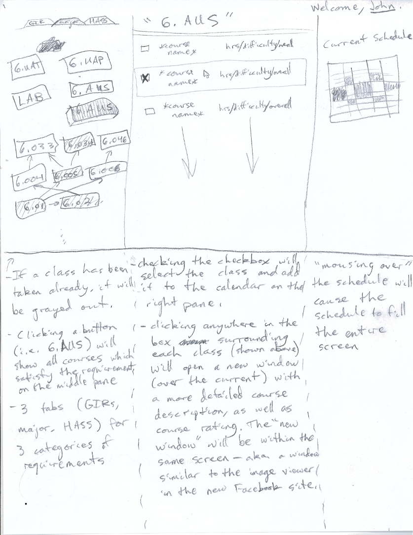
The interphase is situated with a main frame located at the bottom. This frame is what is used to browse and extract all information about classes. There are 4 modes: general browsing (no buttons selected), previous classes taken (previous classes button), current classes (current registration button), and classes required to graduate (required classes). The search bar above helps shorten the list down based on the request. When clicked, the calendar at the top right enlarges and can be synced to gcal.
Storyboard
Analysis
This design focuses on the idea that the most difficult aspect of our tasks is the searching and the quality of such search. Thus, the modes given are strictly used as specialized searches through the general subset of classes. The design is incredibly learnable, as the modes are easy to see, and switch between. There are some issues with visibility, and that its difficult to compare classes between time periods (in that it's hard to look at previous classes taken and see how they align with classes needed). Error prevention is done so that it is easy to maneuver between lists of classes, both adding and removing them with ease.
Design 3
Overview
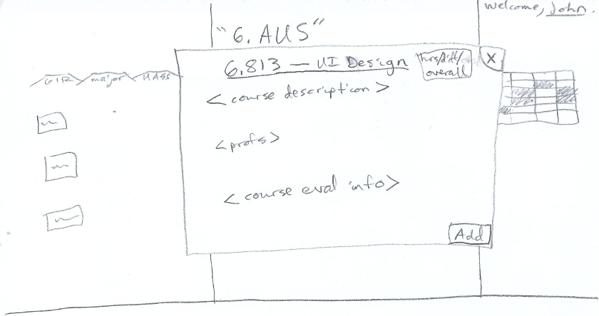
This interface divides the screen into 3 panes. The leftmost pane gives a visual representation of the courses necessary to fulfill the requirements of the category (GIR, major, HASS). The middle pane shows all available classes which fulfill the selected requirement. The right pane gives the class schedule based off of the current selection. Clicking on each course name in the middle pane will bring up another window showing the details of the course. The goal of this interface is to provide the users with all information required to choose classes in a single screen (maximize the amount of important information visible in a single state).
Storyboard
Analysis
Design 3 sacrifices learnability for efficiency and visibility. The interface is slightly more complicated to learn than our previous designs, but one nice part about it is that most important information is visible all the time (few different screens of information). The current schedule, choices of classes under a specific requirement, and course requirements and dependencies are all visible at any given time. Because of this, it is very quick and easy to access and view important information. In terms of error prevention, the only user errors possible with the system would be registering for two different classes which meet at the same time. This is taken care of by the user interface because the courses which conflict with the currently selected courses would be grayed out (and thus could not be selected).
1 Comment
Tsung-Hsiang Chang
Good scenario description.
Good designs and usability analysis.