GR3 - Paper Prototyping
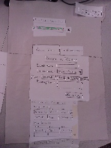
Prototype photos


Briefing
The following is the briefing that we presented to our users:
SkullWeb was designed to provide the brothers of Phi Kappa Sigma a simplistic interface to keep track of their house responsibilities and reserve rooms for events. Today we would like you to become a temporary member and test the main features of our prototype.
Scenario Tasks
We asked all users to perform the same tasks on our prototypes:
- Identify your house job for this week (week of March 20).
- Indicate that you have completed your house job.
- Check what your house job is for next week (week of March 27).
- Reserve a room to watch "Black Swan" on March 20 from 7 p.m. to 10 p.m.
- Find out who reserved "Apple Picking" on March 20.
The final task was not presented until all the other tasks had been completed by the user.
- Oh no! You actually did not finish your house job for the week. Please indicate that you are not done with your current house job.
Observations
For each iteration we had three users. For each user our observers recorded interesting reactions, decisions, and anything significant thing the user said. At the end of the test each user was asked if they had any comments to make that they did not state during the test.
First Iteration
User 1
During Test
- Confused by lack of "Reserve Room" tab
- Hesitated after completing Room Reservation
- Explores website by clicking on many things
- Seems to like the use of two different areas to complete task
- Shows dislike of extra "House Job" tab
- Clicks on dates without hesitation (could be familiar with Google calendar, which is what our calendar is based on)
Comments
- Ask for more feedback during room reservation
- Suggest putting all things on just one page instead of a few on home page and the rest on a different tab
- Suggest a renaming of Room Reservation in calendar list (currently RSVP)
User 2
During Test
- Thought that the home page was HJ (change name?)
- Wasn't sure what to do with the tabs
- Tried to reserve a room on the home page
- Tried clicking directly on the calendar
- Thought that the bolded dates on the calendar were only for house jobs.
Comments
- Would like the calendar to be bigger with more obvious information that's not initially hidden.
- Also wanted the calendar to have some type of color scheme to represent what types of events are happening on what days.
- Thought we should merge the list and the calendar.
User 3
During Test
- Noticed the calendar first and was confused by what it was supposed to represent (reservations, jobs, or both).
- Scrolled through the event list and tried to click on the even listings for more information.
- Was confused about "HJ" and didn't know it stood for house job.
- When we moved to the second task he quickly clicked on "Home" and then said, "Maybe I didn't need to do that."
- Expected a calendar to pop-up when entering reservation dates.
Comments
- He thought we needed a way to show the schedule of currently reserved times so he didn't accidentally schedule when the room wasn't available.
- He wanted more menus when choosing date/time instead of having to type them in manually.
- Thought that HJ list was redundant since it was already shown on the "current HJ" list.
- Overall, he considered it a good design but was kind of thrown off by the lack of link affordances.
Second Iteration
User 1
During Test
- Was confused about what week the HJ list was showing
- "Why does the red X exist?"
- Manually checked the calendar for conflicts before scheduling
- Wanted to type into the date/time box instead of clicking
- Concerned about cancelling completed jobs / accidentally marking jobs as done
Comments
- Get rid of the red X
- Make sure it can handle different types of date/time inputs
- Make it more obvious how to go back to event details
User 2
During Test
- "Is this week current?"
- Wanted to click on the HJ tab initially
- Thought that the green/red X was confusing
- Tried clicking on the event names hoping that they were links
Comments
- It's much easier for a user to check the RSVP calendar for conflicts instead of trial and error
- Remove the X since the HJ colors are confusing
- Move the check in front of the job title
- Wanted more flexibility in navigation / have multiple ways to do the same task
User 3
During Test
- Wasn't sure what it was possible to click on
- Assumed you could type into the date / time fields
- Looked around for an index of scheduled events and didn't like trial and error
Comments
- Make the calendar more clickable
- Show more data on the calendar
Prototype iteration
First Iteration
Our first prototype was a combination of the three designs we had for GR 2. SkullWeb had two tabs that would change the entire page. First was the "Home" tab, this would be the homepage of our site. It included an area that had the current week's house job Under this area was a form that the user had to fill in and complete for reserving rooms. There was a calendar on the left side of the page and under it was a list of all room reservations and the user's house jobs. The second tab was labeled "House Jobs". In this tab was a weekly list of all house jobs, with the user's job in bold. The job was indicated as complete when the user's job was clicked on. At the top of the list was an arrow pointing to the left, the month and week that the user was currently viewing, and an arrow pointing right. When the arrows were clicked on the list would change to the last or next week's list.
Second Iteration
The second prototype that we had user tested only contained one main page. Within this page was an area that had two separate tabs. The first tab (which is selected from the start) was the "House Job" tab. This tab contained a list of all house jobs for a specific week. The arrow system described in the first iteration was used again for this list (where each arrow took you to a new list for a new week). The user's house job now included an "X" or check symbol whenever clicked on, to signify a complete or incomplete job. The second tab was the "Room Reservation" tab. The same form used from our first iteration was included in this tab. Under this form was a list of all room reservations that utilized the arrow system of the house job list. When a entry of the list was selected it would slide the entries under it down and show extra information on that specific entry. Whenever a user completed the form their entry would then show in the list.
1 Comment
Unknown User (glittle@mit.edu)
Great! I would recommend trying to consolodate and boil down all the observations and comments from users to create a list of items that you think are worth fixing.