Design
In order to showcase our design, we took a screenshot of each of the screens used and made some comments on them. Each comment highlights either an important design choice or a feature that was modified after receiving user feedback.
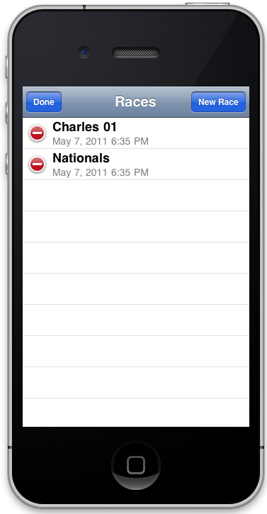
Start Screen

1. We removed the login screen because we determined that it was an excessive feature (iPhones generally belong to one person, so chances are high iCoxBox will only have one user per app). This also removed the logo-like image we had on the splash screen, which was deemed superfluous after our Computer Prototype.
2. We would have liked to have an alternative view for this screen that shows a map with all of the locations of past races to select from, so the user could essentially group and view past races by location, but this required far more technological overhead than it was worth.
3. Races are now sorted by date rather than by title, a change from our GR4 computer prototype.
Edit Pressed @ Start Screen
1. Here we used the standard iPhone UI affordance for editing and deleting entries in order to increase learnability.
"New Race" pressed -> New Race Screen

1. This screen was the major aspect of our design, and the work we put in paid off. Users said that the size of the UI elements (such as text) was similar to an analog cox box, and in reality our UI was easier to read because of the brightness of the screen (as compared to a real cox box screen, which is comparable to a calculator LCD).
2. Title editing is intuitive, again via use of standard iPhone affordance.
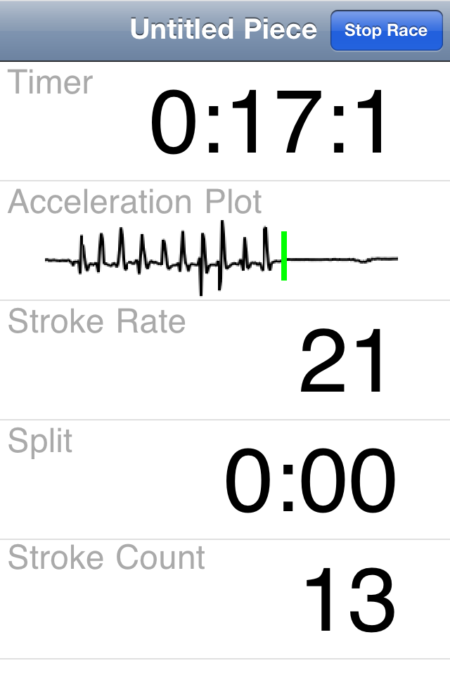
3. Acceleration plot shows real time before race, instead of reading zero. This was because we wanted users to know exactly what the during-race screen would look like before it actually started.
4. The dragging affordance used (the three dashes on the right of each row) were not as intuitive as we hoped; although it is a standard iOS affordance, users did not seem familiar with it.
5. Early on, we thought users would want to save settings to use them for new races, but they showed little interest so we nixed the feature.
6. We also nixed the combined data rows because they are not normal iPhone affordances.
New Race Screen: Scrolled down to view lower elements

1. This map allows the same gesture-based controls that are available in the iPhone Maps application, which meant that users were intimately familiar with it already. We did, however, see some users get confused as to what gestures would apply to the map and what gestures would apply to the table view. See our Evaluation section below for more details.
"Ready" Pressed @ New Race Screen -> Countdown timer
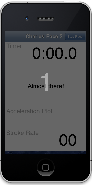
1. We added this countdown sequence (UI disables, screen shades, and there is a countdown from 3...2...1...Start!) after every user mentioned in the Paper Prototype that this would be necessary, in order to allow for the user to get ready to race before the data starts recording. Again, we saw some user confusion with this feature in the final iteration; see the Evaluation section for more details.
Countdown timer ended -> Live Race Screen
1. Once the race starts, we wanted to make sure users didn't feel like they should be editing the UI (since being in a race means that you will not have time to interact with the iPhone). We accomplished this by removing the affordances for dragging rows and editing the race title.
2. We still allowed users to scroll since a user might actually want to quickly take a peek at the other pieces of data during a race (if their coach tells them that they need to keep an eye on new types of data). This improves error correction if they accidentally misplace the row but don't want to restart the race to rearrange it.
"Stop Race" Pressed -> View Past Race Screen

1. We organized the summary of our data into a table, using whitespace to delineate rows/columns. This was immediately intuitive to our users.
2. If there exists no data for the stroke rate/split we grayed out the "Plot" button and replaced the numbers with "- " or "- : -" respectively. Users found this to be very intuitive and never confused that feedback with lost data (usually it meant their accelerometer or GPS were turned off).
"View Map" Pressed from previous (View Past Race) Screen -> View Map Screen
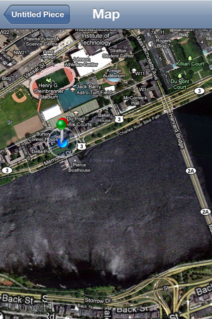
1. Our view map screen shows a green pin where the race started, a red pin where the race ended, and intermediate icons indicating points along the path. Users found this feature very enjoyable and intuitive, since it looks very similar to Google Maps (and allows all the same gestures).
"Playback" Pressed -> Playback Screen
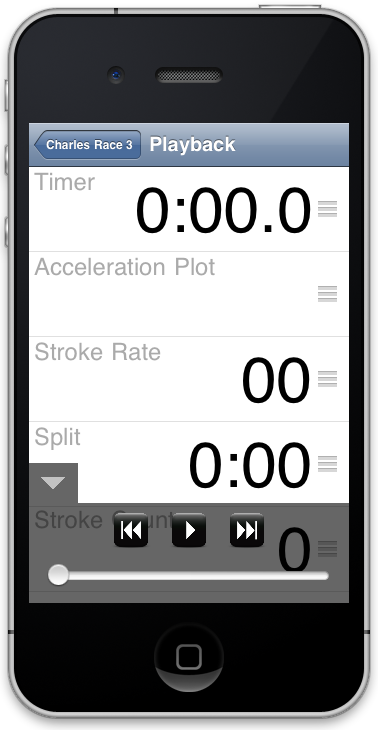
1. Our controls overview had several iterations, but we are very happy with how it turned out. The hide/show button was initially placed on the top navigation bar, which was inefficient and not intuitive. After our heuristic testing, we modified it and users found this new version much easier to use.
2. We decided to make the UI for using the playback screen exactly the same as the pre-race screen, so that users found it natural to drag rows and scroll around. The controls overlay didn't confuse anyone since it is clearly an overlay (the transparency give it the appearance of a window placed over the original view).
3. Our controls interface is very similar to the iPod controls, which improved learnability. Unfortunately, some users were confused at first by the slider; some thought it was for volume instead of a time-controller. Once they tried it once, they realized what it was and thought that the scrubbing was very intuitive and natural. This problem is discussed more in the Evaluation section below.
4. As the race plays back, each piece of data is displayed exactly as it would be if you were recording the race again (the map updates, new strokes are logged, etc). This allowed users to playback a race and view it again as an observer instead of a participant.
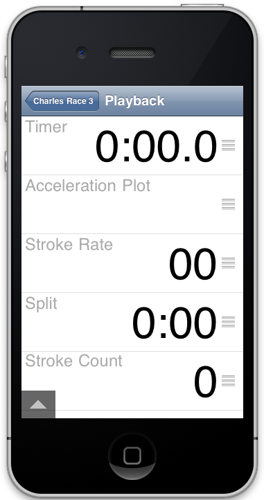
Playback Screen with navigation controls minimized
Implementation
Luckily, we chose to develop our app for iOS deployment. Apple provides a very nice set of UI elements that are standard and used commonly in most apps. This meant that most of our implementation involved dynamic data logging and displaying instead of trying to reinvent UI for the iPhone. Below are listed the parts of our implementation that went beyond the UI and impacted some of our design decisions.
Data
Our initial designs kept data separated by user login so that you needed to login before any races would be logged. We cut this because it was a large feature to implement that wouldn't be used other than the first time you turn on the app, and there were many more interesting aspects of our UI that we wanted to iterate on. However, we kept our data saved on a hierarchical per-race basis (a race holds collections of GPS points, accelerometer points, and stroke points; each collection of points is a timestamp and a value, and so on), which would allow us to abstract it again so each race is saved on a per-user basis if we wanted to add logins back in.
Similar to cutting the login feature, we cut our voice recording feature and our data sharing feature, since the UI wouldn't be interesting to iterate on but it would involve a substantial amount of extra effort during implementation.
Plotting
Our plotting is currently very simple; it simply shows a line graph of the saved split and stroke points. We decided to focus our efforts on the race view UI and ignore the plotting UI, so you cannot compare pieces of data or show a plot while viewing other pieces of data. This is because our tasks focused on the race view and playback, not on quantitative data analysis.
Navigating
We spent considerable effort in this phase of development considering the specific actions each upper navigation button would take, as this is the most fundamental way the user navigates through the application. Changing such simple things as the wording of a button or whether the button appears by default came to have large effects on the usability and learnability of our application. Additionally, enabling text fields to be saved either using the Done button in the native keyboard or using the confirm button in the upper navigation bar helped new users complete the edit they had set out to make without a second thought.
Implementation Problems
As the iOS standard user interface elements are few, well-known, and well-documented, we had a concrete idea of the interface capabilities at the outset of our implementation. Few major problems with the interface eluded us, and overall there were no shortcomings in the interface that significantly change the users' experience with our application. Small issues such as the difficulties in rendering graphs or dynamically replaying the acceleration data are not major problems, and do not affect the interface's usability.
Evaluation
Our 3 users were two MIT rowers and one coxswain. One of our team members knew them from rowing in a past year. Thus our users were very representative of our user population. Each of the users were comfortable with iOS, so we didn't need to introduce them to the UI that a regular iPhone user should know. We gave them the following briefing and tasks:
Briefing
You are a coxen of a crew (rowing) team--the person who sits at the back of the boat and uses her hands to make steering adjustments. Additionally, you give the rowers encouragement and set the pace for the race (though you do not actually row). Rowing generally takes place in a river, and rowers use oars to propel the boat. The boat will accelerate/deccelerate based on oar movement. Each pull of an oar is one "stroke." The time it takes to row 500 meters is referred to as a "split." A Spring race generally lasts approximately eight minutes.
A coach is usually alongside you and tells you what your goal is before a race. For example, the coach may want the coxen to keep a close eye on the stroke rate and the split.
This application serves to monitor various race data, such as the stroke rate, split, total strokes, coxen's notes, and trail (the path taken through the river during the race). It allows for monitoring of race data during a race as well as playback functionality to study race data after a race.
Your iPhone running this application will be mounted to the boat, directly in front of you. Because you cannot use your hands to manipulate the application during an active race (they are busy performing steering adjustments and the like); you must pre-set all settings for this application before the race begins.
Tasks:
- Set up a new race## Re-order data considering stroke rate is the most important datum for this race and split is the least important
- Start recording race data and cox (encourage and guide) your rowers through the race
- Stop recording and save race data after race has finished
- Playback recorded race data
After letting them read over these two sections, we let them use the app and took notes on some of the problems they encountered. Each is enumerated below with comments on how these could be fixed.
Catastrophic
1. Luckily, we only encountered one catastrophic problem, and it is a problem that we have been working on for several iterations. When you are in the new race screen and you press the "Ready" button, the screen immediately counts down for the race. Several users thought that they might have done this when the screen was set up but they weren't actually ready to race yet, in which case they might have to scramble to setup. To fix this, we realized that pressing the "Ready" button should just display a large "Start" button in the middle of the screen, and this button should start the countdown. This improves error prevention and correction and makes the outcome of the button much more obvious.
Major
1. One user thought that she would want to input notes on the summary page of the race, so that she could reflect on it while looking at the data. We think that this could be fixed by adding a text field to the race summary screen that would allow the user to enter notes while seeing the summary data.
2. Several users tried to scroll the race view, only to realize that by starting the drag operation in the map cell, they were actually moving the map view. This lead to some temporary confusion (luckily it is reversible) and frustration since the scrolling is handled entirely by the iPhone and putting map views into table cells isn't standard Apple UI. We decided the best option would be to disable map view scrolling, since users will want the map to be centered on their boat anyways, and instead provide a slider that will change the zoom level if desired.
3. Part of the user tasks was to save the race data. Since the race data is automatically saved, some users were confused by this. We decided that when you first go to the race summary screen, the "Races" back button should actually say "Save". Every other time you go to the race summary screen, it should say "Races". This makes it more obvious that you are saving the race data.
Minor
1. Each of our users, including those familiar with standard iOS interface elements, did not initially notice the scrollable nature of the recording race screen. When asked to add notes to a race, they were confused and asked for clarification on the task (the Notes field is initially obscured on a new race). After between 5 and 15 seconds, the users simply blindly dragged the screen, and were somewhat surprised when it scrolled, noting that that was not obvious. Unfortunately, there is no easy fix to this problem, as this is the standard iOS user interface style. In actuality, there is a scrollbar that is displayed when the page is first shown, which indicates there is more data below, but most users didn't see it. One fix would be to make this scrollbar more apparent, either by lengthening the time it is there or increasing its contrast.
2. Some of our users noted that it was not obvious that maps needed to be setup (oriented, zoomed, panned to desired location) prior to starting the race. Once the race had started and the users were examining the updating data, they wanted to zoom and pan the map screen. A design decision was made that all fields lose the ability to be manipulated during the race. This decision should be irrelevant because during an actual race, as the coxen or rower should not have attention to devote to manipulation of data fields. As mentioned in the second Major problem above, this could be fixed by not allowing for panning and instead putting in a slider that changes the zoom level.
3. Our second user wished that the notes section could be longer (~1/2 pages) for practice sessions, but this was also not implemented because of a design decision. We decided that our application should not support display of large bodies of text, as it is an app designed specifically to show many short snippets of valuable information simultaneously.
Cosmetic
1. Our first user thought the thumb for scrubbing through playback data was a volume indicator, due to its similarity with the Music application in iOS. This user quickly realized the true functionality, but a fix to this would be to add a time elapsed and time remaining value just above the left and right sides of the scroll thumb respectively (this is how it is differentiated from the volume indicator in the iOS music application).
2. Another user was unsure if the screen he had entered when first handed the application to test was in fact the first screen. This screen does appear in the same way a screen in a view stack on which a previous user left the application when closing it. When asked directly, after the test, the user stated that it felt as though he was stumbling on where ever the previous user left the application. A possible remedy for this is to have a splash screen or a simple title screen that leads you to a list of data. This was originally in our design, but the idea was abandoned after no other features could be added to this screen. It is essentially a tradeoff between learnability and efficiency, and we decided to emphasize efficiency.
Reflection
All in all, our project was very well scoped and the user interface we settled on was a natural fit for the iPhone. We were happy with our designs and we picked the simplest of them. We wanted the user to know how to use it immediately and not have to relearn basic iPhone user interface affordances. Our paper prototypes worked well and were very useful in determining which features didn't work and which did. The medium of paper also made it easy to move around the UI when changes were necessary. For example we made the rows separate from the background (on the New Race screen) so that you could reorder the elements with ease and simply flip them over when the race started.
Our computer prototype was not as useful as we thought it would be, but we did cut a few features after making it and rearranged several elements in the interface. We don't think that the lack of usefulness came because it was a low fidelity prototype, but simply because we had already located most of the problems with our UI in the previous stage of paper prototyping. From a design standpoint, building this digital prototype was probably just about as helpful as another iteration on our paper prototype would have been, but having a checkpoint for implementation was very helpful.
Our riskiest decisions were to include playback, maps, and acceleration plots (each had high technical overhead), but we managed to accomplish most of them because a few of our group members were already sufficiently experienced in Objective-C (the coding language used).